AT-AT attacking Time Square
-
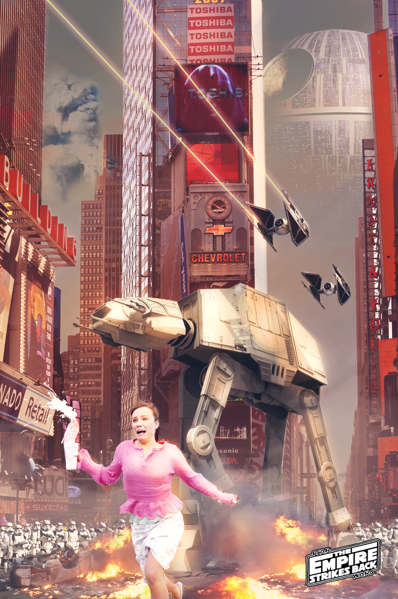
So I was teaching some architecture students basic output from Sketchup for processing in Photoshop. I was quite bored of the usual 'insert your project into your site photo' so we did something a little different: The first two words to be shouted out by the group were 'Star Wars AT-AT' and 'Times Square'. I had some fun doing this and it was a great way to get to grips with Kerkythea, as I've never used a rendering package before.
I'm happy to post up a tutorial if anyone is interested.
- J
-
Excellent

Would love to see to steps involved.
-
Please do.
-

Looking at the SU model wondering if you even needed it, you could have just sourced an image of the walker online.
-
Step 0
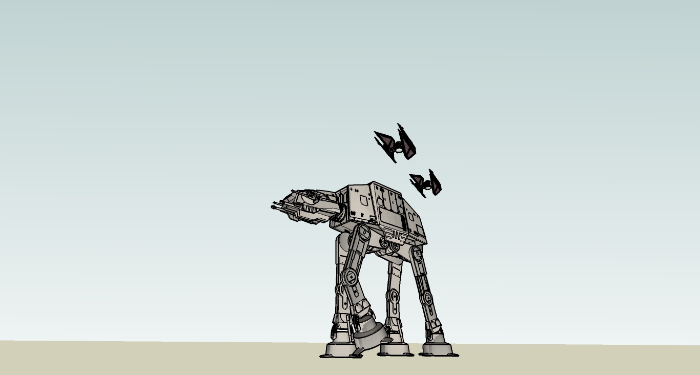
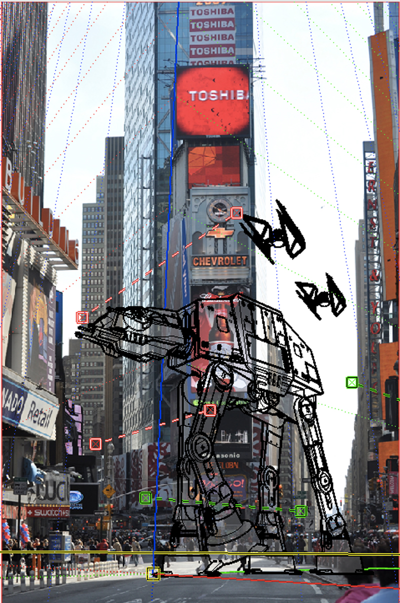
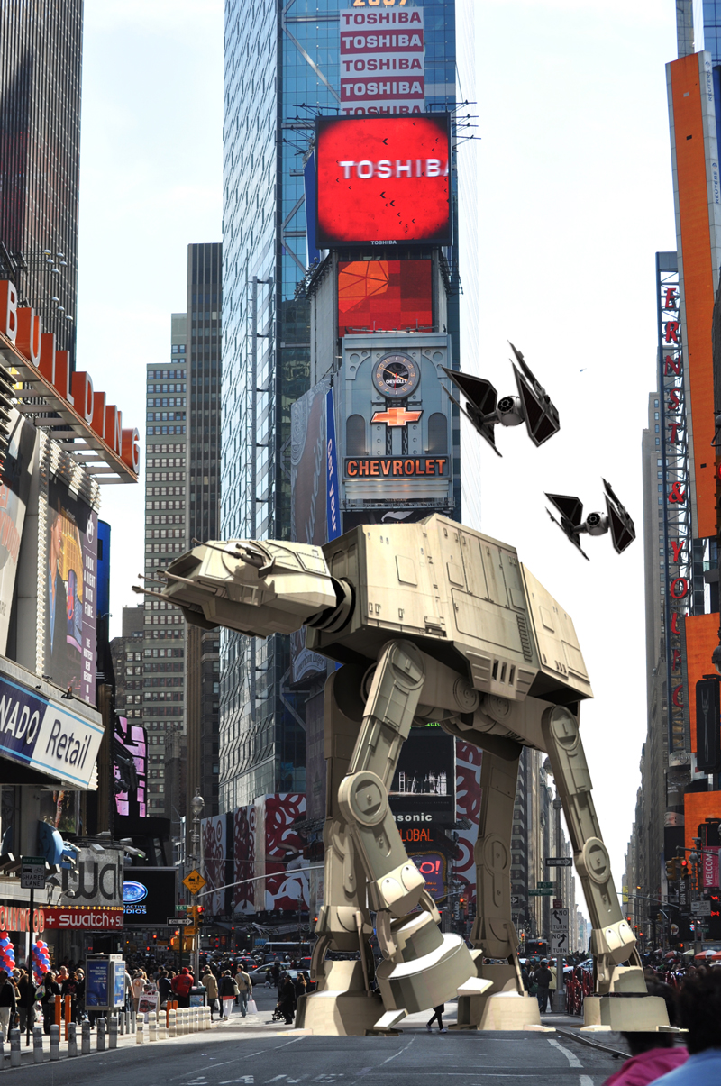
As this was intended as a fun tutorial to prepare SU models for post processing in Photoshop, I asked students to call out the first things they could think of. In 3D Warehouse I got a request for a Star Wars AT-AT walker, followed swiftly by a picture of Times Square.In Sketchup, I replaced the texture of the AT AT with one off CG textures which I thought looked more realistic. Opening the Match Photo dialogue box, I then quickly matched the model with the image of Times Square. I realise of course, an actual AT-AT is much larger than the one in the image, but I wanted to get the image out in under a couple of hours and it would have taken to long to get the composition right if the AT-AT was at full scale.
Step 1
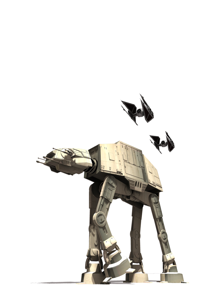
I decided to take the plunge finally and start using a rendering programme for the first time ever. After spending some time installing Kerkythea, I followed a basic tutorial to achieve the render seen above. I adjusted the exposure and darkness setting ever so slightly in Kerkythea's render window whilst trying out the test renders as I knew this would be a late afternoon scene.In addition to the Kerkythea render, I did a shadow pass on it's own of the photo matched model by going to hidden line styles and turning off edges. Opening up Photoshop, the first job was to align the Kerkythea render with the shadow pass. I also added a line render for reference and made a layer group for all three base layers.
Step 2
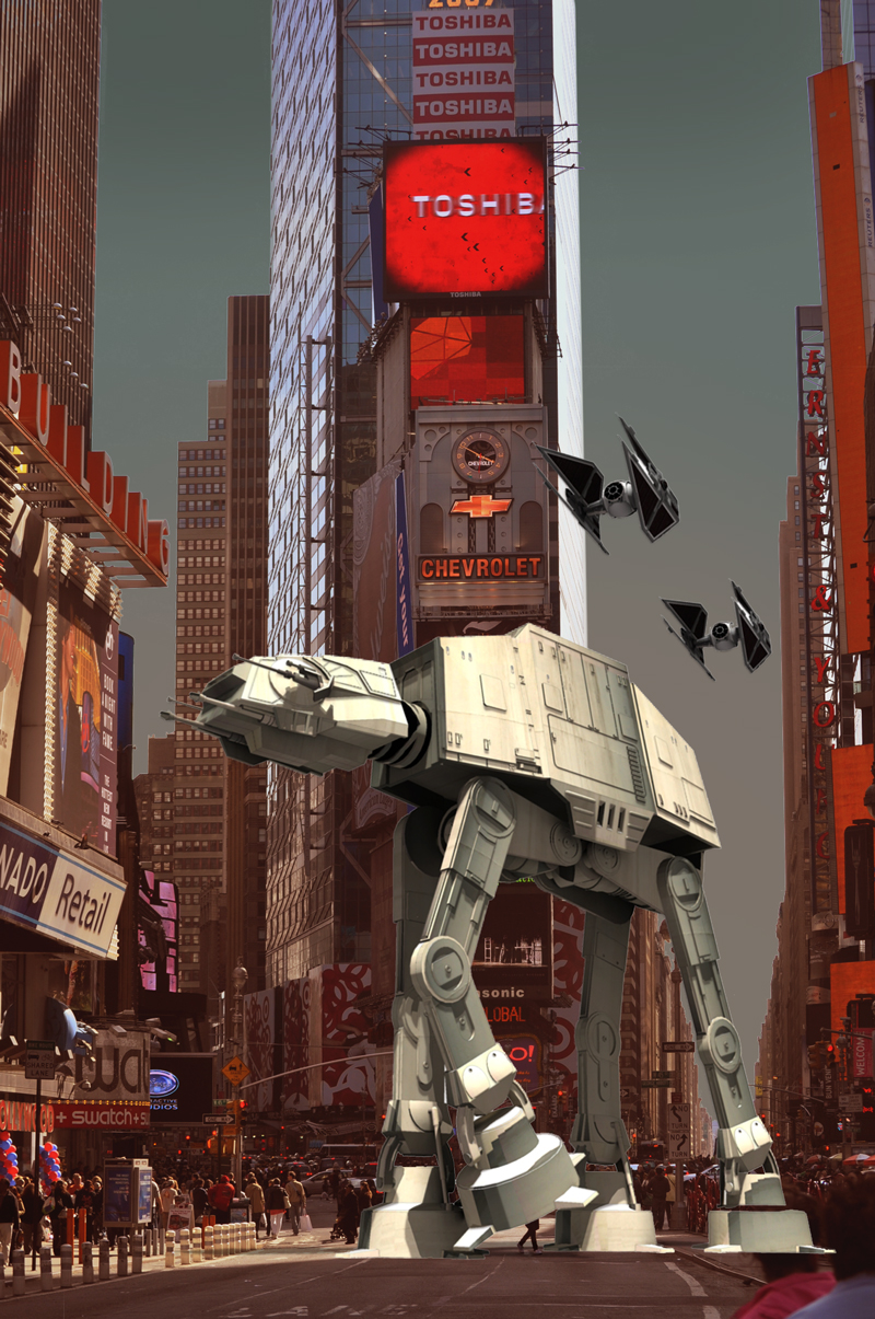
When doing my images for project-work, I usually always start with the sky, as it helps to define to overall atmosphere and lighting for the rest of the image. I always have an idea of what I'd like to have, but things usually change. The best way to extract the sky in my opinion is to make an Alpha Channel selection, by copying the channel that has the largest contrast. The copy is then adjusted using the levels palette to create a black and white silhouette, by painting in the outstanding areas. The selection is then used to create a layer mask.The sky is added as a new layer group beneath the base image. In this case, I used a soft brush, colour sampling the apocalyptic sky from a reference.
Step 3
To add to the war zone atmosphere, chances are there will be a lot of fires. Duplicating the base plate with the layer mask, pressing cmd+B (or cntl+B) brings up the colour balance dialogue, and I shifted the entire tonal range toward a more reddish hue.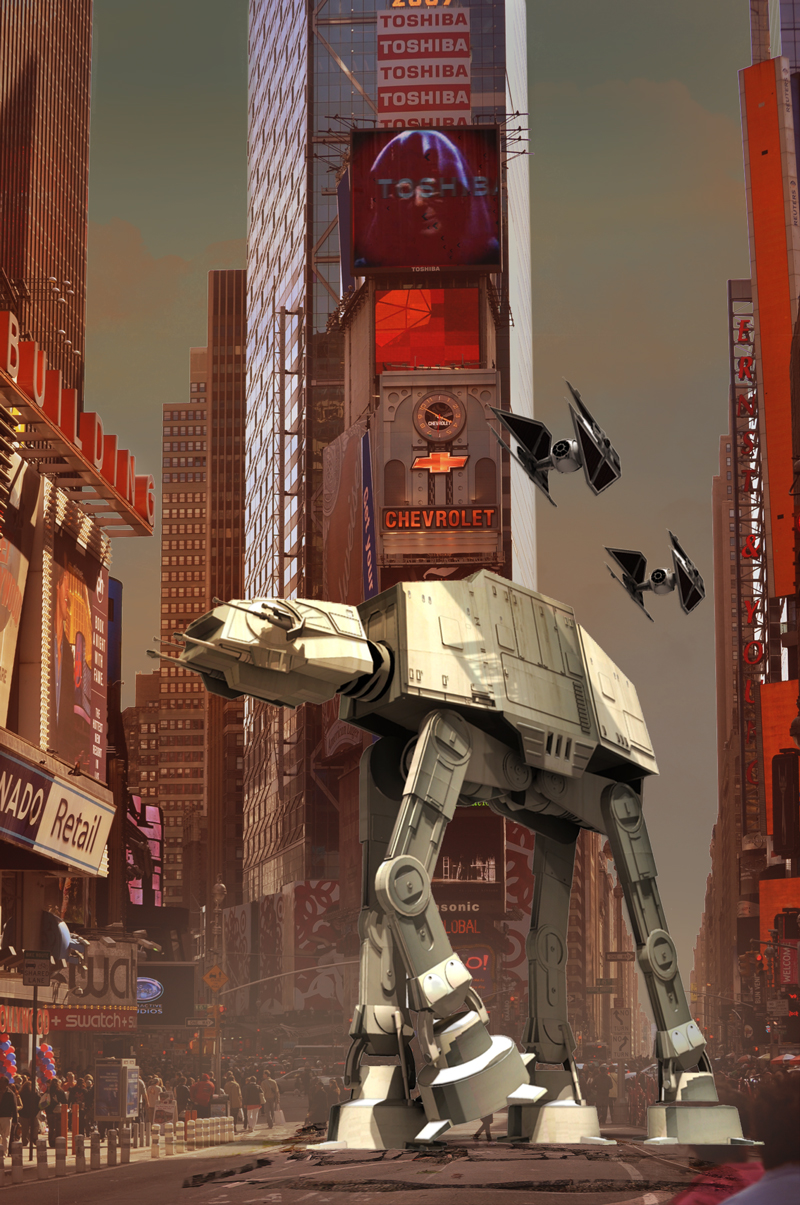
Step 4
Cracks in the road were added by throwing in some real cracks from a reference and distorting it to match the perspective, before applying a blending mode and rough it into the image. Clouds were added using a cloud brush with a browny/orange tone. Using a similar tone, a soft brush on a separate layer with the opacity turned down creates a realistic looking cloud of dust behind the AT-AT. This helps with the atmosphere build up and will wash out mid ground elements.Also added was a new layer set to overlay as a blending mode, and with a soft brush I painted in areas where the light would strike surfaces to give the appearance of a setting sun hitting those edges. This really matches the duplicated colour balanced plate. Furthermore, I added the Emperor Palpatine to give the impression all broadcasting had been compromised by the Galactic Empire. An extra bit of realism was added by having a cast shadow dropping onto the body of the AT-AT itself - copied from the right side of the plate, distorted, levelled to black and multiplied onto the AT-AT, then taking the opacity down to match the other cast shadows. Lastly, a gaussian blur was added to soften the shadow.
Step 5
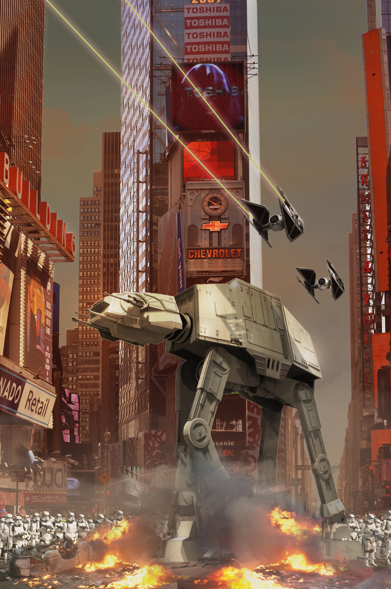
Mid ground elements added. Starting with the laser, this was a soft brush set to green. Holding shift whilst drawing two points keeps a straight line. The layers were rotated into position then duplicated. A solarize filter was added and set to overlay to create the corona from the lasers.I found a picture of a burnt out car online and gave it a layer mask, and simply flipped around. No need to find another photo as I knew there would be a foreground element. The layer mask was simply brushed to blend into the existing dust layer.
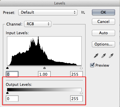
The same process was used to add the Imperial Stormtroopers (taken from a Spanish parade). As they sat behind the car fires and debris strung into the road, the only real adjustment after eliminating the background was to use blend them more convincingly. A lot of images look wrong to me as elements in the mid to background often have too much contrast. The colour delta range should only be sharp and broad as you move towards the foreground. To adjust this, go to Image > Adjustments > Levels. Usually no one pays attention to the bottom two sliders, the Output Levels, which will increase the overall lightness or darkness of the layer. Sliding towards the middle decreases the relative contrast.
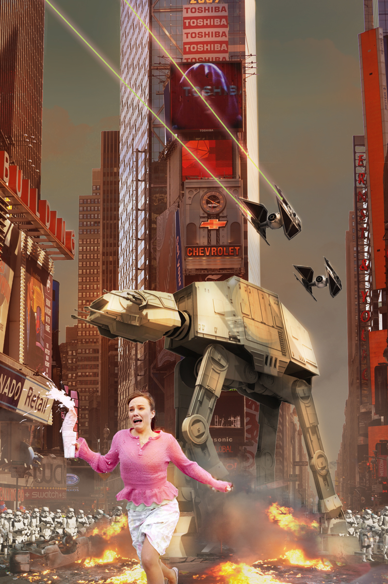
Step 6
The milk shake woman was too good to pass up, in the original she's running away from a zombie. I used the pen tool to create the layer mask, then simply blended her into the photo. Another layer was added with the blending mode set to overlay, and a soft brush with an orange tone was added to light hit surfaces, particularly to the right side of the woman. You could also use the dodge and burn tool to create a similar effect.Usually by this point I'm pretty sure I've got the composition nailed, so the last thing to do is add some lighting effects.
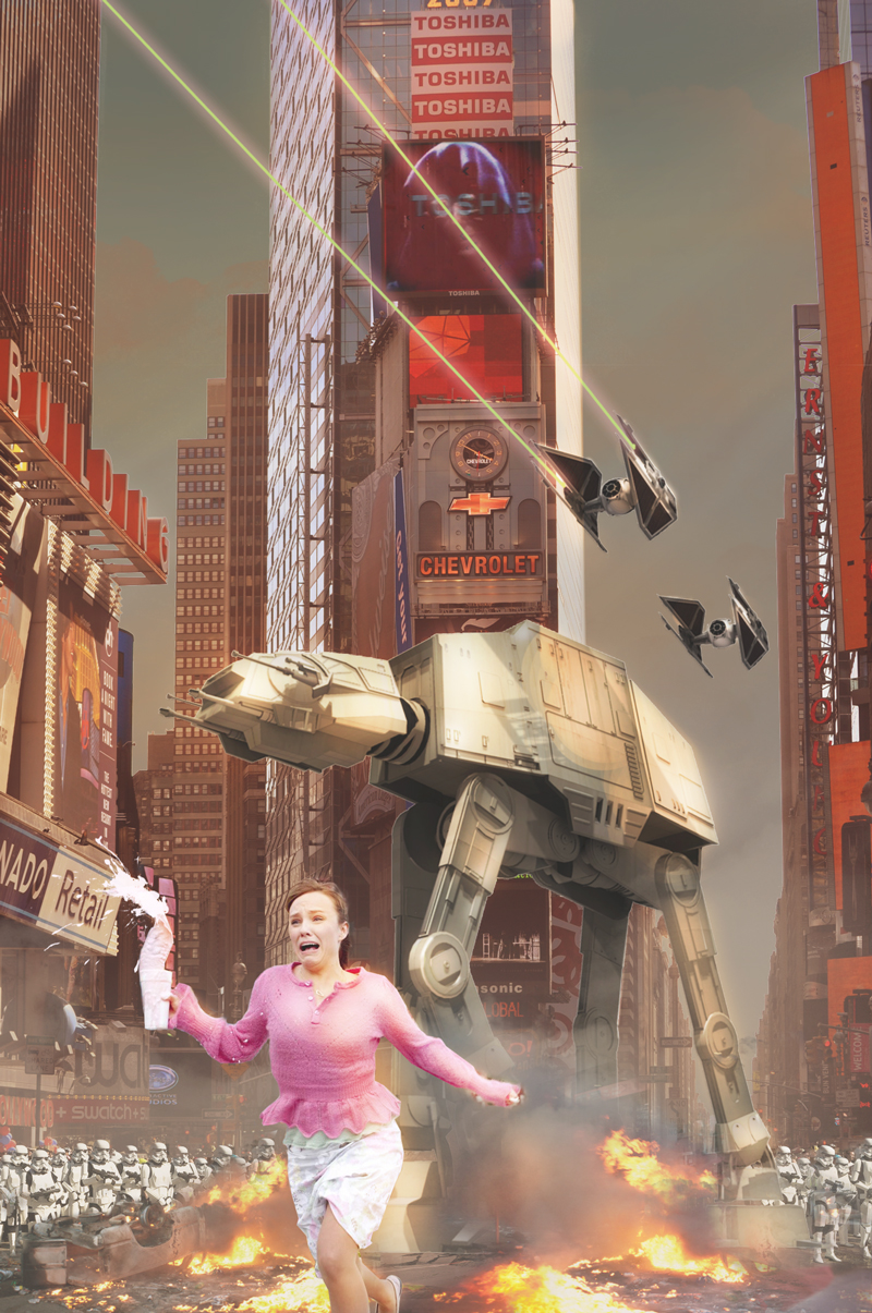
Step 7
One particular trick I have is simply doing a plain white layer, and turning the opacity down to 10%. Like a noise layer, it works a treat of levelling out all of the separate elements.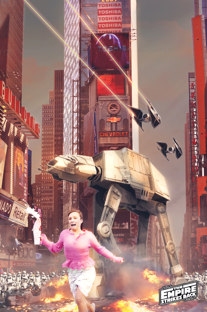
Step 8
Another overlay layer is applied right at the top, with a soft white brush just picking out highlights. I also added a subtle 'god light', a soft brush streaked across diagonally, set to overlay and opacity at around 10%.The final adjustments involved a curves adjustment layer to bring out the shadows and contrast, and a final subtle colour balance, and a photo filter to give it some warmth. Logo added too. Voila.
Total time: 2 hours.
You can download the original model and Photoshop file here: http://ge.tt/9vapLOA?c
Cheers!
- J
-
@solo said:
:thumb:
Looking at the SU model wondering if you even needed it, you could have just sourced an image of the walker online.
For sure, but the tutorial was intended to be a demonstration of how to prepare SU models for processing in Photoshop.
Cheers!
-
That looks great. Very kind of you to take the time to make the tutorial!


-
Good compositing skills. My problem with the final image is the woman. She must be giant or the soldiers are 100mm tall.
Hello! It looks like you're interested in this conversation, but you don't have an account yet.
Getting fed up of having to scroll through the same posts each visit? When you register for an account, you'll always come back to exactly where you were before, and choose to be notified of new replies (either via email, or push notification). You'll also be able to save bookmarks and upvote posts to show your appreciation to other community members.
With your input, this post could be even better 💗
Register LoginAdvertisement


