..Lobby Photo Composite..
-
Here are a couple photo composites I did last week.. not 'great' but this is a bit new to me.. used PhotoMatch (obviously) and then rendered in Twilight.. composited in pshop..
before
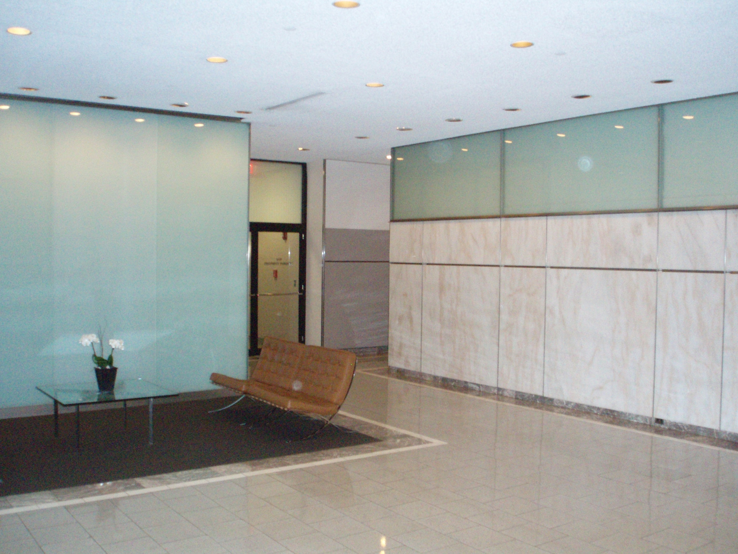
after
before
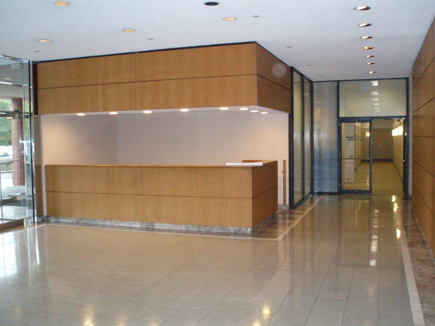
after
-
They look darn good to me, but you have to consider that I know nothing about rendering and even less about architecture

-
pretty good example of photomatch's use
 .
. -
Nice work. The leather on the Barcelona chairs seems off to me. On the last image I get a feeling that the wall on the right should be showing up slightly in the floor. Right now it looks disconnected somewhat.
Scott
-
Those look perfect.

-
thanks guys... yeah, scott...that wall on the right was fudged a bit in pshop...i'm not sure what happened..i think it needed a stone base and i forgot to do that, so i stretched it down to the floor, and.... well

-
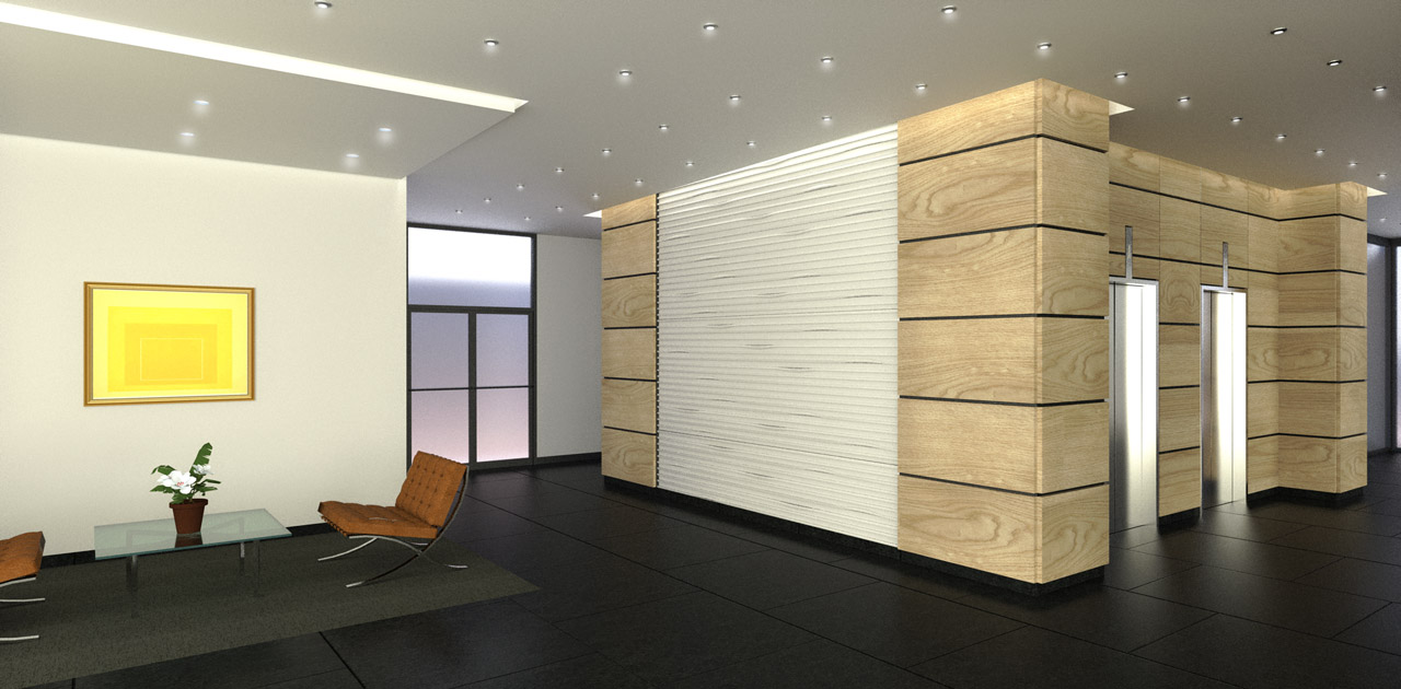
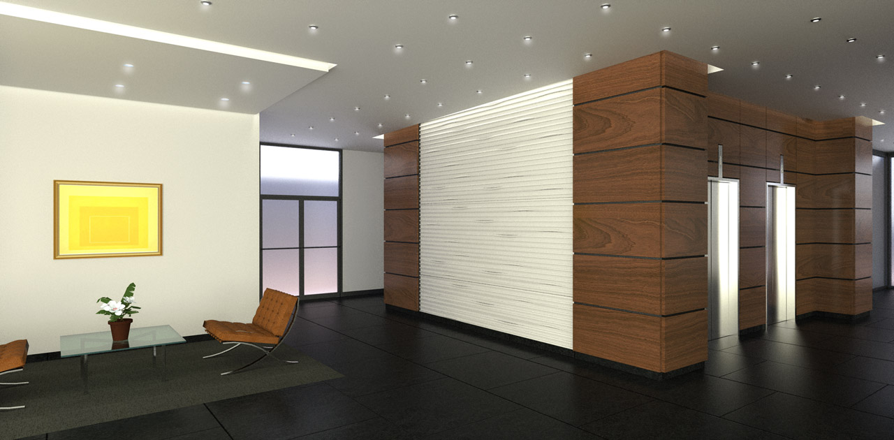
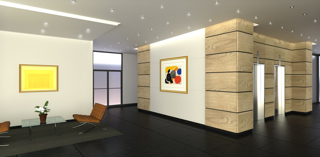
I'll bring these back from the dead because the client is back to working on these.. these are not photo composites, obviously...but the same project
 Three different options....and not my design.
SketchUp/Twilight/Pshop
-
50 years mood!

Hello! It looks like you're interested in this conversation, but you don't have an account yet.
Getting fed up of having to scroll through the same posts each visit? When you register for an account, you'll always come back to exactly where you were before, and choose to be notified of new replies (either via email, or push notification). You'll also be able to save bookmarks and upvote posts to show your appreciation to other community members.
With your input, this post could be even better 💗
Register LoginAdvertisement


