NPR canyon community center interiors
-
Hi everyone -
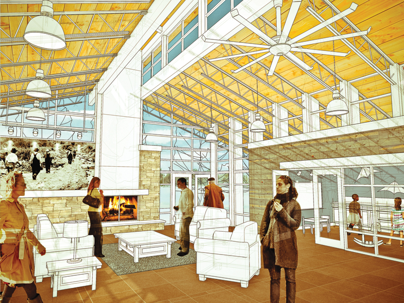
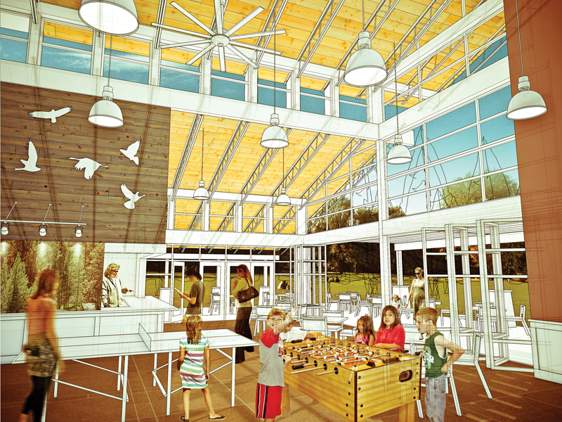
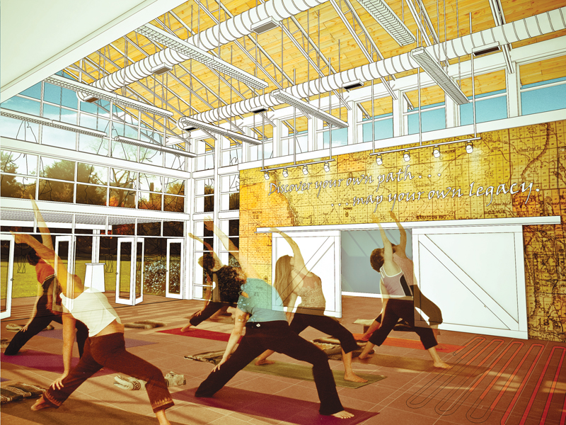
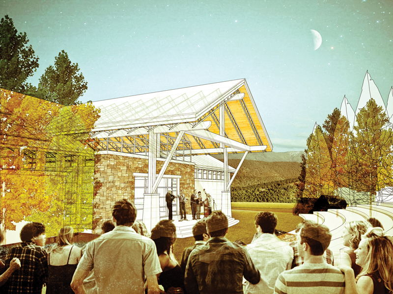
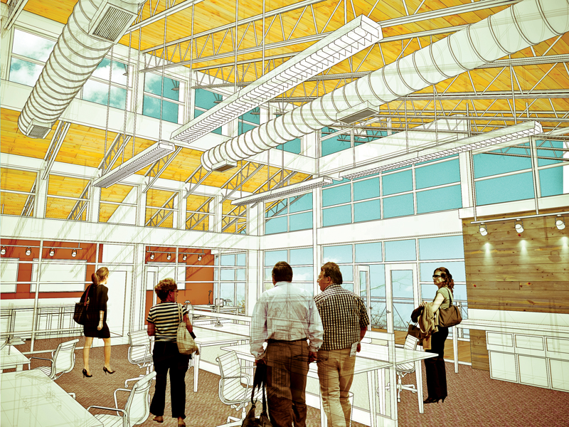
Our office recently completed a quick schematic design for a canyon community center, and presented it mostly through sketchup interior views. Thanks for all the help from the members about trying to get the lineweights right - I know it was a last minute question

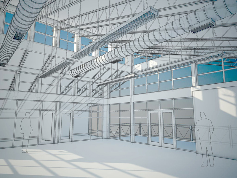
Linework and shadows (vray) were exported from sketchup, the rest is photoshop.
-
Nice style and I like it very much...you can push your style a little more in Photoshop and I think your images has potential if you will work on it some more...
You already have the Concept here in your style...
allanx
-
very cool images.. i like the tones alot. i think the people are a really good balance.
-
nice design and presentation style (this one is one of my favorite)
 . only one thing - I would use sketched people or siluetes - especially for interior.
 -
Nice design and style.
Well done!
I'd love to have a community center like that in my neighborhood.
-
Great images and really nice presentation, you really put the whole feel of the design forward with this.
-
wow, those are some big ass fans!
Very nice project, sir.
-
nice work!
Is the ceiling/floor a texture in SU or Postprocess?
-
Thanks all for the positive comments! I agree the people are a little off - I'm not sure if it is the contrast or what. It was also hard to find good people cutouts that were not exterior shots - lots of people wearing sunglasses indoors, oh well!
penumbradesign - almost everything is photoshop! I started off with a sketchup wireframe overlaid on a simple vray shadow render (see the last image posted above). I made a lot of use of the "vanishing point" filter to match up the textures, layered the people and vegetation, and in the end I applied a couple adjustments to warm up the hue and increase the contrast of the images to get the final look. I think a lot of the "look" is just the color palette. I tried to use a lot of warm yellows and browns in the interiors and contrast it with a blue/green sky.
-
Well done indeed. I play around with a similar process so everything sounds familiar. Do you do an x-ray view overlay for one of your images? It seems there is an interesting transparency showing through. Also, how do you handle your selections in photoshop for things like the floor showing through the furniture and such. That is on heck of a selection! Best wishes and keep it up!
Hello! It looks like you're interested in this conversation, but you don't have an account yet.
Getting fed up of having to scroll through the same posts each visit? When you register for an account, you'll always come back to exactly where you were before, and choose to be notified of new replies (either via email, or push notification). You'll also be able to save bookmarks and upvote posts to show your appreciation to other community members.
With your input, this post could be even better 💗
Register Login


Advertisement