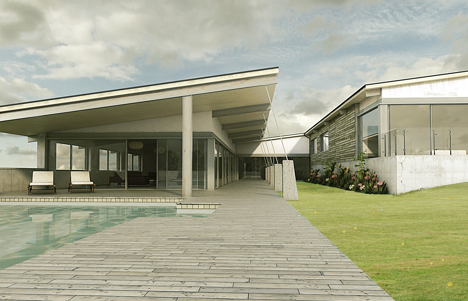
First render on the site
-
Hi been a member of this site for a little while, but I've been a bit busy with work, so not been able to add my input...up until now. Had a bit of spare time so I thought I would crack out a render.
Got a lot of inspiration from the foothills house in New Zealand by the Strachan Group Architects.
It was modeled in Sketchup and then rendered in Vray with a minor amount of postwork done in PS.
Still a load of modeling, texturing and postwork to do.
Would appreciate C&C as I feel I have a long way to go yet and there is a lot of people on this site with some valuable knowledge.

-
Well first off, why isn't this in the main gallery?

Second... very nice!
Third, learn... what? Holy moly but that's good!
-
It's looking good. Maybe some warm-cold contrast between the subject and the background, and cliping lower part of the picture a bit
-
Nice work.
-
Thank you for the comments,greatly appreciated.
srx: That's a good idea, thinking of doing a dusk scene next, found nice hdri to use for the backkground.
Anyway should hopefully have an improved version soon
-
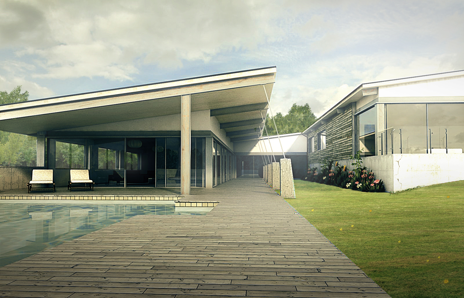
Been a little while since I worked on this piece, but this is my latest update.
Ignore the interior still a lot of work to do.
I'm sorry for the low res image.
As always C&C welcome.
-
The water needs a bump. The render is not bad, but the image looks very flat. I tried to play around in photoshop and improve the tonal and color contrast. Made some color balance, level and hue changes. Also added a background, slight haze and a vignette to bring the image to life
-
Hi Speaker,
Thank you for the C&Cs and taking the time to try and make alterations.
As for the water I did add a bump within vray, it probably needs tweaking a bit more. I think the slight haze and vignette are definitely a nice touch as is adding a background. My only concern would be that the picture now looks over bright on the right, so much so that you cant see the smaller details. I also don't like to add so much contrast and generally try to bring the saturation down, this can sometimes make the image look a bit washed out, but I suppose its just personal taste. Had this been for a client I would however had to adhere to their taste.
Once again thanks for the C&Cs definitely some good tips to help try and improve it.
-
The main idea is that the eye is drawn to the highest contrast points that help to distinguish the most important parts of the image. You could also replace the vignette with a drop shadow from a trees and also add some trees in the reflection to balance out the image.
Hello! It looks like you're interested in this conversation, but you don't have an account yet.
Getting fed up of having to scroll through the same posts each visit? When you register for an account, you'll always come back to exactly where you were before, and choose to be notified of new replies (either via email, or push notification). You'll also be able to save bookmarks and upvote posts to show your appreciation to other community members.
With your input, this post could be even better 💗
Register Login


Advertisement