I need help about style
-
i very like this style, but i dont know how to have or creat it, who can help me creat this style or if you have it, share it for me, thank you very much!


-
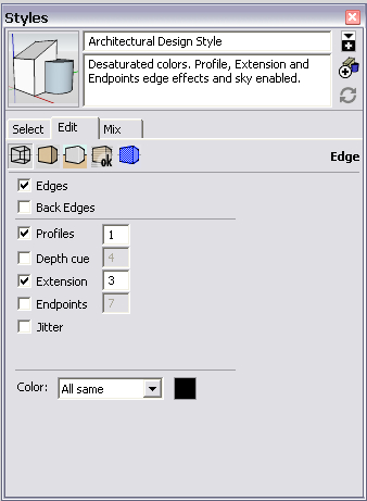
It seems that nothing is very special in this style. It is a simple "Shaded with textures" face style (well, the modeller did not use too many image materials but mainly colours) otherwise these settings are somewhat the ones which would produce a similar look - I guess there is a 1 pixel profile set as well since some curved geometry (cars) display their outlines, too (trees are apparently set to have translucency)

-
@gaieus said:
It seems that nothing is very special in this style. It is a simple "Shaded with textures" face style (well, the modeller did not use too many image materials but mainly colours) otherwise these settings are somewhat the ones which would produce a similar look - I guess there is a 1 pixel profile set as well since some curved geometry (cars) display their outlines, too (trees are apparently set to have translucency)
Thanks for sharing. I tried your way, but the results do not like


-
Well, maybe use longer extension lines and export at a larger scale (say double the size) you need and resample the image in an image editor afterwards. I am pretty sure there is nothing very tricky in that style.
-
@gaieus said:
Well, maybe use longer extension lines and export at a larger scale (say double the size) you need and resample the image in an image editor afterwards. I am pretty sure there is nothing very tricky in that style.
Here are my results, it's not like the that style, a style that seems to be on formfonts.com. but I don't have an account to download


-
Well, to me they are quite similar (even if they are not the same exactly). Maybe adjust the shadow darkness/lightness slider a bit to have somewhat less contrast.
If the style is at FormFonts, the only way you can get the original is to subscribe to FF. No-one is allowed to share (or even ask for) copyrighted material here (see #4 of our TOS you agreed when registering here).

-
@gaieus said:
Well, to me they are quite similar (even if they are not the same exactly). Maybe adjust the shadow darkness/lightness slider a bit to have somewhat less contrast.
If the style is at FormFonts, the only way you can get the original is to subscribe to FF. No-one is allowed to share (or even ask for) copyrighted material here (see #4 of our TOS you agreed when registering here).

thank you very much! i will try! but if you can creat this style in future, please share it for me!
 thank you!
-
I'd share any style here for sure - although I am not a very "stylish" person (you should see me live)

-
There is definitely some post-processing done in the original example. Reflections have been added and I suspect those long lines running through the sky are added afterward, too.
I think a major difference between your image and the examples is their use of simple, transparent trees. You could edit yours to make them transparent which would help.
I have made quite a few styles but wouldn't presume to copy an existing one even if it is commercially available one. If you really want that style, you should get it from Form Fonts.
Hello! It looks like you're interested in this conversation, but you don't have an account yet.
Getting fed up of having to scroll through the same posts each visit? When you register for an account, you'll always come back to exactly where you were before, and choose to be notified of new replies (either via email, or push notification). You'll also be able to save bookmarks and upvote posts to show your appreciation to other community members.
With your input, this post could be even better 💗
Register LoginAdvertisement


