Casa Folha - Leaf House Exterior (Sketchup+Vray)
-
as promised the monochromatic detail shots - i didn´t have the time to play around with the lighting so please excuse for the the mediocre quality.
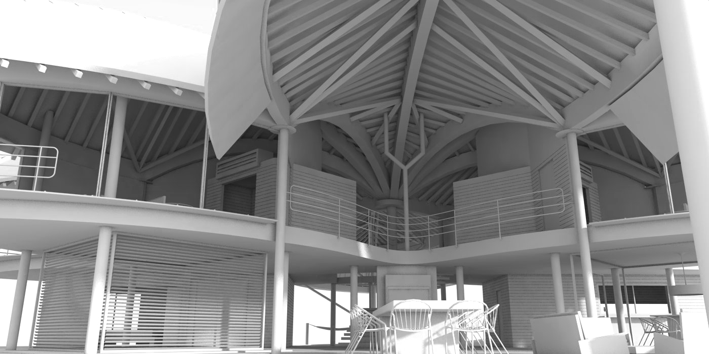
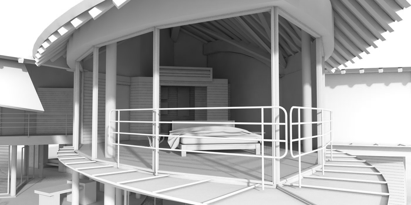
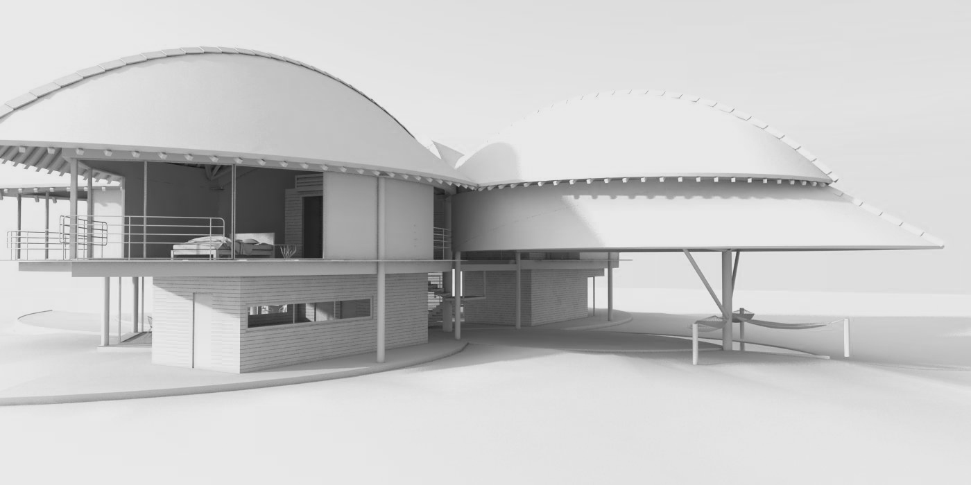
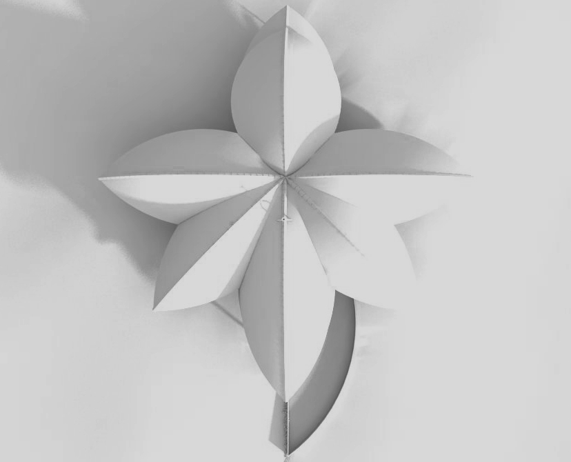
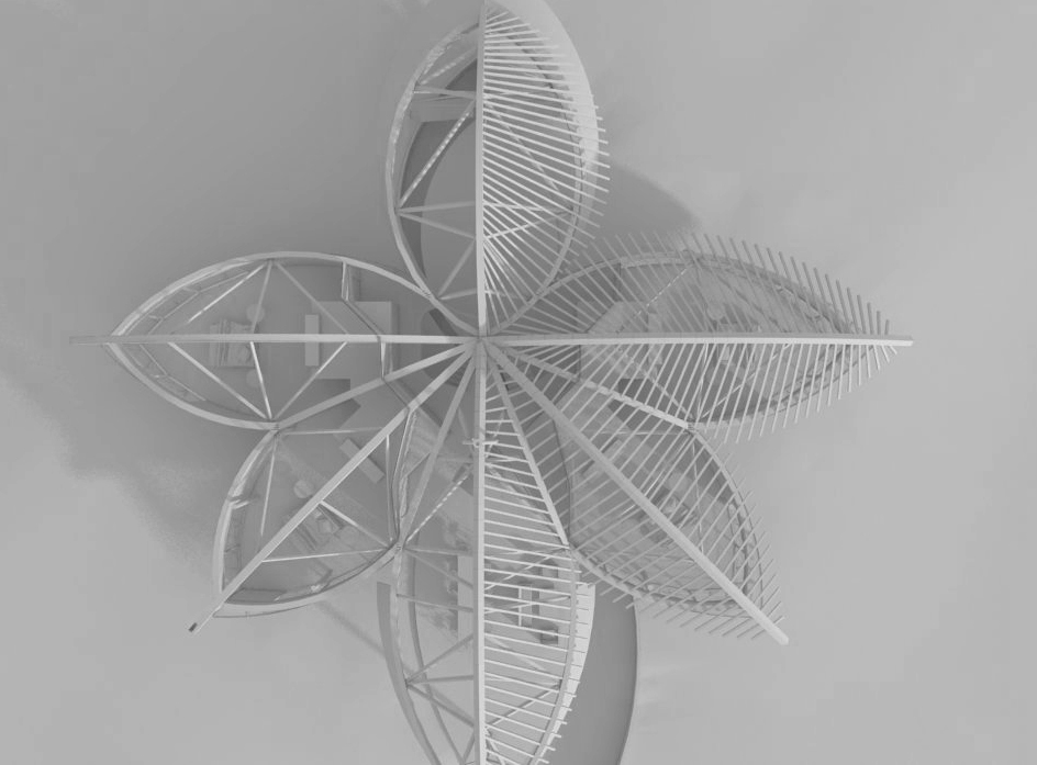
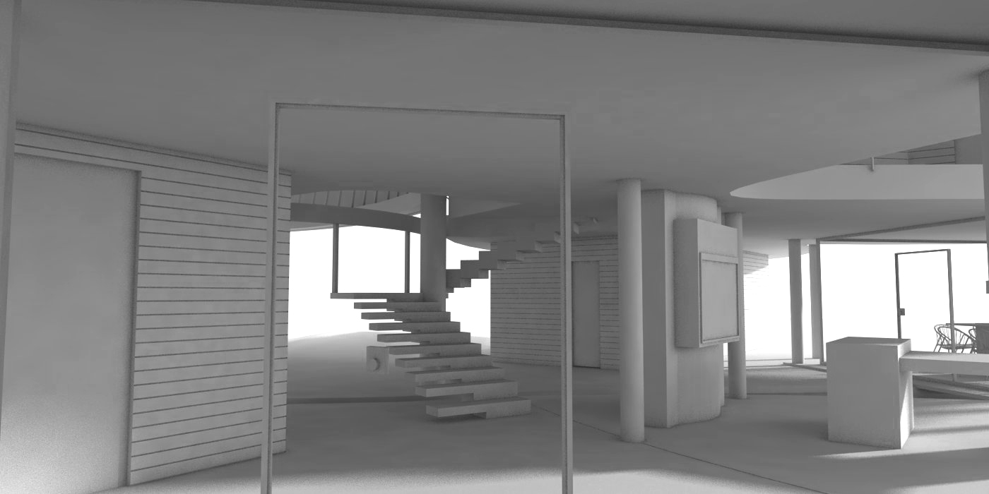
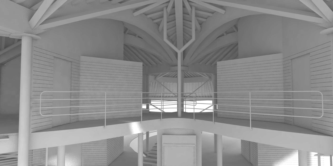
more pictures with textures to come another day.
-
@unknownuser said:
Nice shape....The leaves look like hulls, specifically the Peterborough Cedar Strip from the 60's. The ribbing and gunnels are much the same...if it rains hard they can just flip it over and move on...


yes, actually they do - that´s what i call functional architecture. the guy that lives there is called noah, favourite hobby: collecting animals

-
That is an amazing model and a great render!
-
very beautiful model of this casa. the render materials needs to be addressed more.
-
you´re absolutely right about the textures and materials. looking at some of the work on this forums there is still a lot of potential for improvement in terms of photo-realism.
i´m trying to catch up with Vray for SU but found it hard to get the right hdri/ sun light balance and look for my materials so far. another thing that makes it hard for me with this model is the fact that you simply cannot texture most of the shapes arcs, skins satisfyingly directly in SU and i really failed to work myself into external UV mapping so far. it looks like so much work to export every single curved beam to external UV mapping application just to apply the texture (and all those UV applications i tried so far are everything but intuitive IMO). maybe it isn´t if i just jumped into it and tried

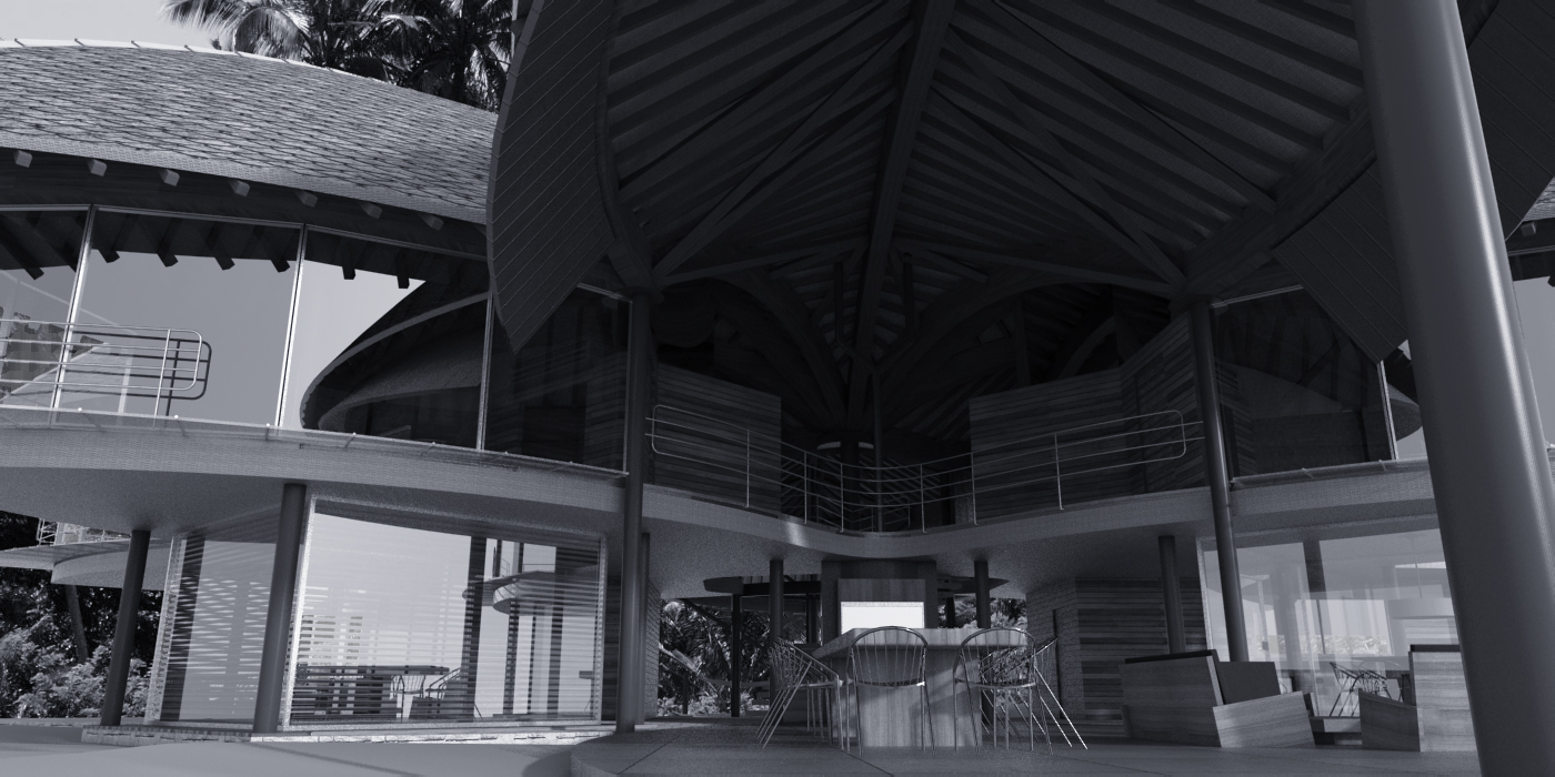
edit: in the meanwhile i could stick to B/W rendering - covers the texturing and accounts for the model

-
Castromann, thanks for posting the 'guts' of the project ..... I think my 'intricate' description was accurate

-
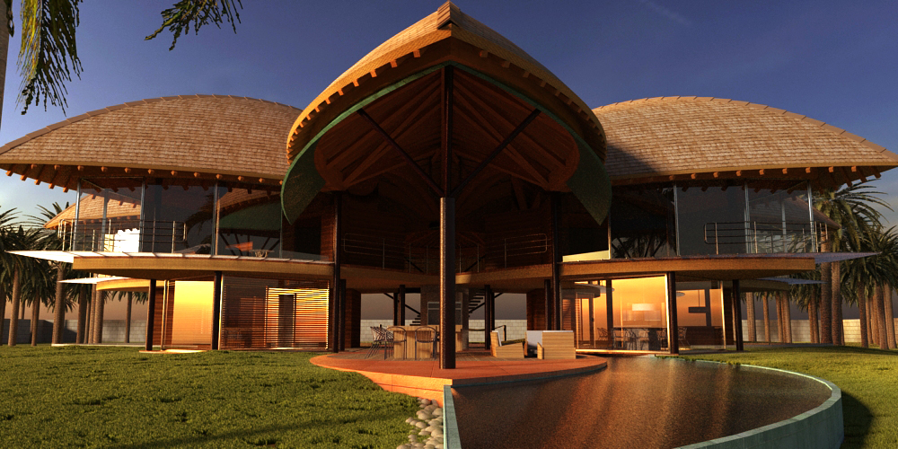
ok - here is another shot i wanted to share. this time i used kerkythea MLT (metropolis light transport) for the rendering. it was my first try with kerkythea and think i fell in love with it
 although its quite outdated and works only in x11 emulation mode on osx its free and it produces great results with much less setup time than vray. the grass and plants were placed with kerkys instancing brush (great tool). a lot of things could have been done with more attention to detail (for example grass, plants were placed directly from the repository without further tweaking) but i´m quite satisfied for a first try. with some tweaking in the MLT engine and a little more time to let the grain clear up completely this could easily get my preferred render engine (or thea probably).
what´s your experience with kerkythea?
here´s the shot:
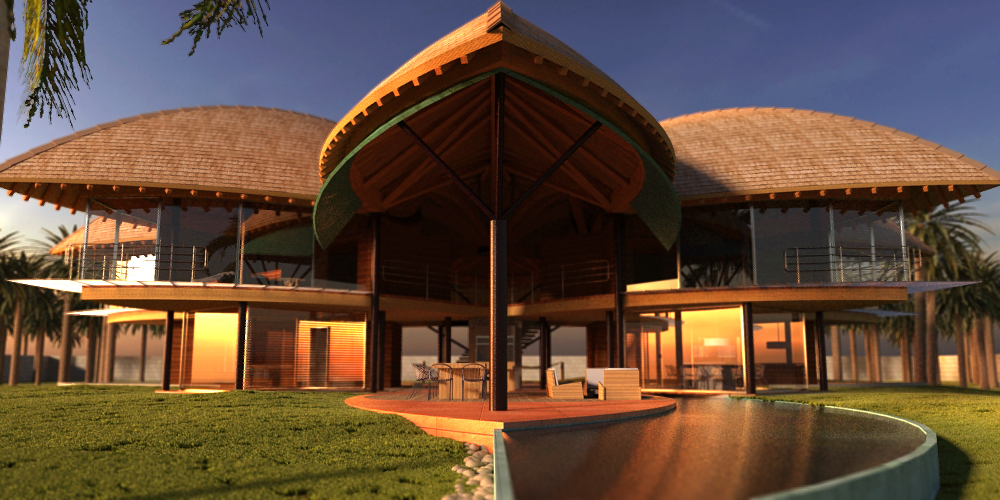
here i played with depth mask:
-
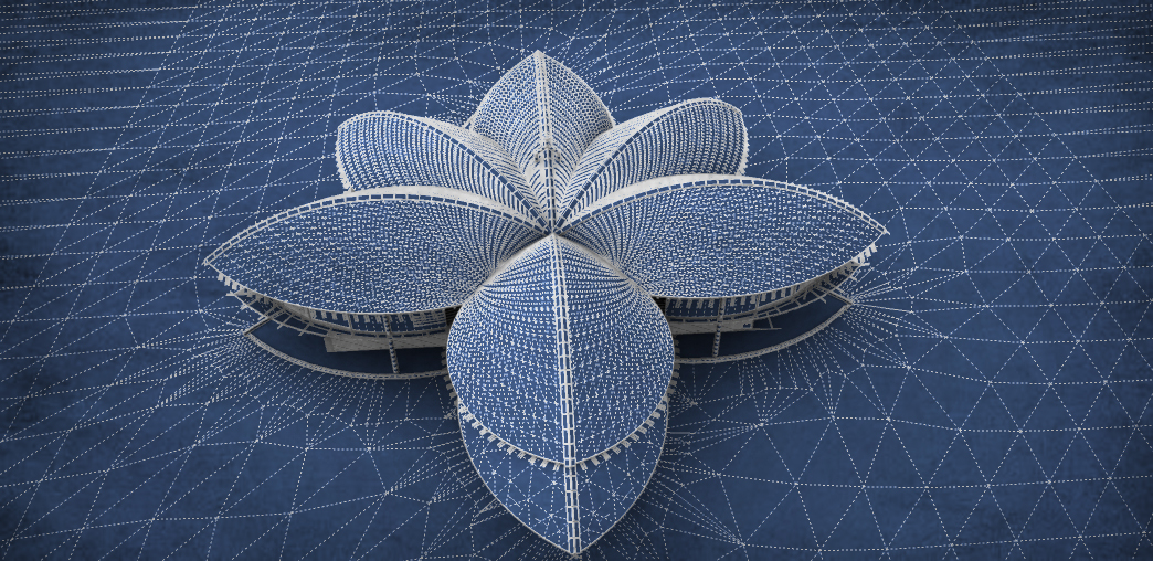
another update: here is a blueprint version of the building. for those of you who don´t know those tutorials already (some of the best i´ve ever seen online) checkout this link http://www.alexhogrefe.com/tutorials/
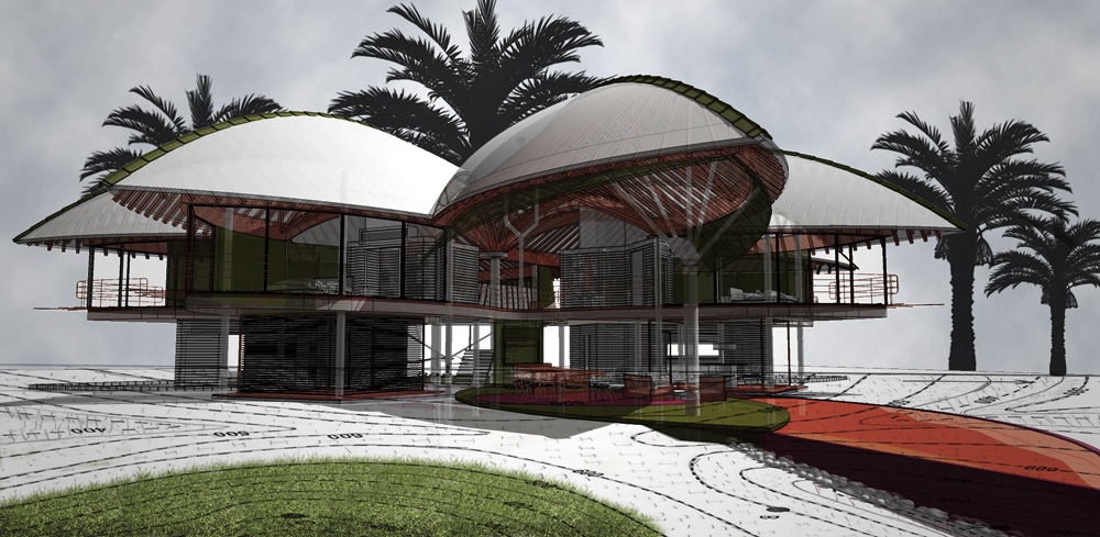
and another one following the daylight tutorial from the link mentioned above - not the best model for it but you can guess that this is a powerful technique.
-
WOW! so great... great renders as well... even with the outdated kerkythea! you should try thearender, musch easier and more features
-
modelhead: thy! i read the "circle" post aswell. funny i always thought it´s exactly the other way around. i haven´t been able to find any tool on the market that comes close to the speed and flexibility for architectural modeling. preferences are different i guess?
rombout: cool you like it. thea is on top of my list. it looks great. on the other hand i want to take some time to evaluate the vast multitude of engines on the market at the moment before i invest in my "new tool".
-
I the shot of the center of the house with all the spines or ridges flowing out to the ends of the leaves. The one question I have is about the extended roof section over the patio. It kind of threw me off and was wondering what the purpose of it was? I like it but was wondering what your thinking behind it was? Was it to extend the patio out further while still retaining the roof symmetry?
-
@jennifert said:
The one question I have is about the extended roof section over the patio. It kind of threw me off and was wondering what the purpose of it was? I like it but was wondering what your thinking behind it was? Was it to extend the patio out further while still retaining the roof symmetry?
well, i can only guess on this one as (i mentioned in the first post) i tried to get as close to the original building as possible. i would say its kind of a sun/rain protection for the part below. the same metal panel material is also used on the other sides overlapping double roof section.
if you like to know more about the house and understand some french you can have a look at this video with the architect: http://vimeo.com/23444194
-
hey can i get the sketch up file. i really needed it for a design case study and i don't have time to reconstruct it. Hit me back as soon as you can please.
THank you
kirubel
kirudesta@gmail.com -
Trolling about I find some of the oddest visitors...........
-
AWESOME...
-
You can tell it's exam season.
-
Great modelling, how did you map the roof texture is it projected ?
-
@chedda said:
Great modelling, how did you map the roof texture is it projected ?
thanks, I think it was, if I remember correctly. has been some time since I did this. it was a challenge for sure

@kdesta123 said:
hey can i get the sketch up file. i really needed it for a design case study...
sorry, it's buried somewhere in the infinite black hole that's called my backup discs.
-
hey castromann, it's an amazing job you have done here. It is truly amazing. i can't imagine the time you must have spent trying to master this piece of art. Any ways i have a slight issue concerning the proportion of the entrance and the back veranda. In your render of the structural support,you made the entrance a bit smaller than the exit which in the real case in totally opposite. But other than that it is truly a great masterpiece. And finally i could really appriciate it if you could find me the 3d file either in sketch up, podium, revit or any other preferable designing software. I am an architecture student and it is one of my favorite projects. if not could you please recommend me to some one who has it please. please e-mail me at delinadaniel123@gmail.com
Thank you for your support in advance.
Delina D. -
Loving it mate! You've shown us some very stunning graphics too - cheers for that!
Hello! It looks like you're interested in this conversation, but you don't have an account yet.
Getting fed up of having to scroll through the same posts each visit? When you register for an account, you'll always come back to exactly where you were before, and choose to be notified of new replies (either via email, or push notification). You'll also be able to save bookmarks and upvote posts to show your appreciation to other community members.
With your input, this post could be even better 💗
Register LoginAdvertisement


