Steampunk Mobile Phone
-
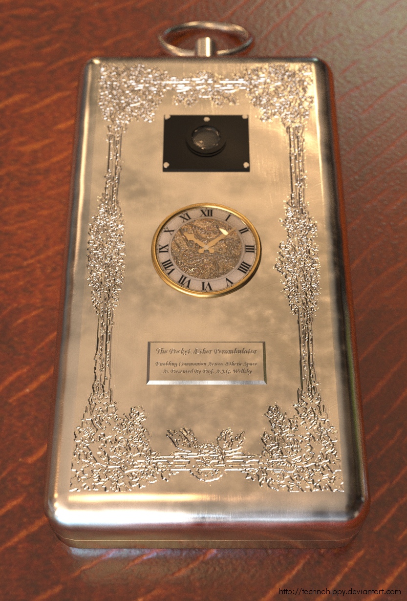
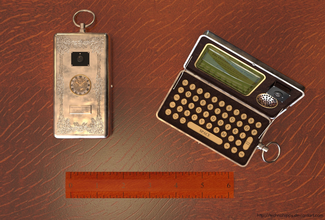
Its been a while since I posted anything so I thought I'd let you have what is (in my opinion) my best work... so may i present 'The Pocket Æther Perambulator'
Finally complete after over 6 months of work. This is a combination of several large renders so download from here http://technohippy.deviantart.com/art/The-Pocket-Aether-Perambulator-200835080 is totally recommended to get all the detail. I would like to note that there are some artifacts which have been left as an indication that this is a mere 3d model. (a gentleman's bowtie is never perfect!!)
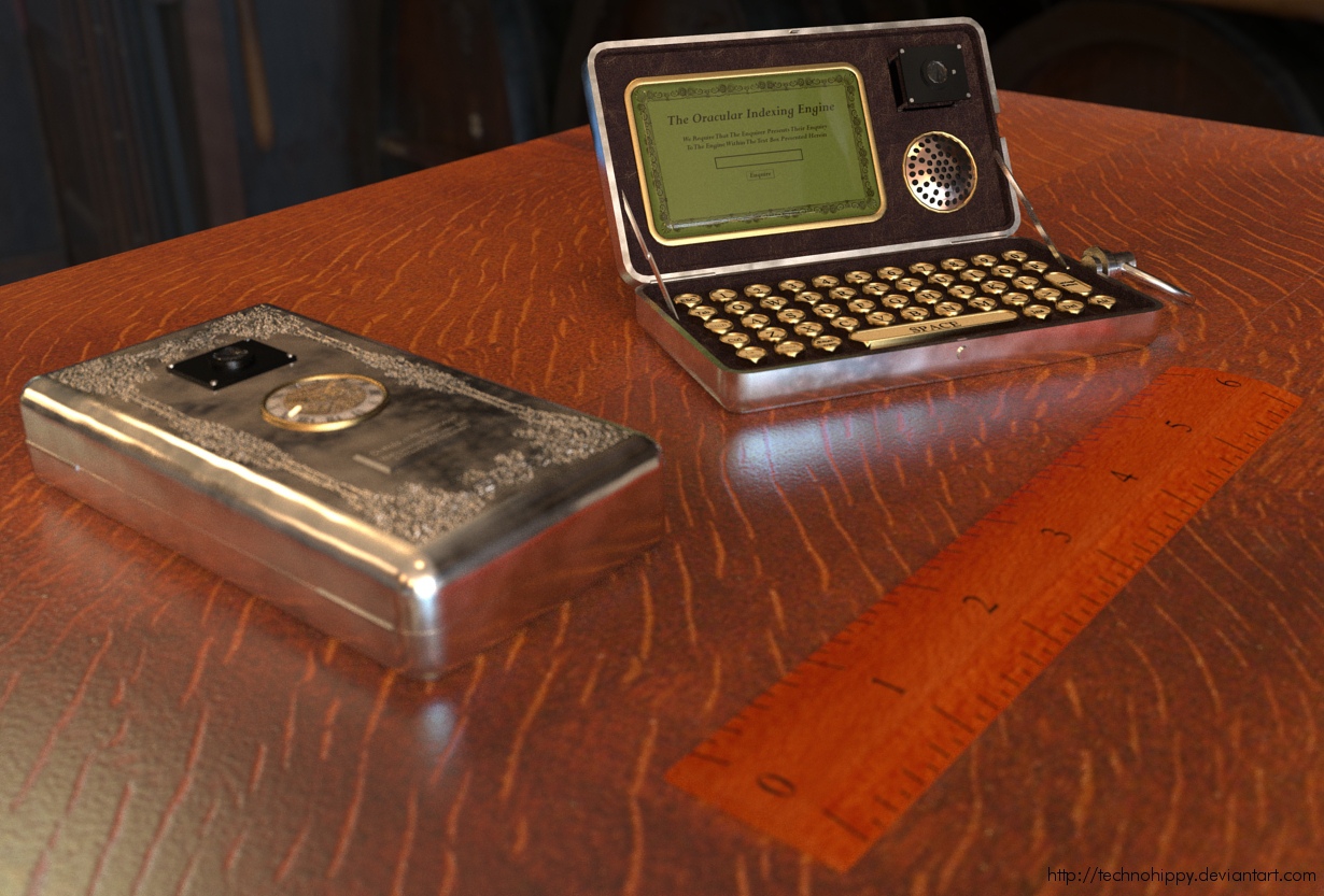
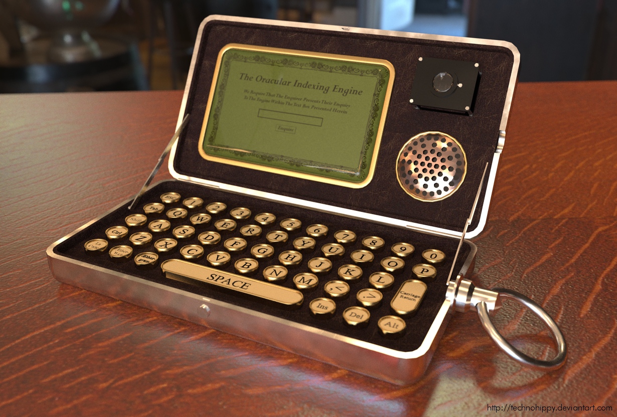
The dimensions for this are based on my trusty Nokia N95, It opens much like a netbook and boasts the following features.
*Fob ring - for attaching to a gentlemans pocket chain
*External Chronograph - with visible mechanism
*External Camera Obscura - for capturing magical images which might take ones fancy
*Internal Camera Obscura - for presenting images of your own visage whilst communing over the Ætheric web
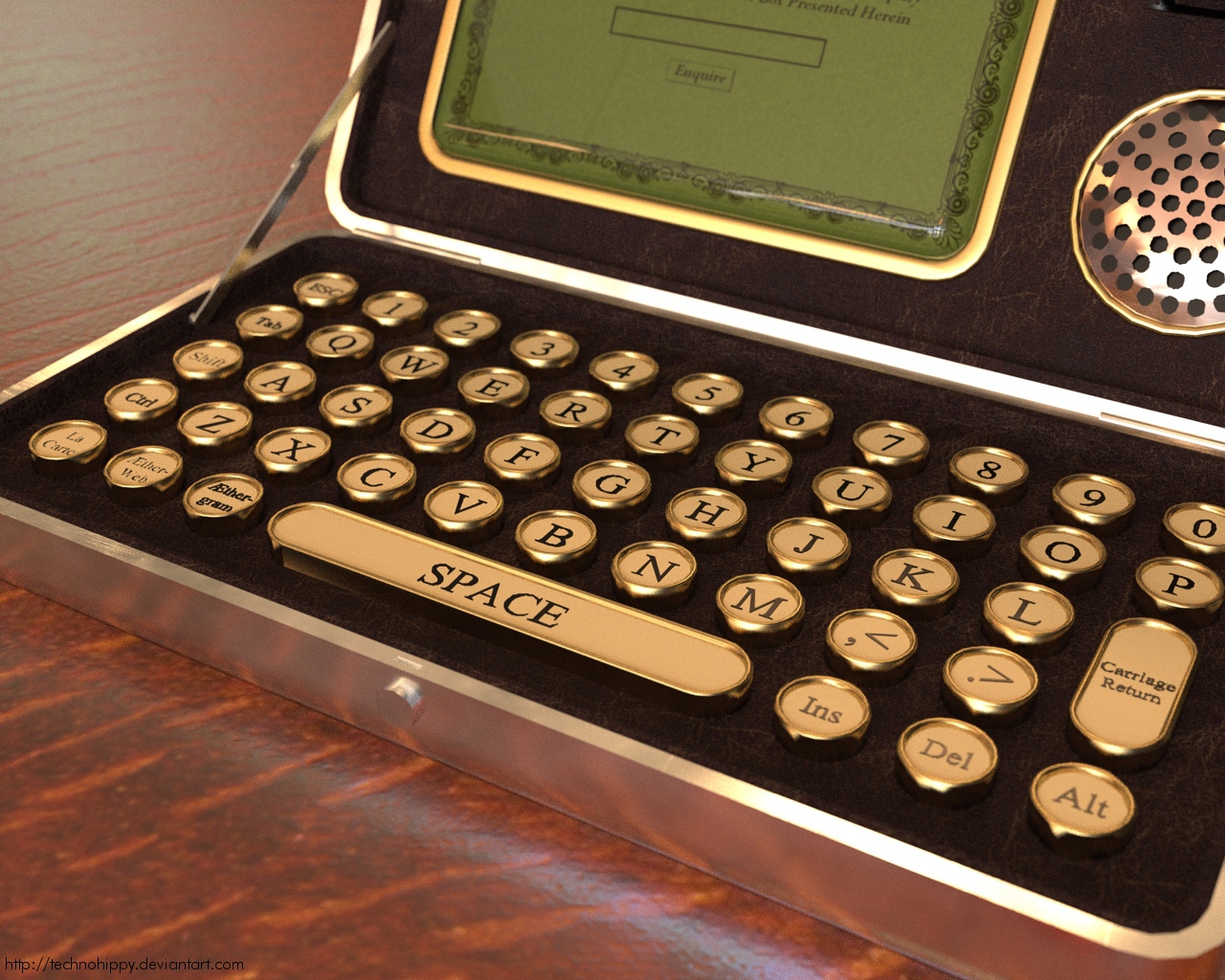
*Miniaturised QWERTY typewriter - to aid in the preparation of Aether-grams
*Ætheric plasma picture frame - for viewing the Ætheric web
*Internal magnetic resonance speaker/microphone
*Dedicated buttons for accessing the Ætheric web
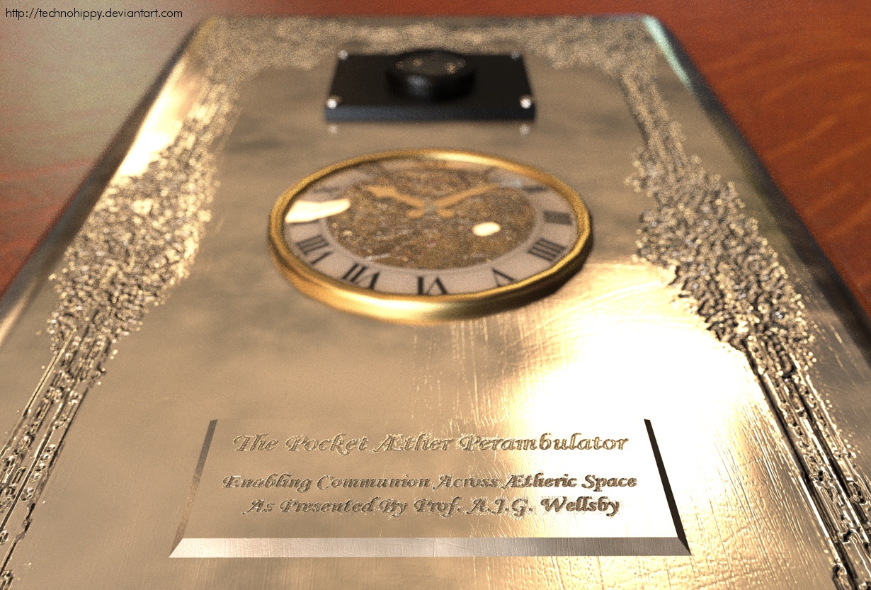
*Exquisite external engraving and name plate bearing the following information 'The Pocket Æther Perambulator - enabling communion across Ætheric space. As presented by Prof. A. J. G. Wellsby'Go here http://technohippy.deviantart.com/gallery/28850359 for the steampunk mobile phone gallery to see other images from this model.
Modelling - Sketchup
rendering - Kerkythea
HDRI - HDR labs/Bob Groothuis 'Van Kleef 3' http://www.hdrlabs.com/sibl/archive.html
Bump map for engraving from openclipart http://www.openclipart.org/detail/48649 -
The constituent renders
-
s***! I thought these where photographs!
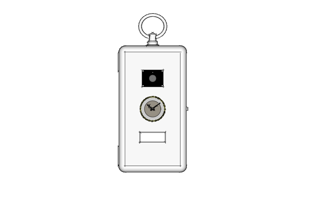
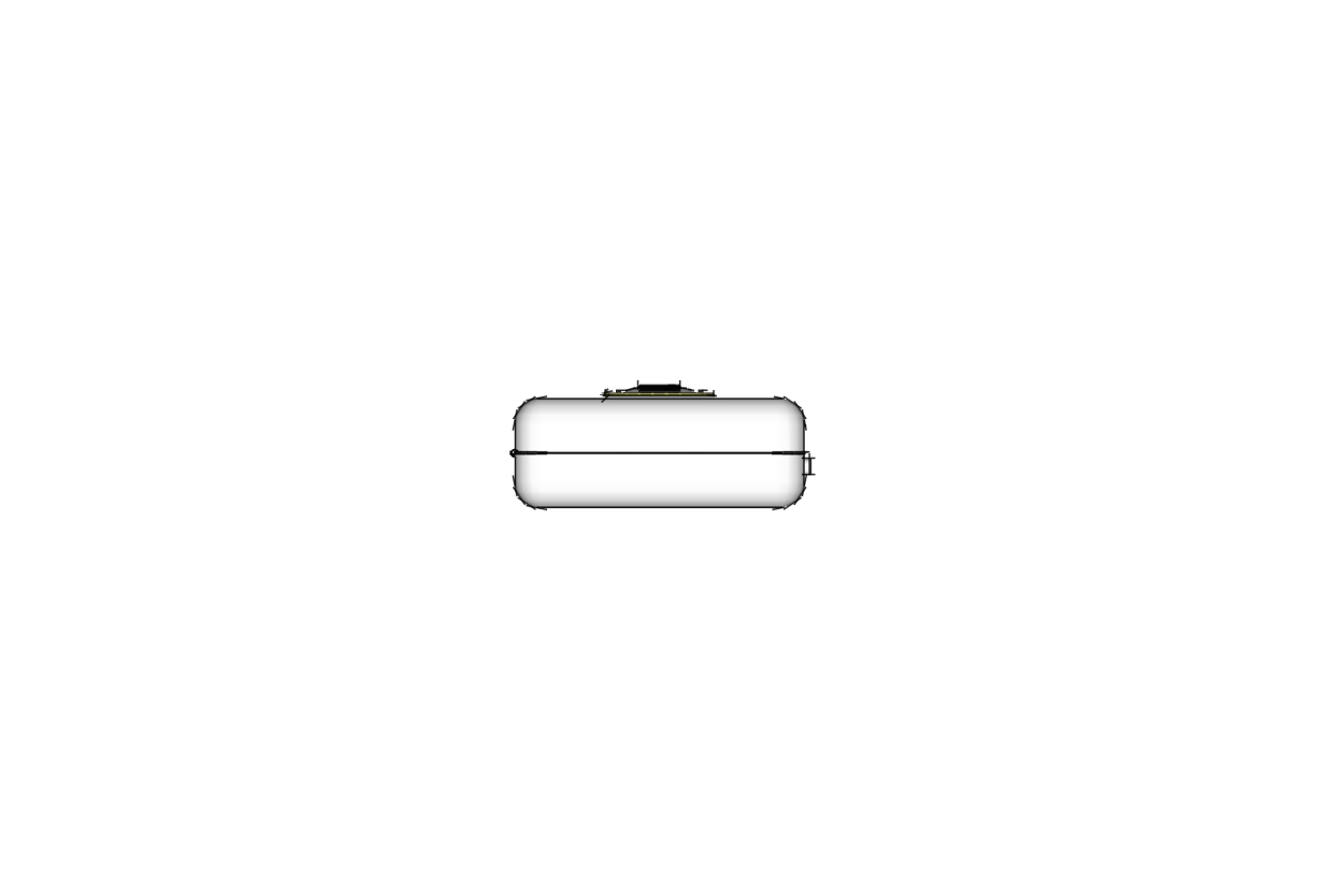
I take my hat off to you Sir! May we trouble you for some raw sketchup views?
-
certainly sir, here's some i made earlier
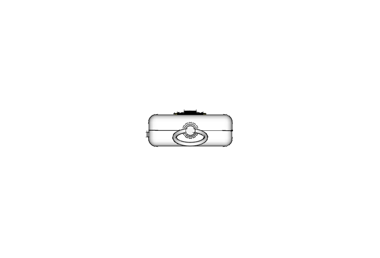
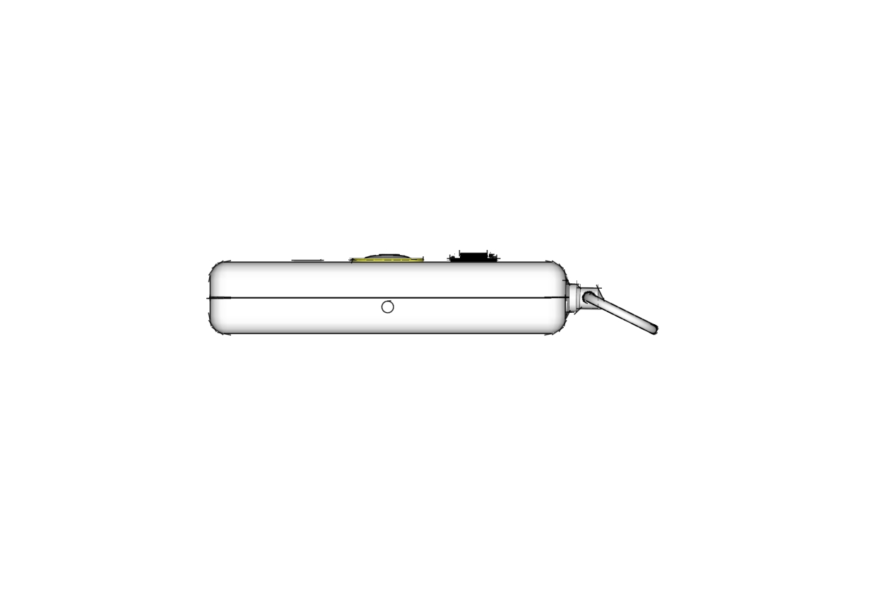
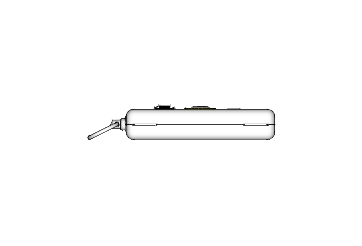
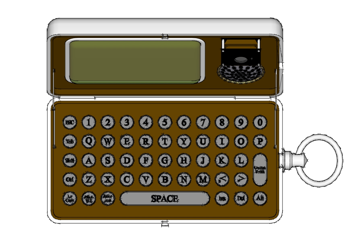
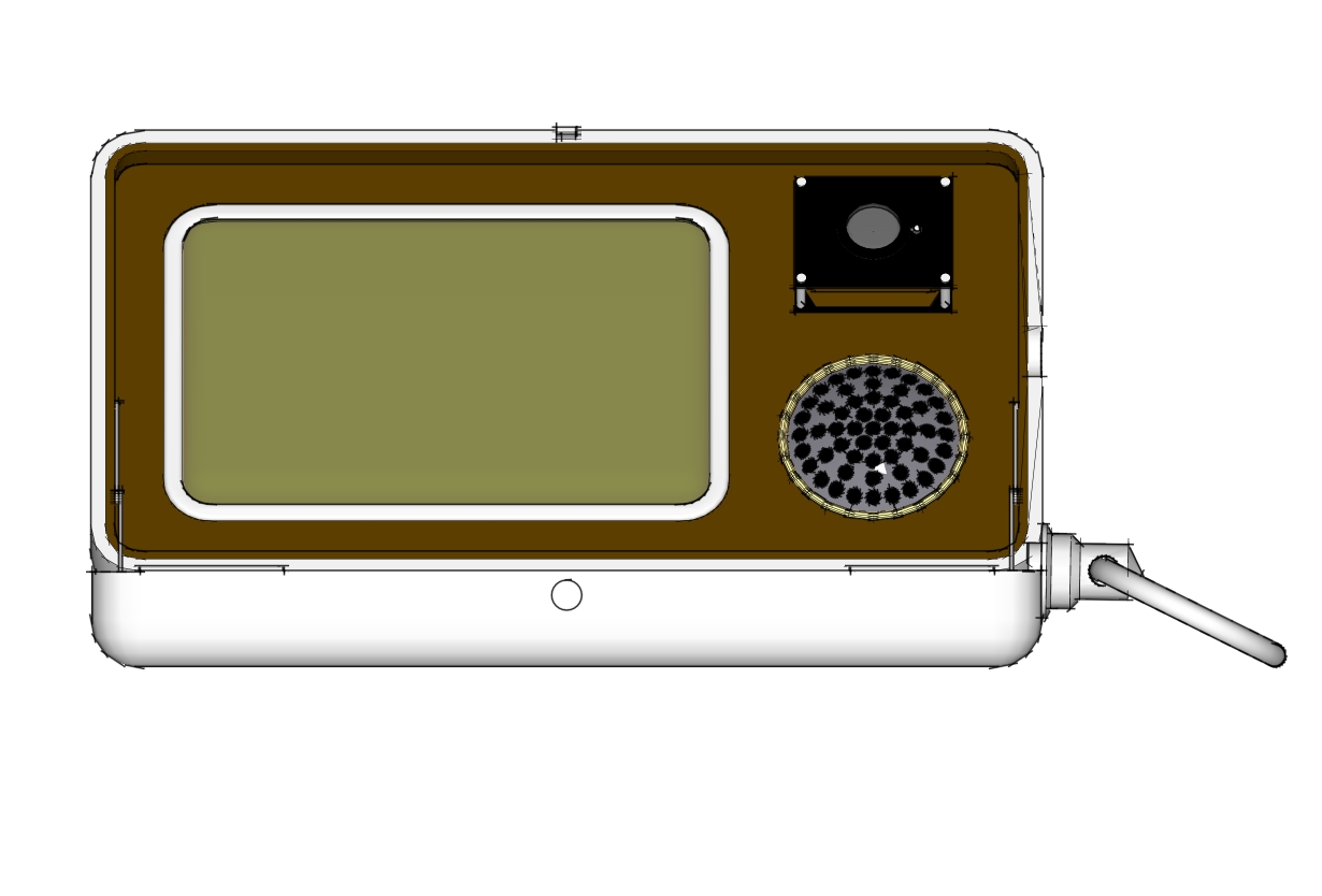
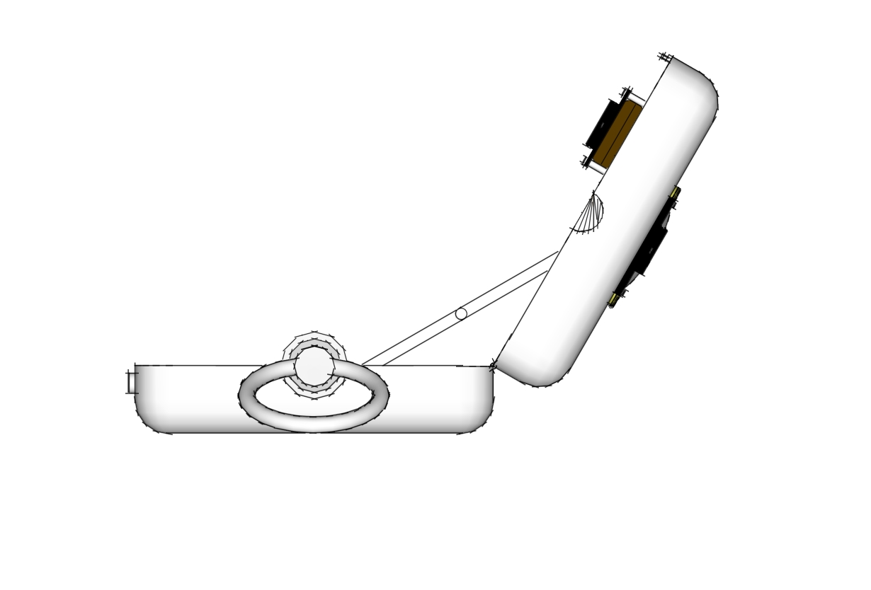
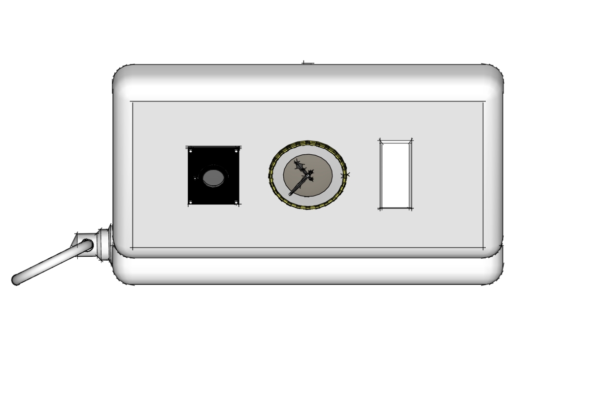
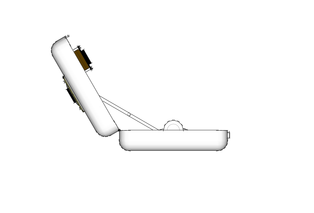
-
@technohippy said:
certainly sir, here's some i made earlier
Wow it always amazes me how such a simple model can be textured and rendered so well. I still have much to learn as far as materials and lighting set ups go! Keep it up.
-
Many thanks, i have sooo many test renders its unbelievable, and a whole library of different silver materials i made in kt to get the scratches just right
here's a clay and a depth
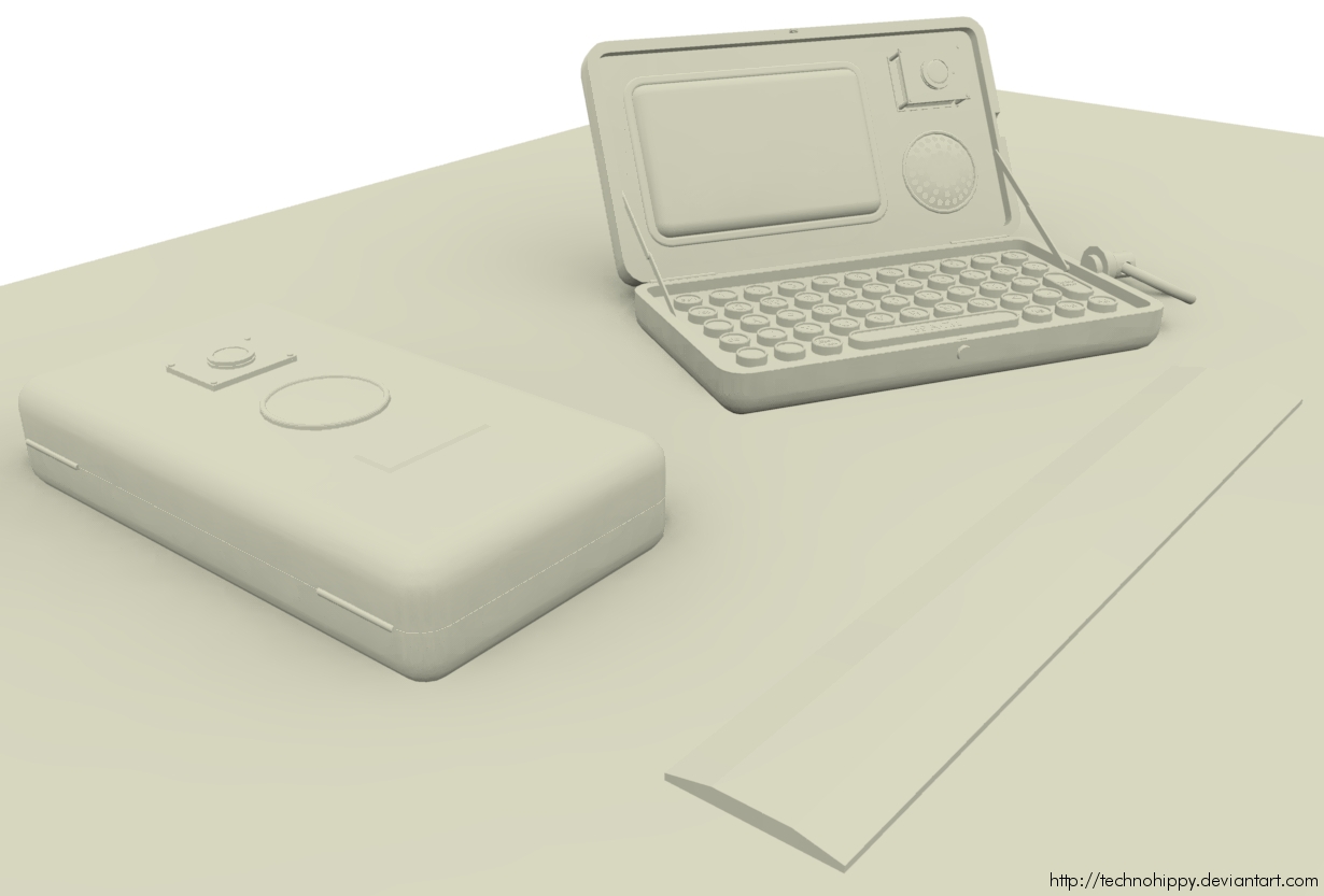
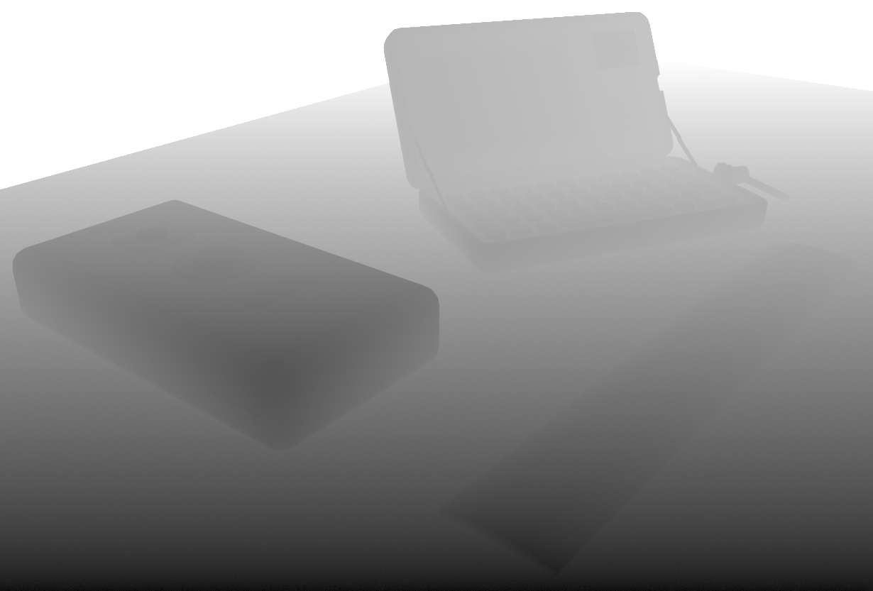
-
Amazing, as Liam said I also thought they were photographs


-
Great stuff, shows the power of a good mapping and solid technique.
-
Fooled me too, great work.
-
Very cool rendering!

Except for the rule on this view seems flat without shadows
-
Very cool.
Finally, buttons suitable for my fat fingers to use for SMS.
Too bad it's only a render (a very good one!)
-
What else can I say? This is eye candy! Great concept, nice modelling, and excellent renders. IMO, the render with the ruler looks the most photo-realistic. It looks too imperfect for a render.
 Looking forward to seeing your next project.
Hmmm. I know I've seen this somewhere before.
 Perhaps the Kerkythea forums a few months back?
 -
@unknownuser said:
What else can I say? This is eye candy! Great concept, nice modelling, and excellent renders. IMO, the render with the ruler looks the most photo-realistic. It looks too imperfect for a render.
 Looking forward to seeing your next project.
Hmmm. I know I've seen this somewhere before.
 Perhaps the Kerkythea forums a few months back?
Yep it was at the kt forums.
thanks for your comments, my goal is realism, not perfection.
-
-
@unknownuser said:
@technohippy said:
my goal is realism, not perfection.
And you sure nailed it.

thanks man!
-

-
Such a wonderful piece of work.
And seriously valuable, if you could get it produced, perhaps with a larger screen, you would make millions.
I would buy one on the spot. -
Is there any way you could share some tips to get that nice, buffed (but not too shiny) soft silver look with the wear scratches? It's very nice.
-
ammmazing... really amazing , and good knowledge of KT materials (and render settings).

-
@escapeartist said:
Is there any way you could share some tips to get that nice, buffed (but not too shiny) soft silver look with the wear scratches? It's very nice.
I'd be happy to, I'm doing some screenshots for you now
Hello! It looks like you're interested in this conversation, but you don't have an account yet.
Getting fed up of having to scroll through the same posts each visit? When you register for an account, you'll always come back to exactly where you were before, and choose to be notified of new replies (either via email, or push notification). You'll also be able to save bookmarks and upvote posts to show your appreciation to other community members.
With your input, this post could be even better 💗
Register LoginAdvertisement


