Brochure and Catalogue - Layout direct!
-
I've these days even ditched Indesign for small jobs due to the pure ease of working with Layout.
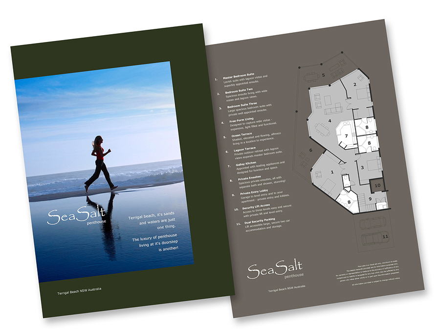
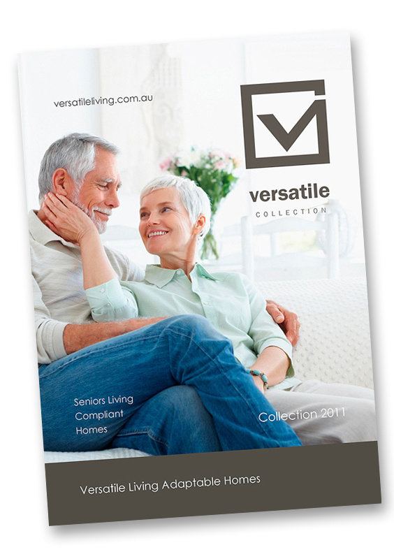
These are two recent small jobs - the first a simple two page marketing brochure (double sided) and branding for a Penthouse Apartment and the second a rough up for a new catalogue cover with soft rebranding and new Logo design.
Both created direct in Layout - for the Brochure if this is to be mass printed it will just be the case of converting the exported PDF to CYMK through Adobe Acrobat.


-
SU is so versatile indeed

-
Wow, you really get some of the crispest image exports from Layout I've seen, Richard! As usual, excellent work

-
These look great, Richard! How did you manage to make a two sided page in Layout?
I,too, am using layout for more and more and Adobe for less and less and I am really happy with the progress Layout has made, though it definitely has some growing to do, too!
Thanks for sharing.
-
Firstly that guys for the comments
@ Marcus - mate exporting at high res with high res images in the LO file helps a lot - PDF from layout is ideal for line work as it remain vectored so is crisp as!!
@unknownuser said:
How did you manage to make a two sided page in Layout?
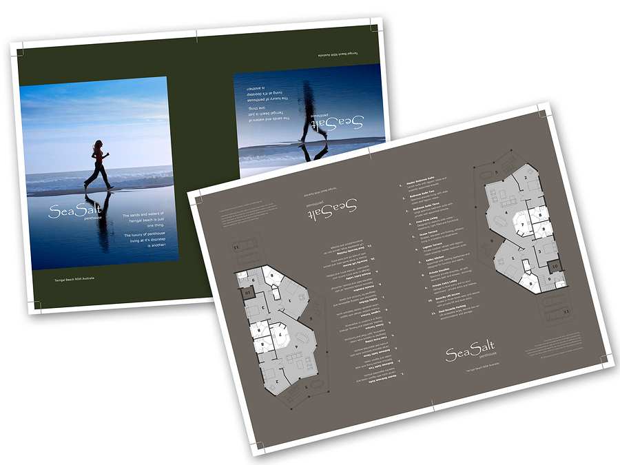
Mate they were originally for a short run print (100 x A4) so they were placed on an SRA3 (oversized A3) then trimmed down to get "to the edge" colour. As this was known to be the print volume the artwork was designed to work for this layout - an edge of common colour with no image so the trimming would be simple and any slight error in registration not evident in the final.
See below - the pages laid two up on SRA3 and rotated to common colour edge so each sheet can be firstly halved then trimmed down on the other edges. The LO doc for the artwork was first set as A4 - the artwork designed (2 page doc) and all grouped. The page then changed to SRA3 - artwork located, copied and rotated. The crop lines added then the groups exploded and the background colours stretched for bleed. The image (chick on beach) was contained in the original page with a clipping mask then this adjusted on the A3 also again to bleed past the crop.

-
Wow! Great.
Maybe one day I'll buy SketchUp
-
Layout? Wow. I used to do work in print and graphic design. I had no idea Layout was this powerful.
-
@bryan k said:
Layout? Wow. I used to do work in print and graphic design. I had no idea Layout was this powerful.
Be mindful Bryan - it leaves a LOT to be desired when it comes to working with text - you're pretty much limited to the same abilities as the "post reply" box on the SCF! ie: size, colour and line spacing - no where near the options of most apps. That said it is brilliant for quick layout work but as soon as you want to set text - well it fails.
It is though very useful for projects were you don't anticipate or can design around the need for well formatted text!
Hello! It looks like you're interested in this conversation, but you don't have an account yet.
Getting fed up of having to scroll through the same posts each visit? When you register for an account, you'll always come back to exactly where you were before, and choose to be notified of new replies (either via email, or push notification). You'll also be able to save bookmarks and upvote posts to show your appreciation to other community members.
With your input, this post could be even better 💗
Register LoginAdvertisement


