New Suburban Garden
-
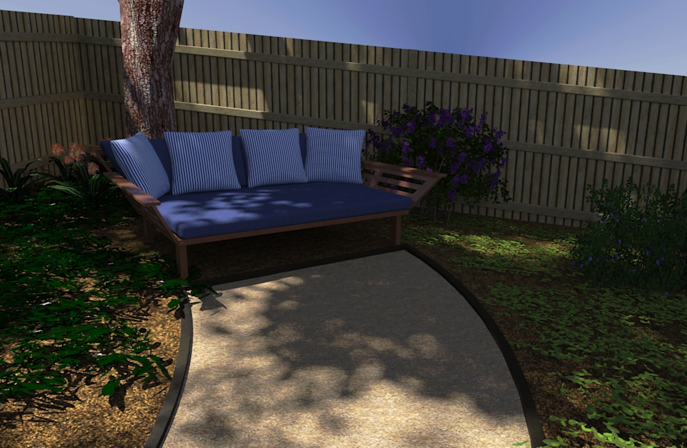
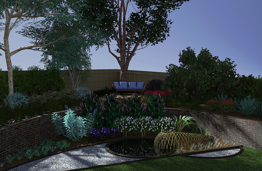
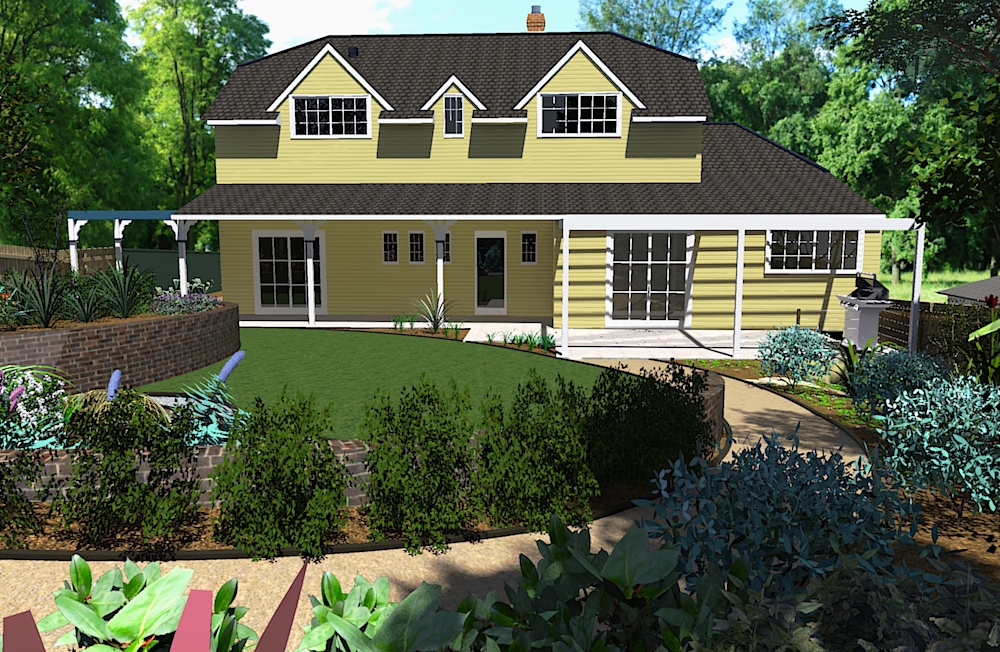
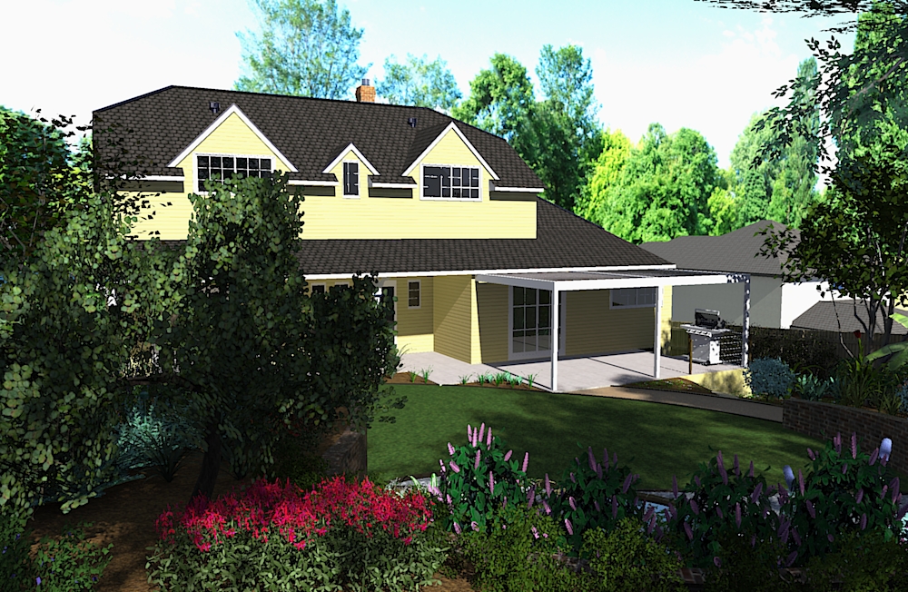
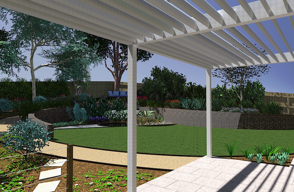
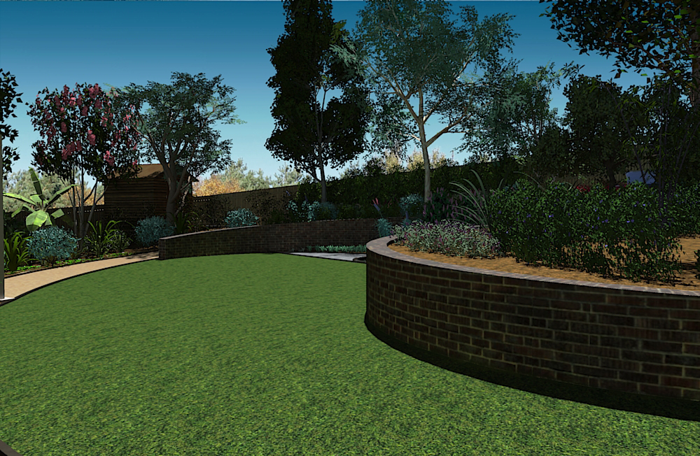
This is a garden I have been working on - it has a few different parts that I quite like - a traditional potager section, a native/bird attracting area and a couple of nice features as well. With the amount of plants involved it has taken some time to put together the model for it. I do everything as an unrendered walk-through as well as doing still images so everything has to look OK in both which means there are always some compromises - some things look good in one format but not in another etc. - so here is where it is at...
-
Wowsers....
-
and finally -
-
Good work! I wish it were as easy as it looks. Isn't it amazing how fast you can think it, but how grueling it can be to produce it?--even with Sketchup.
-
Very nice. What is the woven structure coming out of the water in the second image?
-
Thanks. It is a frame made up of thin bamboo poles (or similar) that will have Muehlenbeckia trailing over it and eventually pretty much covering it. It is kind of an attempt to simulate making a Willow branch feature but unfortunately Willow is a weed here so we can't use it. When I was working in Germany we once made a bent Willow branch dragon that you could crawl inside which looked great once all the branches sprouted - it is a real pity I can't do something similar here.
Anyway - I tried numerous ways to depict the isea in SketchUp and nothing worked so I left it empty. This kind of annoys me but I was running out of time as I have to present it today so didn't have the time to ask people on here for suggestions.
Anyone have any ideas?
and here is the dragon... (apologies for off topic)
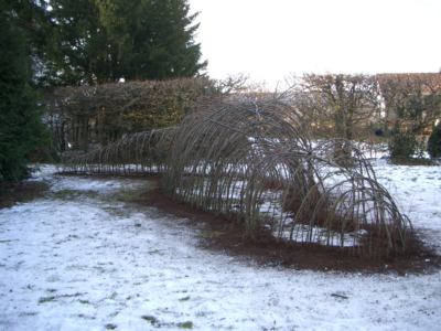
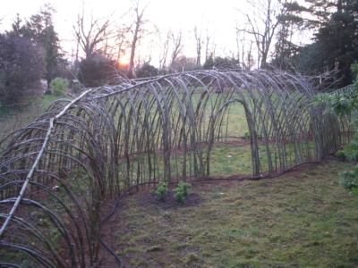
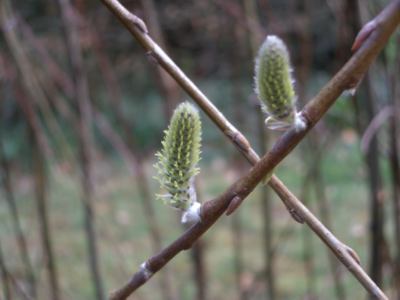
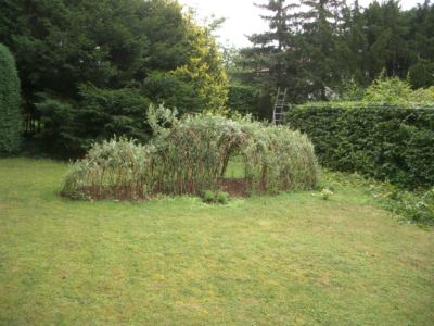
unfortunately I don't have a photo from when we started to trim it back and shape it.
-
Great garden. All that's missing is the beer!
Well done.
-
Yip, well done! One of the best "complete" Gardens I've seen, as most are only just images of one scene that is done:thumb: .
-
Something seems off with the scale of the background and the house. I like the first image, the quality of the shadows help to add to the overall feel. The rest of the images give me the feeling that the ground pitches away from the house really bad or the guy holding the camera is leaning over. Also the brick wall, being a foreground element, needs to be texture mapped correctly. my eye is drawn to the slope of the wall and the bricks not following it.
Scott
-
I agree with the background and the house. Background too close/too big. There are some big trees on behind the house and I was trying to get that to work but I think I over did it for sure.
As for texture mapping the wall - assuming this means giving it a material that works properly - I really struggled with this because of the shape of the wall. That is - beacause the wall curves so much and varies in height from 500mm to 1200mm I had problems modelling it in a way that didn't mess too much with the material I put on it. THere is a ctually supposed to be a double bullnose capping on it but I couldn't get that to work at all. Advice would be greatly appreciated.
Hello! It looks like you're interested in this conversation, but you don't have an account yet.
Getting fed up of having to scroll through the same posts each visit? When you register for an account, you'll always come back to exactly where you were before, and choose to be notified of new replies (either via email, or push notification). You'll also be able to save bookmarks and upvote posts to show your appreciation to other community members.
With your input, this post could be even better 💗
Register LoginAdvertisement


