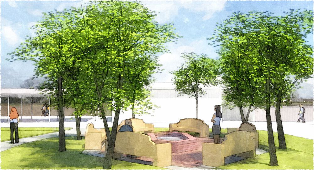
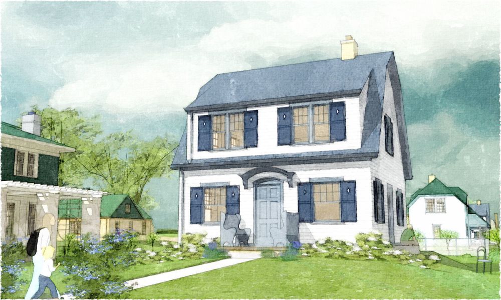
Revamped watercolor tech...
-
...whadaya think?
-
Tom these are beautiful. The nice thing is they do not look at all digital. They look like actual watercolors.
Care to share your secrets? -
Thanks, Dale...a bunch!
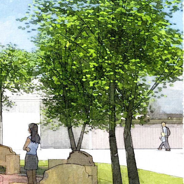
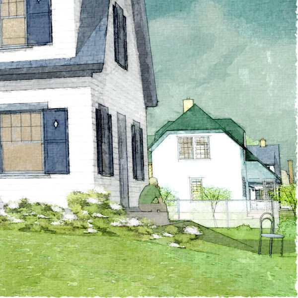
The tech is not much different than before, but adding an underpainting of bold brush strokes gives the Fotosketcher layer a whole new dimension, huh? (Over that is still the sketchy line work and a 'spots' layer burned in to simulate pigment puddles.)
-
I think you forgot to mention (not on purpose) one thing, and that is the "watercolorish" colors.
They help quite a lot too.
Maybe a little more subtle paper texture.
Here is one I've made and used quite a lot.
-
Tom. -
Superb work Tom, the second close up picture really shows it off. Great stuff!
-
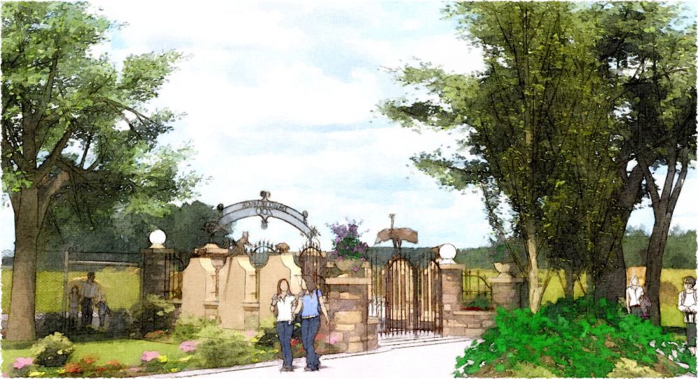
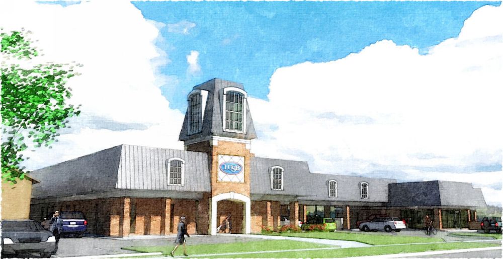
Tom, those are amazing as far as really looking like watercolor. Very very nice! I love 3,4,5. I've never dared say it, because no one can account for taste - But I really don't care for the blue of the sky in 1,5,6. It is a combo of the blue and the neon green of the leaves. They don't jive well in my eyes. But that is just my personal taste in watercolor combinations, so don't take it too seriously.
EDIT: In fact, looking over them again, it might not be the blue of the sky as much as it is the green of the leaves. I dislike the green used in 1,2, and the bush in the bottom right of 5, and the tree in the left of 6. All right, that's it. That is my hyper critique of your work, that I think absolutely awe inspiring.
-
I really like the last one, though I think the leaves and the sky are bit too saturated.
-
Hi Tom,
I concur completely with Chris regarding the greens in 5 & 6 though I find the brighter tones in 1-3 perfectly acceptable. In my opinion Tom, these are probably the best digital watercolours that you have posted over the years whereas in the past I felt the previous submissions were far too saturated using tones similar in strength to the green in 5 & 6.Obviously its completely your choice as the artist whether you choose to follow any advice from us but I for one like what this modified approach is doing for your work.
Hello! It looks like you're interested in this conversation, but you don't have an account yet.
Getting fed up of having to scroll through the same posts each visit? When you register for an account, you'll always come back to exactly where you were before, and choose to be notified of new replies (either via email, or push notification). You'll also be able to save bookmarks and upvote posts to show your appreciation to other community members.
With your input, this post could be even better 💗
Register Login


Advertisement