Site cropped
-
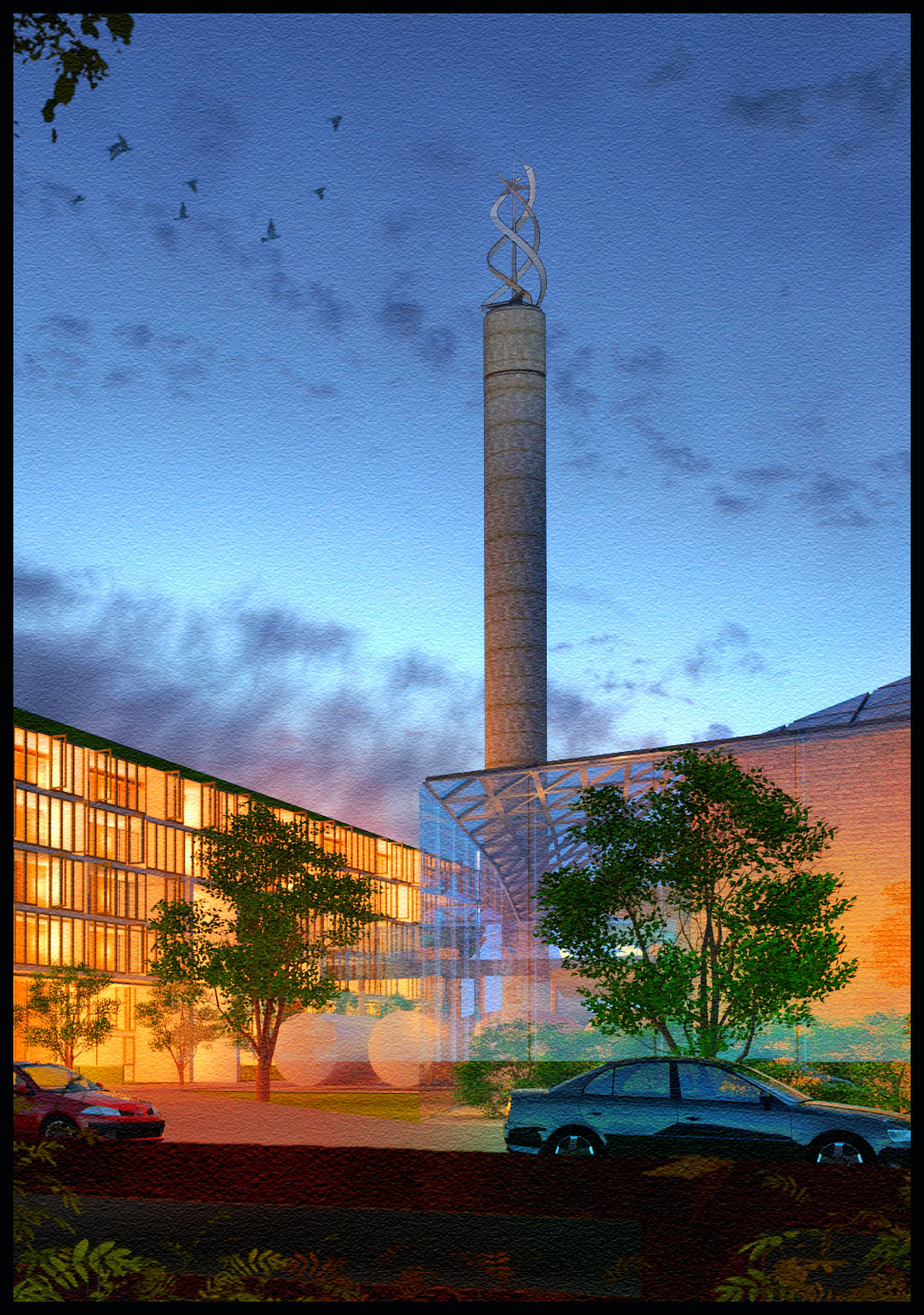
Attached is a cropped image for a presentation I've been asked to partake in the next few months.The original full image for this scene is 90cm x 55 cm and will make up a final image of about 3 times this size,with other buildings included.I hope to upload the final image soon.(rendered in twilight,post in photoshop,the final image will incorporate linework from sketchup,birds will still be present but will most defineltly be not as pronounced)
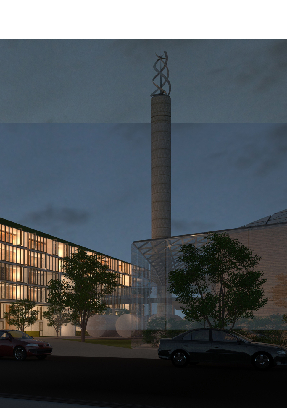
EDIT-Raw render from twilight attached(15 hours render,50 plus point lights used,the line across the main element is becuase its a combination of 2 different views))


-
Both of those are excellent.
-
I always enjoy looking at you work. It is a source of inspiration.
-
The second one is a nice rendering, but I think the first one is stunning. Great use of colors.
-
lighting effect at the first one is really cool

-
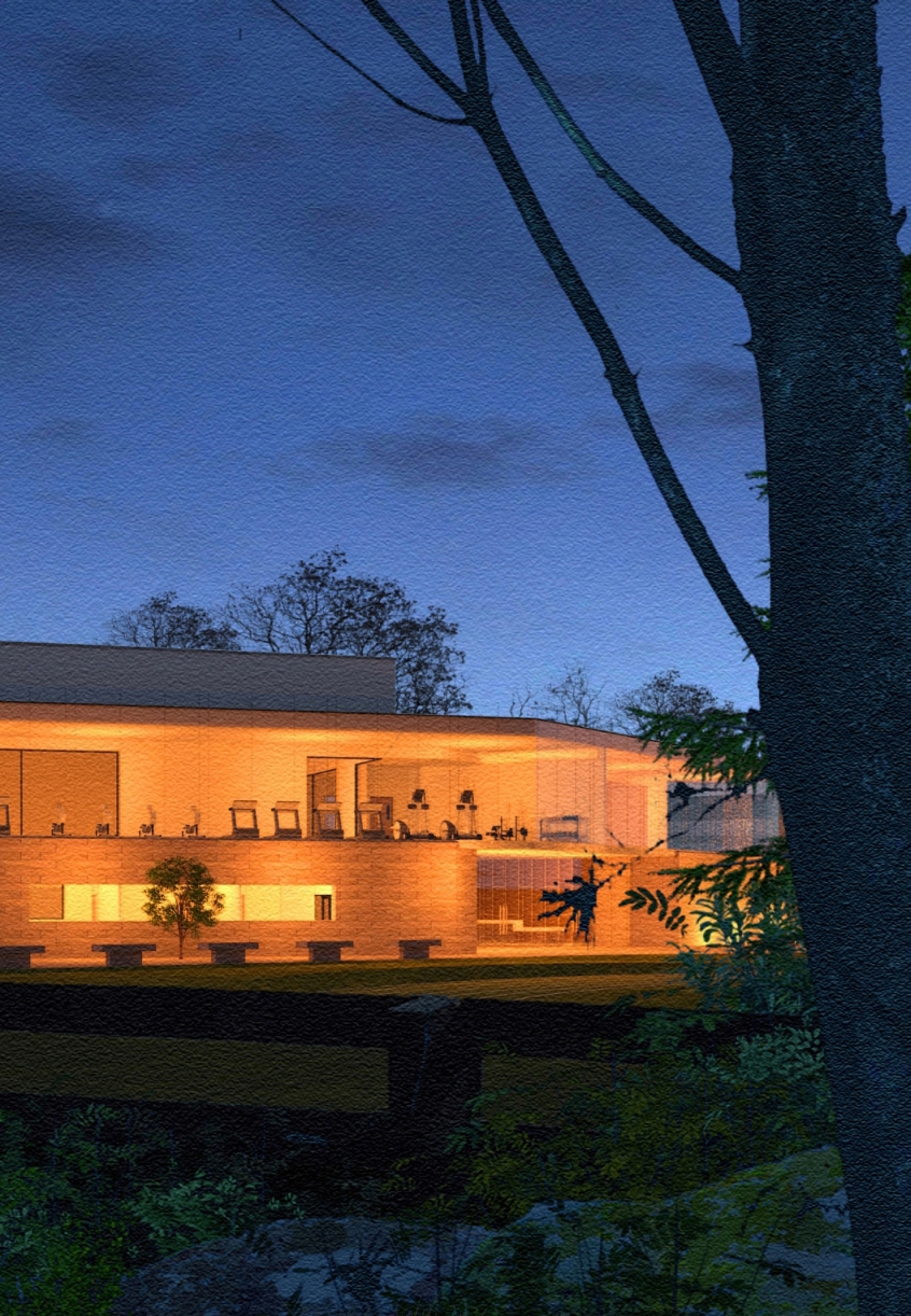
This is another part of the large image we hope to present.I have finished the overall image and this is slightly different to the final image we will be presenting,bearing in mind it will incorporate 3 different projects.There will probably not be as much foreground vegetation,maybe none, but it will incorporate the plans for each scheme.Regarding the first image, it was part of a competition which my company entered.We came fourth out of a global entry of 280 entries,not bad for a company of 3 people.
Later,if anyone is interested,I would like to upload a tutorial ,not so much on the buildings but more on the vegetation as soon as the presentation is complete.The tutorial will include a lot of the vegetation in non-photorealistic versions similar to what you see here i.e rocks,trees,plants , in either jpg or a full photoshop file where you can drag and drop elements as you want to.
the final photoshop image with all buildings and planting combined has 96 layers - most of them called "...trees copy" -is this a record?!

-
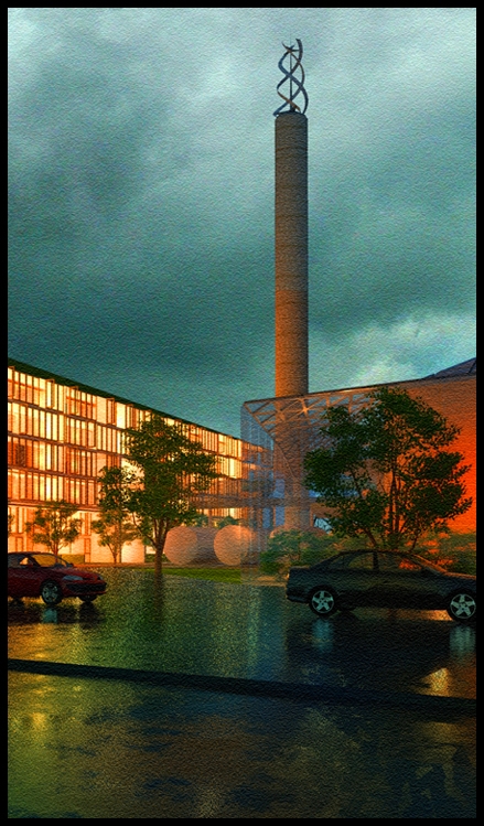
attached is a slightly different version of one of the images.Im still trying to decide wether to incorporate the wet ground and the new sky

-
I like it with that wet asphalt. The image looks great

Hello! It looks like you're interested in this conversation, but you don't have an account yet.
Getting fed up of having to scroll through the same posts each visit? When you register for an account, you'll always come back to exactly where you were before, and choose to be notified of new replies (either via email, or push notification). You'll also be able to save bookmarks and upvote posts to show your appreciation to other community members.
With your input, this post could be even better 💗
Register LoginAdvertisement


