Studio/Guesthouse - Updates
-
Hi Watkins
Really nice study and presentation.

Fun to see you flesh out the details.
Maybe an inset reveal on the columns to complement the siding dtl. but ??
Small request.
Good tree too and where did you find it please.
Just nothing like the native SU to properly describe the architecture.Cheers


dtr
-
Dear dtrarch,
Not mine I'm afraid, and as far as I know a photograph. I found it browsing on the web for kitchens for really small spaces, and used it to illustrate my suggestions. Perhaps someone could have a go at modelling and rendering that scene.
My apologies for the confusion.
Kind regards,
Bob -
Hi Bob
Thanks for getting back.I'll try the "Author" this time.
Help!!!!!
Dave
-
Hi Bryan
I meant to send this to you but just a little mind fade
 and Bob Watkins was good enough to intercede.
SO here tiz again.Really nice study and presentation.

Fun to see you flesh out the details.
Maybe an inset reveal on the columns to complement the siding dtl. but ??
Small request.
Good tree too and where did you find it please.
Just nothing like the native SU to properly describe the architecture.Cheers


Dave
-
@watkins said:
Dear Bryan,
One of the main problems with living in a small space is storage. There appears to be scope for a small 'loft' above the bedroom space (this assumes that you are not going full height to the roof rafters, which would be nice in the kitchen/living area.
A small skylight would be nicer for the bathroom. There is nothing like 'sky light'to illuminate a small space. A largish skylight with low E glass and a sunshade would be good in the kitchen. The porch overhang, while providing shade in summer, might make the interior a little gloomy in winter.
The kitchen looks too large for the likely occupancy (guest, single person etc), so a more modest kitchen would seem appropriate. Presumably, you have your washer/drier in the small, attached service room. I would consider dividing the service room in two and accessing the rear space from inside, which would be possible if the kitchen was made smaller (small door opposite the built in storage unit). I have attached an image of a very small kitchen. Being open, plan, kitchen smells will get everywhere, so a good extractor is needed above the oven hob.
Consider making the bathroom more compact (2 metres x 2.5 metres should be enough), as one doesn't live in the bathroom.
Could you post a few setions to illustrate the construction?
Regards,
BobThank you Bob.
I agree that many of the features can be more compact. The size and scale were meant to be larger than required to illustrate that the space is capable of handing them. But the larger items are not required.
I was going to do another version using the bare min. in every area to illustrate the flexibility of the design. I just made the large scale one first. It was also a personal challenge to see if I could configure the space to accommodate the full size items.
Also, I'm a tall guy and full size things tend to suit me better, so a bit prejudiced in that direction.

It's not shown nor have I modeled it, but there is a loft or attic space for more storage.
The storage room was to be divided, with utilities (water heater, house heater, etc.) in one. smaller section, and storage plus a compact vertical washer dryer in the larger part. I just didn't do it either. I will probably go back to that.
The decision on the bathroom was based on the offset space of the main living area. That, and I hate small bathrooms.
 But again, your suggestion is good and illustrates the other possible alternative for the overall square footage.
Skylights are an excellent idea. I didn't even think of that. The bathroom window as modeled is to act as a fire escape.
Again, the concept was to challenge myself to get the larger items to fit and still keep the space usable, which would mean more compact items would then obviously provide even more usable space.
Great suggestions Bob. Thanks again for the compliments. I will probably take a break from this project for now. It's just an exercise for me.
Oh, and sorry, no sections.
 I didn't put that much detail into it.
 -
@dtrarch said:
Really nice study and presentation.

Fun to see you flesh out the details.
Maybe an inset reveal on the columns to complement the siding dtl. but ??
Small request.
Good tree too and where did you find it please.
Just nothing like the native SU to properly describe the architecture.Cheers


Dave
Thanks dtrarch.
There are actually 3 trees in the model, but one is just for creating shadows and providing foreground leaves.
The trees are from Rp Tree Maker
http://www.renderplus.com/wk/RpTreeMaker_Free_w.htm
FREEThe best way to use it to create a set of trees as a standalone SU file and then import them as needed because they consume a lot of computing resources. As an imported file is automatically made into a component, this help to control the size. But even then, they are still "heavy."
I'm not sure I understand about the inset reveal for the columns. The tops and bottoms of the columns are trimmed in 1/2" board. Can you show me an example?
Thanks again for the compliments.
-
Bryan
Thanks for the link.

See attached SU file
Just a fast guess about dimensions a color but you can re-size and give it a look to see it it has merit.Looks like an 8x8 col with 1x over and same for top and bottom trim.

Again really fun to see the evolution of a small project.
Good stuff.
Dave
-
-
Oh! Yes dtrarch! That would look nice!
Thanks.
-
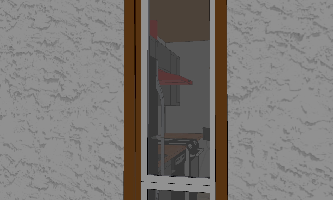
A peek through the back window. (you need to click on it for the larger image to do it justice)
-
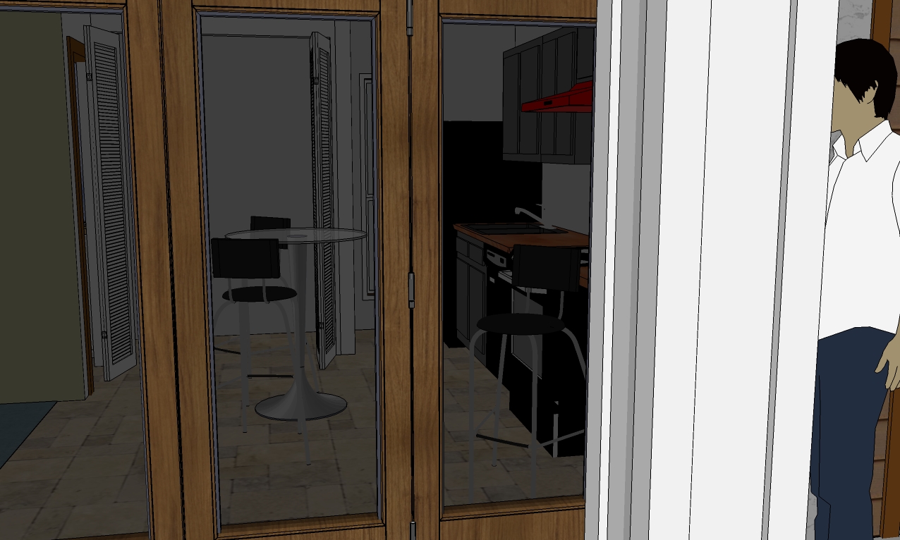
A peek through the FRONT window-doors.(again, click for larger image)
-
Thanks again to everyone for both the compliments and suggestions.
-
Some interiors. Note: These do not reflect the raised ceiling. I was in too deep to change the original.
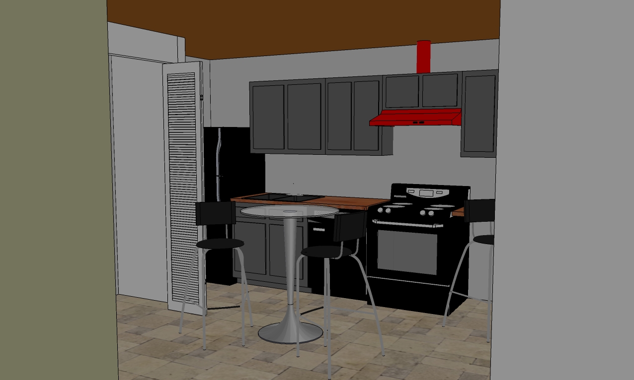
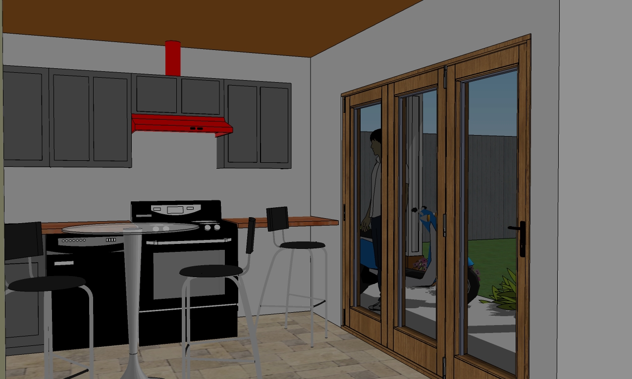
Oh look what I found! Fish-eye lens! (it took me several minutes to figure out how to undo it
 ) Now I wish I'd changed the ceiling.
  And why the heck is it brown? That's gotta go!
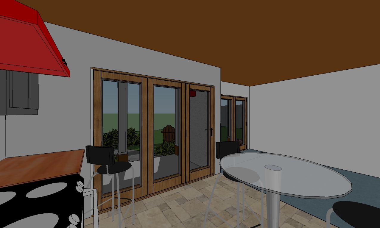
-
Added trim to wood siding and added a...
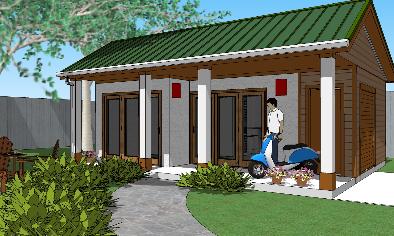 ...bathroom window.
-
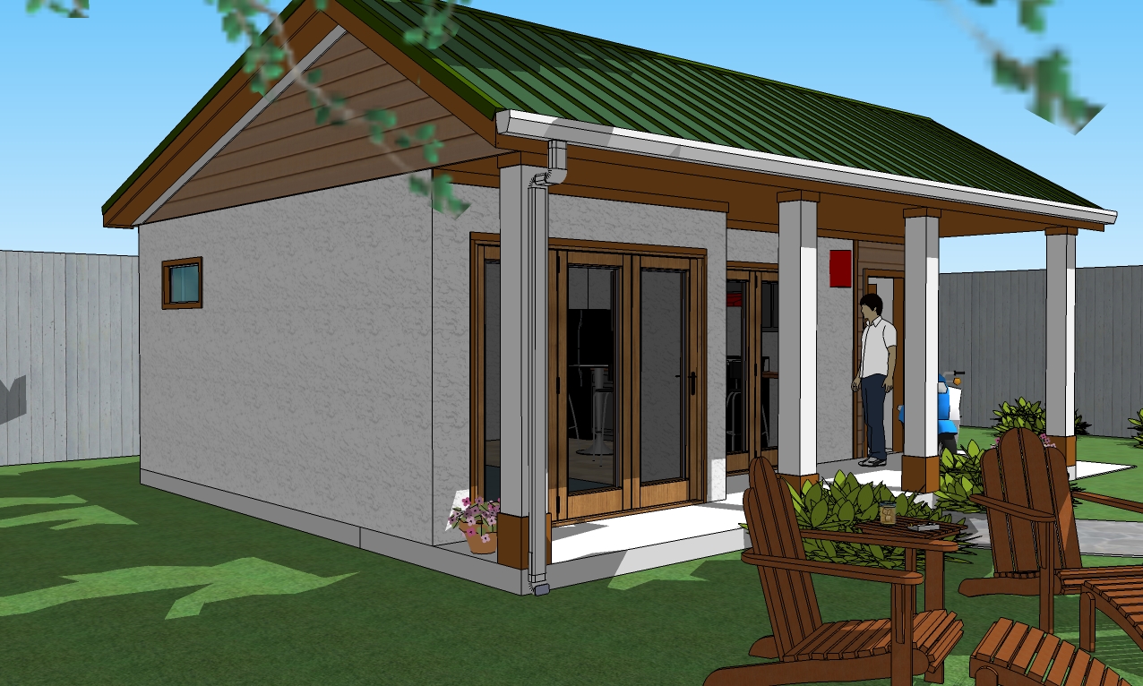
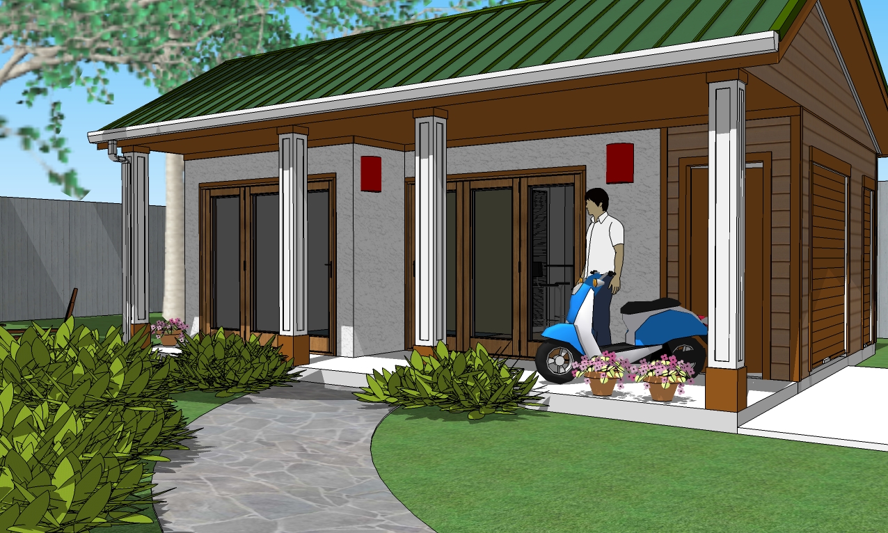
Here's the new inset reveals on the columns as suggested by dtrarch. Also note the new access door at the far right hand, back corner for the utility room.
-
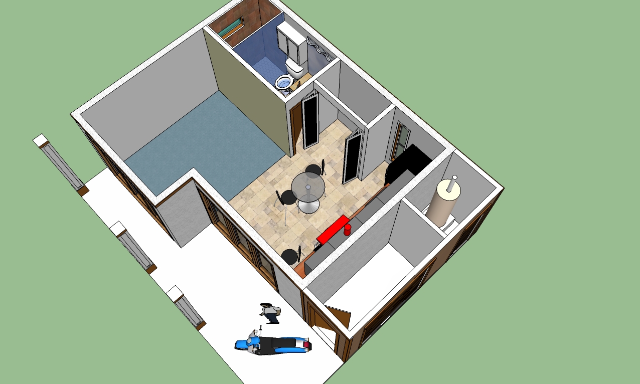
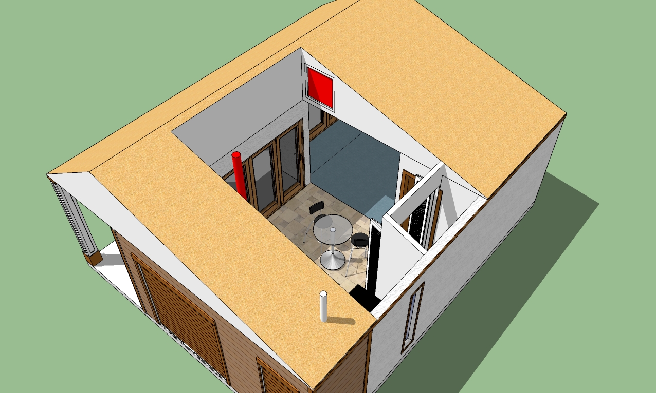
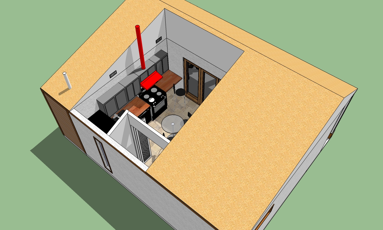
Here's the updates. And Bob, I did a rough sectional to show the ceiling form for storage. That red square is the access for attic storage or it can be open as an alternate design.
The small HVAC sits over the main shed area and is accessible from inside the shed.
The kitchen area can have a cathedral or open, finished, rafter/truss ceiling. My preference would be open rafter/truss as you could hang interesting stuff from the beams.
The water heater tank/utility room is accessible from another roll-up door.
You can see there is also a narrow window in the back of the kitchen.
-
Hi Bryan
Glad it was useful.

Pro bono detail for just a tiny more surface development
Does work for me too.
Dave
-
Thanks dtrarch.
And again, thanks to everyone for your suggestions.
Hello! It looks like you're interested in this conversation, but you don't have an account yet.
Getting fed up of having to scroll through the same posts each visit? When you register for an account, you'll always come back to exactly where you were before, and choose to be notified of new replies (either via email, or push notification). You'll also be able to save bookmarks and upvote posts to show your appreciation to other community members.
With your input, this post could be even better 💗
Register LoginAdvertisement


