Studio/Guesthouse - Updates
-
-
Oh! Yes dtrarch! That would look nice!
Thanks.
-
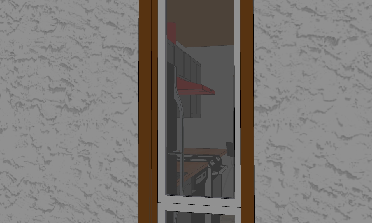
A peek through the back window. (you need to click on it for the larger image to do it justice)
-
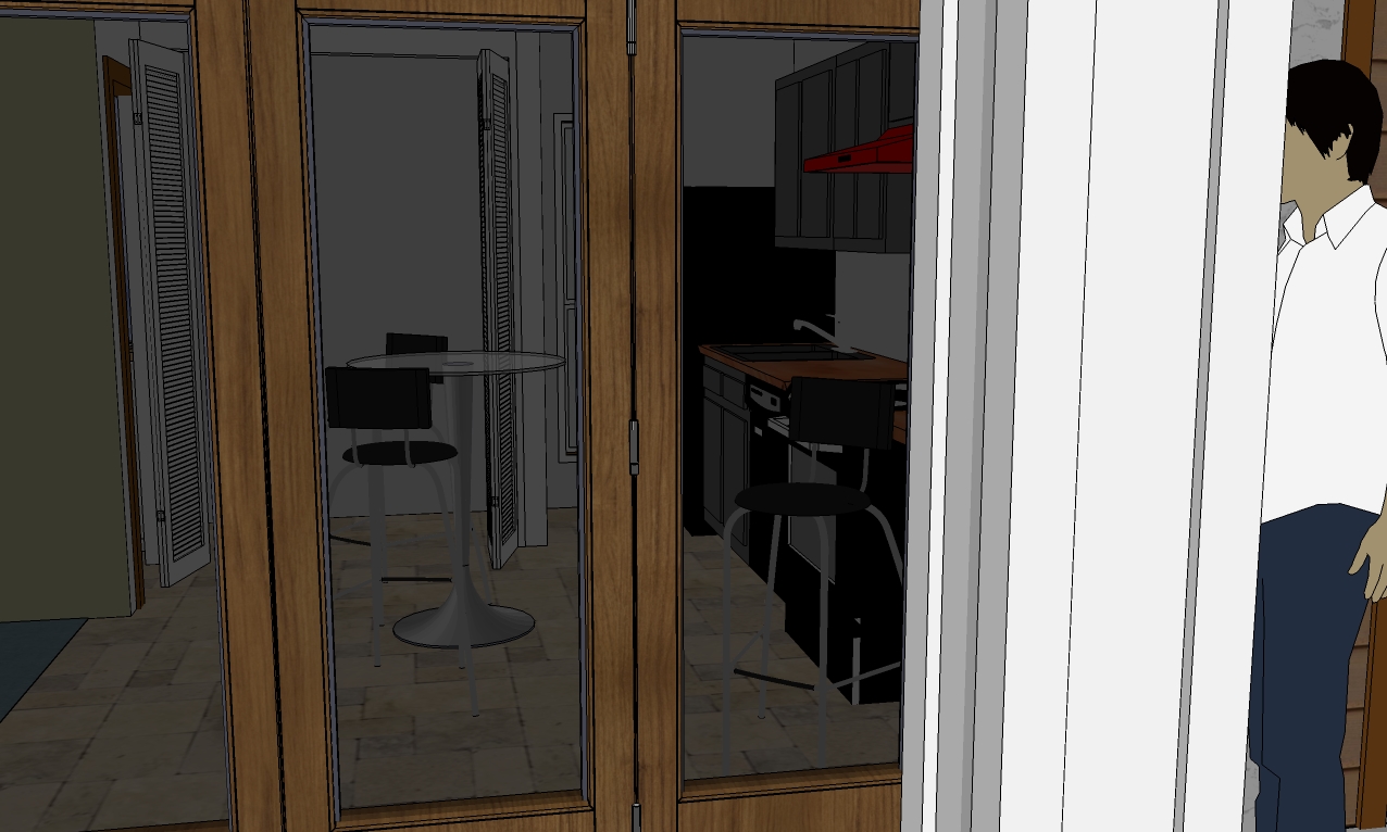
A peek through the FRONT window-doors.(again, click for larger image)
-
Thanks again to everyone for both the compliments and suggestions.
-
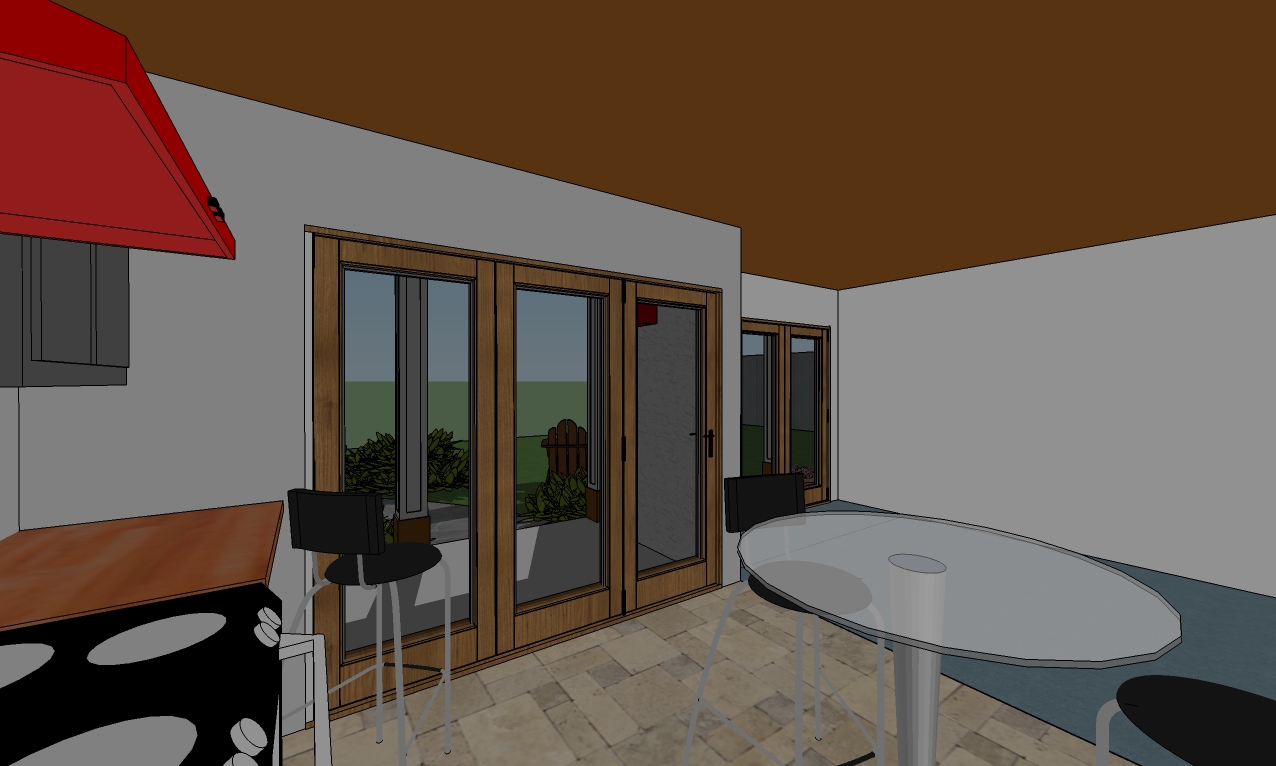
Some interiors. Note: These do not reflect the raised ceiling. I was in too deep to change the original.
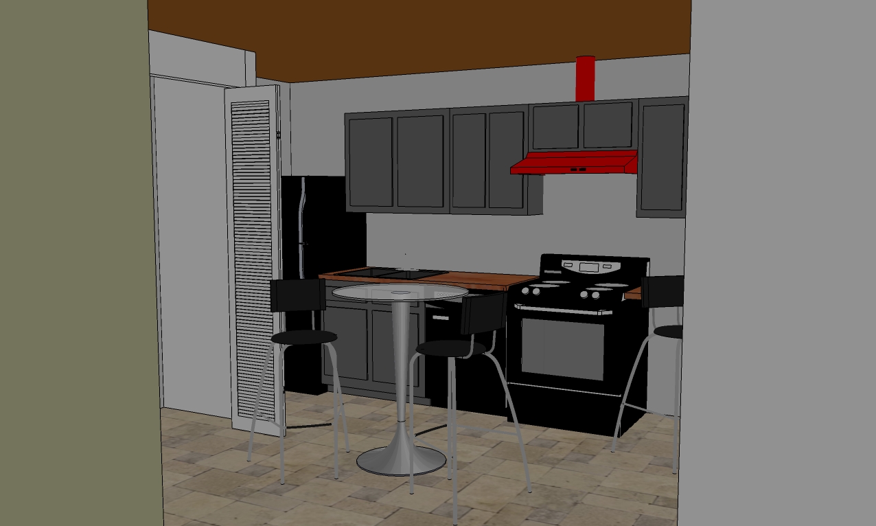
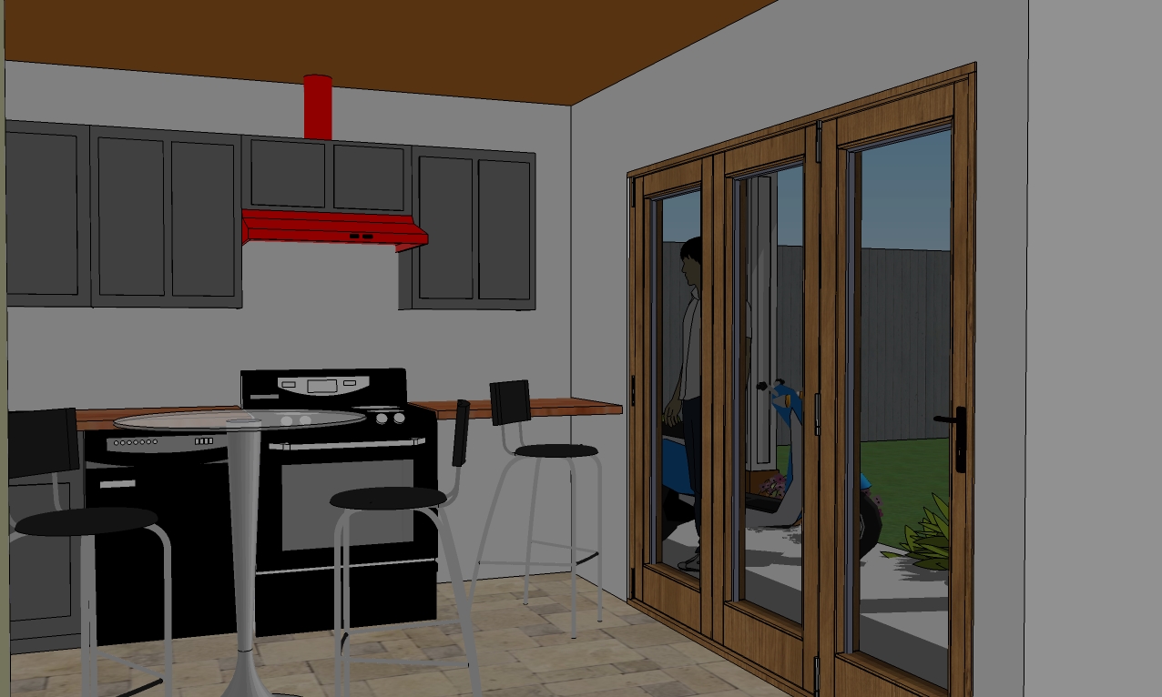
Oh look what I found! Fish-eye lens! (it took me several minutes to figure out how to undo it
 ) Now I wish I'd changed the ceiling.
  And why the heck is it brown? That's gotta go!
-
Added trim to wood siding and added a...
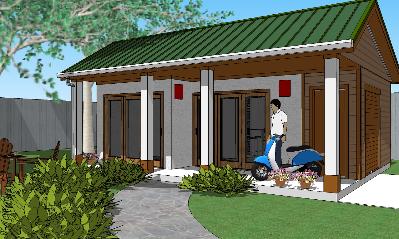 ...bathroom window.
-
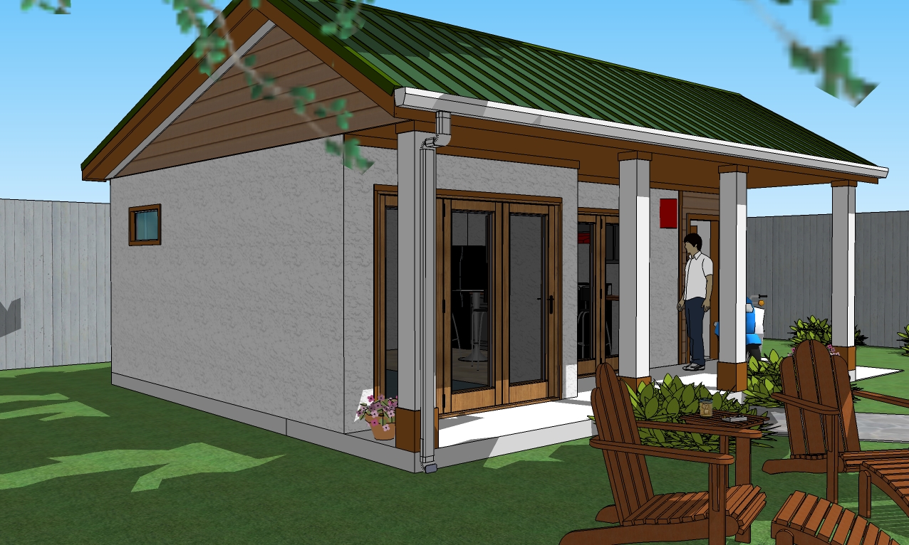
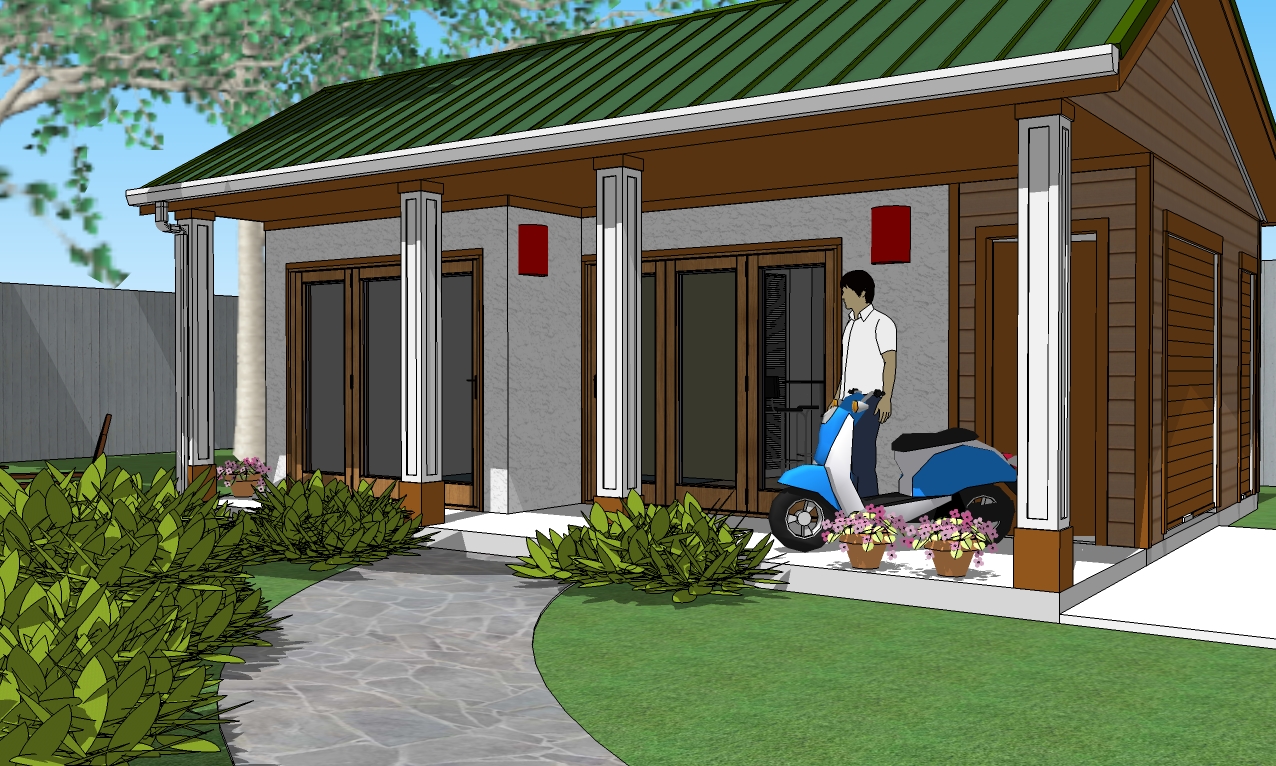
Here's the new inset reveals on the columns as suggested by dtrarch. Also note the new access door at the far right hand, back corner for the utility room.
-
Here's the updates. And Bob, I did a rough sectional to show the ceiling form for storage. That red square is the access for attic storage or it can be open as an alternate design.
The small HVAC sits over the main shed area and is accessible from inside the shed.
The kitchen area can have a cathedral or open, finished, rafter/truss ceiling. My preference would be open rafter/truss as you could hang interesting stuff from the beams.
The water heater tank/utility room is accessible from another roll-up door.
You can see there is also a narrow window in the back of the kitchen.
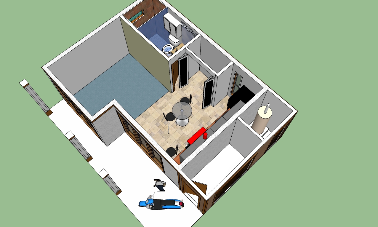
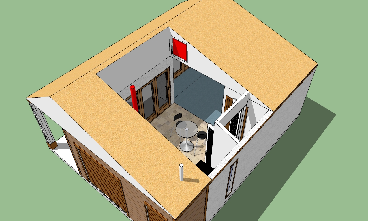
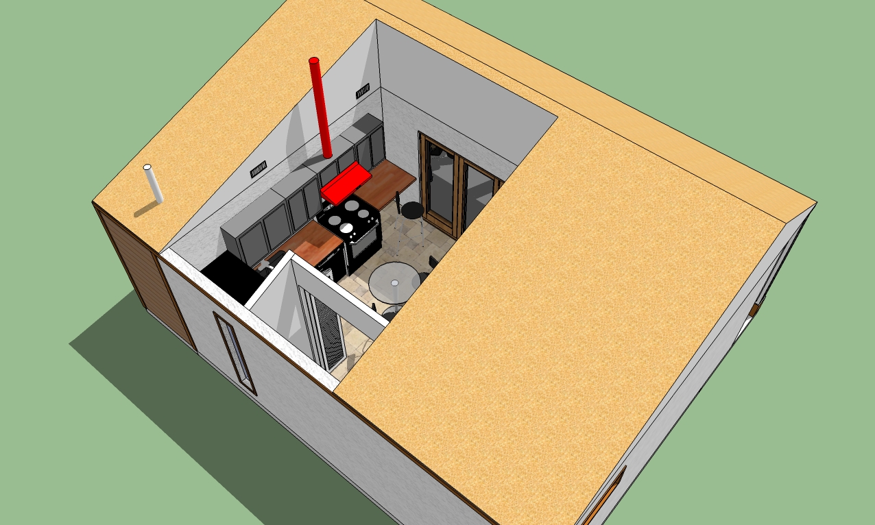
-
Hi Bryan
Glad it was useful.

Pro bono detail for just a tiny more surface development
Does work for me too.
Dave
-
Thanks dtrarch.
And again, thanks to everyone for your suggestions.
Hello! It looks like you're interested in this conversation, but you don't have an account yet.
Getting fed up of having to scroll through the same posts each visit? When you register for an account, you'll always come back to exactly where you were before, and choose to be notified of new replies (either via email, or push notification). You'll also be able to save bookmarks and upvote posts to show your appreciation to other community members.
With your input, this post could be even better 💗
Register LoginAdvertisement


