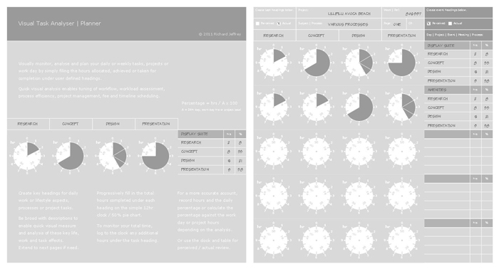
Visually Analyse Tasks - created with Layout.
-
After a thread on the PushPullBar on time sheets I realised something more than a sheet of numbers might also provide some better understanding of where one's days and weeks go!
So took about to create a simple analysis tool so every now and then I can check out what I'm wasting time on and also to get a better handle on rates etc.
The beauty for me is that as a designer it gives visual feedback instantly so I hope can actually make use of it rather than get bored!
The clocks have an obvious advantage where the outside maps the hours per user defined heading whilst inside an up to 50% pie chart enables you to quickly read the percentage of your day (24hr) attributed to a task, so it becomes both a work and lifestyle manager.
After knocking it up I decided I'd put a tut page and share it round!
Any suggestions toward improving it would be great for an update! Particularly any suggestions on improving the clock! Sorry about the odd size that's just the way I roll!
Conceived and created in one day with Google Layout! Bloody joy seriously! The beauty that the objects are so easily aligned ordered, scaled and all fast within a simple clean interface. Sure something very different to create with LayOut but tools are tools, we just have the best one for most jobs! Could have called it LoveUp!

-
Looks great Richard!
 I love Layout as well
Best,
Jason.
Hello! It looks like you're interested in this conversation, but you don't have an account yet.
Getting fed up of having to scroll through the same posts each visit? When you register for an account, you'll always come back to exactly where you were before, and choose to be notified of new replies (either via email, or push notification). You'll also be able to save bookmarks and upvote posts to show your appreciation to other community members.
With your input, this post could be even better 💗
Register LoginAdvertisement


