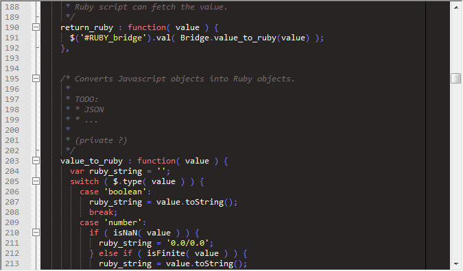
Multiplatform editor Sublime Text 2
-
Here is a comparison with NP++.
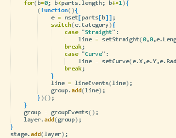
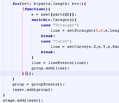
I find the red pairing of brackets useful.
-

SublimeText version: I find underline better
-
The red is more visually distinguishable though, especially like in Chris' example where it cross multiple lines.
-
every programmer with his 'own' taste

BracketHighlighter plugin:

-
@unknownuser said:
every programmer with his 'own' taste

BracketHighlighter plugin:

That reminds me of the blobby Apricot LCD screen I struggled with in the late eighties (except that was a calmer green and black). But if you are looking for some more objective comment, I have been using NP++ and Sublime almost alternately for the last week or so.
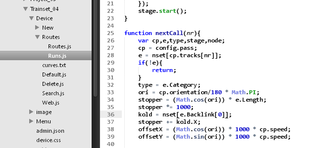
The Sublime lefthand file navigation sidebar is far better than the chaotic NP++ recent file list in its dropdown menus.
Sublime's optional map scroller is good because you can do more informed stab as well as scroll navigation.
If a file is updated outside the editor, Sublime updates its file whereas NP++ asks whether it should do so. I prefer the latter in case I change my mind and use saveAs to restore.
I am using Sublime's Mac Classic which suits me.
-
Anyone created auto-complete for the SketchUp API?
-
I'd think it might be easy to write a Ruby script, that reads the NP++ XML file, and outputs a Sublime JSON file ??
-
@dan rathbun said:
I'd think it might be easy to write a Ruby script, that reads the NP++ XML file, and outputs a Sublime JSON file ??
Was there a complete NP++ made?
-
-
Nothing to do with the last posts, but I found by using the user preferences
{
	"auto_complete"; false,
	"color_scheme"; "Packages/Color Scheme - Default/iPlastic.tmTheme",
	"dictionary"; "Packages/Language - English/en_GB.dic",
	"font_face"; "Courier new",
	"font_size"; 11.0
}
the display is much easier to read ... in fact similar to NP++
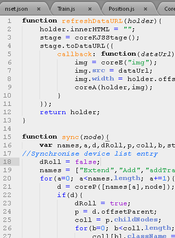
-
-
Default
-
I personally HATE the Courier New font. (It looks so ragged, .. ie unsmooth.)
I LOVE the MS Consolas font.
It was designed specifically for programming. On XP it required that some edition of MS Visual Studio has already been installed, or the font installer would not install it. It may be possible however to open the installer archive with 7zip, etc. and manually install the Consolas font files.It looks like Windows 7 comes "out-of-the-box" with Consolas already installed.
Supposedly, Vista and MS Office 2007 also came with Consolas.@unknownuser said:
(http://en.wikipedia.org/wiki/Consolas)":2xtnoutm]This font [Consolas,] along with Calibri, Cambria, Candara, Constantia and Corbel, is also distributed with the free Powerpoint 2007 Viewer and the Microsoft Office Compatibility Pack.
This website tells how to install Consolas on MAC OSX.
@unknownuser said:
(http://en.wikipedia.org/wiki/Consolas)":2xtnoutm]Bare Bones Software has licensed the font from Ascender for use in their Mac OS X text editor BBEdit.
-
-
Yep.. and I actually (previously) used to hide my Courier New files. Made copies of the Consolas files, and renamed them Courier, in the "
%(#804000)[%SystemRoot%/Fonts]" directory.Then I found an easier way via the Registry's "
%(#0040BF)[FontSubstitutes]" key:Save as a file somewhere with a "
**%(#000000)[.reg]**" extension, say "**%(#000000)[SubConsolasForCourier.reg]**":Windows Registry Editor Version 5.00 [HKEY_LOCAL_MACHINE\SOFTWARE\Microsoft\Windows NT\CurrentVersion\FontSubstitutes] "Courier New"="Consolas" "Courier New Bold"="Consolas Bold"Double-click the file, and answer "Yes" when prompted whether you want the file to make changes to the Registry. (Restart the computer to have the changes take effect.)
It may also be possible to change the Hive to
%(#0040BF)[HKEY_CURRENT_USER]so that the substitutions only take effect for your user account. (Logoff and log back into your user account to have the changes take effect.)
This makes your machine always substitute Consolas for Courier, in all browsers, in all native dialogs, editors etc.
(The native Notepad.exe looks much better with Consolas!)
-
-
I use font DejaVu Sans Mono. Zerro not look like a "O"(Dotted zerro). In Consolas font "l" look like "1"(It's bad)
Hello! It looks like you're interested in this conversation, but you don't have an account yet.
Getting fed up of having to scroll through the same posts each visit? When you register for an account, you'll always come back to exactly where you were before, and choose to be notified of new replies (either via email, or push notification). You'll also be able to save bookmarks and upvote posts to show your appreciation to other community members.
With your input, this post could be even better 💗
Register LoginAdvertisement

