A Noobie's Render
-
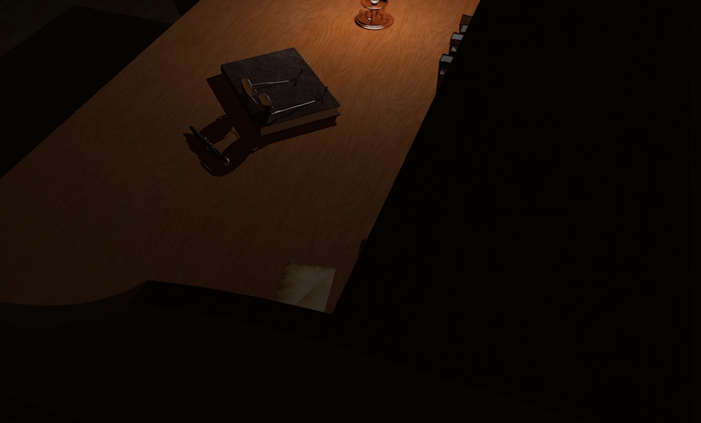
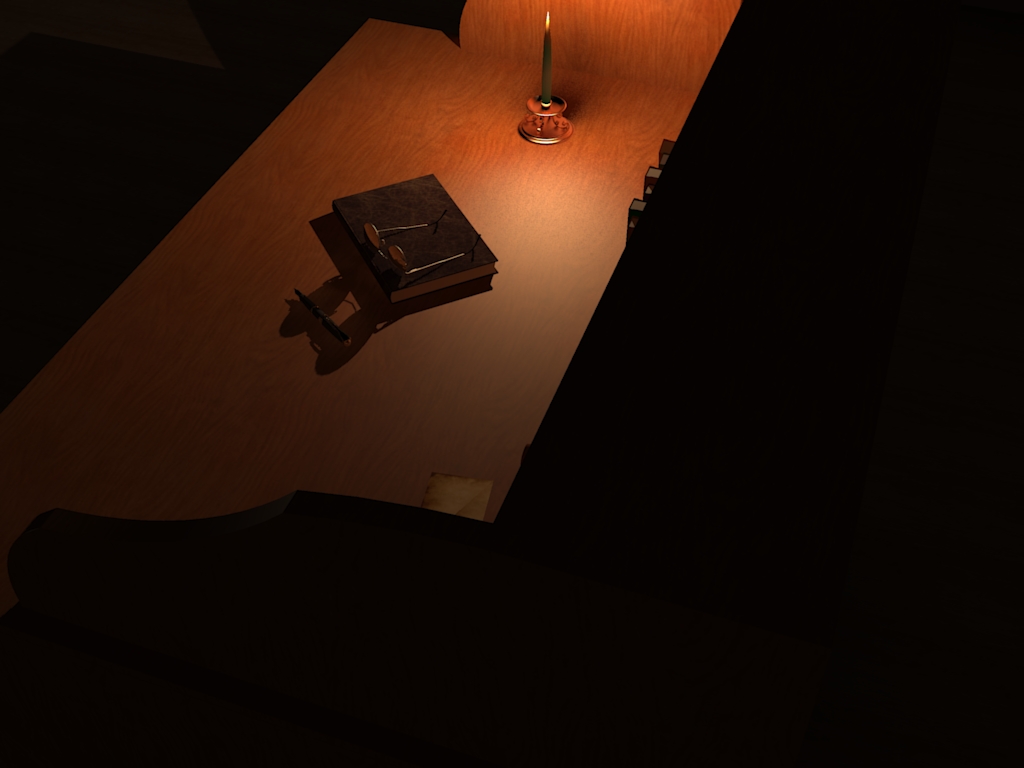
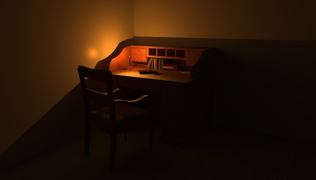
I just finished my first "real" render and thought I'd share it with you guys and get some input. Let me know what you think and what would make it better. This is my second attempt at this render as the first render needed a few changes. I modeled the desk in SketchUp a while ago and the rest of the models I downloaded from the warehouse. Then I exported the model and rendered it in Kerkythea just to get some practice. Render time was about 45 minutes. I am still very new at this so comments and criticisms are more than welcome. Just go easy on me as I still need a lot of work.
 Enjoy and happy New Year!


-
Well great to see you jump in with both feet, and if it was anything for you like it was when I saw my first rendering start to appear, you are probably both pretty excited (and hooked).
The only crit is it is reading pretty dark on my computer, so I can't quite tell some of the peripheral elements.
Good on ya! -
@dale said:
Well great to see you jump in with both feet, and if it was anything for you like it was when I saw my first rendering start to appear, you are probably both pretty excited (and hooked).
The only crit is it is reading pretty dark on my computer, so I can't quite tell some of the peripheral elements.
Good on ya!Thanks!
 Yeah, it is pretty dark. The only light source is the candle so I figured it should be a bit dark. The first render I did of this was a lot lighter and it just didn't look like a candle could emit that much light so I darkened it a bit. I'll post a raw SketchUp shot to show what it looks like fully lit.
You are right, I was pretty excited.
 I am also proud of it even though it is far from what most of you guys can produce. I will use this as a learning experience and hopefully improve in the coming months.
 -
Cool, now I can see it is a desk. Sometimes it is the intention of the person rendering to intentionally make a scene intriguing, and if this was your intention, it worked.
I really think that spending some time in Kerkythea is a great experience, as it almost forces you to gain an understanding in all the rendering voodoo terms like phong and diffuse.
Keep them coming! -
@dale said:
Cool, now I can see it is a desk. Sometimes it is the intention of the person rendering to intentionally make a scene intriguing, and if this was your intention, it worked.
It is meant to be dark, mysterious, and secretive but I never intended for people to not be able to discern what everything is. I guess I don't notice stuff like that until it's pointed out as I know it is a desk because I made it. That's why it's great to get some other people's input. They see things you don't notice.
 Thanks for the kind comments.
  If I get around to it, I may run another render based on the advice given here as well as from some other people I shared this with. Thanks again.
 -
I think darkness is sometimes relative, or implied and the effect has less to do with the physical lighting than with other elements.
It's like watching a movie where it's supposed to be pitch black, but the audience still needs to be able to see what happening.
(Maybe. I just made it up.)
-
Yes Welcome to SU-Addiction... I agree with this comment:
It's like watching a movie where it's supposed to be pitch black, but the audience still needs to be able to see what happening.
We are creating "altered" reality with the renderings, and as such you are free to take creative license, but of course your viewers must be able to discern what it is you are trying to portray.
-
Ahhh, alright. That makes sense. Thanks for the analogy Jim.

-
@jim said:
I think darkness is sometimes relative, or implied and the effect has less to do with the physical lighting than with other elements.
It's like watching a movie where it's supposed to be pitch black, but the audience still needs to be able to see what happening.
(Maybe. I just made it up.)
Funny, I was thinking of stinlies work as well
-
Monitors also vary. It's always best to up the lighting a little bit. I find this true with photos and videos.
-
I agree that it is a bit dark even if it was meant to be. In this virtual world, we do need some references as to what we are seeing.
A possible solution would be to load a hdri background image ("image based lighting") and tune it down enough not to add to much light (so that the candle light still "sticks out" and prominent/dominant) but still light the scene enough so that we can at least "guess" what's around and give a real life (like) context to the whole scene.
I dunno actually. I really suck at these things and you should not listen to me.

And of course, I like it nevertheless...


-
Thanks Gaeius! I think I know what you're talking about. Like a moonlit night hdri?
-
Posted my latest render as well as a render I did along the way. Hope you like them. Please let me know what I should do to make it better.

Hello! It looks like you're interested in this conversation, but you don't have an account yet.
Getting fed up of having to scroll through the same posts each visit? When you register for an account, you'll always come back to exactly where you were before, and choose to be notified of new replies (either via email, or push notification). You'll also be able to save bookmarks and upvote posts to show your appreciation to other community members.
With your input, this post could be even better 💗
Register LoginAdvertisement


