Grand Riviera Theater - Detroit
-
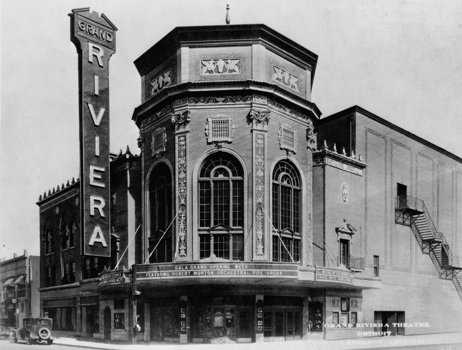
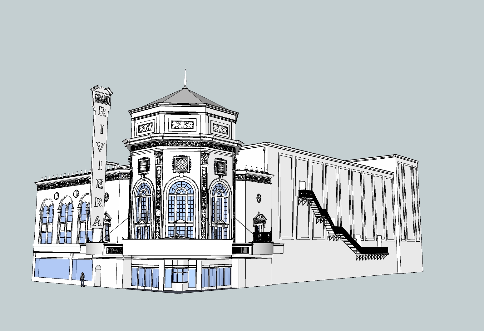
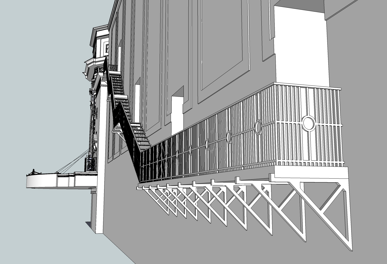
This is the work I've done to try to recapture the Grand Riviera Theater which formerly stood in Detroit. More pictures and drawings of it can be found here.
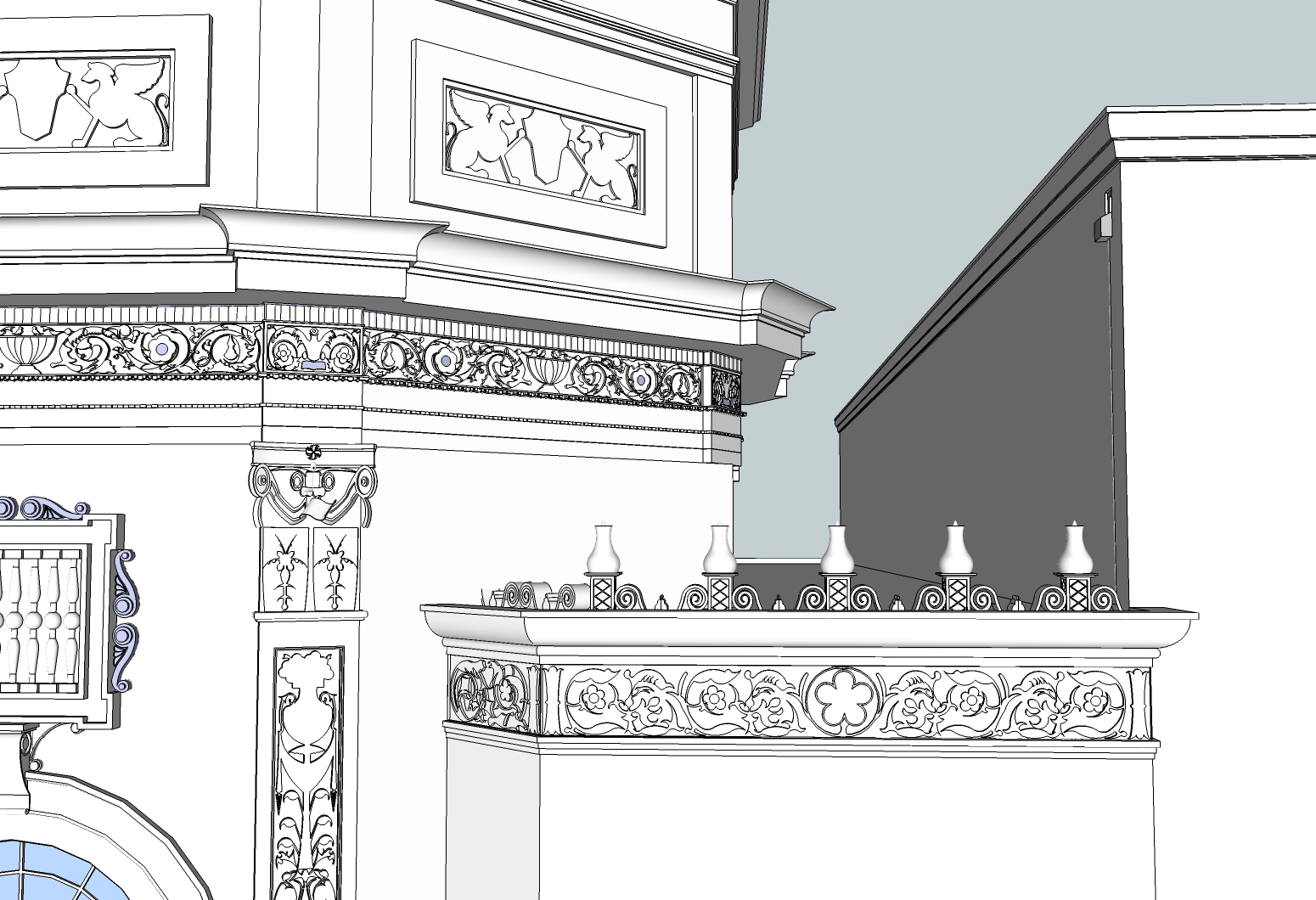
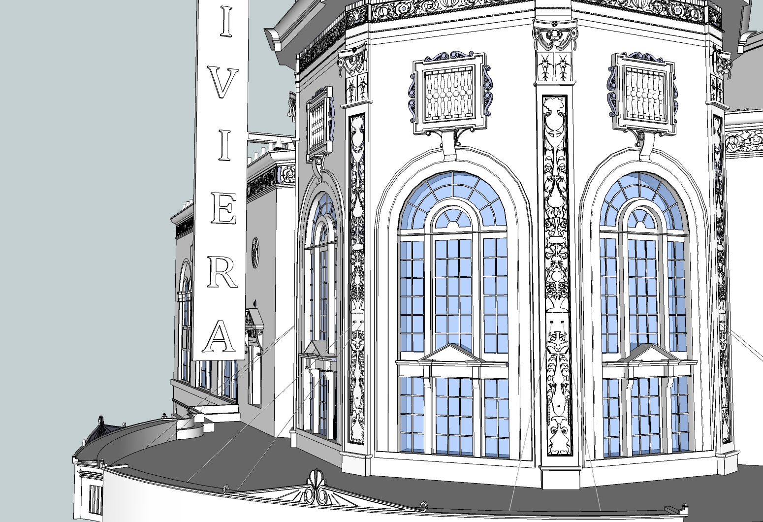
I know that I definitely could have put in much more time into details, particularly some of the rooftop ledges, but I wanted to have this done by the end of the year and it felt like it took forever only to get this far.
After so many days of coming home from my actual job to work on this for a few hours, it feels weird to not be using SU right now.
As with the previous project I did, I made this using no additional plug ins or the photo match tool. Everything I put down was based on the best approximation I could make given the resources I had and time available to dedicate to the project.
-
This is very nice work! The sheer amount of detail packed into this piece is amazing!
 And since no additional plugins were used, I guess it makes it a real hand-made of excellent quality.
 -
Great looking model, lots of detail. Only crits would be that I think the arched windows could of used more segments and also it looks like there are some reversed faces in the model. Now it's time to texture and render!
Mike
-
The model looks very very good. Great details.
My only crit is that the font, that you used in the sign is not right. In the picture it is a more clear one, without serifs
-
Very nice made.

It joins simplicity and details. Simply great.
I hope you will make a render.
-

Another fantastic preservation of a historic building. Minor quibbles aside, that's looking excellent! Wow!
-
My God Man! There is some detail there!! Nice project to push the patience on! Hope you will continue - get it textured and rendered!
-
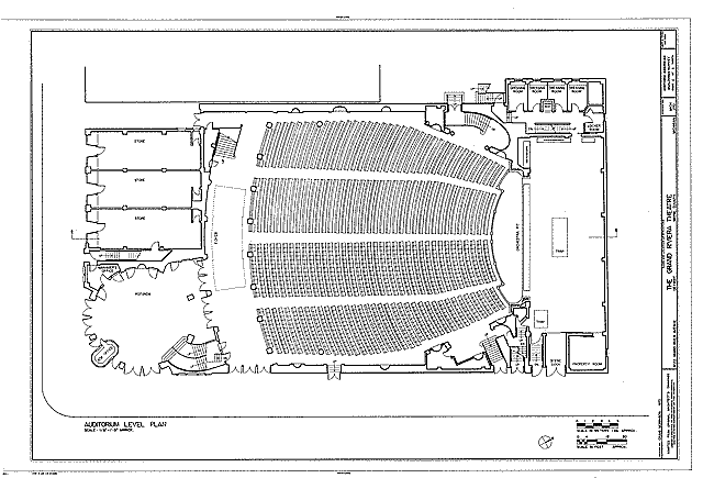
i'm thinking you should rework the front (entrance)
it looks too much like something you'd see nowadays and missing the little deco hint of the original.
i think the entrance is more rounded off instead of the chamfer look.[via the link you posted.. auditorium level]
higher res:
http://lcweb2.loc.gov/pnp/habshaer/mi/mi0000/mi0020/sheet/00002r.tif
-
Thank you all for your comments, I very much appreciate them

@jo-ke said:
My only crit is that the font, that you used in the sign is not right. In the picture it is a more clear one, without serifs
I agree. I finished this on my wife's machine and she doesn't have a lot of fonts installed on it (not like I personally do on my machine either), and I made the sign last, so by that point I was quite exhausted and didn't want to spend an hour just to find a decent enough font online or otherwise. That font just seemed like it at least centered well enough. What I probably should have done, besides spending the time to find a better font, was make each letter individually and manually center them.
@unknownuser said:
i'm thinking you should rework the front (entrance)
it looks too much like something you'd see nowadays and missing the little deco hint of the original.
i think the entrance is more rounded off instead of the chamfer look.I definitely made a big compromise there. I already went through quite an ordeal to make those flower decorations on the top of the marquee actually match the curve of the sign below them. From looking at the pictures and plans, you are right in that it should be a round entrance instead of what I did - but I knew that in order to make it look more like the plan, I would have had to do the same type of work which I did with the marquee decoration and wrestle with a lot of face intersection and subsequent line erasure.
What I should do next time, given that I have that type of drawing available, is start by reproducing the drawn plan using photo match and pull the entire line work up to the needed height, and work from there.
-
i dunno.
i normally wouldn't be bothered by a missed detail or whatever but in this case, it just seems to me that the whole building is based around the entrance. as if it's the most importantdetail by the architect.
Hello! It looks like you're interested in this conversation, but you don't have an account yet.
Getting fed up of having to scroll through the same posts each visit? When you register for an account, you'll always come back to exactly where you were before, and choose to be notified of new replies (either via email, or push notification). You'll also be able to save bookmarks and upvote posts to show your appreciation to other community members.
With your input, this post could be even better 💗
Register LoginAdvertisement


