Office Interior - SU + VfSU
-
Nice images!
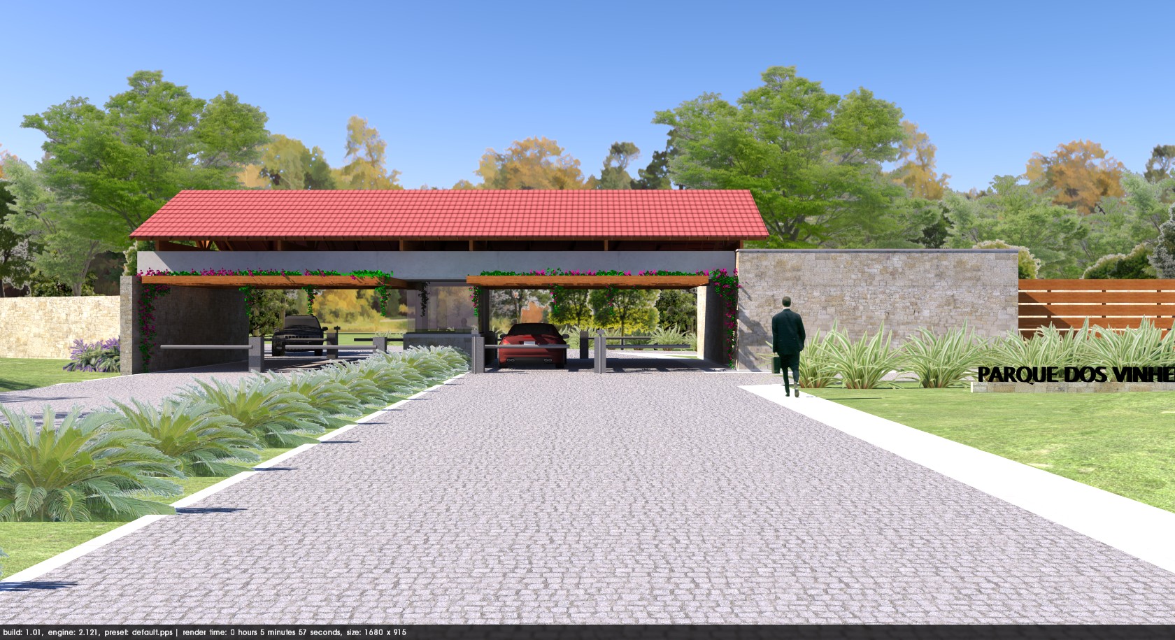
My suggestion would be to try to increase the contrast in the images and the people may fit in better. If you look at a real photo, there are a lot of dark areas, and that is one thing your scenes are missing. It is all very bright, so people in dark suits really stand out.
-
I also don't like these happy clear people. I prefer in that case some motion blur people, that looks more realistic.
But the renders look really nice.
-
This is nice,Im guessing its Vray? ...need to get KT to get renders out like that,nice Shadows! decent darkness change when it gets closer to the object, How long did these take to render?
-
Great renders, Thomas.

 Very photo-realistic.
Did you model the chairs? If not, where did you get them from? They are really nice.
Take care,
_KN
-
@unknownuser said:
How long did these take to render?
Don't remember any more, I got a few (5-6) old discarded computers at the office I used as a renderfarm. About 0.5-2hours depending on the view. I don't really remember any more.
-
@ken28875 said:
Did you model the chairs? If not, where did you get them from? They are really nice.
FormFonts! http://www.formfonts.com
-
@thomthom said:
Trivia: I actually do other things than just write plugins.

I'd appreciate some good pointers for some decent people to use in montages. I generally don't like to insert photoreal people into illustrations. They never look right. And all too often they poses too weirdly. I much rather prefer the silhouettes, but the clients always insists in smiling happy people... bleh..
Thom,
beautiful work indeed. I share the same dislike of post processed people in renders. one alternative I have been using is to place them in the Sketchup model as face me components (see below). the face me components are not just an image pasted on a rectangular face: they are real cutouts. if you want to know a way to make them very fast, let me know.
-
Beautiful renderings, Thomas. The one thing that stuck out to me, though, are all the empty bookcases - the office looks like they are in the process of moving in, and it's still unoccupied. It has that clean, empty look.
-
Very nice renders, though your postpro office workers have neither shadow nor reflection on the nicely polished floor! The plant looks quite bare and radioactive too...apart from that it's much better than anything I'd ever get to put out.
Any tips on setting up your improv. render farm? is it easy?
-
sorry... reviewing your images and yes they Do have a bit of shadow

-
Good point Edson - I use face me people too when I need to have people in my models. It helps a lot as there are then shadows and lighting from the light sources in the model. example using vray and 2D face-me person:

-
@magpie said:
Any tips on setting up your improv. render farm? is it easy?
I just grabbed all the old computers the office discarded when they upgrade the workstations. I currently have 11 old P4 computers. Not very efficient in terms of CPU power and power consumption compared to modern computers...
@magpie said:
sorry... reviewing your images and yes they Do have a bit of shadow
I've flooded the interior with lights so there is no strong shadows. I guess it's been in fear to too dark areas, but I suppose that the renders would have benefited from some lighter and darker areas in order to provide better contrast and dynamic in the images. As well as more details to indicate that people actually used the place.
Hello! It looks like you're interested in this conversation, but you don't have an account yet.
Getting fed up of having to scroll through the same posts each visit? When you register for an account, you'll always come back to exactly where you were before, and choose to be notified of new replies (either via email, or push notification). You'll also be able to save bookmarks and upvote posts to show your appreciation to other community members.
With your input, this post could be even better 💗
Register LoginAdvertisement


