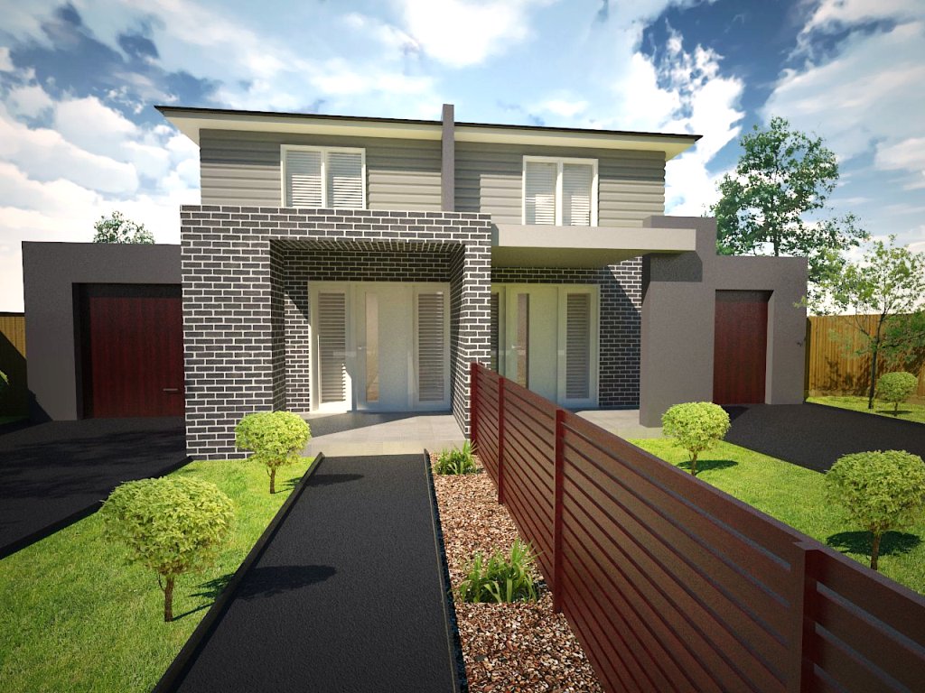
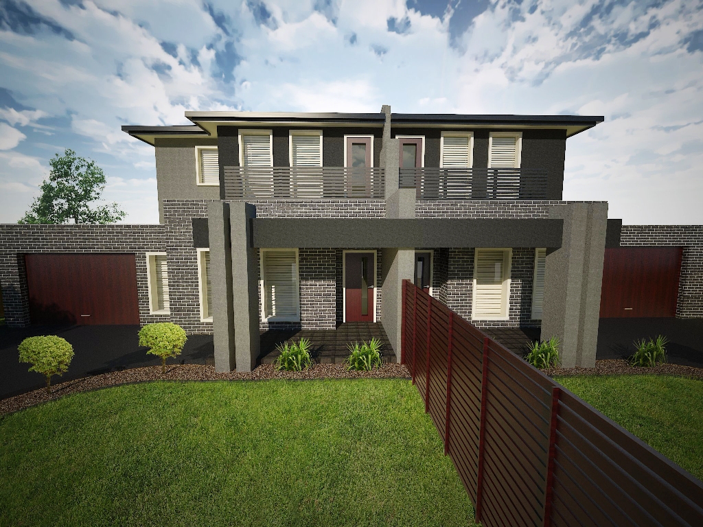
2 exterior renders
-
Hi
Kinda getting the hang of this, just struggling with some 'realism' - comments/suggestions are welcome


-
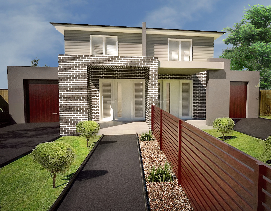
Not too bad. I think the sky is a bit too distracting for the viewer. The color and saturation also needs a bit of adjustment to add more realism. I had a quick play in photoshop to show what I mean. I replaced the sky and just adjusted a few settings. (Hope you don't mind)
I think overall you are getting a good starting point and there a lot of great things about the renders. Keep up the good work!


-
@earthmover said:
Not too bad. I think the sky is a bit too distracting for the viewer. The color and saturation also needs a bit of adjustment to add more realism. I had a quick play in photoshop to show what I mean. I replaced the sky and just adjusted a few settings. (Hope you don't mind)
I think overall you are getting a good starting point and there a lot of great things about the renders. Keep up the good work!

thanks heaps (i love this forum)
Was that all you adjusted in terms of the actual render (colour and saturation)? What exactly was done if you dont mind me asking?
The sky Im using is a HDRI cheapie i purchased off the net for $12, perhaps i need to upgrade.
Im using a HDRI background for the sky and im using the SU natural light for the GI. Would it be better to just place the sky in photoshop at post processing stage?p.s that looks great and it made such a big difference, thanks again!!!!
-
Look at the direction of the light on your "face-me" plants and then look at the direction of the light cast by the "face-me" component. The light is coming from opposite directions. The light in the face-me is going one way and the shadow actually cast is going the other. Scale your "face me" by a factor of -1 in the horizontal direction.
-
I think I would also apply some perspective correction to make all your verticals parallel. Convergence is great if you want to empasie the height of a 10-story building. But on a small building sot close up, it does not feel right.
-
@unknownuser said:
The sky Im using is a HDRI cheapie i purchased off the net for $12, perhaps i need to upgrade.
No need to purchase backdrops. Take you digital camera
out and shoot some.If you take a series of several images and stitch them together you can make some very nice skies.
p
-
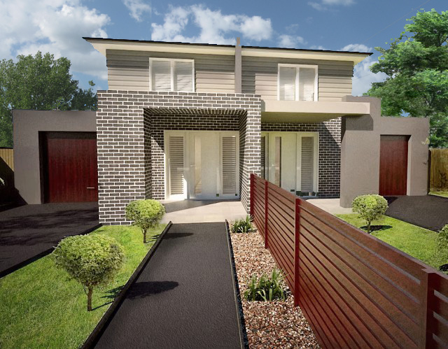
To demonstrate I grabbed an image I took at my home a month or so
ago and plunked it in your background.Took about two minutes to erase your sky, insert new sky image, copy new sky image,
stitch together copies and re post.If you think about the pictures when you taking them, you
can get some nice trees or other stuff included in the shot
to help give it a more lifelike feeling.Another thing to keep in mind is landscape plantings.
Too few gives an incomplete feeling or looks
like the builder ran out of $If you have the skills, I would recomend photo shopping in landscape
rather than modeling it. More life like and quicker in the long run I think.
-
this is getting much improved every iteration!
I would look at some of Richard's work in this forum....he is a master of this sort of render and a very similar architecture.
i think a more traditional artistic proportion of the image would make it look better. third foreground, third subject, third background, too much path IMO.
-
Great start; I have a couple of comments if I may.
The brick at the top of the opening seems to be a half brick. The ceiling in the opening seems to be hanging brick, how do you plan on hanging that brick?
The siding on the upper would typically have corner boards.
Hello! It looks like you're interested in this conversation, but you don't have an account yet.
Getting fed up of having to scroll through the same posts each visit? When you register for an account, you'll always come back to exactly where you were before, and choose to be notified of new replies (either via email, or push notification). You'll also be able to save bookmarks and upvote posts to show your appreciation to other community members.
With your input, this post could be even better 💗
Register LoginAdvertisement


