A Thread for Fine Design
-
Hi Guys,
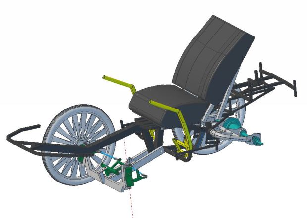
I have just noticed PodRide, a velomobile that is meant to be a practical every day vehicle. The Swedish designer, Mikael Kjellman has produced a really well thought out and designed 'Car Bike' that could be ideal for rainy or cold climates!
From what I can gather the finished PodRide will cost in the region of €2500 but he offers lots of 'buy in' options on his IndieGoGo campaign, here,
PodRide a practical and fun bicycle-car
https://www.indiegogo.com/projects/podride-a-practical-and-fun-bicycle-car/x/286680#/I think its definitely one to keep an eye on particularly if the designer can, as he proposes, produce a reasonably priced self build kit.
Mike

-
The words 'good' and 'Russian Car Design' were never two words I would have used in the same sentence but after reading about Malyshev Alexander's, OneDoorCar, the Mirrow Provocator, I might be about to change my mind.
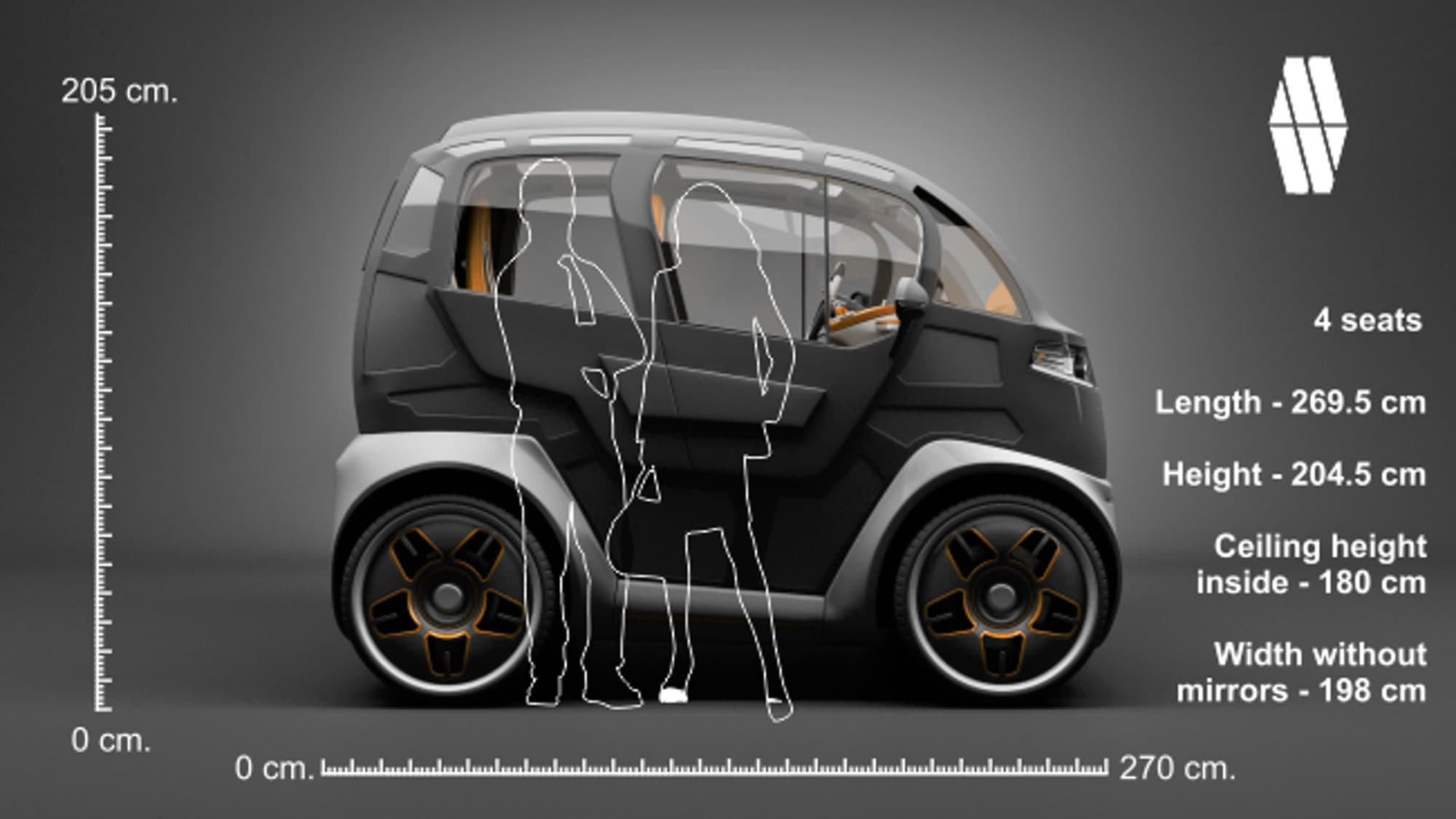
This 2.7 m (8.86 ft) long and 1.98 m (6.5 ft) wide 'city car' ticks a lot of the boxes when it comes to what a family car should be.
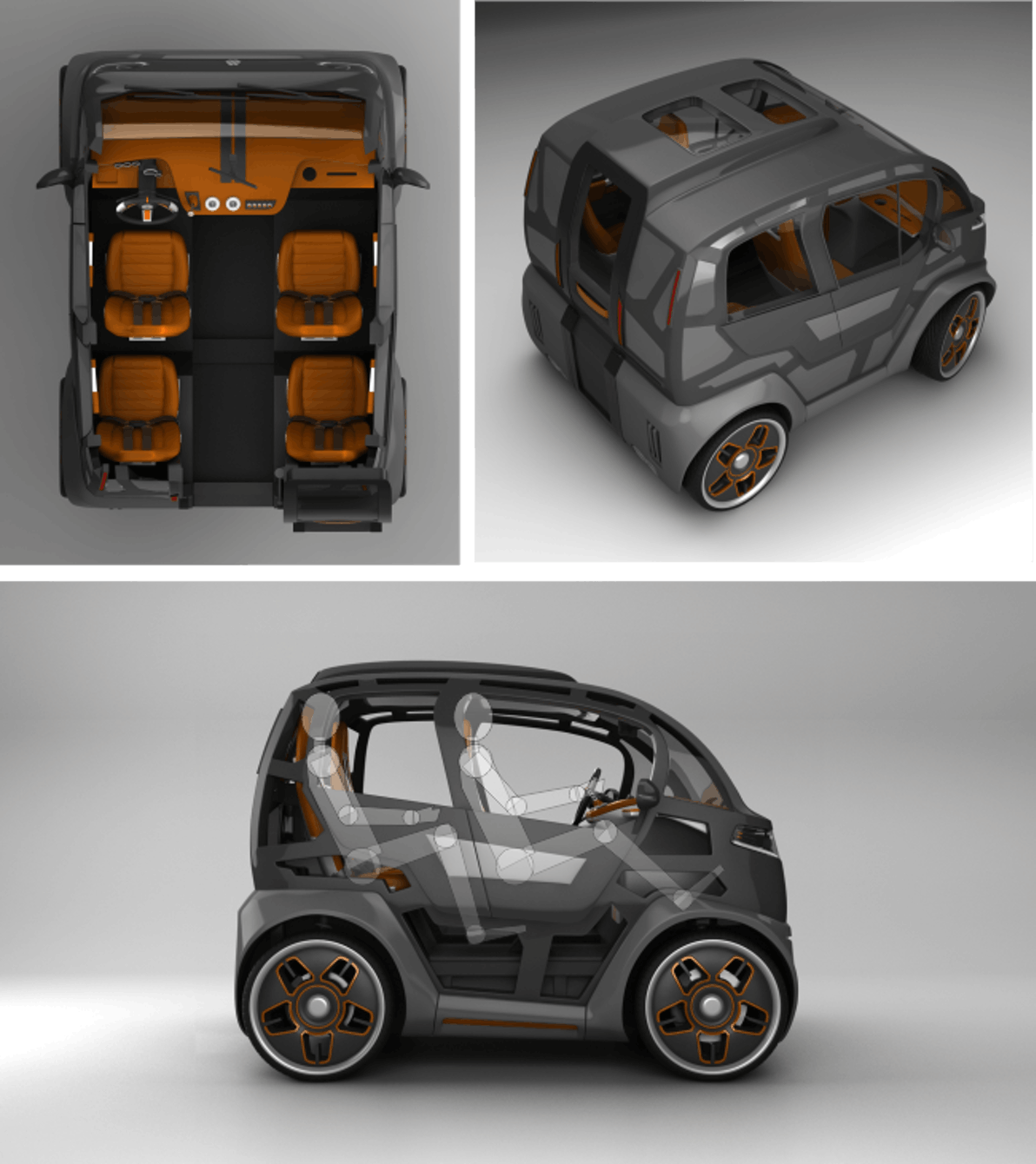
Check out the full details and more images here,
Russian city car leaves convention behind
http://www.gizmag.com/mirrow-provocator-city-car/43303/pictures?thumb=true#picture9 -
Flight seating might be about become more affordable (due to increased capacity) and comfortable at least for business class passengers with Acemen's patented design for universal aisle access.
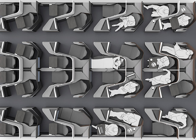
More details here, http://www.popularmechanics.com/flight/a21471/acumen-design-united-business-class-aisle-access/?mag=pop%26amp;list=nl_pnl_news%26amp;src=nl%26amp;date=062316
-
Just provide a cubby and some drugs and we can stack in and save some real room.
-
That's quite a brilliant design Mike.
-
@mike lucey said:
Flight seating might be about become more affordable (due to increased capacity) and comfortable at least for business class passengers with Acemen's patented design for universal aisle access.
[attachment=0:3lhc0qp1]<!-- ia0 -->Acumen.jpeg<!-- ia0 -->[/attachment:3lhc0qp1]
More details here, http://www.popularmechanics.com/flight/a21471/acumen-design-united-business-class-aisle-access/?mag=pop%26amp;list=nl_pnl_news%26amp;src=nl%26amp;date=062316
We saw a similar setup on our trip to Basecamp! Was a United flight I think... Chicago to Denver. First class were these huge sleeper chair things, then business class were nestled together almost like that image, staggered placement, with the exception of singles on the outer column, and doubles in the middle.
The girls have both flown first class with my wife (she often gets upgraded due to work travel...) - they asked if they were sitting in the comfy seats... and sadly, no, because we were burning points to bring the family to Basecamp.
-
Mike Lucey, here is something you may fancy:

Motoped Survival Review – the board track-inspired survival motorized bike
Survival - motorized bicycle from Motoped that helps you ride out the worst of times.

Personal Electric Transport (motoped.com)
Motorcycle Hybrid Designed As A Survival Bike That Can Travel 300 Miles Without Refueling

-
@solo said:
Mike Lucey, here is something you may fancy:
Very good Pete. "That’s a good thing when you’re traveling through the desert on a horse with no name. . ."

-
Fascinating construction and quite beautiful. All animated rather well too
Alconetar Bridge - Construction Process.
Vid says 'Embedding disabled by request?

-
Well done

Would love to know what software was used to generate the animation. I would also imagine there are a lot of scenes and a pretty big file size.
-
An interesting and informative construction video but the music was inclined to put me to sleep!
-
 I've been hearing the term, 'the last mile', quite a lot lately in relation to modes of city transport. Seemingly it refers to transport used to get from the parked car to place of business.
There are quite a few electric bikes and scooters that go some way to addressing the last mile but most of them fall short when it comes to what you do with the transport device after arriving at the final destination.
I think GoTube - The World's Most Portable Electric Scooter may have solved this problem. This electric scooter ticks all the boxes when it comes to convenient storage and weight. The design is also very slick and can even be brought on planes as carry-on luggage.
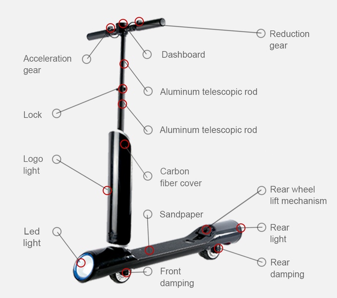
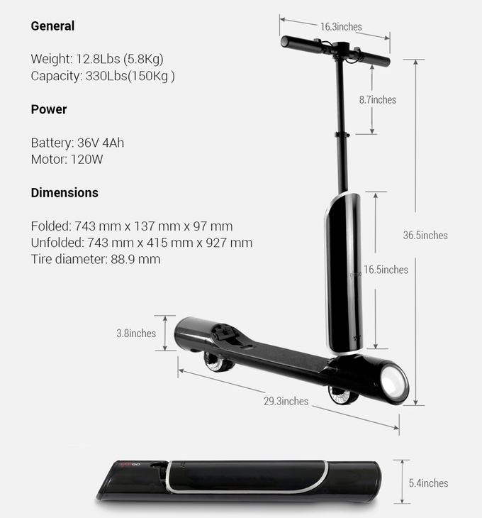
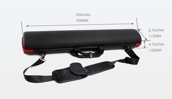
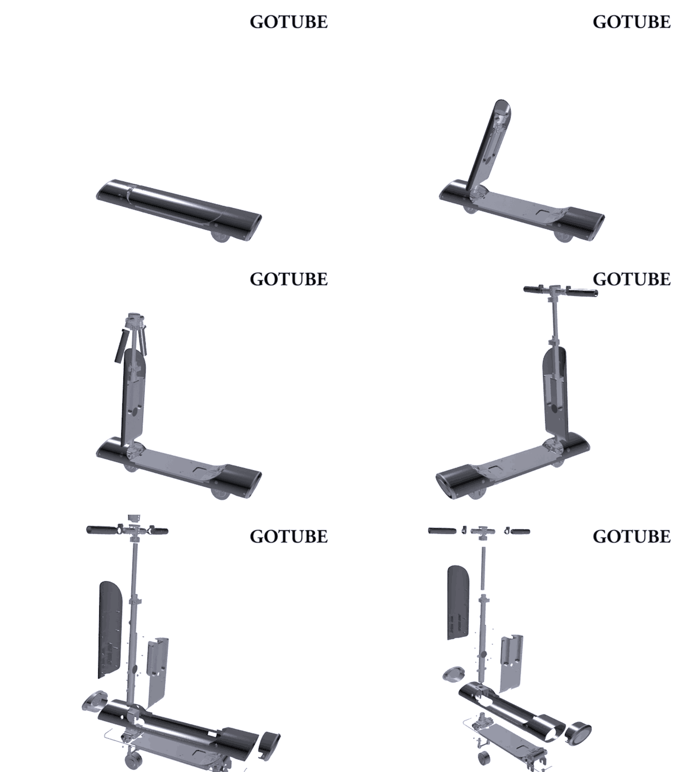
-
Hi Guys,
Of late I have been researching various ways on how a person could actually live 'off-grid'. I've come across quite a number of good ideas and one such idea that I picked up on this morning is the HomeBiogas system.

It's simple, reasonably low cost and most importantly easily maintainable for 'off-griders'. I'll probably make a 3D model soon and post here.
Mike
-
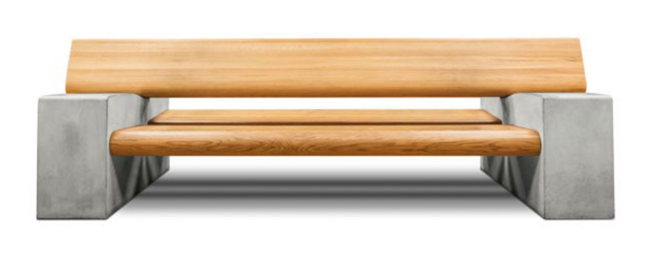
I mean, what's not to like. Very public, sturdy, sensual, beautifully contrasted materials, and above all kept simple.
Makes design look soooooo easy.....Design by John Lasvall and Nils Loventorn-Idesign Partners
-
Dale, you forgot to mention ... it's also thief proof!
-
Actually, glad you pointed that out Mike.
I've been thinking about "Design" recently, and in terms of the criteria that determined the design of this "object", designed for public spaces, I bet that was high on the list.
If you have ever tried to find a concise definition of "Design", you may notice it is a difficult concept to pin down.
Here's an example:
design (verb), as a discipline: plan the creation of a product or service with the intention of improving human experience with respect to a specified problem.
Does creating a cake fit?
So here is another example:(Headvert-by Chijoff and co)
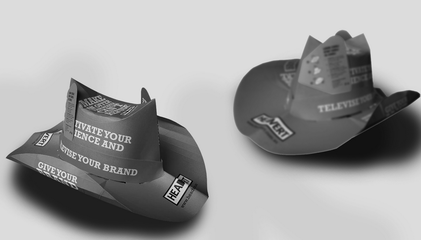
Obviously created to advertise.
(in the companies own words it has)
Measurable Effectiveness
It also has an interactive component as you pop up the hat
Totally mobile branding
It's recyclable.
Qr Codes for Social media engagement
Sun protection for outdoor events
As such it fits the above definition.....
But....I'll leave it there. -
Yes, Dale, good or even bad design is difficult to pin down. An engineer friend of mine simplified it, for himself at least, "If it looks right, it more than likely is right!". It's hard to argue with his logic.
-
So in the world of music,digital has become king. You can emulate most any analog musical sound digitally.
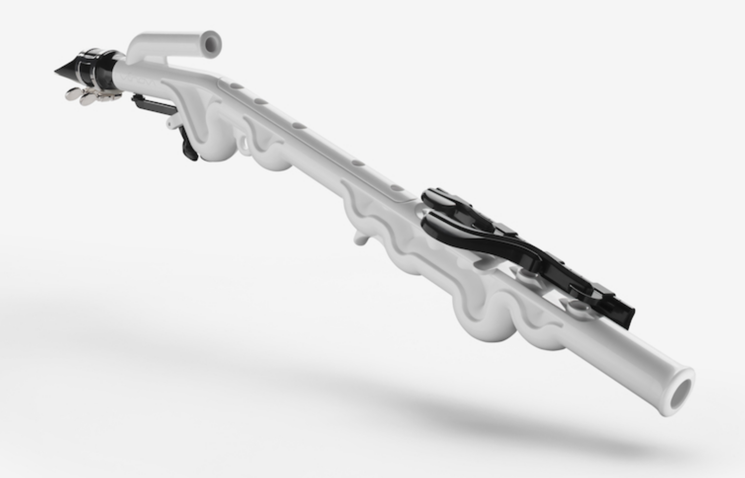
The fact that Yamaha would create a non digital instrument of this complexity, and actually make it sound reasonable just speaks good design.
The fact that they even allowed an R&D team to pursue this is equally amazing.
The Yamaha Venova is a little ABS instrument that has distorted and compressed the airways of the instrument, to emulate a saxophone, and give it the fingering technique of a recorder.
https://usa.yamaha.com/products/musical_instruments/winds/casual_wind_instruments/venova/index.htmlQuite remarkable really.
-
Dale, At the same time I doubt Yamaha would have been able to create Venova with the help of computers, so in a way its a result of digital input ..... me thinks!
-
Absolutely right Mike.
I hired a carpenter one time that turned out to be a trained Patternmaker. Before computers and cad/cam he would have been the guy who would bring something like this to life out of wood, so that molds could be made to create an instrument, gear, car part, well virtually anything cast or out of plastics. Of course his trade has gone the way of the Do-Do bird now, and things that may have taken him weeks can be crafted so quickly via computer.
You can't discount a tool with so much power and potential.
Anyway...
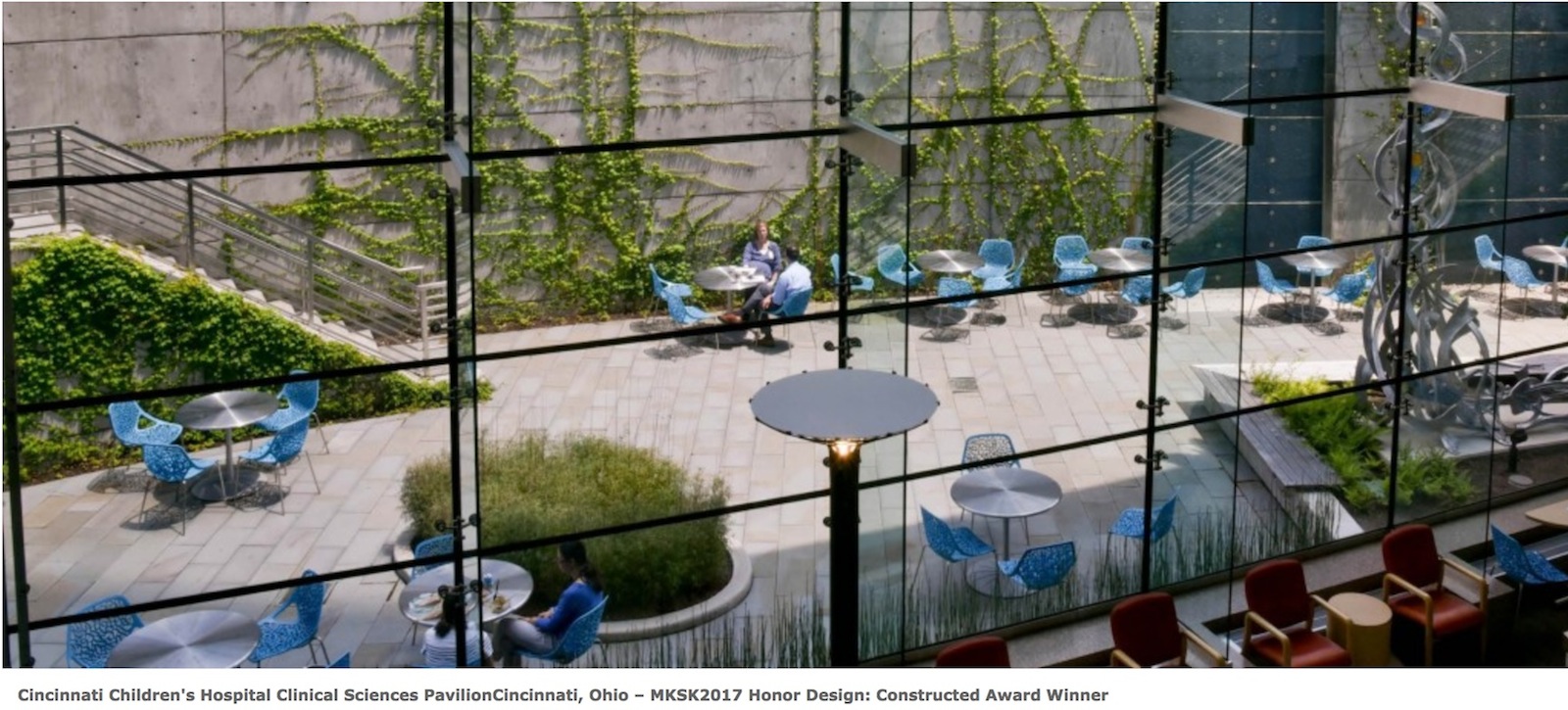
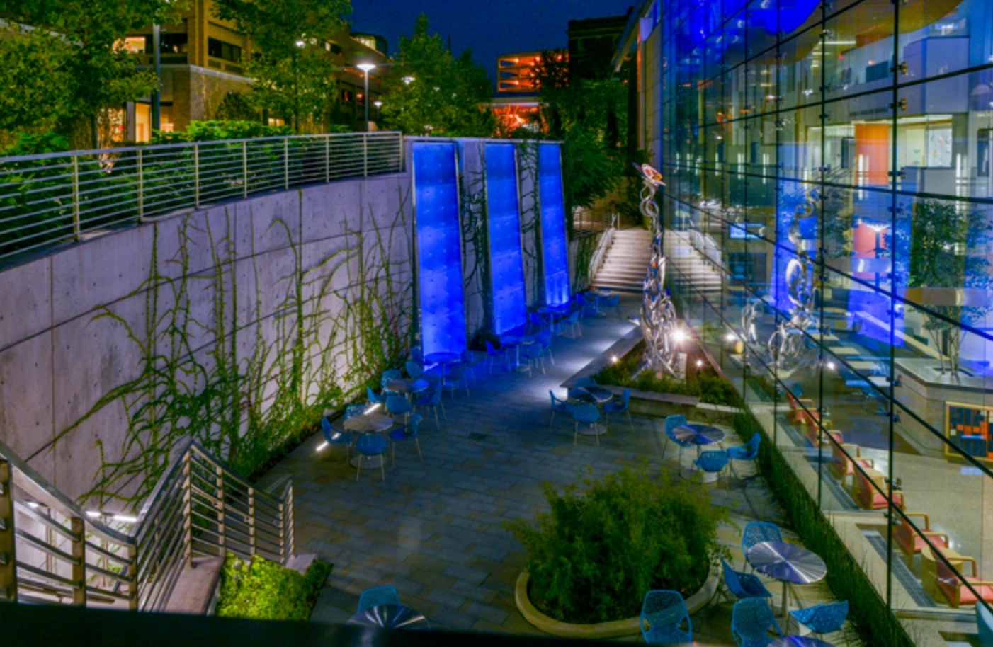
I'm posting a landscape architecture design By MKSK who created a series of therapeutic green spaces and respite areas at the Cincinnati Children's Hospital.
Creating a space like this among all the sterility which is really a requirement in Health Services design is really quite commendable.
Hello! It looks like you're interested in this conversation, but you don't have an account yet.
Getting fed up of having to scroll through the same posts each visit? When you register for an account, you'll always come back to exactly where you were before, and choose to be notified of new replies (either via email, or push notification). You'll also be able to save bookmarks and upvote posts to show your appreciation to other community members.
With your input, this post could be even better 💗
Register LoginAdvertisement


