A Thread for Fine Design
-
Saw the chairs on Gizmag. The first thought I had was only if the floor is truly level. I assume that this is a quick, "impromptu" arrangement. I didn't see any kind of interlock hardware, but I am sure there is something to unitize the work surface.
-
-
I've always loved this one. It's so tactile.
More here http://www.restorationhardware.com/search/results.jsp?start=25
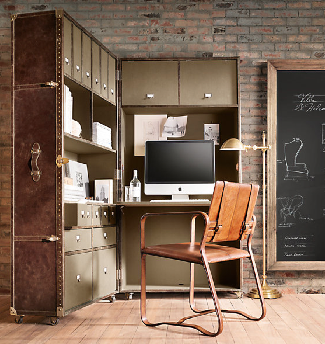
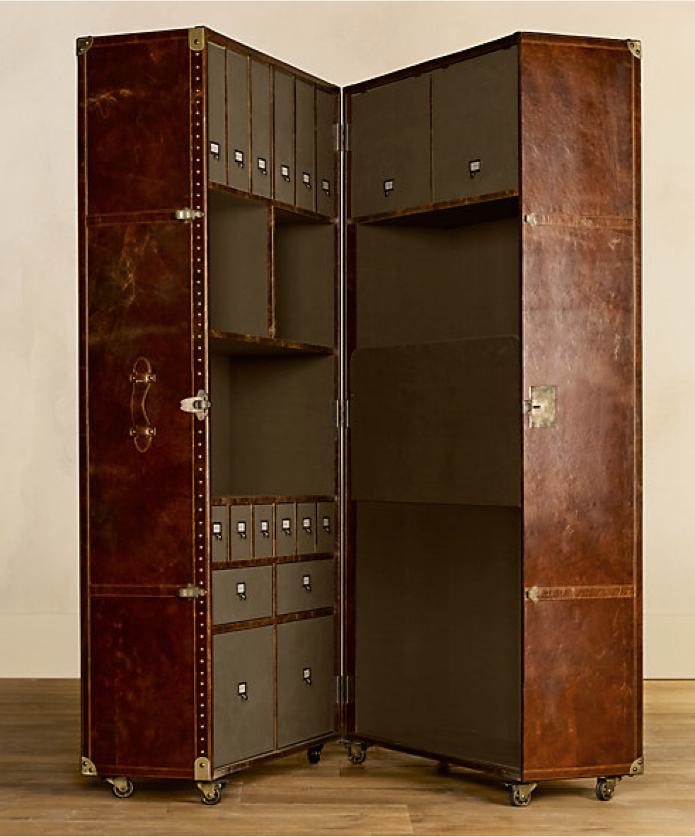
-
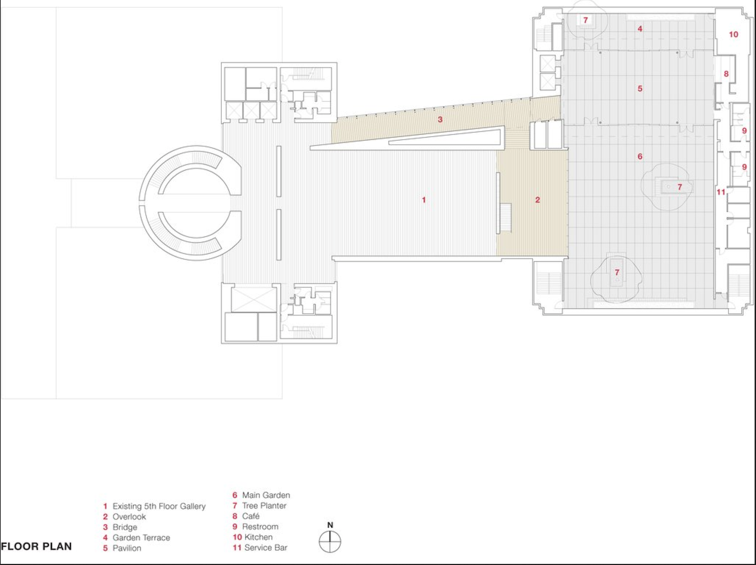
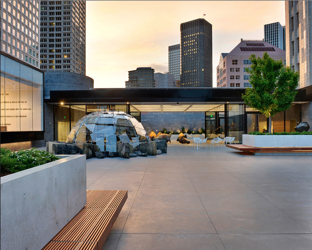 Jensen Architects
SFMOMA Rooftop Sculpture Garden
http://jensen-architects.com/our_work/featured_projects/sfmoma_rooftop_garden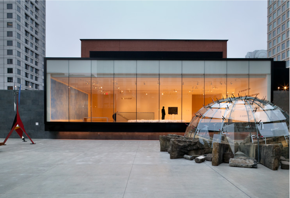

-
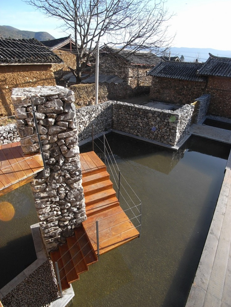
A Variety of inspirational works by Li Xiaodong Atelier
http://www.lixiaodong.net/en_home.aspWater house

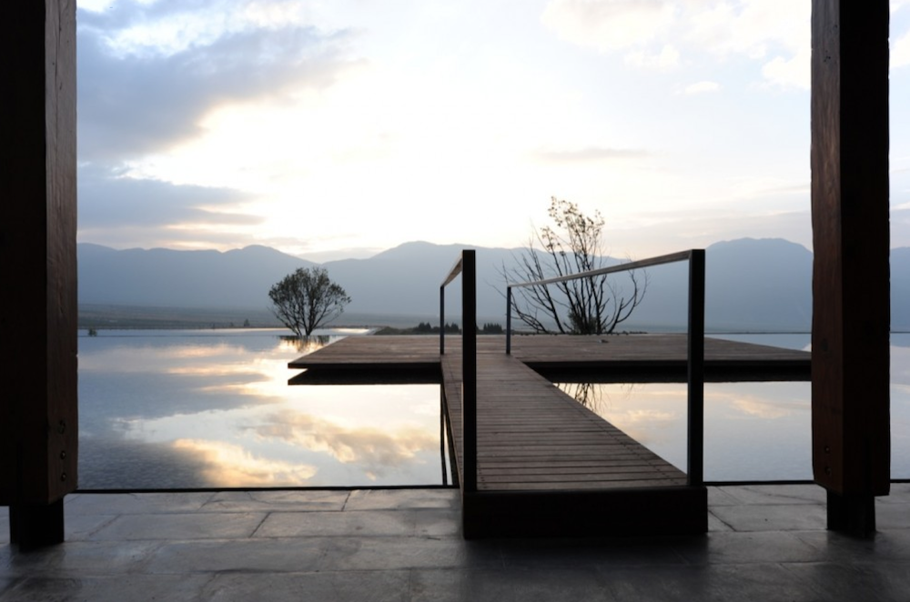
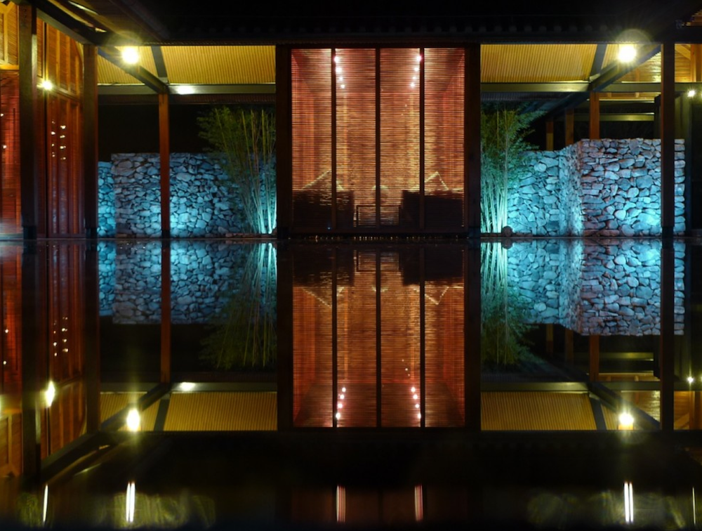
LiYuan Library

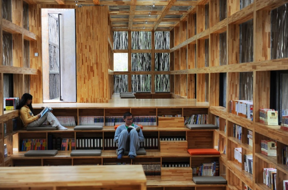

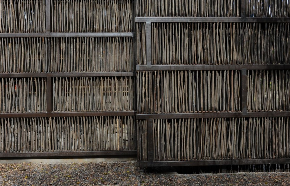
Yuhu Elementary School
-
I think the birdhouse tiles are ill-advised. Again the solar gain problem. Also I'd rather have a built-in elevator. Who wants to see that, much less ride in it (more than once
 )Rest is looking good!
 -
Just saw this posted on Facebook. Thought someone would like it.

-
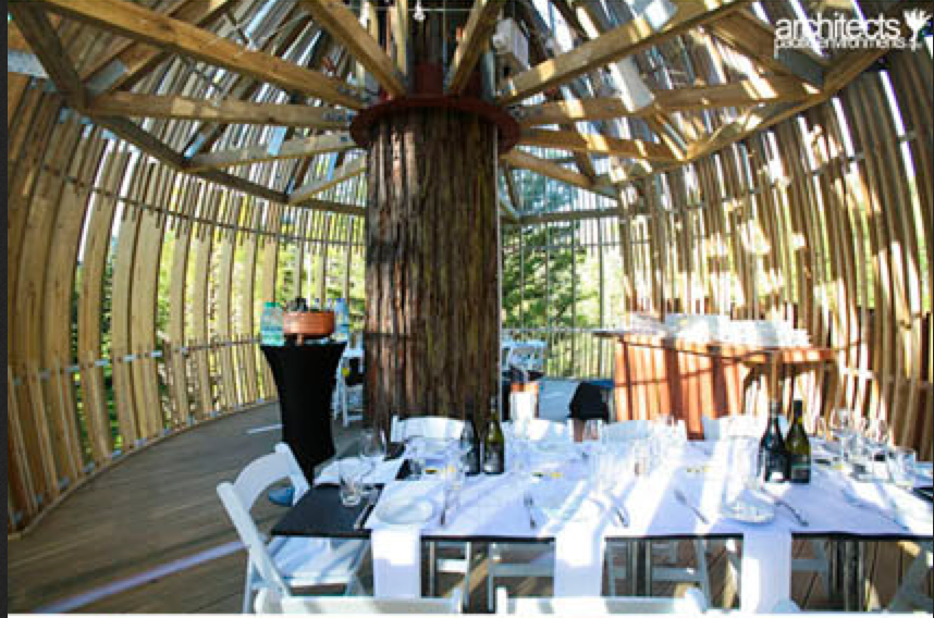
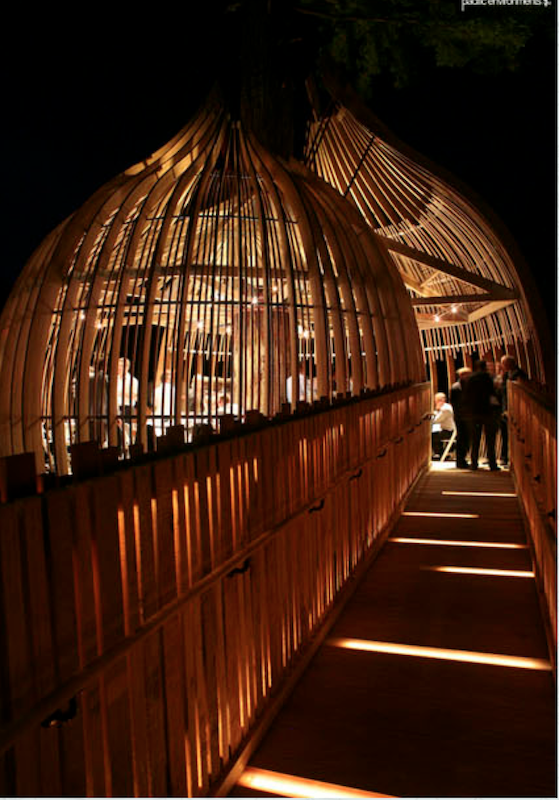
Who could resist a tree house. Pacific Environments Architects NZ http://www.pacificenvironments.co.nz/

-
-
-
Such fine work.
This is by David Fletcher http://www.dbfletcher.com/
He has designed a few tables like this, mostly I believe for Yachts.
Bloody brilliant. -
-
modular briks


-
Take my money already as this I want!

-
This project surely deserves a place in this thread - Picture updates on pages 1, 5, 7, 11 and the final product on page 17. I challenge you to make it all the way through without wincing.
-
OMG! That's all I can say!
-
In a sense this is out of the box for this Thread, or is it?
Japanese researchers say they've developed a way to decode your sleeping brain's activity using an MRI machine in real time - or in other words, "watch" your dreams. http://www.cbc.ca/news/yourcommunity/2013/04/scientists-learn-to-see-your-dreams-with-mri-scans.html
If this same technology can be applied to your memory, it could mean a the largest single change in the justice system since DNA.
-
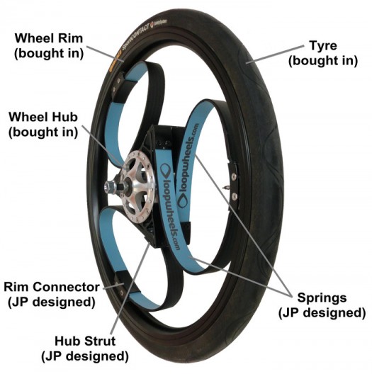
I thought this new concept is very clever!
-
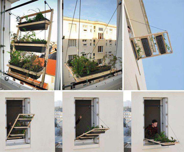
More of a great idea than fine design if you live with limited space.
-
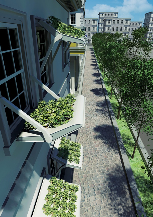
Here's a slightly more refined production concept based on the same idea:
www.yankodesign.com/2012/11/19/herbed-windows/
Hello! It looks like you're interested in this conversation, but you don't have an account yet.
Getting fed up of having to scroll through the same posts each visit? When you register for an account, you'll always come back to exactly where you were before, and choose to be notified of new replies (either via email, or push notification). You'll also be able to save bookmarks and upvote posts to show your appreciation to other community members.
With your input, this post could be even better 💗
Register LoginAdvertisement

