A Thread for Fine Design
-
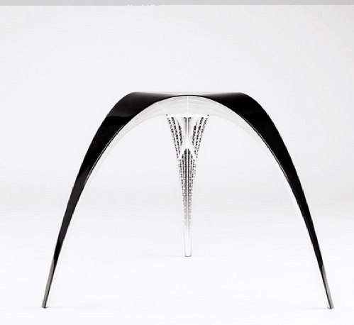
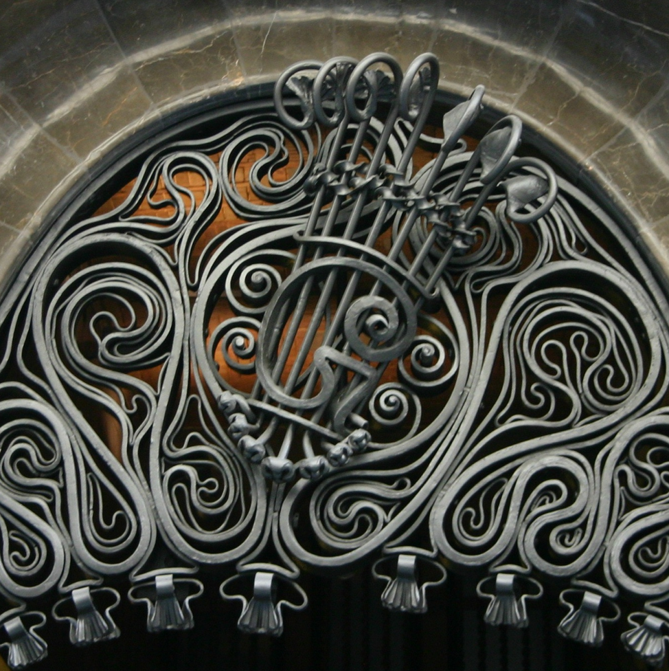
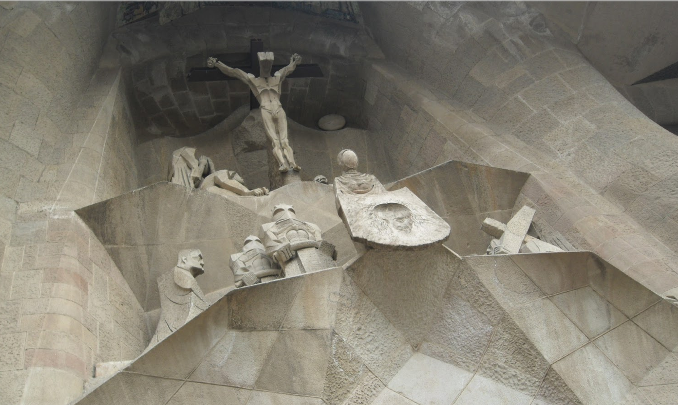
Well, speaking of inspiration, here is some work by Designer Bram Greenen, inspired by Antoni Gaudi. Although most will recognize the iconic structures by Gaudi, few are aware of the beauty of his detailing, and the amazing connection to the forms and therefore structural integrity of nature.
Brams work is not only beautiful, but is truly based on a Gaudi connection.
http://www.bramgeenen.com/projects/
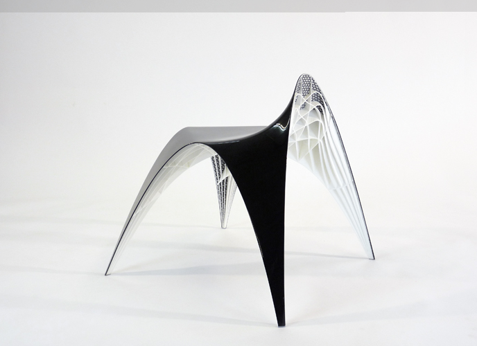
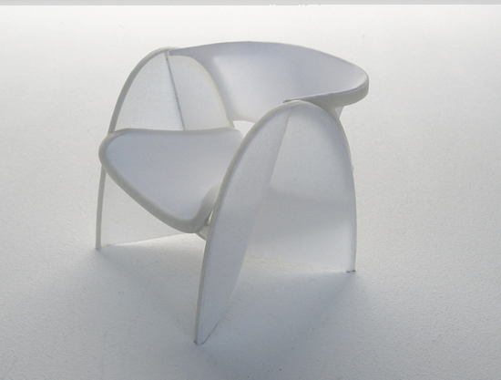
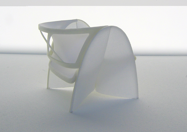
-
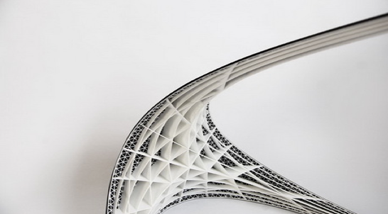
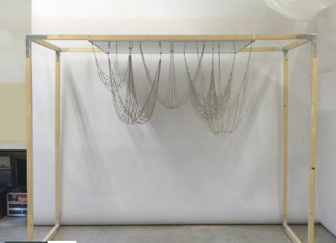
Bram follows in Gaudi's footsteps by adopting some of his natural forms methodology. Gaudi studied natural forms not just for aesthetics but for structure.
One of his methods was to hang chains to determine the forces that played on a natural configurations of arches and curves. An Image from Bram's site showing at how he arrived at the arches in his stool designs, following the Gaudi tradition.
-
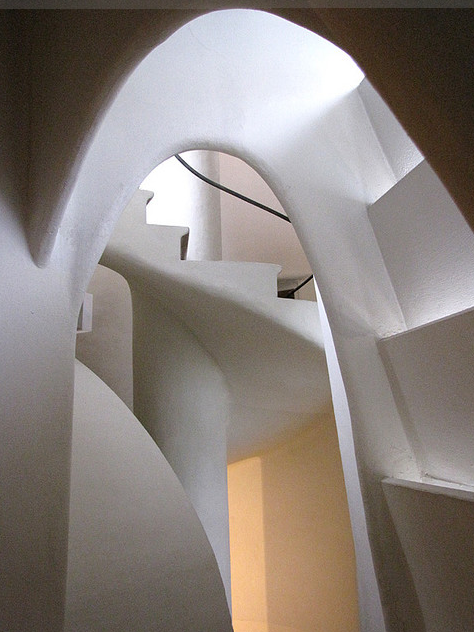
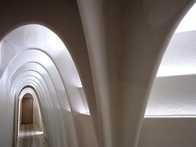
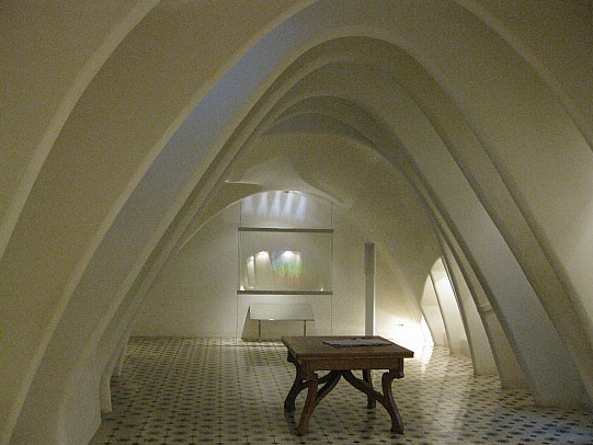
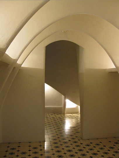
And as for Guadi, here are some images of his Casa Batllo.
-
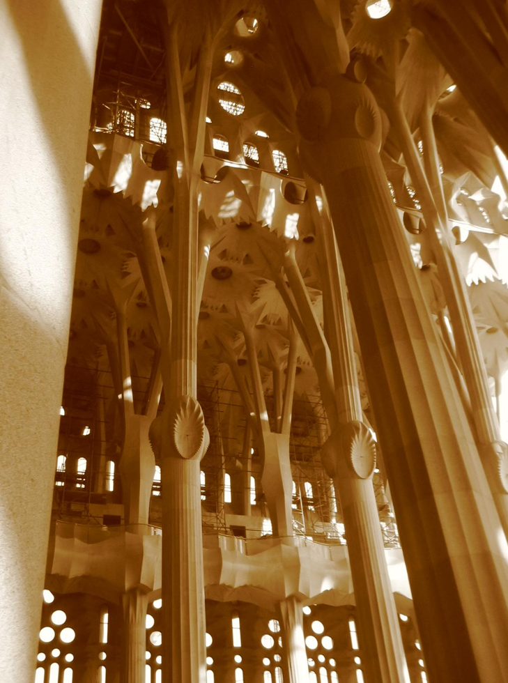
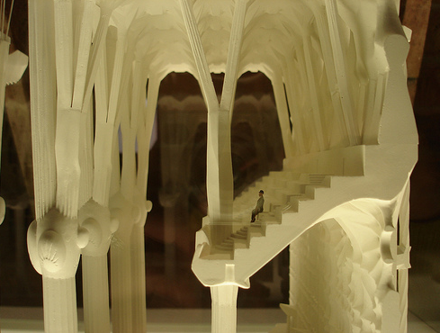
The structural integrity of Gaudi's columns, which get ever slenderer and branch as they rise, following a combination of the structure of trees, and the joint of bone structure.
What they accomplish is structurally incredible, accepting the load spread over larger surfaces, but also retain a quality that is visually amazing.
-
detail both small and monumental. (Thanks to Bram Greene for reminding me of the work of Gaudi)
-
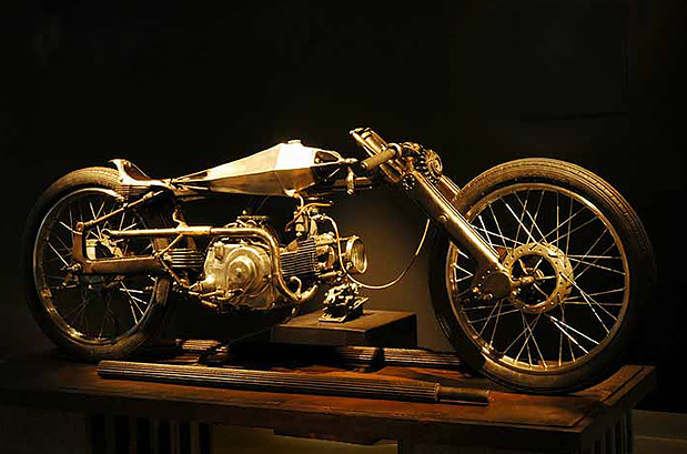
Shinya Kimura
http://vimeo.com/16981453
(can't seem to embed vimeo... but watch the vid, its really well done...)I'm not much of a motorhead... but this stuff is pretty incredible - steampunk / art / sci-fi:

-
-
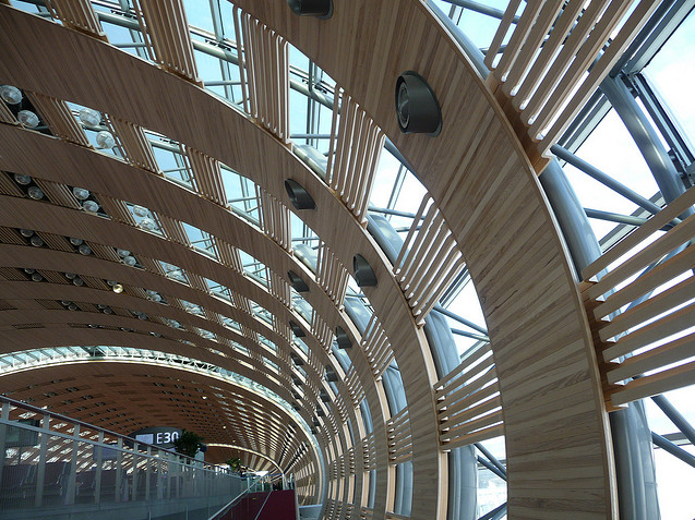
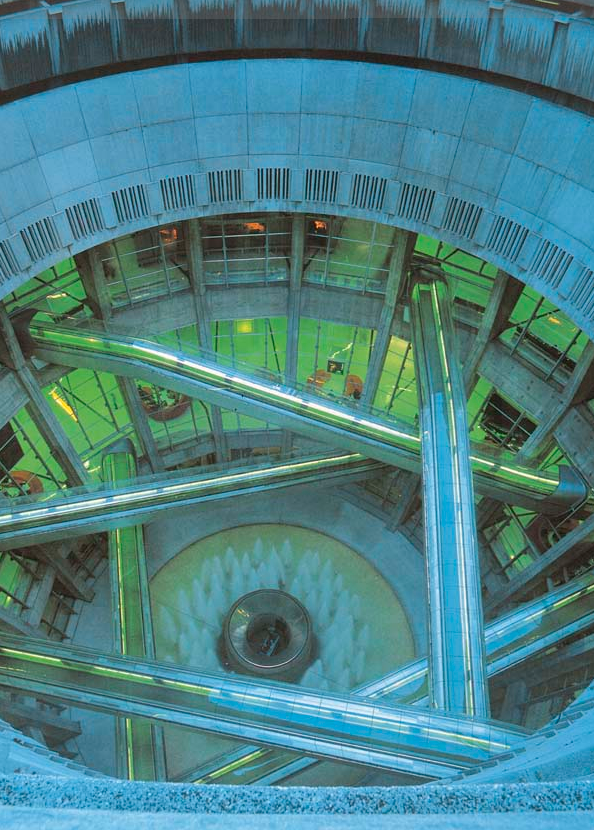
Charles de Gaulle Airport Architect Paul Andreu http://www.paul-andreu.com/pages/sommaire_gb.html
The design for this airport was initiated in 1972. The project completed in 1982.
I think the design will stand the test of time.
-
Fascinating creative energy. Steve Watson http://www.steve-watson.com/
Skase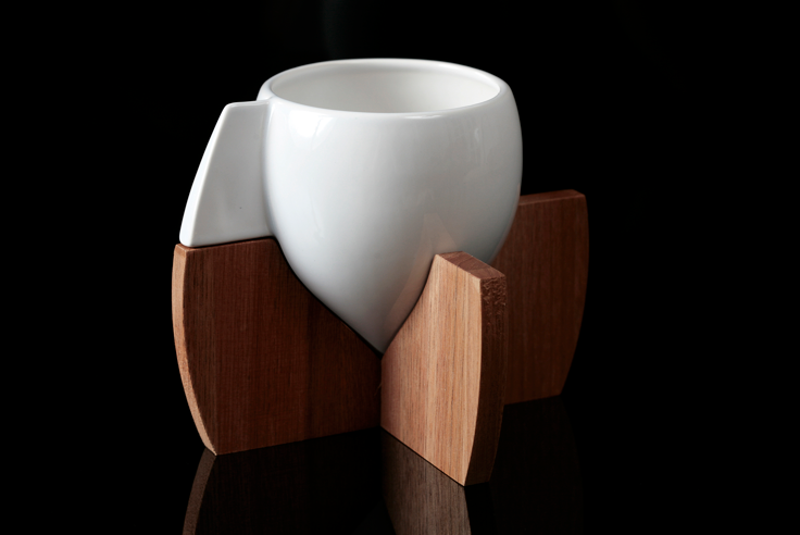
Flex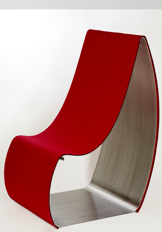
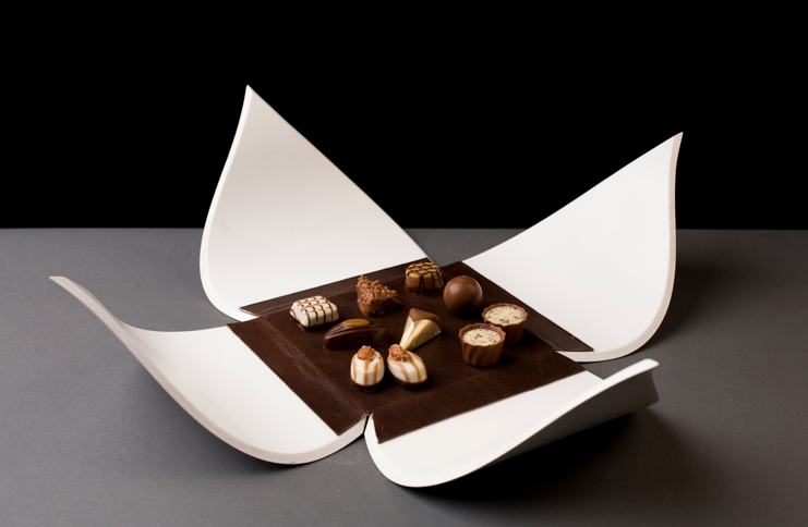
pt4 display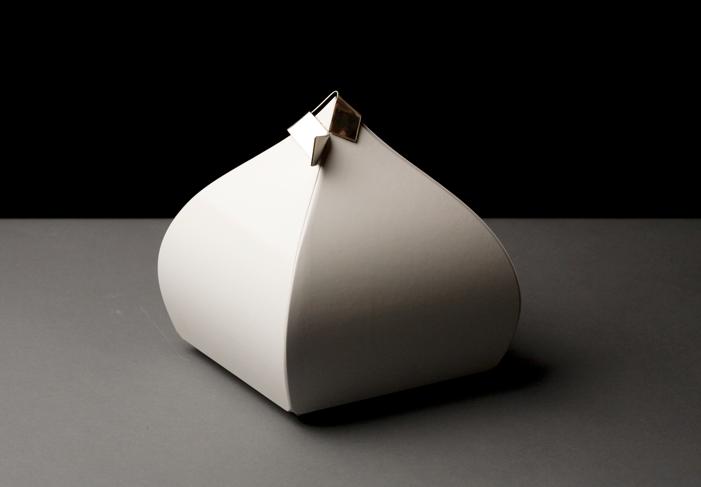
Push Chaise Lounge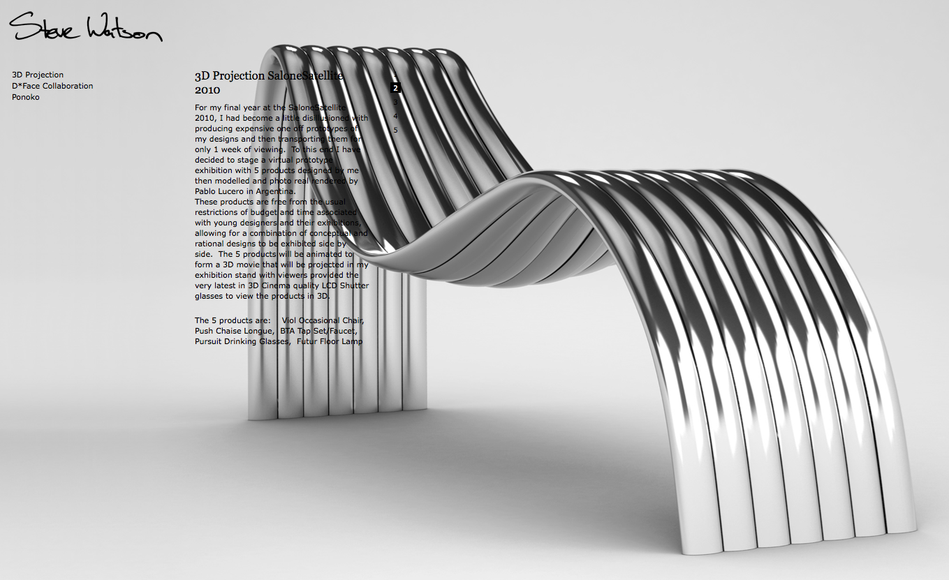
-
Opinion: While Mr. Watson's "Push Chaise Lounge" may be pleasing and interesting in so many ways, I am concerned about the readability of the text superimposed on the image. Presentation is an element of design, and is subject to design. And communication is an element of design, also subject to design.
-
@mitcorb said:
Opinion: While Mr. Watson's "Push Chaise Lounge" may be pleasing and interesting in so many ways, I am concerned about the readability of the text superimposed on the image. Presentation is an element of design, and is subject to design. And communication is an element of design, also subject to design.
I have to agree, and I searched his website for another image of the lounge, because not only does the text take away from the image of the lounge, but the lounge makes it impossible to read the text.
Most of his other design work has individual high res images available in a download link on his site, but this doesn't.
So in the end I guess I decided to include it because I was intrigued by the form. (In my mind I was also wondering about the appropriate choice of materials in terms of comfort, and thought this might spark some discussion as well.)
But in the end I post some of these designers because I see a parallel between them and some of the members of this forum.
Highly creative, often independent, very self motivated, and usually self confident enough to express opinions both through their work, and their posts.
Thanks for the input. -
Well, dale:
Regarding selection of materials for the Chaise Lounge, I did not have an opinion, because with a sculpture background, I perceived that this was an exploration. As I said, the object is pleasing for its visual sensuality? whether or not anybody lounges on it.
How about women's high fashion clothing design? Some of those, a lady can't even sit down in, and certainly can't throw them in the washer.
I think this person is a good designer, with sensitivity and creativeness. Sometimes good design will venture well away from the path of pure function, and vice versa.I appreciate this thread, too. It certainly makes me think a lot.

-
Nothing new under the sun ?
-
@larsen said:
Nothing new under the sun ?
Haven't read it, but I shall, thanks.
Copyrights prevent me posting a direct copy, but here is a link to English pdf version.
http://translate.google.ca/translate?hl=en&sl=fr&u=http://classiques.uqac.ca/classiques/Alain/propos_esthetique/propos_esthetique.html&ei=1nRJTa3TNpSksQOzrs35Cg&sa=X&oi=translate&ct=result&resnum=1&ved=0CB8Q7gEwAA&prev=/search%3Fq%3Dpropos%2Bsur%2Bl%2527esthetique%2BAlain%2BEmile%2BChartier%26hl%3Den%26client%3Dfirefox-a%26hs%3Dntz%26sa%3DG%26rls%3Dorg.mozilla;en-US;official%26channel%3Ds%26biw%3D1336%26bih%3D708%26prmd%3Divnso
Now that's a link
-
-
I saw Jansen's piece on TED.com and was amazed, then. These examples are really "stepping out".
-
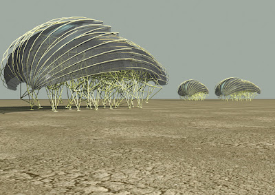
Theo Jansen Kinetic sculptor
http://forums.sketchucation.com/viewtopic.php?f=179&t=15953
janv 2009

 simon
simon -
I have been following Theo Jansen's work for quite some time, and it is a real faux pas to have not included him in this thread. Thanks for correcting that.
This man amazes me. -
The Sydney Seafood School
Designer Michael McCann of dreamtime austrailia design
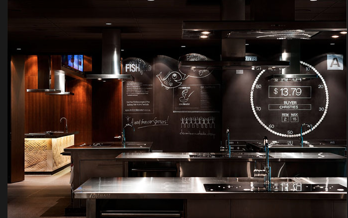
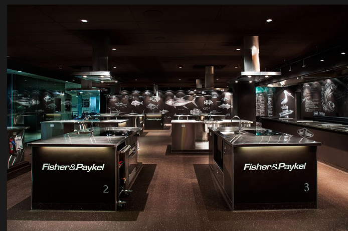
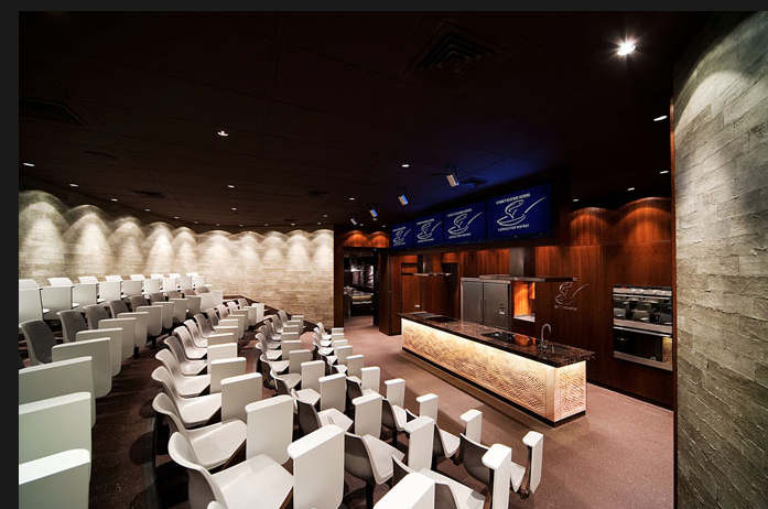 http://www.dreamtimeaustraliadesign.com/
And his Cardboard Bar Melbourne
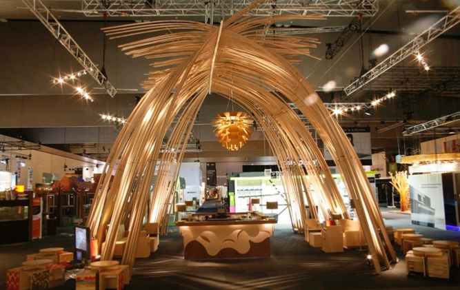
And a residential design.
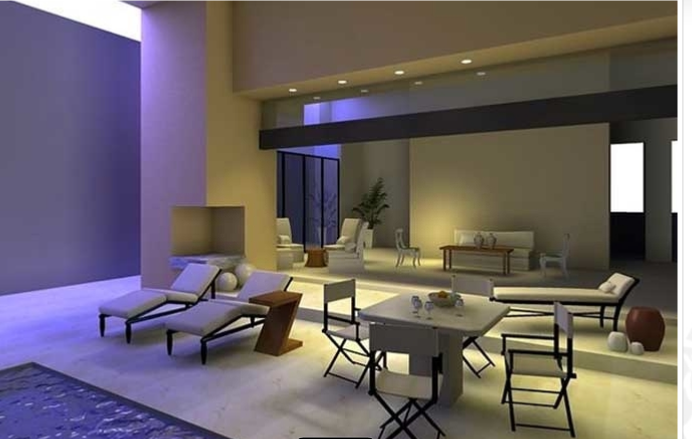
-
Since we have ventured into the art world...
Tom Fruin Kolonihavehus Copenhagen, Denmark
http://www.tomfruin.com/
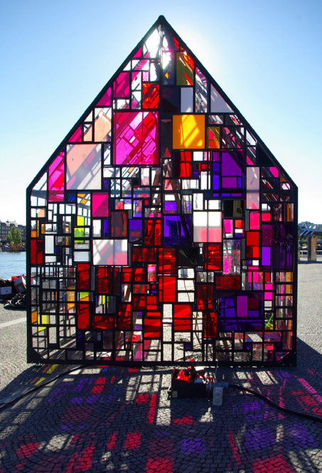
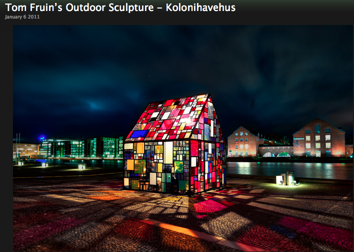
Hello! It looks like you're interested in this conversation, but you don't have an account yet.
Getting fed up of having to scroll through the same posts each visit? When you register for an account, you'll always come back to exactly where you were before, and choose to be notified of new replies (either via email, or push notification). You'll also be able to save bookmarks and upvote posts to show your appreciation to other community members.
With your input, this post could be even better 💗
Register LoginAdvertisement
