A Thread for Fine Design
-
@dale said:
very uplifting
Took that up to the castle a couple of years ago, surprisingly large for as little traffic as there was. I suppose it depends on what events are being held at the castle, though. There are lots of "modernizations" occurring at the castle, not sure that I liked them at all because they were not in keeping with the castle's age at all; but OTOH it was good to see new life being breathed into the castle rather than allowing it to rot into ruin.
-
Must have been an interesting tram ride, but,sometimes the trend to add the modern to the old works, and sometimes it really doesn't (IMHO)
-
@dale said:
Must have been an interesting tram ride, but,sometimes the trend to add the modern to the old works, and sometimes it really doesn't (IMHO)
I think that "the more it's a ruin, the more modern you can be". The Neues Museum refurbishment in Berlin seems to be a good case in point (haven't been there yet myself, but seen photographs).
Anssi

-
@anssi said:
I think that "the more it's a ruin, the more modern you can be". The Neues Museum refurbishment in Berlin seems to be a good case in point (haven't been there yet myself, but seen photographs)
For me that works,as it adopts the defining lines of the original.
-
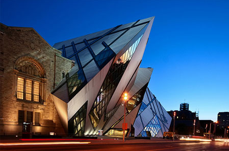
This one will start a conversation though. (Royal Ontario Museum addition designed by Daniel Libeskind.)
-
@dale said:
This one will start a conversation though. (Royal Ontario Museum addition designed by Daniel Libeskind.)
His additions that I've seen pictures of look like cancers eating the older building. This one is more like a collision of alternate universes or a time-transport mistake. You either go for it or not. Apparently enough people like it. This one is not so extremely pointy, better for my tastes than some.
Wine glass: Don't know either but we should try it out fully to judge.
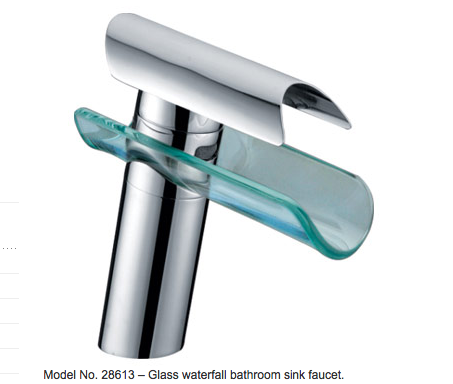
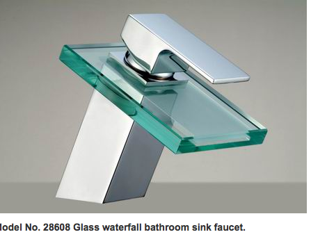
Faucets: is that water going over or inside the glass? If inside, I could see it becoming unsightly with deposits. In some locals you don't want to know what's in your pipes.
 Or maybe you should. I like it otherwise.
 -
@dale said:
This one will start a conversation though. (Royal Ontario Museum addition designed by Daniel Libeskind.)
"Let's see what sticks when we throw some ideas at the board."
-
Are these new additions really good designs? Because they are beginning to look like those tacky curiosities from catalogues like that 'Innovations' one in the 1980's. And I seem to remember that it was the Innovations catalogue that brought us these;
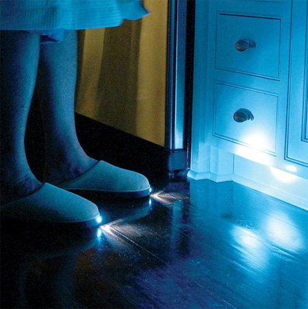

Those duck-billed platypus taps? And as for that wineglass?!
 I wouldn't be seen dead holding that, it looks like it has mumps!!
-
[flash=425,344:3ownewid]http://www.youtube.com/v/vXrAK6sUZ_0?fs=1&hl=en_GB&fs=1&&[/flash:3ownewid]
-
@pbacot said:
Faucets: is that water going over or inside the glass? If inside, I could see it becoming unsightly with deposits. In some locals you don't want to know what's in your pipes.
 Or maybe you should. I like it otherwise.
It looks like they have some that flow over, abut as you can see with the attached the one looks like it has a square slot that the water runs through.
This next one looks like the water flows through the glass, and your right on some systems this would be scary.
-
@tfdesign said:
Are these new additions really good designs?

Well I do think that it is certainly very subjective, and I really enjoy seeing others take on some of these objects. I probably should have named the thread "A thread for Intriguing Design", or maybe "Fine Design?"
-
Well yes, there is a point where 'good' design can go one step too far, and step into the realm of the over engineered, and somewhat ridiculous.
-
lol

[flash=425,344:38dy4vbp]http://www.youtube.com/v/wDmQaZm_a3U;hl=en_GB&fs=1&&[/flash:38dy4vbp]
-
@tfdesign said:
Well yes, there is a point where 'good' design can go one step too far, and step into the realm of the over engineered, and somewhat ridiculous.
Although I still think fine design is subjective, are there then objective attributes that define it?
Is it only usefulness, function,(after all a cell phone can be quite useful, while its UI design can be virtually dysfunctional in reality). Is it innovation? How much do aesthetics contribute? (and who decides)
What give an object a pleasing personality, an appeal? Physical presence? Psychological suggestion? Symbolism? Comfort?
Are we really all victims of marketing, or are the markets (and therefore designers) just reacting to public trends? Do we define trends, or they?
Is there one object that really exemplifies fine design in everyone's mind? -
Excellent bit of Dr Who there Bohdan!
 Rowan Atkinson certainly makes a highly entertaining Doctor!!
Dale, I wish I could say the same for Apple's process of writing and updating iOS apps! It's a bloody nightmare!! A good example of over engineering.

Yes- I've got an app in the Appstore, and oddly enough, it has a Dr Who theme!

Good design you ask? Oh I wish!


-
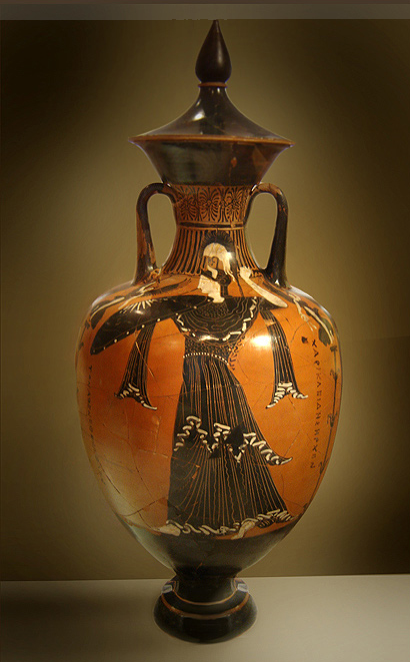
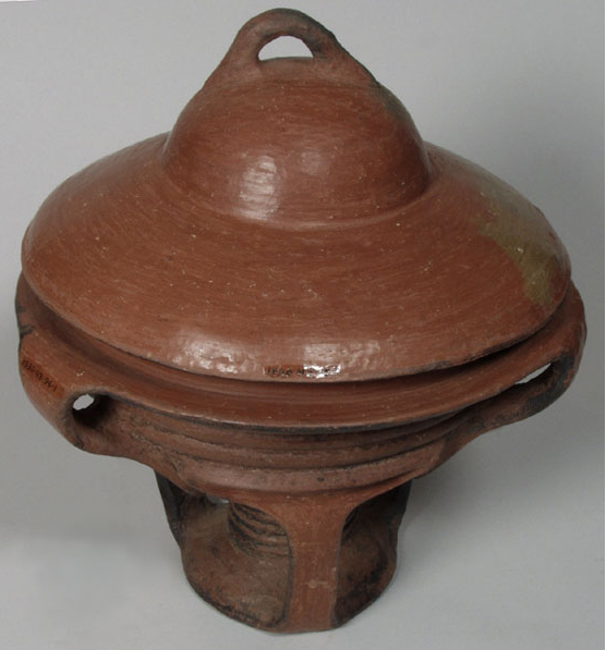
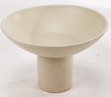
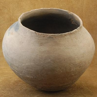
vessels (A hollow or concave utensil for holding anything; a hollow receptacle of any kind, as a hogshead, a barrel, a firkin, a bottle, a kettle, a cup, a bowl, etc. [1913 Webster])
Both modern and antique
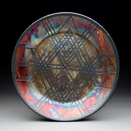 http://www.etsy.com/listing/34871677/copper-sand-raku-plate




-
-
I think I've got all the others. I need to run out and get me a firkin

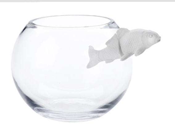
That fishbowl is cool. It would be even cooler if the fish figure were somehow continuous through the glass wall.
-
@utiler said:
That's the coolest thing I've seen for some time, Dale; nice find!
When I saw this I thought "It's about time", not just cool but practical.
This was from a student design competition sponsored by 3M at the Ontario College of Art. 3M is going to produce the winners submissions. Another, is posted below (by Scott Currie)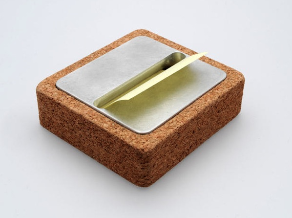
mitcorb, I agree about the fish, (or at least they could have adjusted the camera angle so you couldn't see the cut) I found this when I was doing some research on porcelain.
-
@mitcorb said:
That fishbowl is cool. It would be even cooler if the fish figure were somehow continuous through the glass wall.
Do you remember this;


The Headington Shark, Oxford
Headington, Headington Oxford, Headington News, Oxford, Headington Shark, History of Headington, Shops of Headington, Where to stay in Headington, Headington Market, Headington Market, Pubs in Headington, Restaurants in Headington
(www.headington.org.uk)
Hello! It looks like you're interested in this conversation, but you don't have an account yet.
Getting fed up of having to scroll through the same posts each visit? When you register for an account, you'll always come back to exactly where you were before, and choose to be notified of new replies (either via email, or push notification). You'll also be able to save bookmarks and upvote posts to show your appreciation to other community members.
With your input, this post could be even better 💗
Register LoginAdvertisement


