Design Proposal
-
Here is a series of images I created for a building renovation in North Alabama.
Unfortunately we did not win the contract but I got some nice portfolio images out of it.SU and FotoSketcher
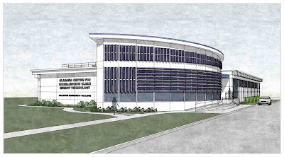
1600 px wide:
http://2.bp.blogspot.com/_vwHulONym58/TFIzl0gWuOI/AAAAAAAAA4Y/PBjvb65UIrY/s1600/210.jpg
1600 px wide:
http://4.bp.blogspot.com/_vwHulONym58/TFMn8A22eFI/AAAAAAAAA4g/Dc7BNYlOsKE/s1600/220.jpg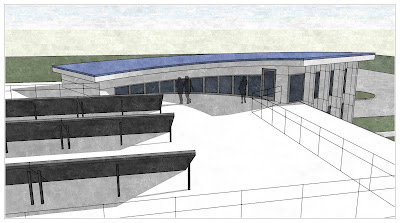
1600 px wide:
http://2.bp.blogspot.com/_vwHulONym58/TFQsMg5lPKI/AAAAAAAAA4o/hyFs7OqrjSA/s1600/230.jpg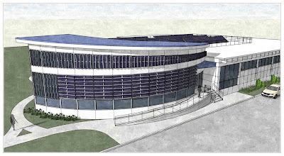
1600 px wide:
http://3.bp.blogspot.com/_vwHulONym58/TFUb2Q2aS7I/AAAAAAAAA4w/T-ScoLqOU7o/s1600/240.jpg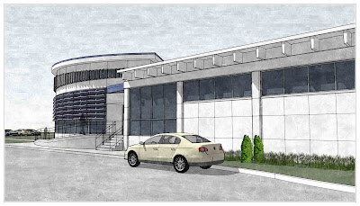
1600 px wide:
http://3.bp.blogspot.com/_vwHulONym58/TFeBAYiIHVI/AAAAAAAAA44/jMhFq_lX7h4/s1600/250.jpg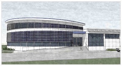
1600 px wide:
http://4.bp.blogspot.com/_vwHulONym58/TFixmx0ufeI/AAAAAAAAA5A/mwGVUKWvJhA/s1600/260.jpg -
Great composition on each Eric and I like the sketch effect very much
 . It's difficult to know how far to take visuals for pitch work, and maybe time is an issue, but I think colour and a bit of life of some sort is always a good call when trying to sell a proposal.
 -
Looks good, love the FotoSketcher. Haven't used it yet for a schematic image yet, but I am gaining inspiration.
-
Really nice presentation, Eric...!
-
Nice effects. How did you manage that? It looks like simple SU with an overlay pattern added in PS? But you handled some areas, like the dark windows differently. So this was a sort of design competition, just to get the job? Is this a sign of the times?
-
Thanks guys.
Peter, I mentioned in the original post that I used FotoSketcher for these images. There are a few threads in the gallery showing examples. For this one I used Painting 6 (oil Painting) and just played with the sliders until I was happy.
http://www.fotosketcher.comThis was not a design competition, our firm was submitting a design proposal. We had about 10 hours to work on the images prior to delivery.
-
Oops, sorry to have missed that! I have been watching the FS posts. Now I must start using the PC partition on the Mac and get FS. This is a great one, and these images use it with subtlety and effectiveness.
-
NICE design and presentation Eric!! On some of the images though I just wanted the camera pulled away just a bit more. I know sometimes this is hard particularly when you are limited with time to attend to any context. Though in that I think lies the trick in getting away without consuming context into a scene without needing to fade out the extents - this for me often spoils a nice image when used to demonstrate a contemporary design, they tend not to mix. I think you just got in on the balance of that aspect!
Well done again mate! Rich
-
Thanks Richard, I appreciate that.
-
I just wanted to echo what Richard said. Excellent presentation. Only a couple comments. I think you could have shown more sky than ground by selectively cropping the images, and the sky through Fotosketcher sometimes looks gloomy. Would you mind if I used one of your images and did a quick fix tutorial for this?
-
No problem, sure.
-
Thank you Boo. Here is the quick sky adjustment tutorial.
It's pretty basic but masking can be used for a lot of things. You can also use exported hidden line views as a way of selecting the sky easier.
http://forums.sketchucation.com/viewtopic.php?f=18&t=29943 -
If i may comment...?
I really like the style of the images but they seem a bit lifeless, more peoples running about the place would give it more dynamism for sure.
Its maybe personal preference but i dont like seeing photos or images of wonderful buildings devoid the people they were designed for! Unfortunately, a favourite past time of the architect...
-
Thanks for your input Joe, I appreciate it.
Hello! It looks like you're interested in this conversation, but you don't have an account yet.
Getting fed up of having to scroll through the same posts each visit? When you register for an account, you'll always come back to exactly where you were before, and choose to be notified of new replies (either via email, or push notification). You'll also be able to save bookmarks and upvote posts to show your appreciation to other community members.
With your input, this post could be even better 💗
Register Login


Advertisement