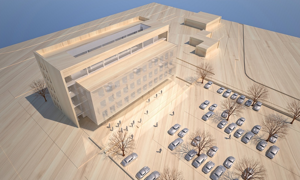
SU-Maxwell- scale model in wood
-
Hi,
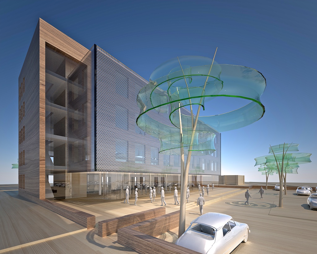
made this "scale" model for a client. This was done during the design process, just to quickly show around without any decisions made on the materials to be used.
Francois
-
The wood and glas materials are looking funny. I like the trees.
-
I like the trees also!

-
Great image
 Materials are very good. The only crit is on the trees, too low poly IMO.
 -
We did not do the design for the building but we did for the tree. TX.
Its low polygon for good reasons, try a dozen and the high polygon version does not make you happy. Anyhow, the tree was sketched in SU, then modelled in Modo and then imported back into SU.The glass looks funny since glass does look funnier than you think, its rendered unbiased. These models are not meant to do anything else than quickly set up a rendering at a moment nothing but the general shape is concieved. As long as the client feels we did our best its fine. We are not looking for the perfect scalemodel lookalike. Modeling and rendering should be done in about a day.
Francois
-
very nice model. i think it may present better if the base was a flat color (maybe pale grey) though, would highlight the building better.
 i'd like to see it for comparison.
-
I kinda hate and love the trees at the same time. They are very distracting from the architecture. They are too formal and give the impression that they themselves are the architecture and the focus of the image. (they are quite a nice model though, elegant
 ) If you are trying to achieve a scale model appearance then i don't think it works.(when do you see glass trees/blue sky in a scale model?.....the illusion is immediately lost) It appears full size even though you have timber texture to floor etc. I know you are not trying to achieve real scale model look-alike but I think your styles are too contrasting.
its still a nice image but I think you need to work on the focus and what you are trying to achieve. anyway thats just my opinion I am sure your client was happy. good verticals

-
@unknownuser said:
Its low polygon for good reasons, try a dozen and the high polygon version does not make you happy.
Oh, really good reasons... So if you can't handle high poly models better you don't make so close-up views.
-
Looks like a very compelling image to me. Oli has made some very good points I think though. I'd like to add that if you try to achieve a 'scale model' effect you should go for a shallower DOF or a more realistic viewpoint. The trees, albeit lowpoly which doesn't bother me that much, are awesome.
If by any change you called it a "scale model" but meant massing study or prelim, I'd suggest going for more of a clayrender-type approach, maybe with a line-overlay.
Btw, is that a Citroen DS in the foreground???
-
MAJOR FAN of those trees
they are dope

I really really like this image. Something just clicks for me.
I think its the mood. -
Well it works for me, I love it and it's very cleverly done imo.
The main tree does distract a little but it is impressive and at this stage is not overly important really. -
TX all for the comments and suggestions. All have a certain truth to them and are appreciated.
The woodtextures do look better when larger, just to make you feel its just a model. Actually they were larger but I reduced the size with finer grain since the texture wasn't really at its best to show any larger, iow, it was showing pixel at larger scale.
The low polygon trees only distract people who are into 3D modeling. But I am also more comfortable with smoother glass on the trees. We have endless smoothness in Modo really and we might for closeup use some higher polygon trees in the future. Btw, get Modo if you can, its a great app to go along with Sketchup and you no longer need to scan the plugin index here for organic modeling tools.
That's a DS is the foreground...and a Porche in the distance.
I have tried clayrender models but clients are not very impressed, somehow they seem a little underwhelmed by anything less expensive looking...I like the trees distract the viewer, actually I am always hoping the trees will, in the studies and in real life. Regretfully usually the buildings are the cause of distraction obstructing the view. I like to add a little critism to my innocent presentations...
But I should have added the other views that are done with this one. Making the tree in the foreground not a problem, being only one view out of 4. I tried to add more images but this board only allows me to add one, no matter how many times I tried to add more. I am on OSX though, that might be a bit of a hassle with the browser and loading images.
In my daily work as far as designs and presentations are concerned, if the mood is good I am (finally..) finished. Big TX for that comment.
Francois -
Mate for some reason the image took sometime this end to load and I got to read all the replies prior to seeing the image so I was half baked after the comments as to what I was going to see!
Then saw the image, scraped my jaw of the ground and smiled! VERY NICE!
Mate I can see a little Stck studio influence here with the vintage use of cars! The trees are simply stunning and the camera perfect! So bloody well done mate!
I have to however agree with Oli, scaling the scene down would have helped a lot with DOF which for me the image is really wanting this might also assist in the tree poly issue!
And mate I see what others are saying with the glass! It could for me use about 3-5% roughness or even the cheap plexiglass material from the gallery though in that case with a reduced roughness. The fully reflective glass is actually causing the excess foreground illumination and this is slightly aver exposing some of the forground elements. Making the glass geo "hidden to reflections" may fix this though I'm not sure though if this will stop reflections on the glass - "hidden from GI" might fix otherwise!
If you ever care to share those trees mate you can father my children! Would like to play with the trunk a bit it seems it needs something a bit more scaled from something, sticks or wire? Not sure!
More images mate!!!!!!!
-
Btw...are you doing this in studio or thru some plugins?
Just a couple of exporting issues & hope you can help.
-
Hi Richard,
tx for all the comments and praisal. There is a lot to improve but I am trying to keep these kind of images done in a day including rendering. This is low budget visualisation working with first sketches of a building. Lateron we will make more realistic images based on these ones.I have been sick just now and I might upload some more images this weekend.
I will think about uploading these trees but I can't promise anything. But really, get Modo, and you can easily make them yourself. I heard Rhino is also going OSX.
I use Studio to render my SU models. But as soon as the new plugin is ready by JDHill I will probably render these images straight from SU. Also a good reason to keep trees low polygon.
Francois -
I like it. It has a certain "whimsy" and yet presents exactly what it needs to present.
Glass? Well yeah, glass does funny things. I found this out when I used to work in the film and video world. I really don't see anything wrong here and in fact, find the reflections interesting.
-
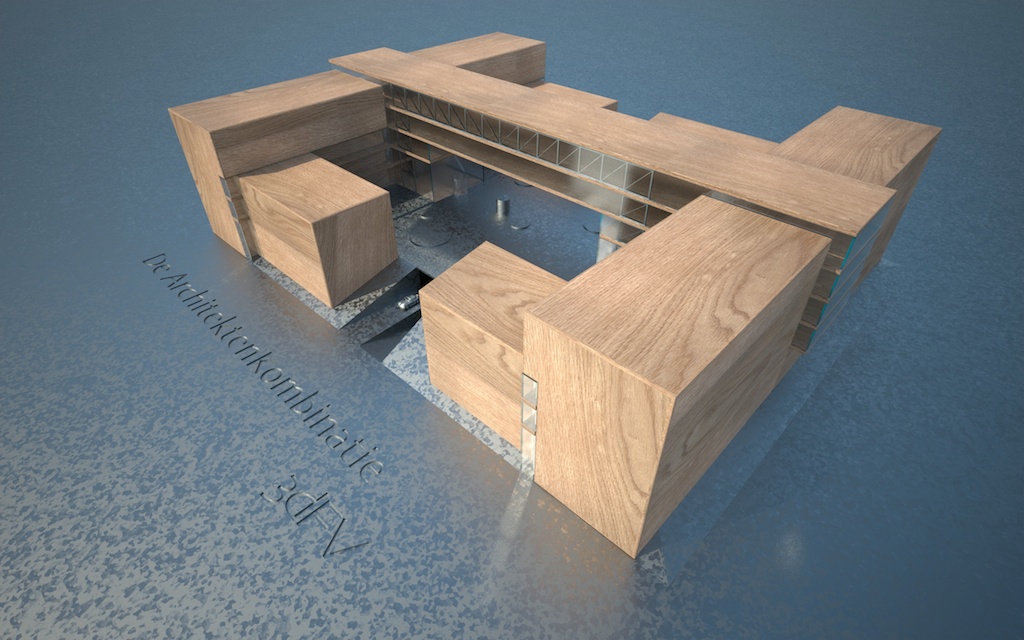
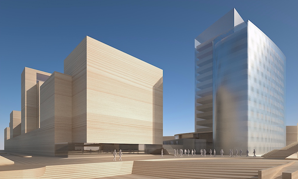
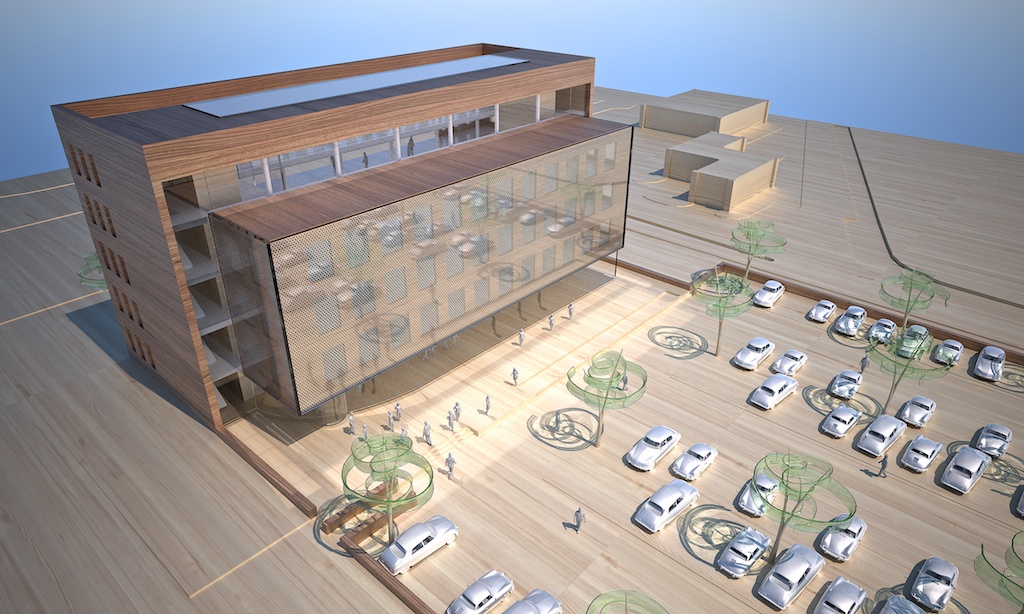
Here some other tests and models we made with SU-Maxwell combo. The trees with the fine branches are from Evermotion added in Studio.
-
When I see my reply only the first image shows up although I added all six,
here's nr. 2 ...of 6
-
When I see my reply only the first image shows up although I added all six,
here's nr. 3 ...of 6
-
When I see my reply only the first image shows up although I added all six,
here's nr. 4 ...of 6
Hello! It looks like you're interested in this conversation, but you don't have an account yet.
Getting fed up of having to scroll through the same posts each visit? When you register for an account, you'll always come back to exactly where you were before, and choose to be notified of new replies (either via email, or push notification). You'll also be able to save bookmarks and upvote posts to show your appreciation to other community members.
With your input, this post could be even better 💗
Register LoginAdvertisement


