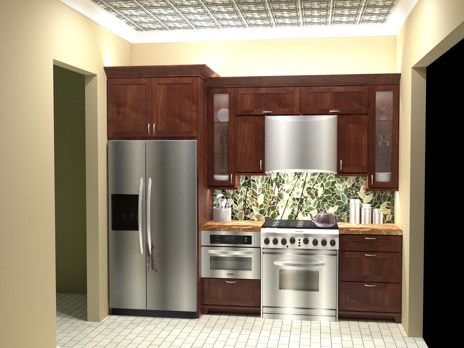
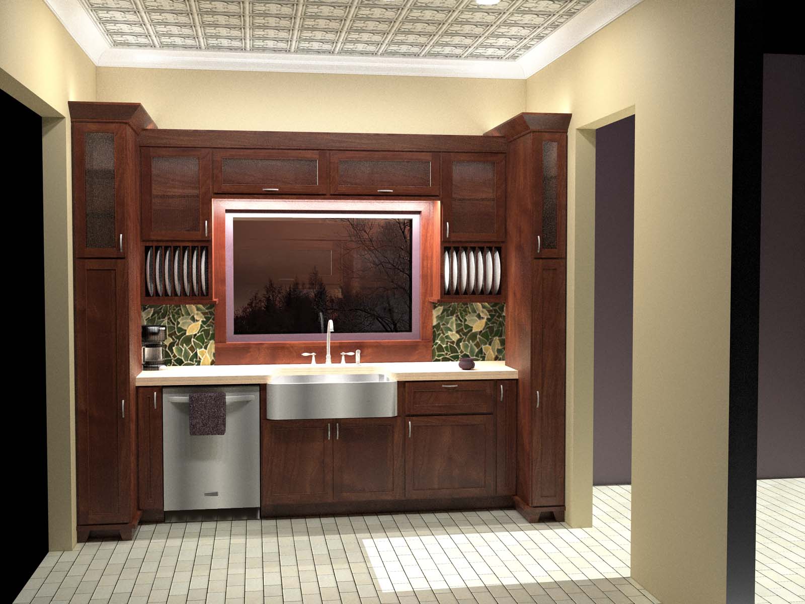
Galley kitchen
-
Oh ya... might as well post this as well. I don't think I posted this yet but if I did I am sorry...I have been so busy lately I can hardly think straight. Quick and dirty but it gives a visual representation of the design. Some elevations. I will tune up at some point when I have some time. Comments always welcome.


-
Nice use of the limited space - i take it that the tall unit to the right is a broom cupboard / ironing board storage?
-
Thanks. Its a custom pantry pull out with adjustable shelves. Fits cans, bottles, small food boxes and whatever. There is a small utility cabinet in the room next to it. This project wasn't for a client...it was a problem solving project for school using a difficult floor plan without being able to do demo work. Thought it was a rather interesting project. You always see things you can improve but I enjoyed it.
-
I like the tile work on the wall. Hired a Art student to do that on a powder room wall once. Black and white broken tiles in my case. How did you model it? Image or faces?
-
Its a mosaic art tile by ann sacks. So I just used a png of the image and added bump and specular. If you look at it you will see a branch along the middle of the image of it in the back splash. It is an incredibly beautiful tile if you ever get a chance to see it in person.
-
That cupboard just looks so small to put your arm into at a depth of 2ft. Looks no wider than 6 inches - I dont do any tall cabinets smaller than 1ft (300mm) wide as they are just too small internally to be of any real use IMHO. Love the tile too, have used a few glass splashbacks recently with a coloured foil on the backside to really lift the design. Works very well in contemporary style jobs.
-
I like this a lot mate.
do you do this stuff for clients or just for fun? -
I agree with you. It would be too thin for standard cabinet. Its 9 wide with a full pull out. still very little room. but the pull out at least makes it usable. If I was to redo the design I would probably do a 12 on that side and a 15 on the other. But since its just a visual concept for the entire home and not a true clients home it will do. I think even if it was a 12 I would still speck a pull out though. Just for practicality.
-
Good use of space, but from my experience in building kitchens, I don't thin the left door of the fridge will open. That because usually the thickness of the doors will require a minimal 100 mm or so added to the width of the fridge.
Cheers! -
Indeed. Ya if it was a real kitchen you are absolutely right. It would need a filler scribe board on the left side of the refridgerator. Good catch. You will also notice that on all swinging doors near the walls or other cabinets.
-
Nice. Compact kitchens are very challenging to design well.
Good job on this one.
Hello! It looks like you're interested in this conversation, but you don't have an account yet.
Getting fed up of having to scroll through the same posts each visit? When you register for an account, you'll always come back to exactly where you were before, and choose to be notified of new replies (either via email, or push notification). You'll also be able to save bookmarks and upvote posts to show your appreciation to other community members.
With your input, this post could be even better 💗
Register LoginAdvertisement


