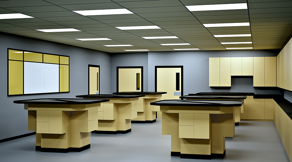
Interior
-
I think that you do not really understand my previous post.
I can see in your render images a real quality and strong render skills.
But it's really a wish for me, show me(us)a "normal" view of a more "normal" project, I am sure that it will be great...
Refer to Pierre Bonnard, I live at 1 mile from is tomb... He was a magician... -
@olishea said:
Sorry I just don't see it. It's just a standard, poorly rendered laboratory with horrible lighting (the reference)!
I know!
 I've been trying to achieve the same "poor" quality (using Vray) since this morning! Here's a fro:
@olishea said:
art is opinion anyway mate
Yep.
Fred, I don't think you understand me. I'm not an architect! Nor am into architectural visualisation! I may use some of the same tools, and vocabulary, as architects and archviz people do, but my objectives aren't the same as theirs.
As for Bonnard - he indeed was a magician.
-
Didn't mean to sound shitty sorry, I haven't had my coffee today!
nice fro

-
You needn't apologize, Oli. As you said, art's about opinion. I'm cool with that. There's loads of artists whose output I'm not fond of - I won't be writing them a letter of apology anyday soon.
-
I'm not sure I like it. But that's good in a way. I like being provoked.
I'm curious about scale here. I see this as a small, jewel like object of sharp, ugly geometrical forms like a harsh little puzzle that coheres into a geometry of ugly lab furniture. But maybe I'm wrong about that?
This is the first image of yours that provoked a question of scale for me. I wonder why that is.
-
@arail1 said:
I'm curious about scale here. I see this as a small, jewel like object of sharp, ugly geometrical forms like a harsh little puzzle that coheres into a geometry of ugly lab furniture. But maybe I'm wrong about that?
No, that's about right.
@arail1 said:
This is the first image of yours that provoked a question of scale for me. I wonder why that is.
I tried to make it appear ambiguous in this regard. Sort of wanted it to look like an old 'Star Trek' set from up close, and like an angular take on Arp's dadaist reliefs from afar. Not sure if this makes any sense, but there you go.
I'm quite pleased with this image. Though the general opinion seems to be it isn't very good, I feel this is one of the best I've done so far. In printed form (about 27 cm high), and stuck directly to the wall (no frame, and no white border), I think it'd be strangely (and even aggressively) at odds with almost any space one hangs it in.
-
I'm sure it's not the sort of reference you had in mind but it hints at some of the American pre-war geometrical abstractionists, Charles Sheeler and similar. Before the big boys Pollock and Kline started strutting their stuff.
-
@unknownuser said:
The mundanity of the image would be the point. The original struck me as a rather evocative (and somewhat scary) illustration of, ahem, the human condition. I'm sure it wasn't meant that way - but I tried to further exploit what I saw in it nonetheless.
That's exactly what I got from it! With the taps even it would not have left the feeling as open, never answered!
-
@arail1 said:
I'm sure it's not the sort of reference you had in mind but it hints at some of the American pre-war geometrical abstractionists, Charles Sheeler and similar. Before the big boys Pollock and Kline started strutting their stuff.
No, but there's something about Sheeler, though. Saw a painting of his ('American Landscape', a figurative work, not an abstract) at the MOMA. I thoroughly liked it. (Though, obviously, there's a lot at the MOMA to enjoy. What a collection! I had a fantastic day there. Like a kid in a candy store!)
@richard said:
With the taps even it would not have left the feeling as open, never answered!
Sorry, Richard, no matter how I try, I cannot work out what this means. My grip on English grammar isn't quite as firm as I'd want.
-
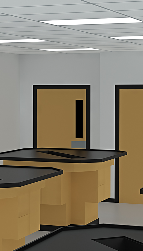
Vray version.
seeks cover
-
Hey, very nice image, I feel a bit a 70's mood, nice and clear...

You use witch version of Vray for SU ? -
1.05.30. The latest version's a bit too buggy, so I reverted. Looking forward to the patch, though, as ambient occlusion does come in handy now and then.
-
Like the first one more than the second. It's gone from Star Trek to Master Chef. But strangely I see faces?
Easter Islandish

-
@unknownuser said:
Like the first one more than the second.
Me too.
@unknownuser said:
But strangely I see faces? Easter Islandish
lol! You're right!
-
@unknownuser said:
Sorry, Richard, no matter how I try, I cannot work out what this means. My grip on English grammar isn't quite as firm as I'd want.
Yeah I'd had a few beers by then!
What I was meaning is that the first image left me with SO many unanswered questions, which I would want the image to do if I conclude correctly your intent. With even the introduction of taps or anything else that gave hint to the use, a few of these questions may have been answered and reduced the effectiveness or impact of the image!
-
@richard said:
Yeah I'd had a few beers by then!
Which begs the question if I'd understood you if I had some myself. I think this calls for investigation. Scientia vincere tenebras!
@richard said:
With even the introduction of taps or anything else that gave hint to the use, a few of these questions may have been answered and reduced the effectiveness or impact of the image!
I do think you're right here. And I know because I've tried - though I suspected it'd be in vain. Also, the printed versions of my images are relatively small. Lots of detail crammed in a small image ... doesn't work.
-
Sorry for bumping this thread. Just wanted to vent how happy I am with Thea. I rendered this image at 6000 x 10560. It took me quite a bit of tinkering and thinking, but I managed to get the render time down to ... 1h 8s.

Yay!
-
My first reaction is to add some primary reds and blues and call it a hommage to Piet Mondrian or Gerrit Rietveldt. Right now it looks like a hommage to DeWalt power tools. This is not a crit, but just a momment what it evokes from my visual memory.
-
I really like the abstract quality when I scroll down far enough to get rid of the fluorescents and T-bar. Then it really would be Mondrian or Rietveld with primaries added.
However I sense that your intention is not to take away the identifiable. -
Stinkie!
Mate it looks like you have used PS's shadows and highlights filter or something akin to that to drag out dark spots yet have at the same time used too small a sampling area and from which you have gained the halo around the inference of dark and light areas. Best exampled at the top edge of the dark benches as they contrast against the background! Just spoils the sharpeness for me. Sorry to be so critical just cant let you get away with that an mage spoilt on hat detail!
BTW is it still too much to ask if we could see some type of compliation of your works so far! Like a video or slideshow, or are you not quite there yet! I'd really love to see a slef compiled work of your progress - from a open eyed fan!
Hello! It looks like you're interested in this conversation, but you don't have an account yet.
Getting fed up of having to scroll through the same posts each visit? When you register for an account, you'll always come back to exactly where you were before, and choose to be notified of new replies (either via email, or push notification). You'll also be able to save bookmarks and upvote posts to show your appreciation to other community members.
With your input, this post could be even better 💗
Register Login


Advertisement