Twilight Render - Regas Challenge
-
Great images, Oli!

Regarding people, as another person mentioned, clients need them. Really... in fact, if they don't see people no matter how good the render most of my clients say "where are the people!? fill it up with people!!!"I think the motion blur is very appropriate considering the exposure time on the cam needed for this shot.
Wish there were a ladder, bucket, and some tools on the floor inside that made it look like he just bought the place and is coming to inspect the work progress before they come in the morning.

-
Thanks Gaieus, very kind of you!!
@unknownuser said:
am not very fond of these "hazed" (moving) people however but that may be a personal taste
yes its personal. I tried greyscale, colour and transparent but a moving figure suited this image better. I have found that 90% of architectural photos with people have emphasized motion blur. seems to add more life maybe, a kinaesthetic.
i added the SU view too....
and a version without the man (just for you gai!)
@unknownuser said:
Nice work Oli.
Thanks Eric, I think it's one of my better ones.

-
very interesting images...U did a very good job at making a fairly bare scene come to life. Congrats at accomplishing a lively scene without having to clutter it with accessories to bring it to life. The background you used is also very nice. Good work bud.
-
Cheers mateys!
@unknownuser said:
The background you used is also very nice
I have shared the background here if you like it. It is number 4 of 6:
http://forums.sketchucation.com/viewtopic.php?f=40&t=27540
@unknownuser said:
Wish there were a ladder, bucket, and some tools on the floor

@unknownuser said:
"where are the people!? fill it up with people!!!"
Man I've heard that one before!
-
i kinda dig the SU textures too.
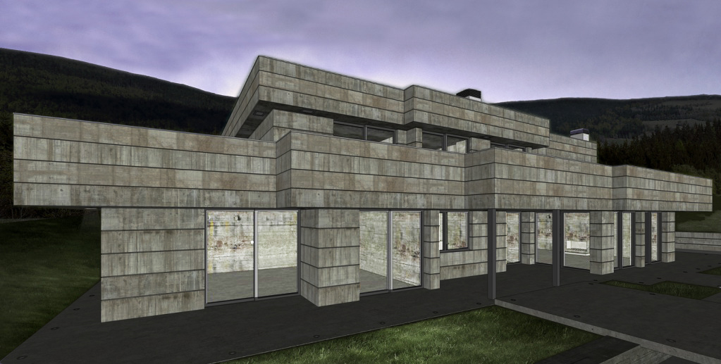
-
I know Thea is amazing, but I do not need it. Twilight is more than enough for me. I would rather totally perfect my twi skills before moving onto anything else. [edit] i also prefer a totally integrated rendering solution. Twi's power lies in the ability to render hidden layers, so its possible to render massive models without slowing down sketchup.
I used unbiased interior + preset (as its a dark scene) and let it cook overnight. But a coupe of hours would have been enough (the resolution is around 2000 pixels wide, so its a quick render to be honest). There are about 10 omni lights for the interior and a several emitters (for the downlights and little LED ones),
sorry frederik, i changed the lighting in the model a bit. I like emitters!
24 inch, dual core imac, 2.8ghz, 4gb ram. Rendered via windows 7 via vmwarefusion. needless to say im waiting for the mac version

i would also kill for quad core

-
Hi Oli. I really like the early morning version. Maybe I'm not up to speed but what is the Regas Challenge?
As for people motion blurr etc, have you seen Iain Denby's work. He put's that to great effect and I think it adds a huge amount to an image. Especially exteriors. For me Architecture is as much about the use as the form. I'd have a party in full swing inside and this guy is a late arrival.
Really good work Oli.
-
@landie said:
Maybe I'm not up to speed but what is the Regas Challenge?
If only you had taken a few minutes to read the first post of this thread...

@olishea said:
Download the original model here:
http://twilightrender.com/phpBB3/viewtopic.php?f=13&t=1461 -
@olishea said:
needless to say im waiting for the mac version

i would also kill for quad core

Is there going to be a Mac version of Twi and if so are they going to do the same awesome licensing thing as Thea (one license fits all supported OS)? I'd give my firstborn for a quad core (although he's married and has kids)

Rick
-
haha xrok...i was actually tempted to overlay the SU view over the render but decided against it last minute...but yeah you share my vision

@unknownuser said:
Is there going to be a Mac version of Twi
YES. JUST DON'T ASK WHEN HAHA
@unknownuser said:
are they going to do the same awesome licensing thing as Thea (one license fits all supported OS)?
YES. thats why I bought the windows version at the introductory price.....so I could transfer the license to the mac version when it comes out
 . It's a beautiful program and so easy to use.
@unknownuser said:
I'd give my firstborn for a quad core
nice, serious dedication there!

Landie....its a friendly non-competitive challenge. Frederik has kindly reposted the link back to the Twilight forum where you can download the model and play!
cheers for all the comments. thanks for stopping by

-
@unknownuser said:
haha xrok...i was actually tempted to overlay the SU view over the render but decided against it last minute...but yeah you share my vision
funny thing is we share the vision but exactly opposite. i overlayed the render, then punched holes in it.

-
Seldom do exteriors, but this is my try with exterior presets and probably you can give some comments.

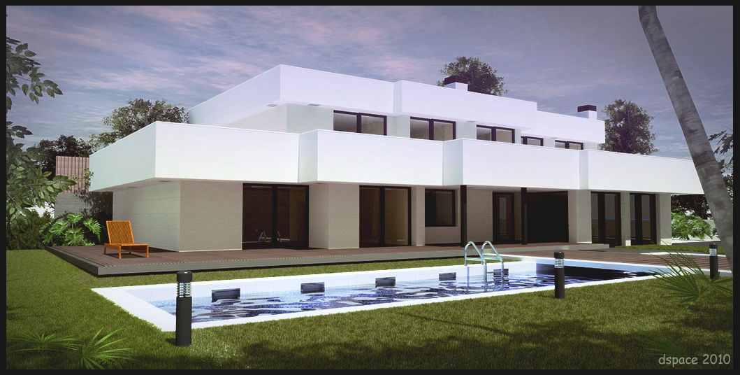
-
other than the white being too white, its very good.
-
@xrok1 said:
other than the white being too white, its very good.
Thank You! Probably I overdid the contrast.

-
nice dspace! yeah white is too much...the details are lost. but hey who cares! its a dramatic punchy image.
for exteriors i like to have a bit more sky showing so the composition is split into thirds....third foreground, third building, third sky. its not a strict rule but it helps IMO.
@unknownuser said:
i overlayed the render, then punched holes in it
xrok1: same thing, no?
 hehe
hehe -
Thanks Oli, kinda interesting rule or workflow!
Definetly you got thing going when exteriors are concern, but I'm just playing around and needs more practice.
-
@unknownuser said:
kinda interesting rule or workflow
it originates from traditional landscape painting.
interiors are so much harder than exteriors IMO, so if you crack interiors then an exterior should be relatively easy!!
-
nice. just downloaded this and need to start playing with it.
i like seeing people and 'life' in schematics, renders, etc.
architecture without people... seems a bit odd to me.
i mean, buildings are typically for people...but your mileage may vary. to each his / her own.
-
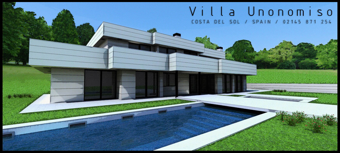
Here's a quick try with podium (Not twilight
 ) and some fiddling with photoshop. Not attempting to be lifelike but still give a good impression of what it would look like.
Using one if Oli's GREAT treelines - cheers Oli! They really are great resources!
-
Just to recap...
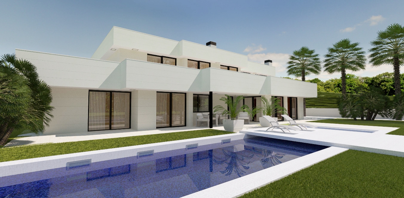
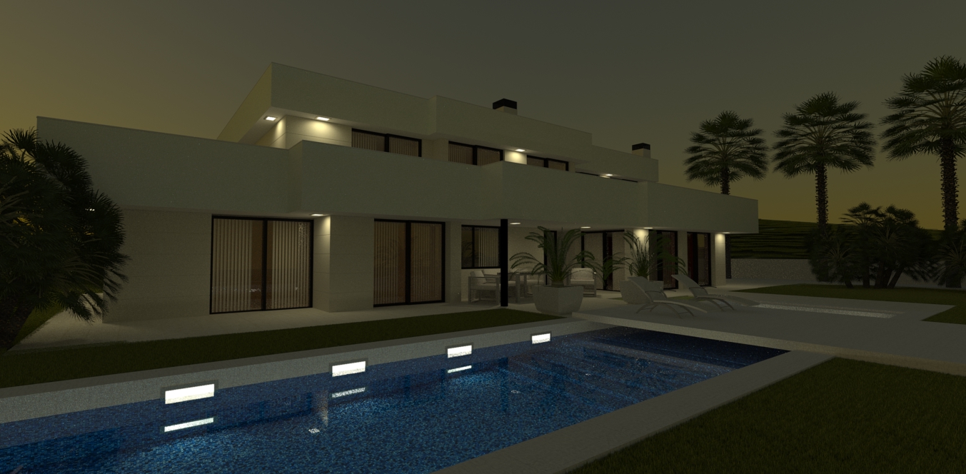
Some month ago I worked on a project where I came across a building in a Spanish magazine, which I decided to model and make available for the Twilight Render community...You can see the original thread here, where you also can get the SU model and try it yourself...
I gave it a swirl in Thea Render and must say that I'm really pleased with the result...

There's still a lot I can do with this model/scene...
Grass is instances from the KT Grass library...
The Mediterranean fan palms are real 3D models taken from the Xfrog Plants | Mediterranean Library...Only post pro in the day-shot is a whitebalance adjustment and then resizing to post the render here...
There's no post pro in the dusk shot... It's a raw Thea Render output...
Hello! It looks like you're interested in this conversation, but you don't have an account yet.
Getting fed up of having to scroll through the same posts each visit? When you register for an account, you'll always come back to exactly where you were before, and choose to be notified of new replies (either via email, or push notification). You'll also be able to save bookmarks and upvote posts to show your appreciation to other community members.
With your input, this post could be even better 💗
Register LoginAdvertisement


