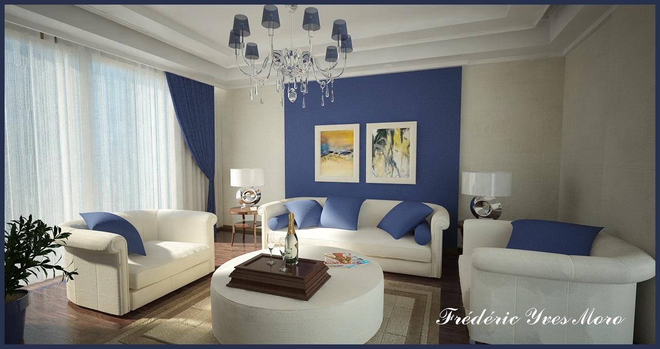
Vray 1st version Living room...
-
Hi All,
The recent amazing renders of Teofas and Nektares made me want to re-use my "old Vray" first version and SU6...

Furnitures are from the "web", imported as 3ds to SU (very heavy models...). The Textures Mapping of the sofas took me 3 hours...
Just a little PP with ACDsee Pro (Contrast, border and signature)Comments are welcome...


-
Great job Fred. I really like your style and am very envious of your ability to get these results. Someday I may be able to produce that level!
Well Done!
-
Many Thanks Dermot, you make me shy...

-
Great stuff Fred, nice scene, colors and lighting, the sheer curtain netting is fantastic.
The one thing that catches my eye is the light shades on the Chandelier, are they glass? if not then maybe less transparency? -
Thanks Pete,
The light shades on the Chandelier are not in glass, I will fix that...

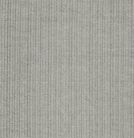
For the curtain, I have used the Maps below without refection, you can see the settings in the screen shot.


-
Very nice work, Fred! The curtain really looks amazing. I don't understand why you stopped using v-ray.
Regards,
Stefan -
Thanks Stefan, It is good to have the choice...

For me, Twilight is really good for some kind of stuff(The Lighting is really amazing), and Vray Of course really good too...
-
Thanks for sharing. It's amazing what you can do with SU and VRay/Twilight. I always like your posts as you'll contribute settings and setups for others to see. Would like to see this output in Twilight to compare results!
That's not a request by the way just a thought
-
Awesome, Fred... Simply awesome...

-
Very cool!


-
Very impressive.
-
Great work bro, your good with vray, imagine what you can do with more practice!!


-
Thanks to all...

Rich, I will make a test with Twilight for the lighting, because in this scene with Vray, I cant add one light because SU crash every-time, It might be the file (120meg)...

Teofas, Many thanks for your comments, I have used your settings "the Teofas visopt", really great...

-
whowzwer.
Looking good. and great color you choose.

-
Im more into the minimal style..
but i must say you did a great job with light
and textures, specially the curtains.
the inferior left side of the image is my favorite.
great job! im very glad you got inspired by our renders.
Hello! It looks like you're interested in this conversation, but you don't have an account yet.
Getting fed up of having to scroll through the same posts each visit? When you register for an account, you'll always come back to exactly where you were before, and choose to be notified of new replies (either via email, or push notification). You'll also be able to save bookmarks and upvote posts to show your appreciation to other community members.
With your input, this post could be even better 💗
Register LoginAdvertisement


