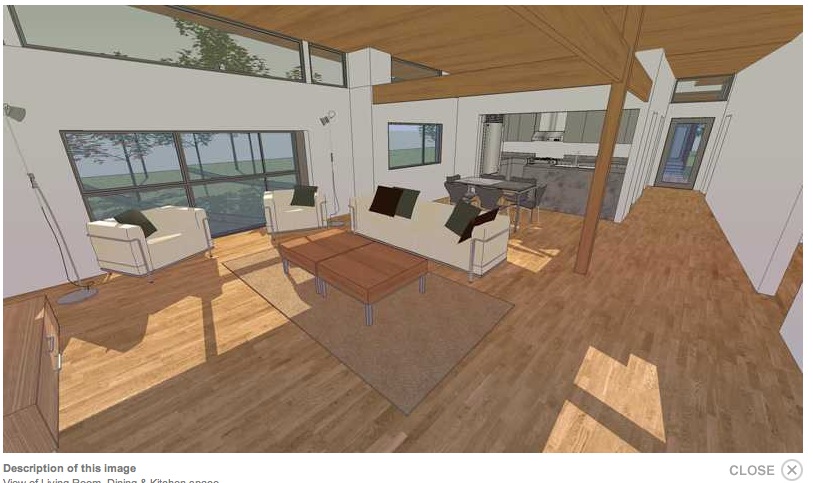
Nock House - competition project
-
Hi cheffey,
Its good to see actual plans being shown here along with exteriors. I have studied your design and think you have addressed the site conditions well. I have a few comments,
a. You might consider providing an internal link lobby between the secondary bedrooms. This would allow these bedroom users to enter the bathroom without having to first go through the open plan living area. Of course the bathroom could still be used for visitors.
b. The middle bedroom has just a north window, or is there a clerestory light? In any case you might consider extending this bedroom so as it would be possible to provide a narrow (slit) window east and west. Making this bedroom larger would allow it to be used as a comfortable double bedroom for kids also. Maybe there could be an option to subdivide it into two narrow rooms at a later stage?
c. It might also be an idea to provide a small WC in the Utility area near the rear door.
d. How about a small 'looking out' window in the kitchen. Its nice to be able to look out to the open while working there.
I think I am familiar with the wind turbine your show. From what I remember about this particular one, there seemed to be good results. I suppose it all depends on where the house is located and the wind exposure it gets. Have you made provisions for solar roof collectors? Just noticed this, http://www.srsenergy.com/Products.aspx, might be a good idea.
I have voted for you and the best of luck.
Mike
-
Thanks for the comments Mike and dozer.
I will definitely work those comments into the design. There are clerestory lights in every room but I do like the idea of lookout window in kitchen.The wind turbine is really suited to higher elevation areas, in the southeast USA we have had good results with wind turbines on the many ridges around the foothills of the Appalachian mtn. range. There are many houses that are essentially off-grid in the area now. I didn't show photovoltaics, because I've heard the same as dozer about the wind turbine. The conduits could be run though to allow them to be installed at a later date. I was trying to use the most cost effective without getting too much initial cost. What I've found in this area it's wind and rainwater harvesting. It could be though; that the initial systems are selected based on region.
Thanks for the vote and comments!
cheers

-
Just gave you my vote also

-
Nice work there, you've got my vote as well. Interested in the hall's varying width; I'm thinking to manipulate interior perspective? Or am I missing something else?
-
@mtntrails said:
Nice work there, you've got my vote as well. Interested in the hall's varying width; I'm thinking to manipulate interior perspective? Or am I missing something else?
The hall would appear to be a dual use area, transit and overflow living area. Its really only a true hall from the front the kitchen to the rear entry, neat planning


-
Mike has it right on target. It's overflow so that the living space can expand. You know when you have your friends over playing wii or rock band!
Thank you all for the support, I truly appreciate it. After this is over with I'll upload an updated version here that addresses those suggestions you guys are giving me. -
Very nice, Cheffey. Two comments: 1) the closet in the master bedroom is too small for two people; and 2) you might consider sliding the garage forward, or rotating it closkwise 90 degrees, so it doesn't block the view from the bedrooms.
-
@cheffey said:
After this is over with I'll upload an updated version here that addresses those suggestions you guys are giving me.
Cheffey, It will be interesting to see how the design develops. I looking forward to seeing your final design, although with all the comments you are getting and probably will continue to get, it may be an ongoing project

I would really like to see more designers showing their works on SketchUcation. It would add a totally new and interesting dimension. Hopefully we see more and more.
-
@mike lucey said:
The hall would appear to be a dual use area, transit and overflow living area. Its really only a true hall from the front the kitchen to the rear entry, neat planning

Yeah. Took a quick look at the plan view, and the overhead beams/ walls didn't register.
 Thanks for pointing that out, Mike. Now it becomes clear...
 -
nice work!!! .. I'd like to ask that how did you create those filled walls in sectional views? SketchUp is modelling... my walls come as hollow on sectioning...
-
Cheffey
I enjoyed looking at your design, it is well considered. I support your selection of a helical wind turbine.
The building I work in has an array of small (residential scale) traditional 2 blade prop turbines which require constant maintenance. The mechanisms that allows them to turn into the wind need regular tweeking. As I understand it, there is also 2 gearing systems, one to increase the number of revolutions that go to the transformer but also a mechanism that restricts their spin in high wind as they could shake themselves apart. This gearing adds a lot of weight to each turbine so they are inherently inefficient. According to the expert that does the maintenance for us helical turbines have nowhere near as many problems! You probably know this Cheffey but I thought it might be good info for somebody else.
-
Cheffey,
I was keeping an eye on the design's progress in the competition and noticed one of the comments,
%(#0000BF)[3/3/2010
Mike: From the living room, you'd see the water closet of the shared bath unless you kept the door close, otherwise, not a bad design.]
I hope you don't think it was me after my above comments in relation to what I said above.
I also noticed this,
%(#0000BF)[3/4/2010
Greg La Vardera: This is a great scheme - I love the play between the two volumes of rooms. And this is something plausible for a middle class home owner to afford. This should have more votes than it does.]
I know Greg from the old @Last Forums. He designs some really cool houses. Receiving this comment from him carries weight ..... so SketchUcation Members! Get your arses over to the site http://www.freegreen.com/whosnext/view/plan-general.aspx?id=43 and give the Nock House a vote.
Mike
-
Cheffy
Nice work
Don't give up on wind yet. Honeywell has just released a new wind generator that operates in winds as low as 2 mph, can produce 2750 kwh /year and is a complete package with inverter ready to install for about $5500 U.S. The system dumps a lot of restricting drag by placing the coil around the tips of the blade.
http://www.earthtronics.com/honeywell.aspx
Good luck. -
Thanks for the comments guys. I don't mind it being a work in progress for a while

I know the Mike that was he's a developer friend of mine. He doesn't care for modern design at all.
I don't let that bother me though. -
@linea said:
According to the expert that does the maintenance for us helical turbines have nowhere near as many problems! You probably know this Cheffey but I thought it might be good info for somebody else.
I had not heard this but I did get have some info on these wind turbines from a local newspaper article about a residence that has been adding wind and solar to bring their monthly bill down. I'll have to see if I can dig that article up.
-
@mike lucey said:
I also noticed this,
%(#0000BF)[3/4/2010
Greg La Vardera: This is a great scheme - I love the play between the two volumes of rooms. And this is something plausible for a middle class home owner to afford. This should have more votes than it does.]
Yup - thanks Mike. I've also entered the competition, but I'm voting for my favorites including Cheffy's. I also had wind generators featured prominently in my scheme although I just made them up - not based on any real product.
I've been bookmarking new small wind generators as I come across them. The Honeywell product is promising as described - the generator is at the rim rather than the hub, so gearing is eliminated. And the vertical axis type also seem simpler. There is a lot of innovation going on with small wind generators. Its fascinating. Some links:
vertical axis:
http://urbangreenenergy.com/turbine.php?id=14
http://www.oregonwind.com/Non bladed - less blade tip noise:
http://www.inhabitat.com/2008/09/03/energy-ball-by-home-energy/
http://swiftwindturbine.com/?r=1
http://www.jetsongreen.com/2009/12/honeywell-wind-turbine-coming-soon.html?utm_source=feedburner&utm_medium=feed&utm_campaign=Feed%3A+jetson_green+%28Jetson+Green%29this one is interesting - vertical or horizontal, and you can build arrays:
http://www.aerotecture.com/products.html -
@mike lucey said:
I know Greg from the old @Last Forums. He designs some really cool houses. Receiving this comment from him carries weight ..... so SketchUcation Members! Get your arses over to the site http://www.freegreen.com/whosnext/view/plan-general.aspx?id=43 and give the Nock House a vote.
Mike
Mike, I agree. Greg has been doing a high level of design work that I've been admiring for awhile. To have him make such comments is a big win for me regardless of how the competition goes for me. It's a total honor to have him give me a vote and even take the time to comment on my thread here. There have been a lot of people come and go from the modern residential scene here in the USA; but Greg has been doing it the right way year in and year out. So, go over and give Greg a vote on his entry as I did!
http://www.freegreen.com/WhosNext/view/plan-general.aspx?id=27
-
@arjunmax09 said:
nice work!!! .. I'd like to ask that how did you create those filled walls in sectional views? SketchUp is modelling... my walls come as hollow on sectioning...
Thanks, I exported the view from sketchup and then did a filled layer above in photoshop and filled in the section. There is a plugin for this but I never loaded it up.
-
Hi Greg,
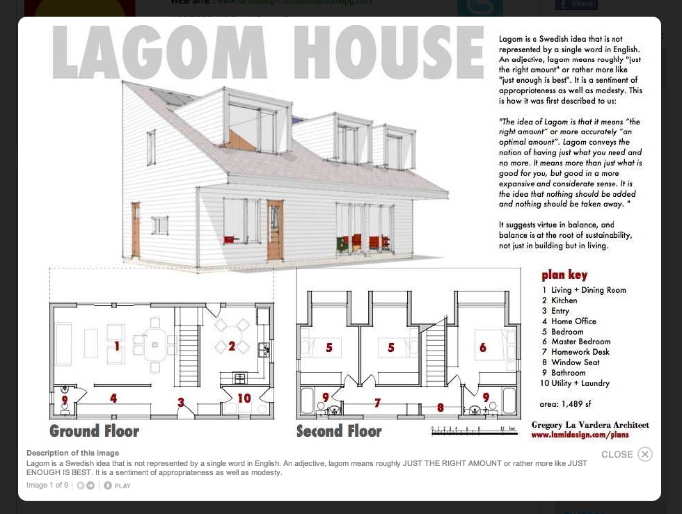
Good to see you popping in here, reminds me of old times at the @Last Forums. I have indeed given you a vote for the LAGOM HOUSE. I've actually viewed design this some time ago as I often check out your site to see what you are up to.
For the members that are not familiar with Greg's work, I am attaching an image. A nicely designed, practical house all under 1500 sq.ft. I particularly like the stairs treatment, dual entry from what I can gather and a widened well to give an anti claustrophobic feeling when using it .... if I am reading it correctly. The dormer window treatment is something that I have not come across before but imagine they serve their purpose well.
Mike

-
Thank you Cheffy and Mike! But I have to protest - this is Cheffy's thread and you both are mucking it up!

I appreciate the vote - things have slowed down a bit there and if we could gain 30 or 40 votes Chefy and I could both punch up in the ratings a good bit - so let fly with the mother of all voting!
Hello! It looks like you're interested in this conversation, but you don't have an account yet.
Getting fed up of having to scroll through the same posts each visit? When you register for an account, you'll always come back to exactly where you were before, and choose to be notified of new replies (either via email, or push notification). You'll also be able to save bookmarks and upvote posts to show your appreciation to other community members.
With your input, this post could be even better 💗
Register LoginAdvertisement


