Ludic Living Room Project
-
Thanks

If someone is interested by these music instruments, I share them on Google download page :
http://sketchup.google.com/3dwarehouse/search?uq=17371800824893020755&scoring=m@unknownuser said:
how did you get these dimensions in there? is it a texture? or 3D text?
These are autocad 2D text view in 3D.
-
@tridem said:
:shock:
 awesome!
just a criticism.. you need a flat TV
So, a little update with flat TV ...
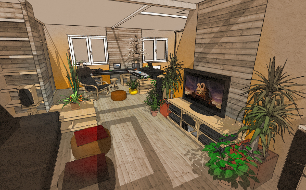
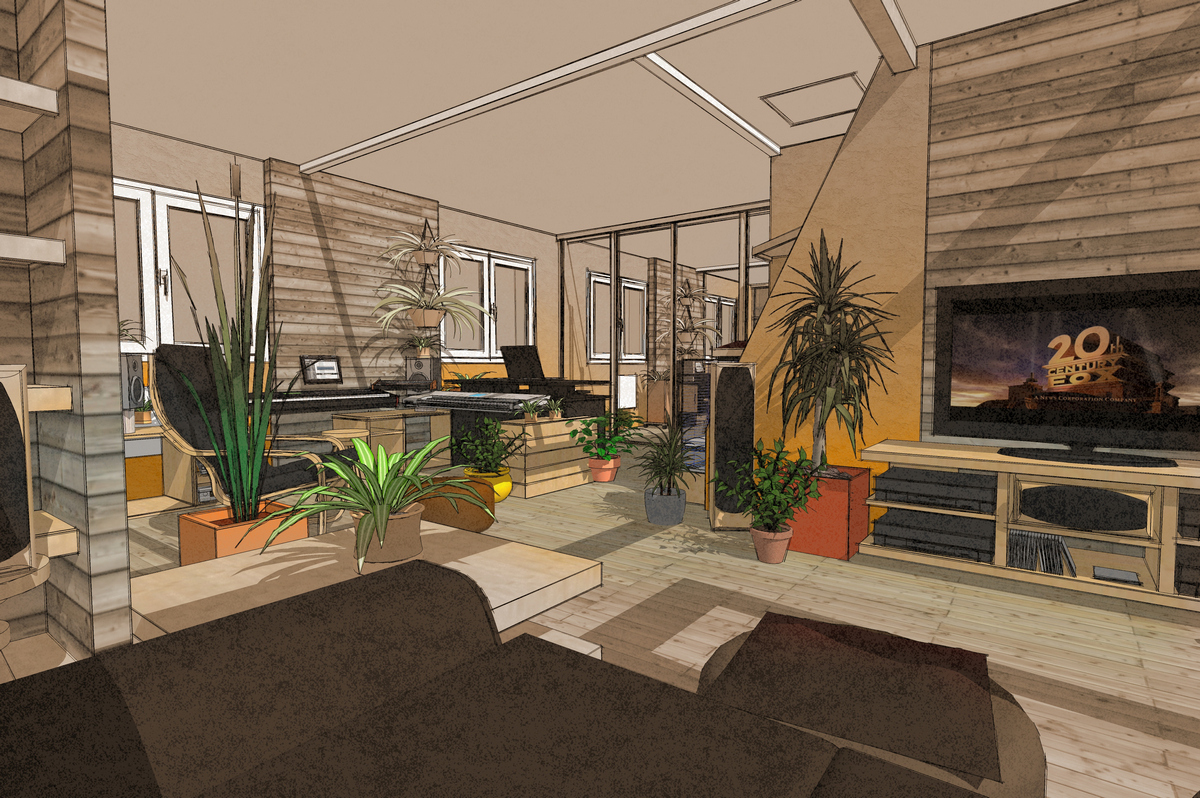
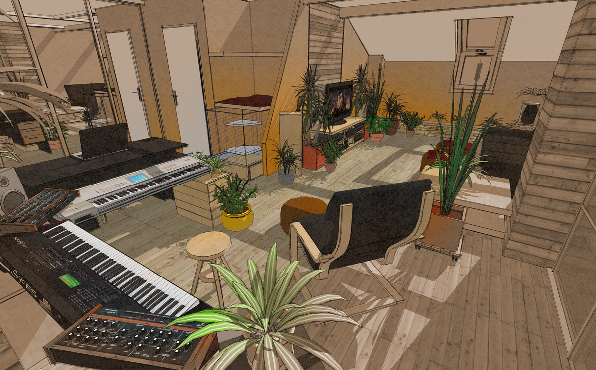
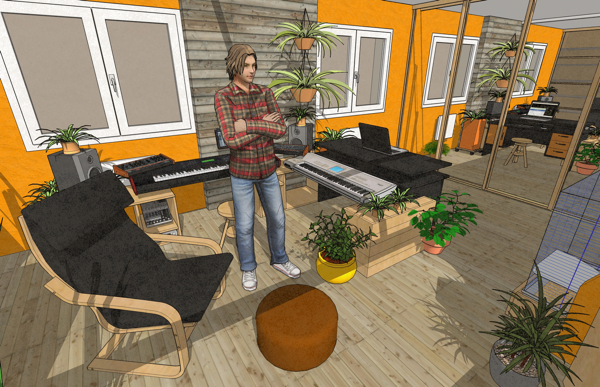
-
very nice model but it looks like there is no ceiling because of the shadows.
-
@teuf said:
I'm quite surprise about comments regarding plants
 I feel good with them and so sad without greenery and sun.
Me too. Life is better surrounded by plants. Looks like you had fun with this personal project. Keep up the great work!
-
@jo-ke said:
very nice model but it looks like there is no ceiling because of the shadows.
The lower face of the ceiling is white but the higher face of the ceiling is transparent.
With this easy way I can have shades in the rooms (Sketchup can't show light from "spot" like rendering software, so I use the sun...It's not a perfect way, I know.
Any ideas ?Teuf
-
Trys with Photosketcher :
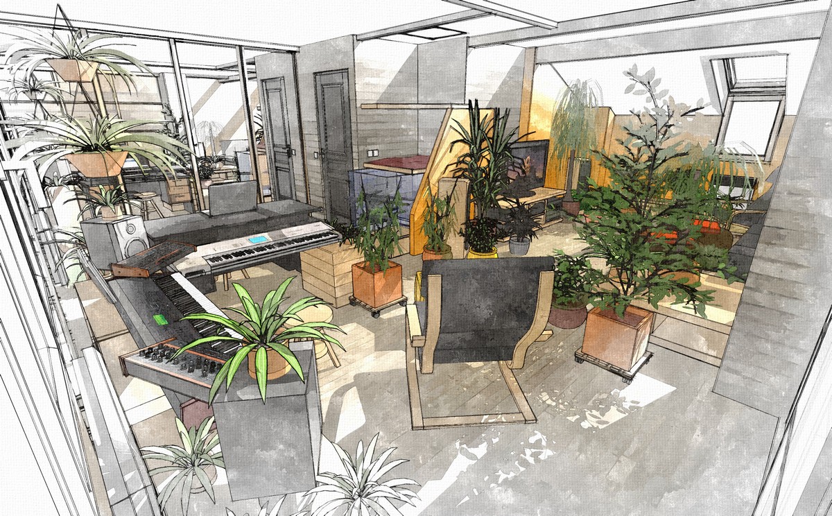
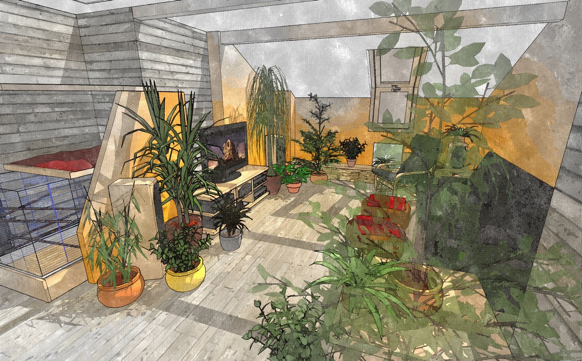
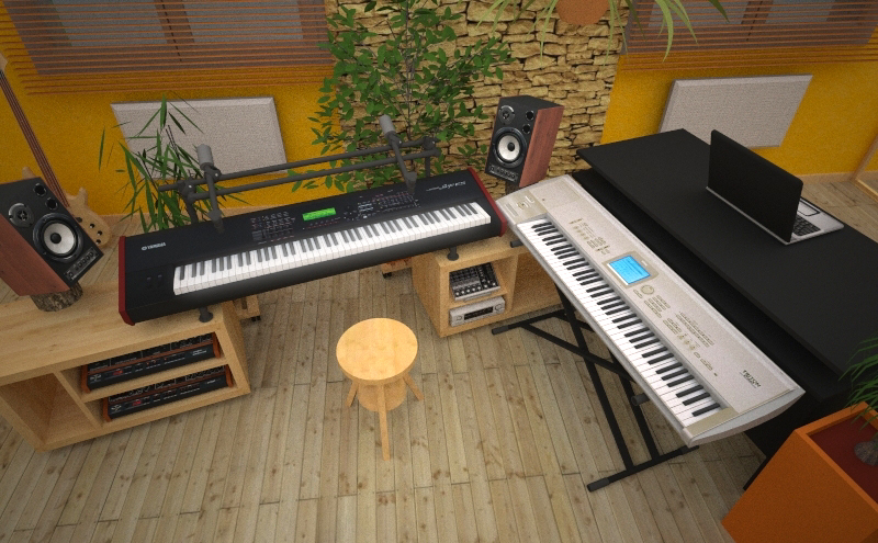
Try with Maxwell render :
Somes latest changes :
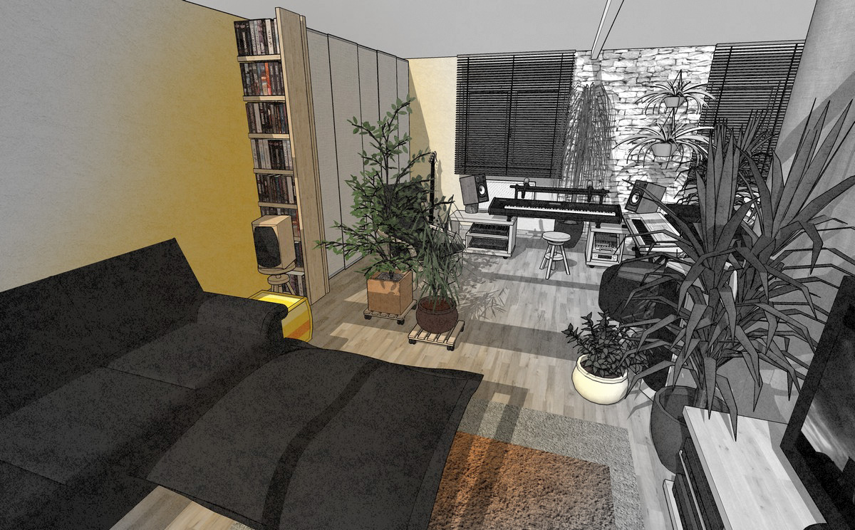
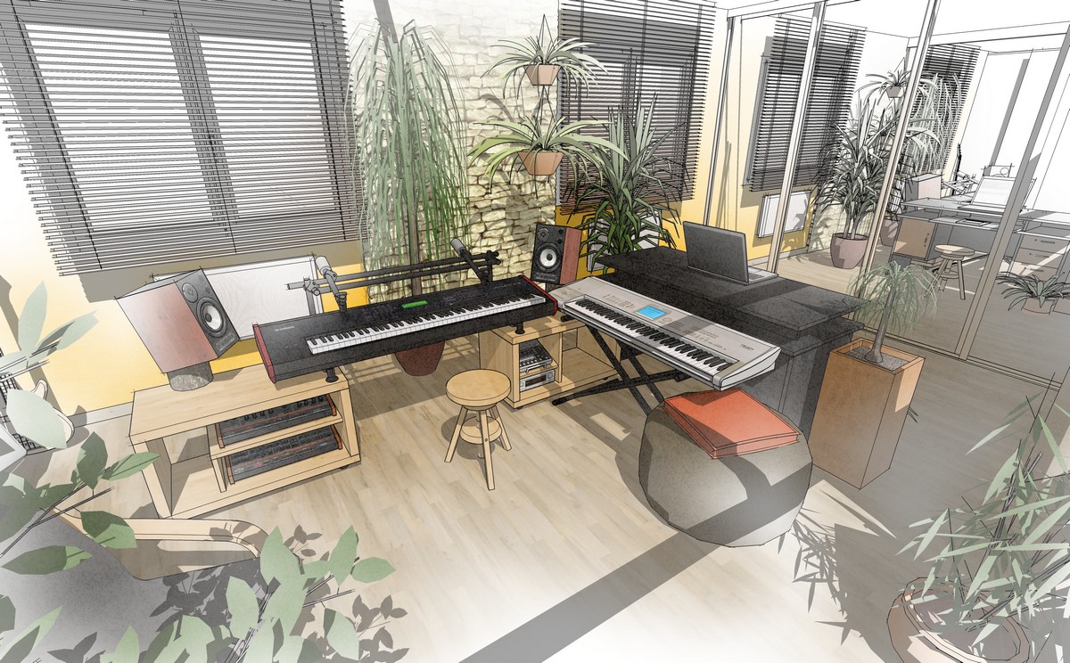
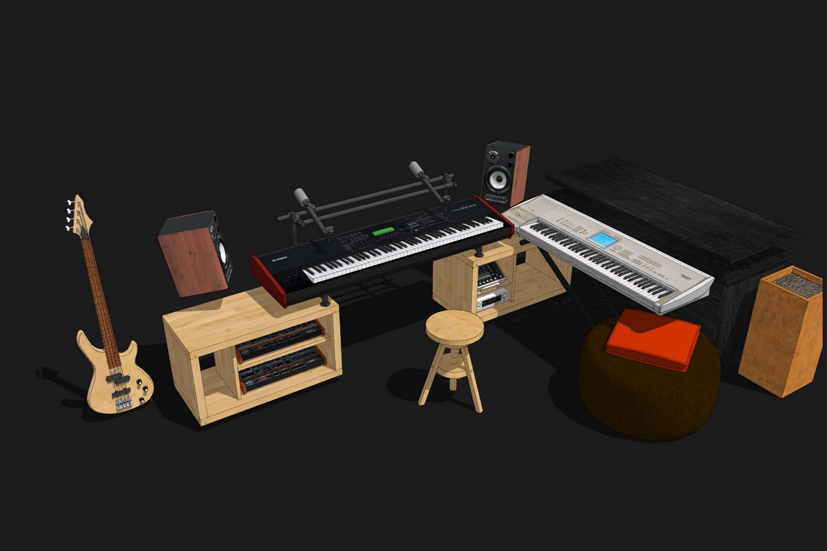
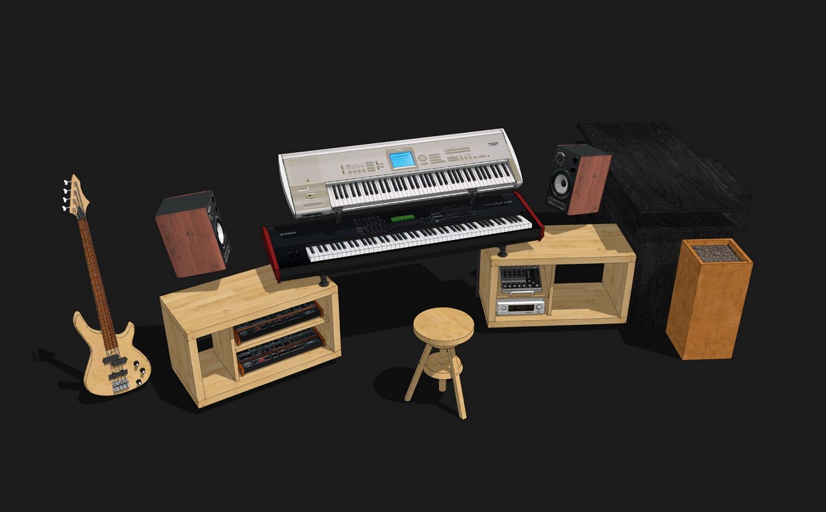
-
@teuf said:
I'm no so a newbie ...I work with SU since november 2008 after 10 year with autocad

Do you work with both now or only with SU? Would you advice others to switch to SU?
Great visualizations!
-
@teuf said:
I still use autocad for 2D.
But since I discovered Sketchup I don't use autocad for 3D anymore.The advice is simple, install free sketchup, try it (it is very handy) read the memento !!(help / memento), look some tutorials on youtube, analyse some draws from 3D warehouse, download some textures from CG texture or SketchupTexture and love it

Since I teach SketchUp from time to time and most of the course participants are familar with autocad (and don't have much time to try SketchUp for fun), I'm happy about every argument to force their change to SU. Since I don't know autocad, it is difficult for me to find them myself...
-
Thank you for these helpful hints!
-
@cotty said:
@teuf said:
I still use autocad for 2D.
But since I discovered Sketchup I don't use autocad for 3D anymore.The advice is simple, install free sketchup, try it (it is very handy) read the memento !!(help / memento), look some tutorials on youtube, analyse some draws from 3D warehouse, download some textures from CG texture or SketchupTexture and love it

Since I teach SketchUp from time to time and most of the course participants are familar with autocad (and don't have much time to try SketchUp for fun), I'm happy about every argument to force their change to SU. Since I don't know autocad, it is difficult for me to find them myself...
I see
The arguments are too technical for me to explain them in english which is not my mother language.
So...
SU is easier than autocad for simple forms such usual buildings and actual furnitur. Textures mapping and photo insert.
Autocad is more efficient and accurate with curves because SU uses only segments, not real curves.
AutoCAD is easier than SU for complex volumes such vehicles, guitare, accurates industral forms.
SU is free (or cheap for DWG compatibility). No need to learn a lot of things with it.
SU is more handy and fun than autocad and with good rederer and some plugins you can do really really good job... But I prefer comic/cartoon syles.I'm buildings CAD drawer and it was easier for me to draw vehicles with autoCAD :
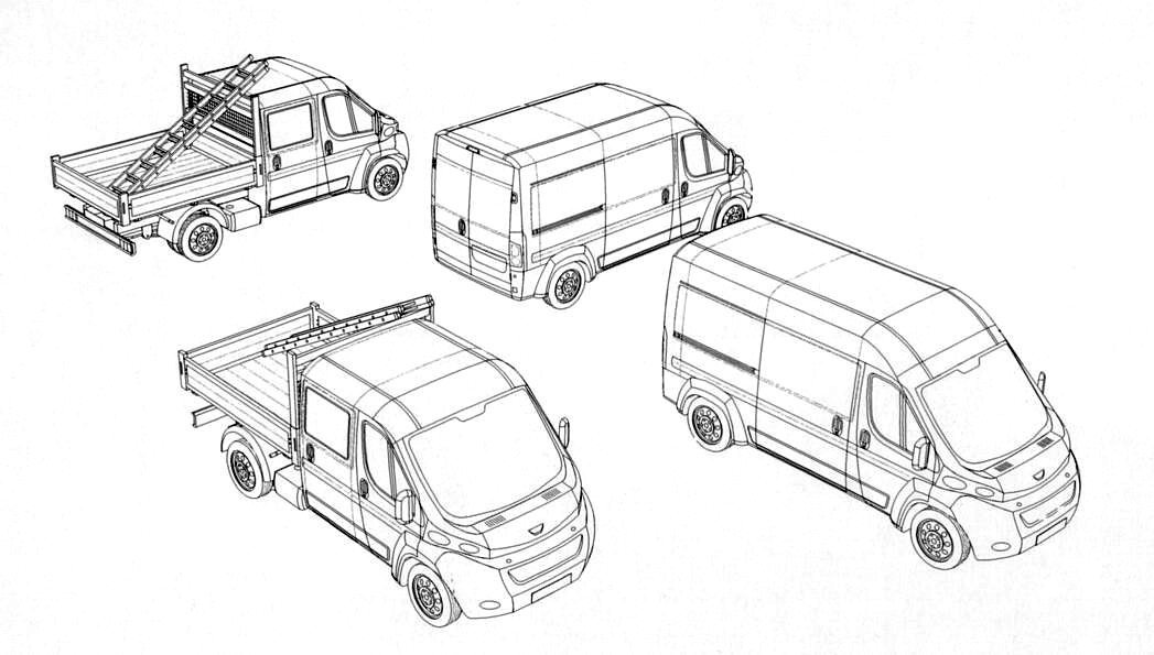
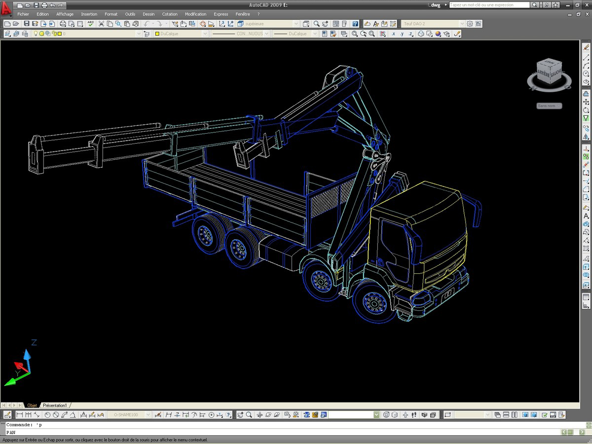
or soft shapings :

If I want to draw a home, building or simple furniture, I naturally think "Sketchup"
With a photo mapping you can easily simulate a lot of tetails.
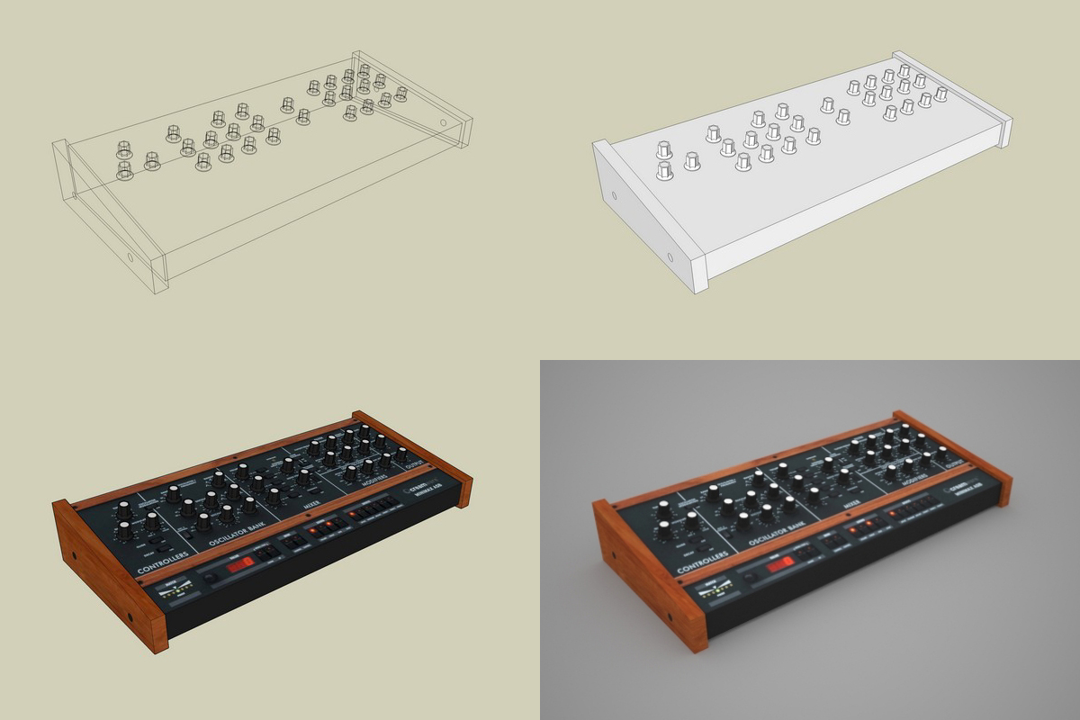
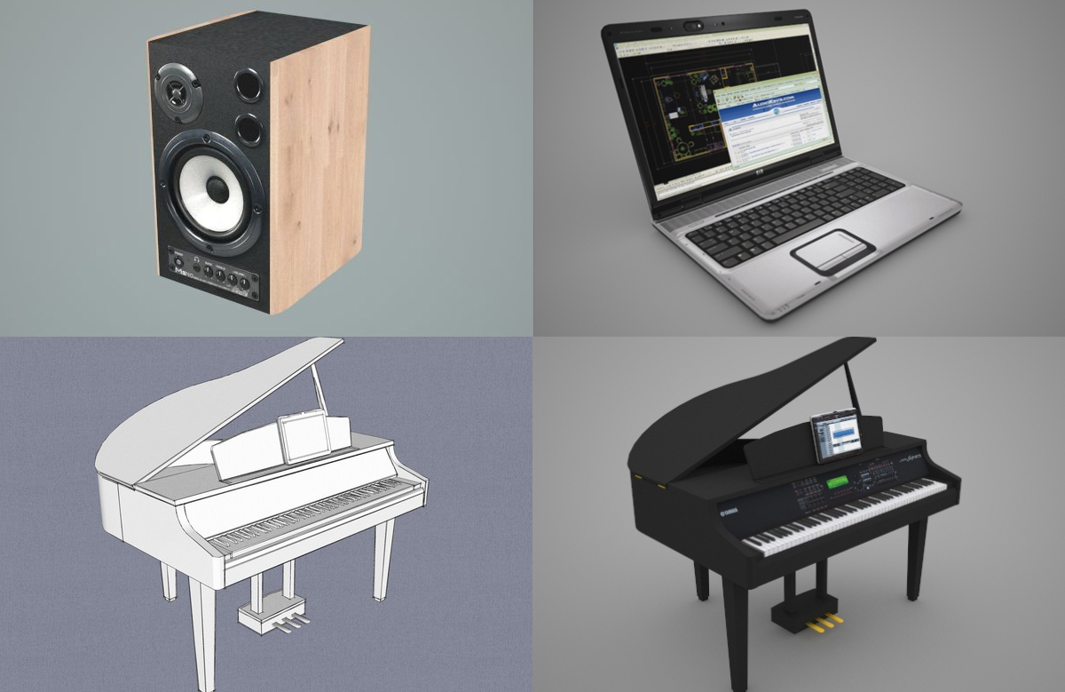
But I don't know what are the last new improvements in autocad 3D...Best regards
Teuf -
@cotty said:
Thank you for these helpful hints!
I edited my last reply and add some pics.
Another example of the ease to use SU :
Sketchup (free) + maxwell (free) + photoshop element
and some 3D models and textures from the web.
I never think or hope to do that with autocad...
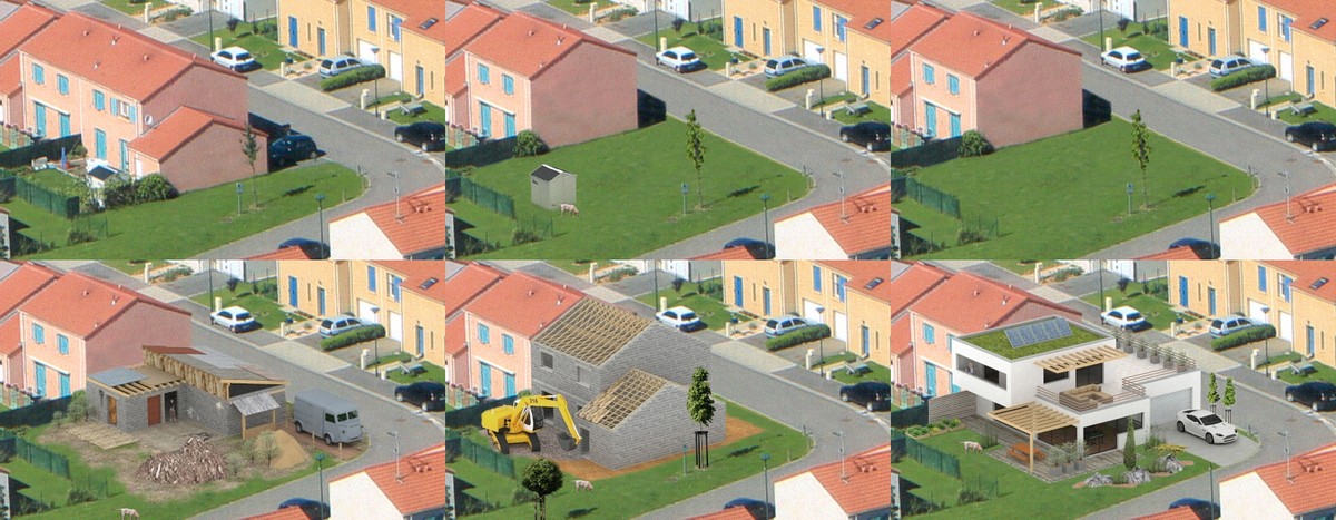
Best regards.
Teuf -
Hi

So, my Living room is almost finished.
The desk and the keyboards are placed in a different way...
It allows me to watch TV during "working" and I can also see all of the room and my girl friend when I'm playing keyboardsThe "bean bag" parade around all over the floor. Quite nice to do ...lot of stuff.
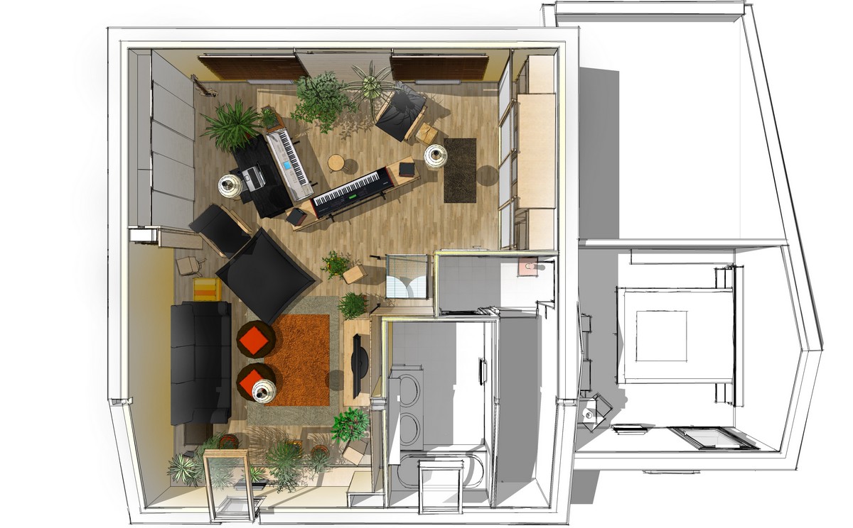
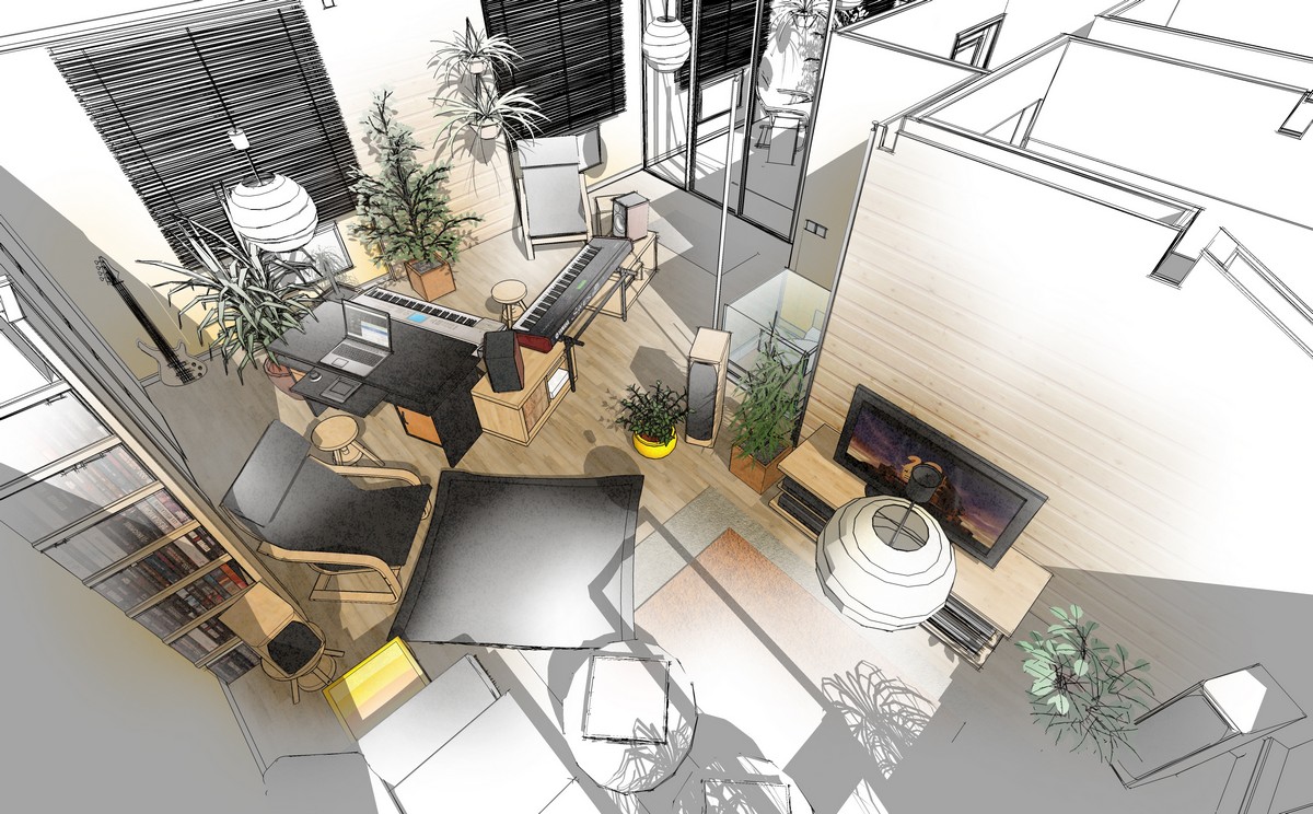
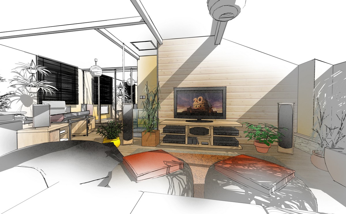
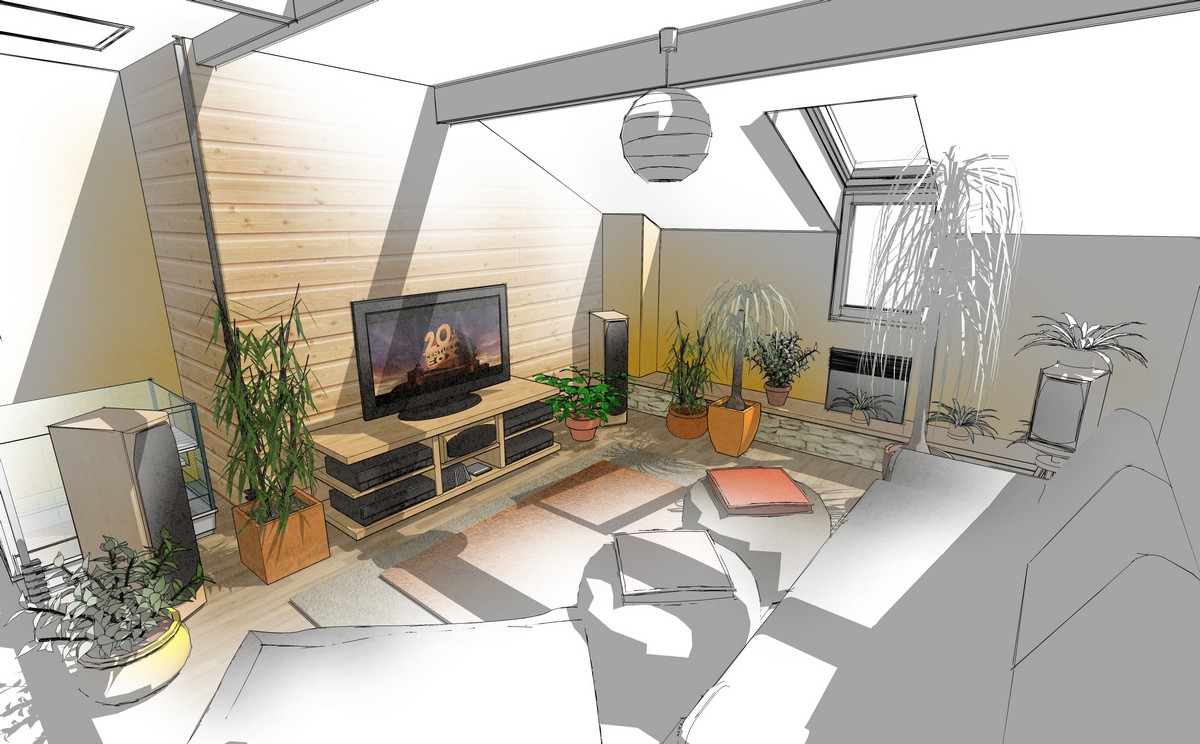
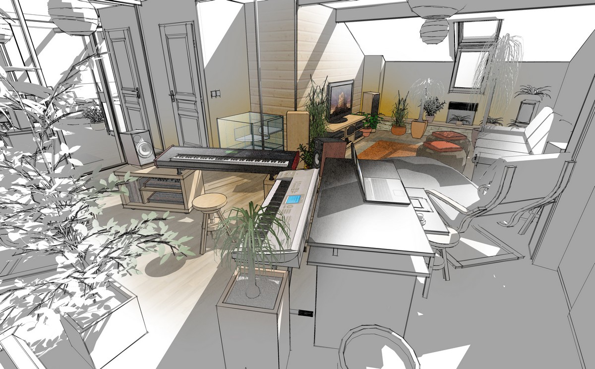
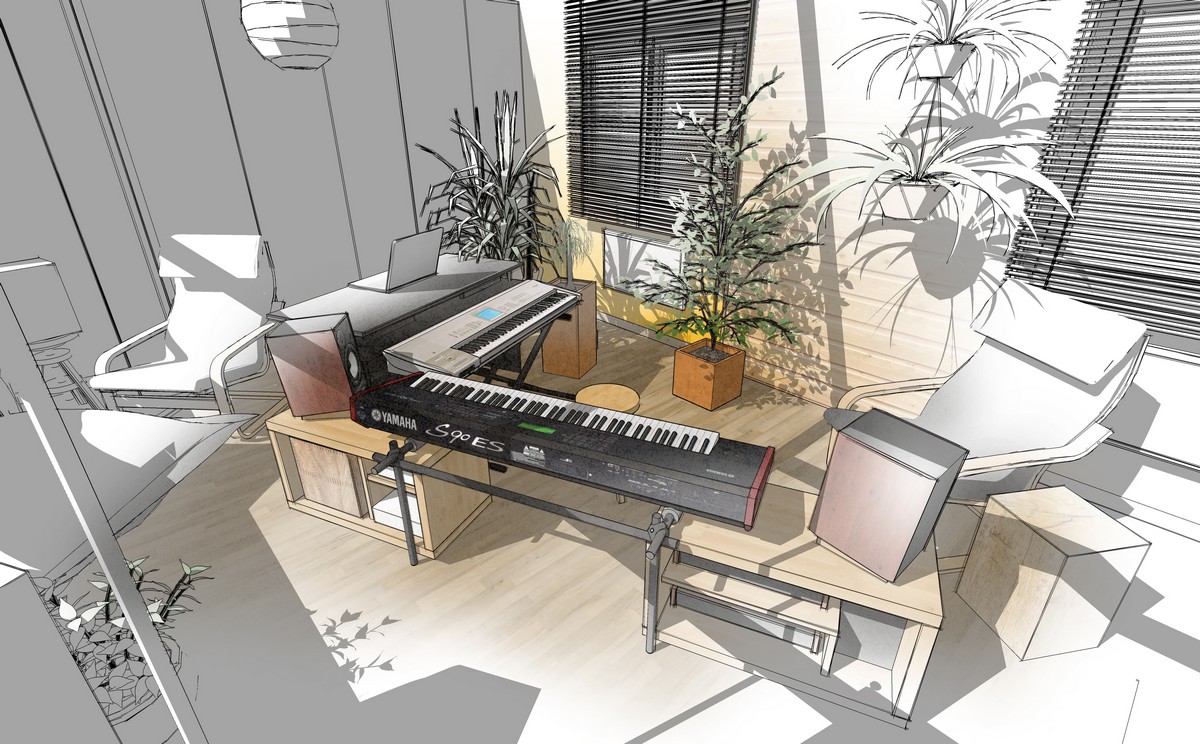
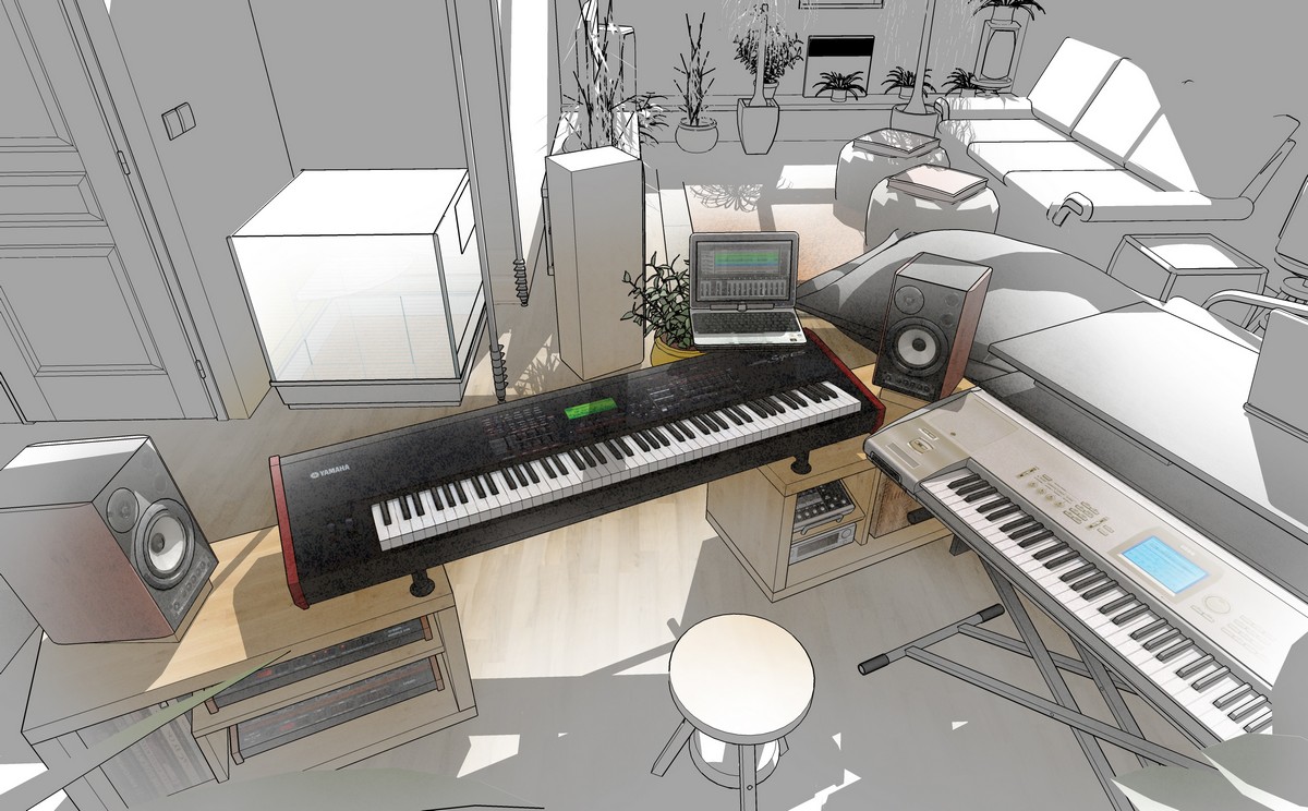
The modular system tier for keyboards :
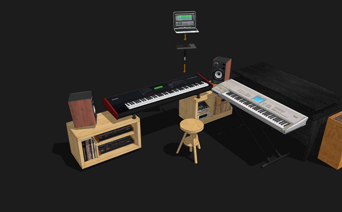
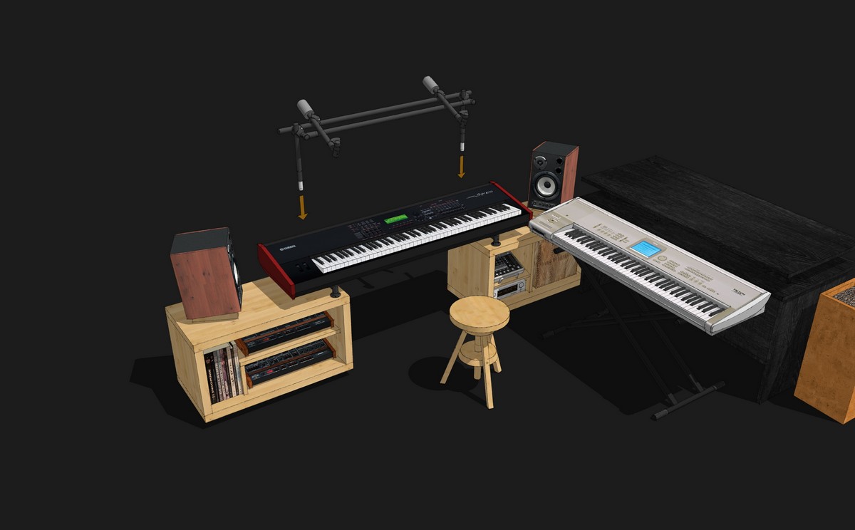
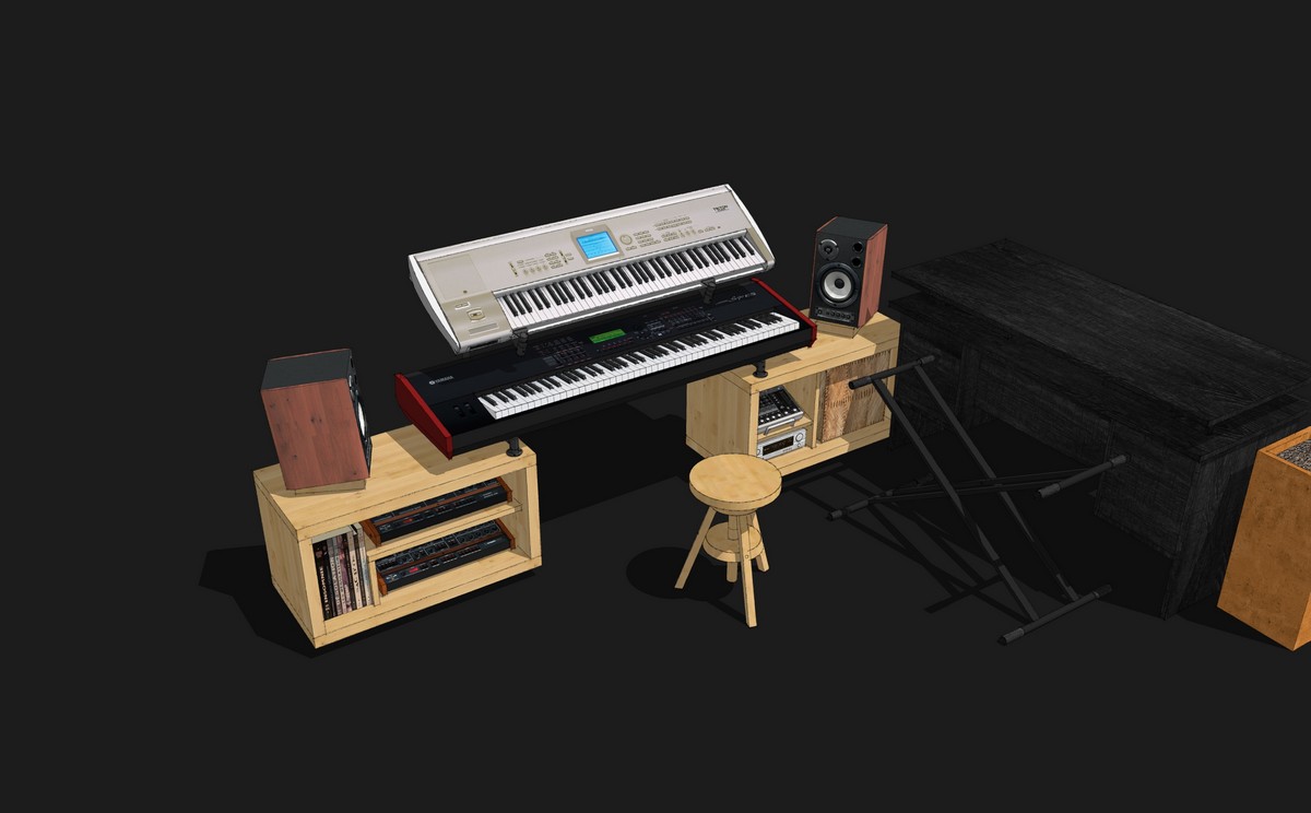
Best Regards
-
With some Photoshop elmts FX :
Diffuse glow, Blur ...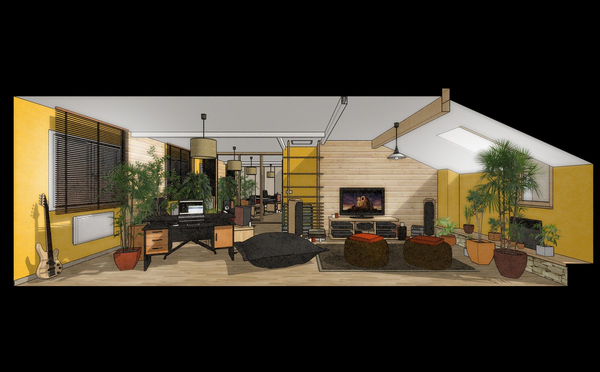
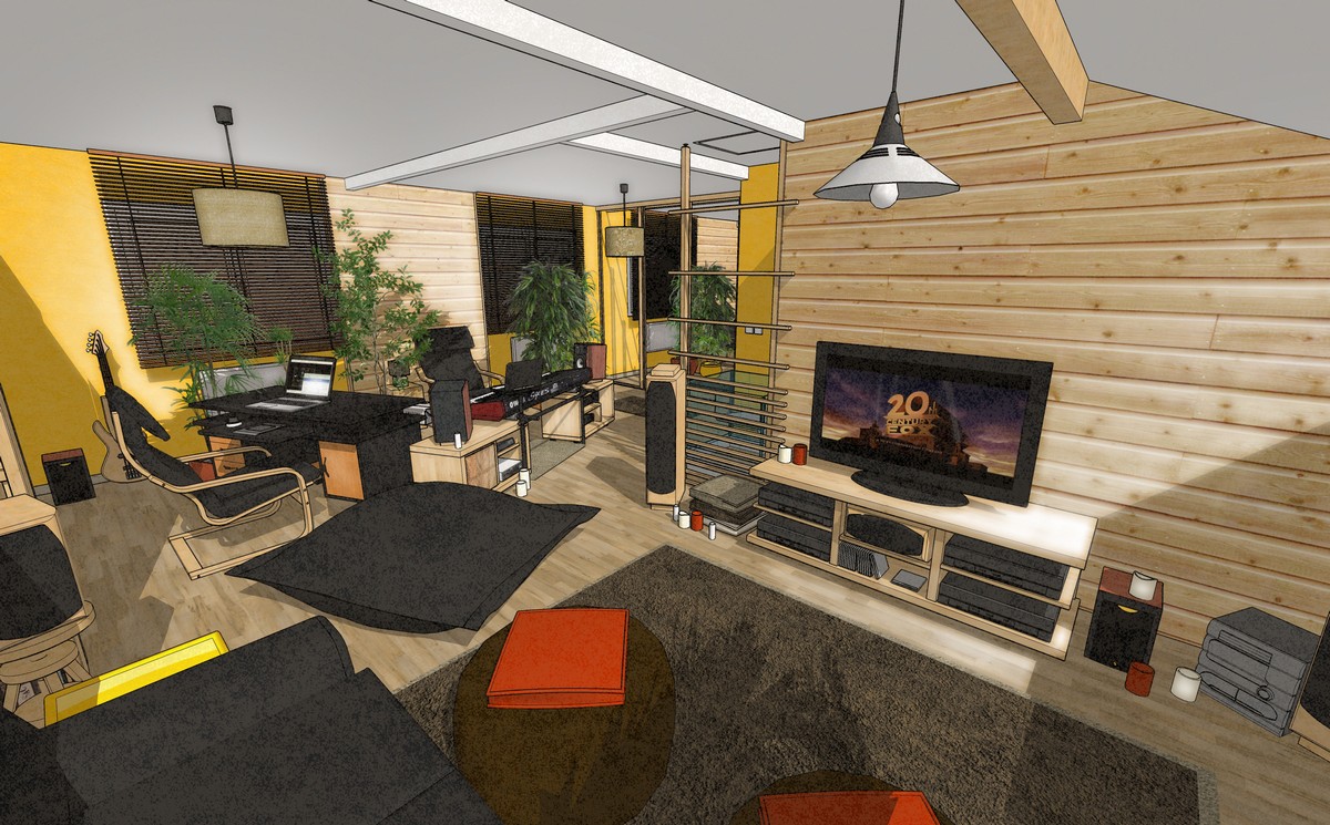
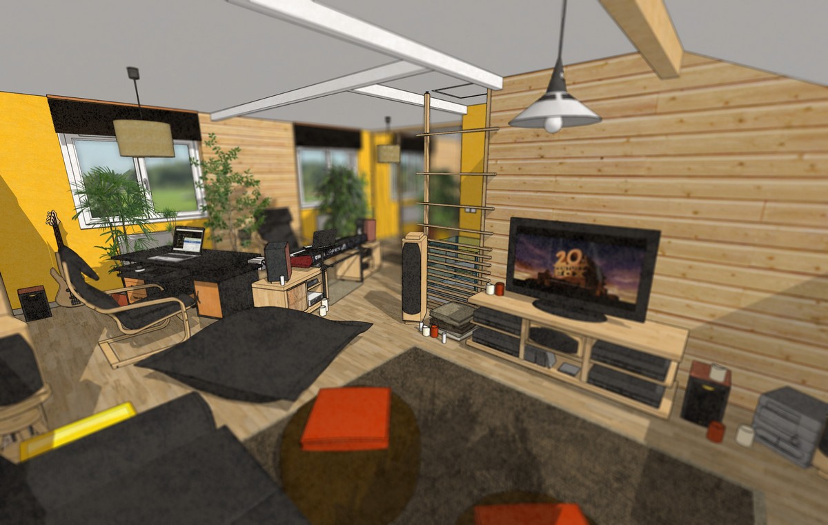
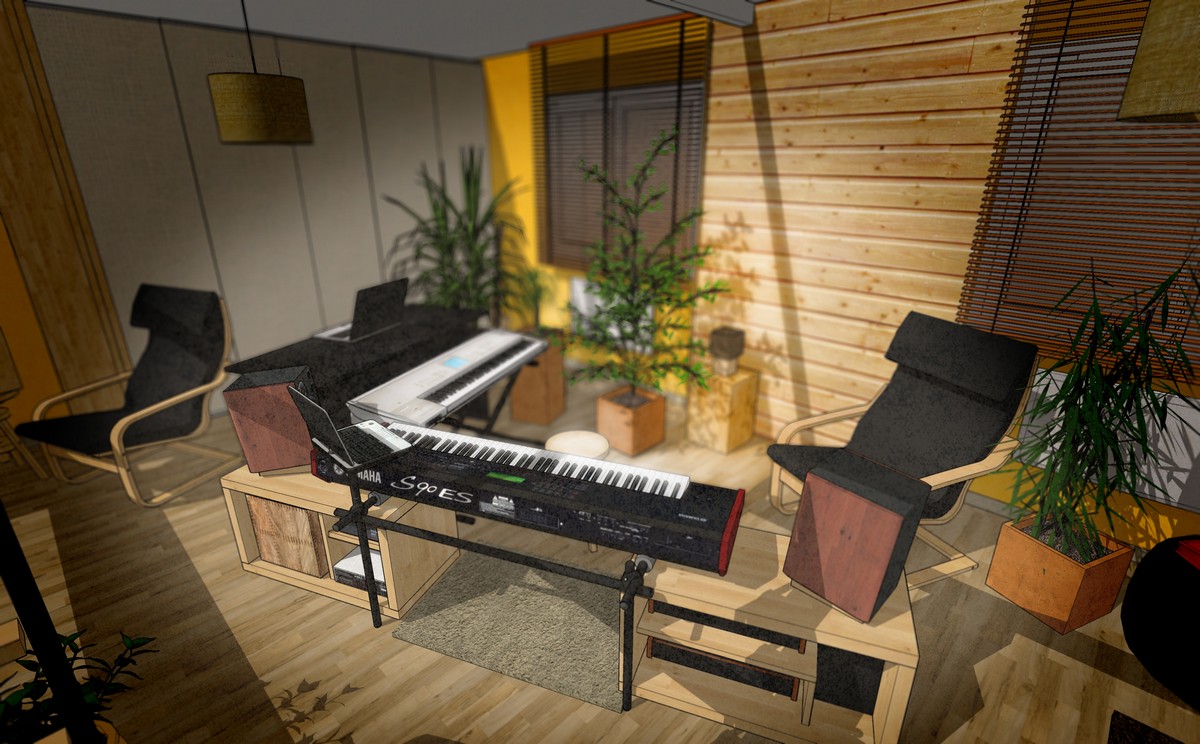
DepthMaps are made with SU fog (black fog without edges and without shadows...)
After this, DepthMaps are sent in Photoshop and use Blur-lens FXRegards
Teuf -

I like that "out of SketchUp look" very much!
One criticism: Where are your soundsamples ?!?

-
Last update using "Ambiant Occlusion Pro" and some lights effects with photoshop...
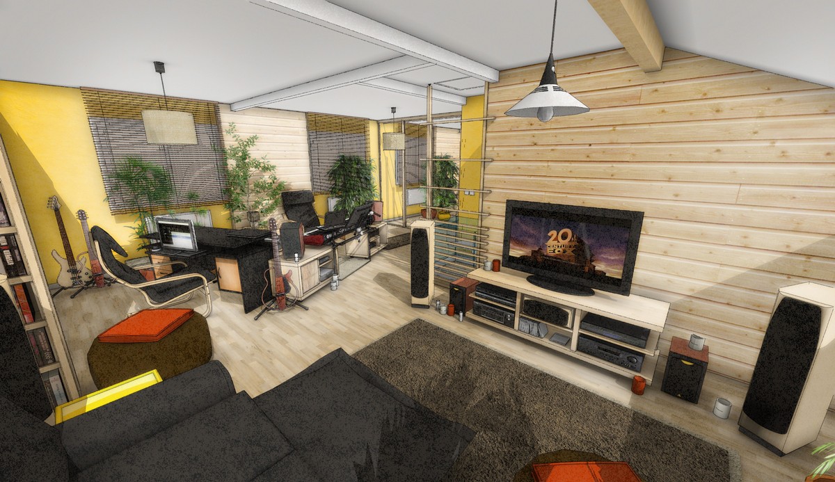
Best regards
Teuf -
Nice board pictures! and I like the living room shots a lot too!
-
Excellent design, models and NPR styles.
-
@cotty said:
@teuf said:
I'm no so a newbie ...I work with SU since november 2008 after 10 year with autocad

Do you work with both now or only with SU? Would you advice others to switch to SU?
Great visualizations!
Guten Tag Cotty

I still use autocad for 2D.
But since I discovered Sketchup I don't use autocad for 3D anymore.The advice is simple, install free sketchup, try it (it is very handy) read the memento !!(help / memento), look some tutorials on youtube, analyse some draws from 3D warehouse, download some textures from CG texture or SketchupTexture and love it

You need to buy sketchup if you want .DWG compatibility.I was fond of love !
http://sketchup.google.com/3dwarehouse/?hl=en%26amp;ct=lc
http://www.cgtextures.com/
http://sketchuptexture.blogspot.it/[Images Deleted...]
Made with sketchup pro 6 and Photoshop Elements
Best regards
Teuf -
nice models. Your AutoCAD car models look great too. How do you map photos on your SketchUp models? Just import and position the texture?
-
@pbacot said:
nice models. Your AutoCAD car models look great too. How do you map photos on your SketchUp models? Just import and position the texture?
Thanks Pbacot : )
To map photos, I drag & drop pics on Sketchup window, use "explode" functon and disable its "projection*" ability(important). Then I copy it on the model and position it (I hope I use the good words...because my Sketchup is in French)
[*But, projection mode may bu used for loud speaker, for exemple]
There are many ways to make a model...
You can drag a model from 3D warehouse (or else)... the easyer way, but...not fun.
You can modeling it with details (may be hard)
And you can map simple photos on basic volumes (nice and interesting way, isn't it ? )
)Exemples :
Detailed model
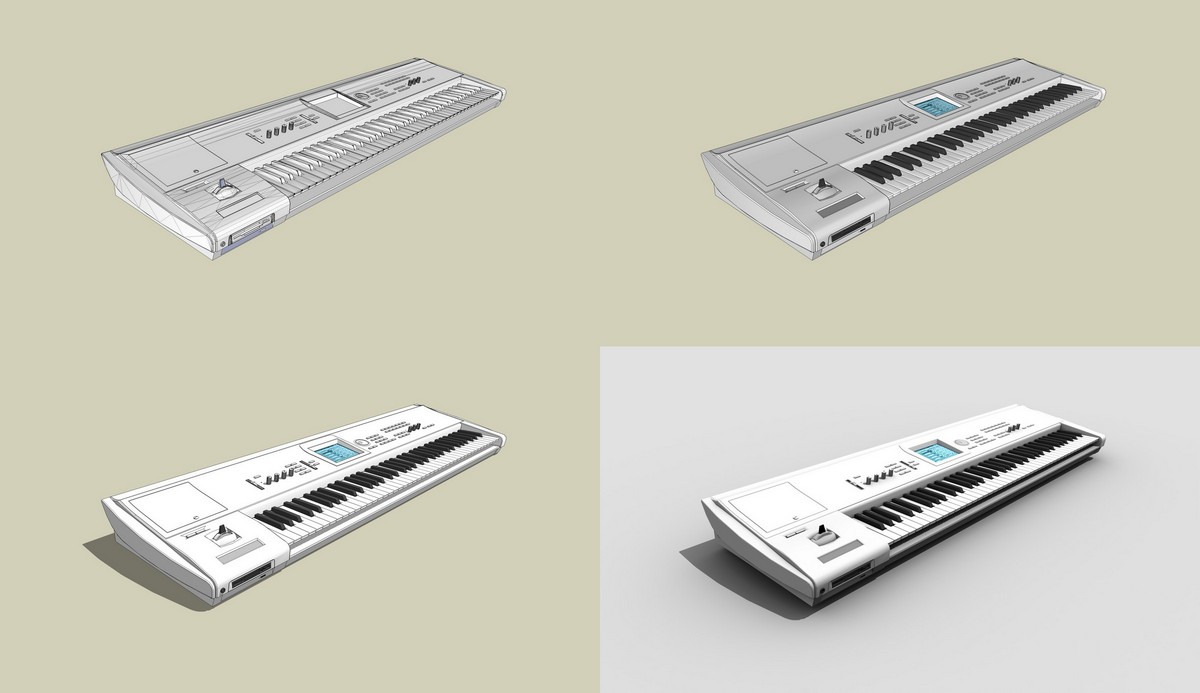
Basic model with mapping
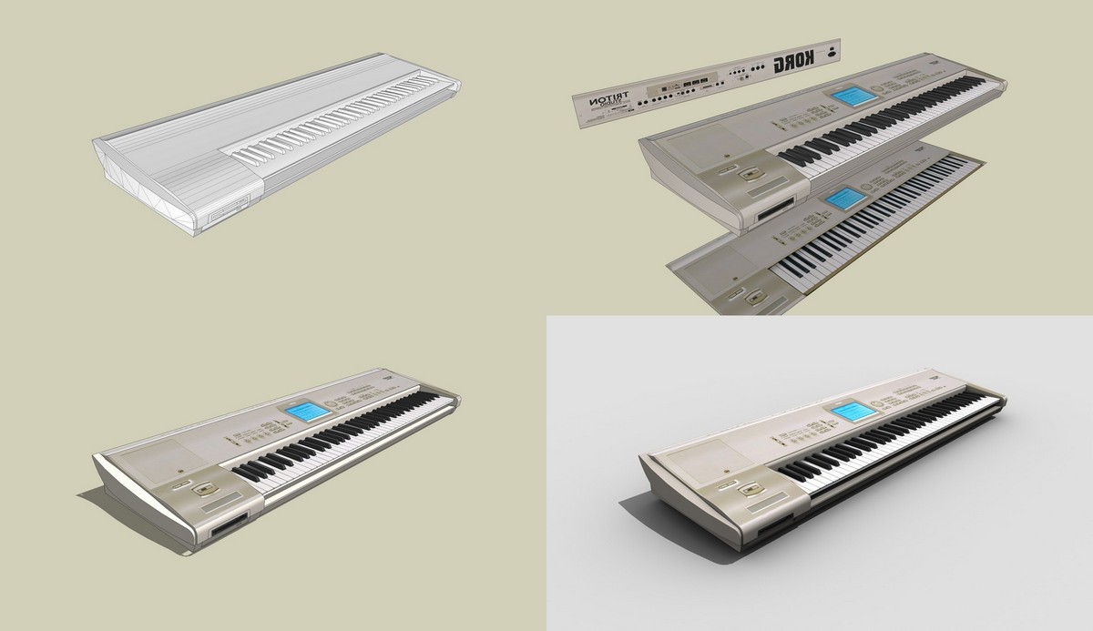
I think it's a quite good illusion for a non-professional use.
So, in a large view between others models, knobs and details are often unecessary ...sometime(?)Best regards
Teuf
Hello! It looks like you're interested in this conversation, but you don't have an account yet.
Getting fed up of having to scroll through the same posts each visit? When you register for an account, you'll always come back to exactly where you were before, and choose to be notified of new replies (either via email, or push notification). You'll also be able to save bookmarks and upvote posts to show your appreciation to other community members.
With your input, this post could be even better 💗
Register LoginAdvertisement


