sketchucation logo sketchucation
    • Login
    πŸ€‘ SketchPlus 1.3 | 44 Tools for $15 until June 20th Buy Now

    So Lonesome I Could Cry

    Scheduled Pinned Locked Moved Gallery
    16 Posts 9 Posters 999 Views 9 Watching
    Loading More Posts
    • Oldest to Newest
    • Newest to Oldest
    • Most Votes
    Reply
    • Reply as topic
    Log in to reply
    This topic has been deleted. Only users with topic management privileges can see it.
    • StinkieS Offline
      Stinkie
      last edited by

      a.k.a. One Is The Loneliest Number


      Your Flesh Is Candy To Me.jpg

      1 Reply Last reply Reply Quote 0
      • Rich O BrienR Online
        Rich O Brien Moderator
        last edited by

        so LOVELY i could cry....

        Your Flesh Is Candy To Me???

        Download the free D'oh Book for SketchUp πŸ“–

        1 Reply Last reply Reply Quote 0
        • StinkieS Offline
          Stinkie
          last edited by

          Creepiest title I could come up with. 😎

          1 Reply Last reply Reply Quote 0
          • olisheaO Offline
            olishea
            last edited by

            aww look at it all depressed looking at the floor, poor thing 😞 not a hope in the world

            oli

            1 Reply Last reply Reply Quote 0
            • EscapeArtistE Offline
              EscapeArtist
              last edited by

              Looks like it's feeling a little blue...

              1 Reply Last reply Reply Quote 0
              • soloS Offline
                solo
                last edited by

                LOL, great title, sounds like a country song.

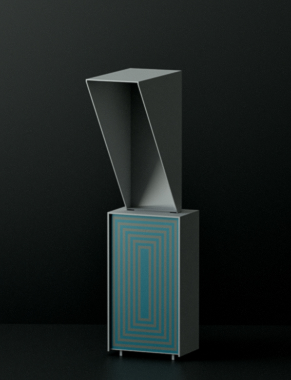
                So...what is it? looks like a public telephone shell.

                http://www.solos-art.com

                If you see a toilet in your dreams do not use it.

                1 Reply Last reply Reply Quote 0
                • boofredlayB Offline
                  boofredlay
                  last edited by

                  Looks like a cubist slant on the flying nun although I don't think you got the nose quite right.

                  http://www.coroflot.com/boofredlay

                  1 Reply Last reply Reply Quote 0
                  • david_hD Offline
                    david_h
                    last edited by

                    @solo said:

                    LOL, great title, sounds like a country song.

                    It is. Classic Hank Williams

                    Still can't figure out what the object is. . . . πŸ˜›


                    williams_sr_hank_fc.jpg

                    If I make it look easy...It is probably easy

                    1 Reply Last reply Reply Quote 0
                    • StinkieS Offline
                      Stinkie
                      last edited by

                      I suppose it's best to think of it as a sculpture.

                      Here's another image I did the past week. Not the final version, though. That one rendered longer, but I haven't gotten around to post-processing it yet.


                      halitosis.jpg

                      1 Reply Last reply Reply Quote 0
                      • boofredlayB Offline
                        boofredlay
                        last edited by

                        I like that one, nice.

                        http://www.coroflot.com/boofredlay

                        1 Reply Last reply Reply Quote 0
                        • StinkieS Offline
                          Stinkie
                          last edited by

                          Thanks, Eric. Might still change that one, though. Bit too anecdotal for my liking, I think. Perhaps some cropping (and subsequent touching up) might do the trick.


                          halitosis_CUT.jpg

                          1 Reply Last reply Reply Quote 0
                          • arail1A Offline
                            arail1
                            last edited by

                            Cowboy Junkies

                            1 Reply Last reply Reply Quote 0
                            • K Offline
                              kwistenbiebel
                              last edited by

                              I love the images. Very consistent work.
                              Do have problems with the title (if it is really going to be the title of the image).
                              Somehow you are giving away too much. Leave your work open for interpration.
                              I'd rather see a number there (like 'image nr.15') or a completely 'Da Da' title, that has nothing to do with anything....

                              First image is perfect.
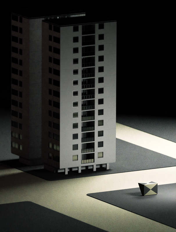
                              Second one might indeed have a little bit too much context in there... Loose the roads?

                              1 Reply Last reply Reply Quote 0
                              • StinkieS Offline
                                Stinkie
                                last edited by

                                Titles: won't be using any IRL. I add them to pictures I post here for laughs. One must channel one's tendency towards silliness somehow.

                                Second image: I like the roads. Think I'm gonna hang on to those. What I meant was that the uncropped version has too much, er, narrative to it. There's something 'happening' there (a dialogue of sorts, it seems), and I don't want that. Furthermore - the uncropped version is just too cute.

                                Come to think of it, so is the first image. It even borders on the sentimental. Hm. The fretting never stops. πŸ‘Š

                                1 Reply Last reply Reply Quote 0
                                • arail1A Offline
                                  arail1
                                  last edited by

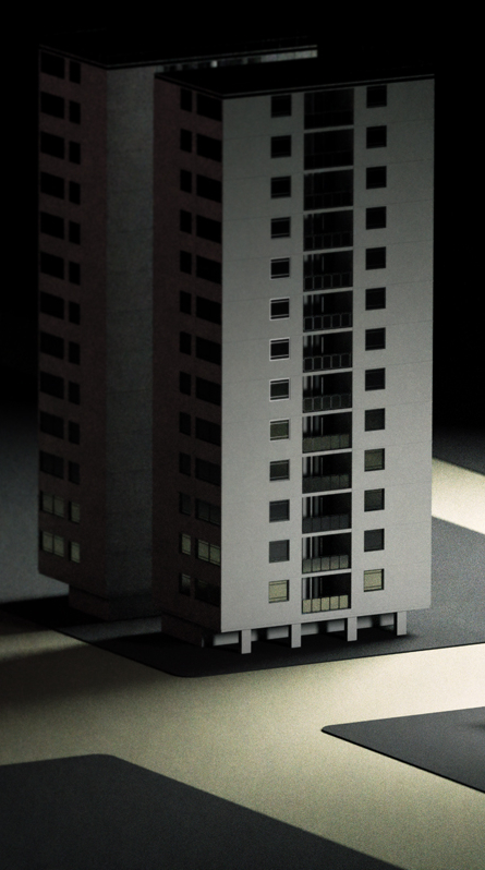
                                  Like the first building image better, but not the 'thing' next to it. The thing seems too distracting, maybe too interesting - I want to know what it is, but that toying with identification is probably not what the picture is intending. But I like the wider image, showing a bit more of the plaza around the building. I think it balances the building.

                                  The furniture object conjures the word 'cowl'.

                                  1 Reply Last reply Reply Quote 0
                                  • StinkieS Offline
                                    Stinkie
                                    last edited by

                                    @arail1 said:

                                    The furniture object conjures the word 'cowl'.

                                    Spot on.

                                    404 Not Found

                                    favicon

                                    (www.artinthepicture.com)

                                    1 Reply Last reply Reply Quote 0
                                    • 1 / 1
                                    • First post
                                      Last post
                                    Buy SketchPlus
                                    Buy SUbD
                                    Buy WrapR
                                    Buy eBook
                                    Buy Modelur
                                    Buy Vertex Tools
                                    Buy SketchCuisine
                                    Buy FormFonts

                                    Advertisement