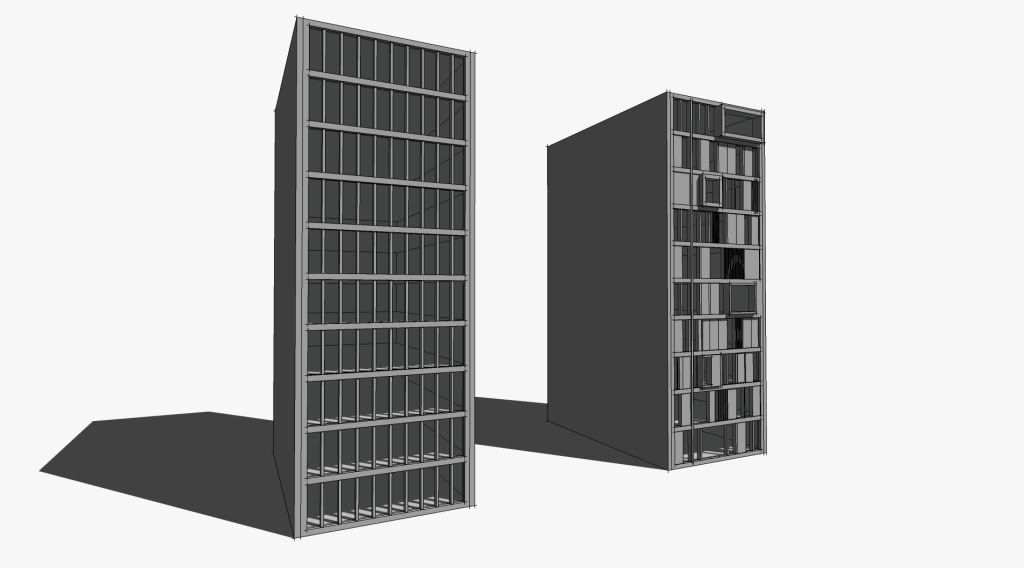
Push/Pull Tower + model/render challenge, page 2
-
these are great. but guys we are supposed to articulate the second tower into something new....but ah well!
massimo, is that a frosted glass material? looks great how you can see all the floors inside.....like it a lot!!
@unknownuser said:
But not sure that form before function is the good way of architecture
I agree with you entirely. This is the first thing I learnt studying architecture.
This is just experimentation into form and material....no brief or programme needed.
-
%(#BF0000)[skp attached below
So does anyone want to make their own tower?
Here is the skp of my tower. In the file you will also find a simple tower to begin the push/pulling technique.
For rendering, just move your tower into the position of mine and click Scene 2 to flip the camera. (obviously delete my tower first)Each floor facade is a separate group. Each window is a component so you can quickly add reflections.
Have fun and please post any funky results you achieve.
You can design the tower however you want. Texture it however you want. Place it in some context if you like?
Maybe a couple of you may wanna develop some new sketchy styles? I dunno, just have fun and lets see what emerges!]

-
Thanks d12dozr and Oli.

Yes it's a frosted glass. I used a global + sun + lens flare effect in PS.
Hello! It looks like you're interested in this conversation, but you don't have an account yet.
Getting fed up of having to scroll through the same posts each visit? When you register for an account, you'll always come back to exactly where you were before, and choose to be notified of new replies (either via email, or push notification). You'll also be able to save bookmarks and upvote posts to show your appreciation to other community members.
With your input, this post could be even better 💗
Register LoginAdvertisement


