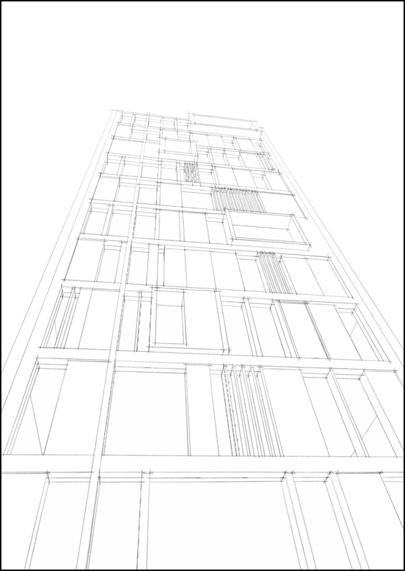
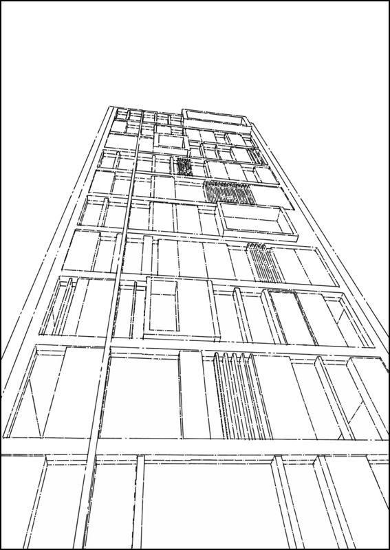
Push/Pull Tower + model/render challenge, page 2
-
"thats what most people think when they see a concrete tower or anything remotely black and white.....system built housing. weird isn't it!"
It is because people are conditioned by the parents aspirations and upbringing IMO.
"sid I wish 1960s architecture looked like this!"
I wish as well. Unfortunately 1960s modernity was hijacked in the name of housing people on cheap. Majority of the projects were designed by mediocre architects or in a many cases by engineers. The quality of built was appaling as well.
Concrete is as beautiful as any material. It is the way how it is used that determines the beauty or lack of it. I suggest that doubters look at the work of Corb in more depth or our contemporary, Tadao Ando. -
I didnt mean it reminded me in looks I know the style is completely off I just meant the dark colors and imposing monolithic shape on the landscape, grey dull you get the idea. I know concrete can be great but obv the stereotype is tower block stuff.
-
i understood what u meant mate don't worry!

massimo: that looks great.....is it straight from sketchup?

-
seriously? haha nice, please share this style!

-
Yeah, I made this for fun trying to learn "Style builder" grabbing some lines from LC's real sketches.

-
Added in previous post.

-
-
how do you import it? mac

-
Hmmm, I can't help you. Don't know how to do that on mac.

-
Surely dropping the file in styles will do.
-
sorted! i had to make my own styles folder, it doesn't create one by default (or at least I cant find it)....thats weird.
thanks massimo it looks great
-
-

-
awesome line style!!
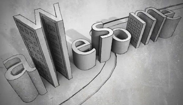
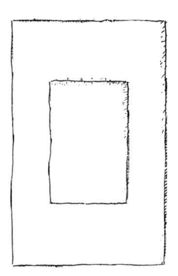
something more corbusier style, the golden rectangle:
-
thats really nice pete
-
Oli,
Thanks for the tower - this was a fun diversion. I took a little different perspective!
Bytor
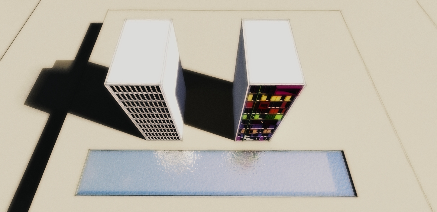
-
-
Played a bit with your beautiful images, hope you don't mind Oli. Heavy PS

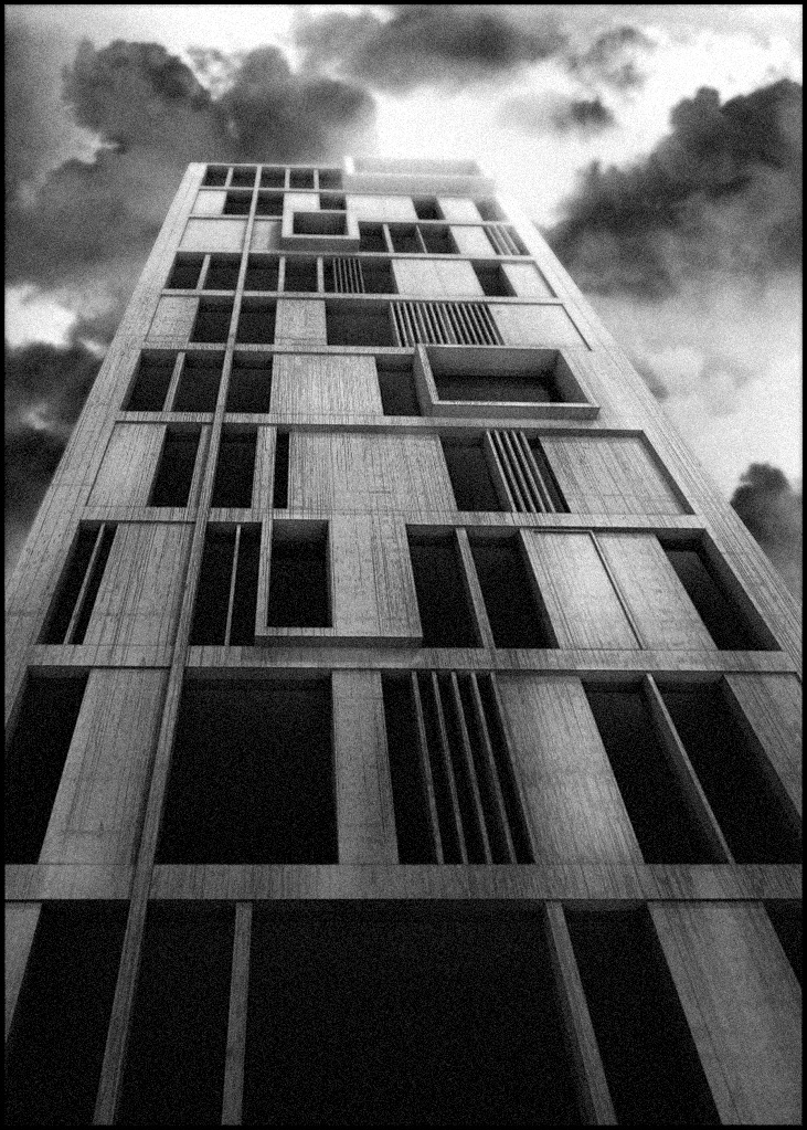 More DOF + volumetric light + some cloud effect overlayed on the tower + a bit of grain
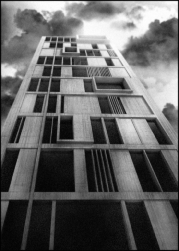 More DOF + volumetric light + some cloud effect overlayed on the tower + a bit of grain + gaussian blur
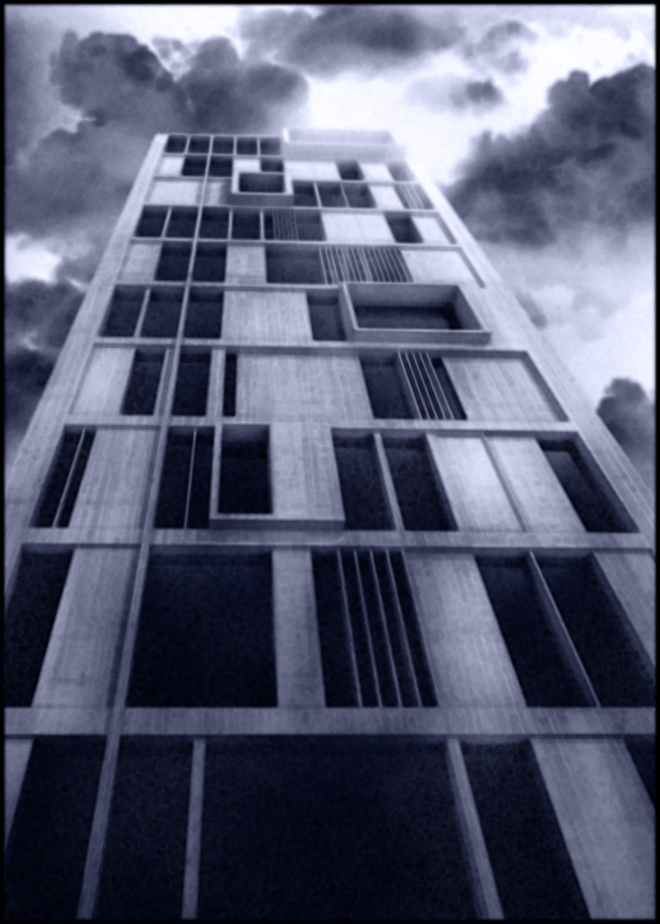 More DOF + volumetric light + some cloud effect overlayed on the tower + a bit of grain + gaussian blur + beyond edger filter + a bit of blue.
 -
no i dont mind massimo, do what you like. this is an experiment thread. great images...i like your first one best, inky blue looks cool as well.
bytor I love it! so simple......looks great! funny how just a splash of colour can completely change the mood of the architecture!

Please guys be as experimental as you like.....its not a competition or anything....so dont be afraid to have a go and have fun!!

-
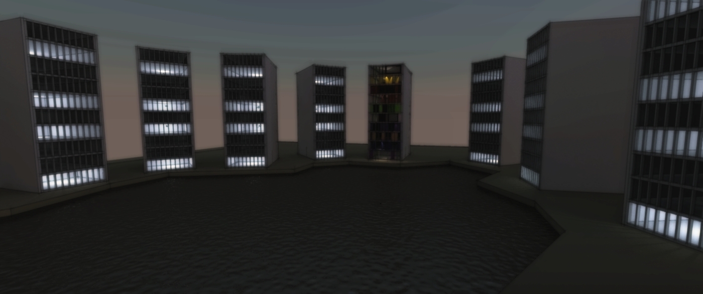
Welcome to Twilight Towers!
Hello! It looks like you're interested in this conversation, but you don't have an account yet.
Getting fed up of having to scroll through the same posts each visit? When you register for an account, you'll always come back to exactly where you were before, and choose to be notified of new replies (either via email, or push notification). You'll also be able to save bookmarks and upvote posts to show your appreciation to other community members.
With your input, this post could be even better 💗
Register LoginAdvertisement
