Low Res Maxwell Kitchen test (updated with final)
-
kick seems a little high to me.
are the uppers supposed to be a different color? if so i'd make the one above the fridge match the theme.
i think the island could be closer to the stove , would be more convenient and add space to the dining/living area.
something like this might be cool too if the counters stay that far apart (roughly):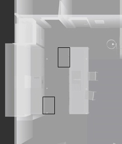
nice work!
-
@xrok1 said:
kick seems a little high to me.
are the uppers supposed to be a different color? if so i'd make the one above the fridge match the theme.
i think the island could be closer to the stove , would be more convenient and add space to the dining/living area.
something like this might be cool too if the counters stay that far apart (roughly):[attachment=0:v69oelvh]<!-- ia0 -->Capture.JPG<!-- ia0 -->[/attachment:v69oelvh]nice work!
Thanks mate!
The upper cupboard colours and kick height are correct - not sure I agree with fridge upper being same as where pantries (not in this model) are incorporated they will go opposite end to the fridge and then in white also!
As mentioned to Brodes this is for adaptable housing so minimum space of 1500 between benches for circulation - yes to me also mate visually TOO far!!
Thanks again!
-
@unknownuser said:
great stuff as always Richard. What kind of new PC are you getting?
The floor and ceiling look a bit odd to me. The ceiling seems to have some odd rectangular light pattern on it (caustics from the sink perhaps?). I find it a bit distracting. Also the floor seems to have little light colored specs that get brighter and more apparent the further back you go. Since they get brighter as the shadows get deeper it doesn't look like a floor pattern. Perhaps some other weird caustics?
I love your shadows, you're quite a master at that! The lighting in general very much follows your style which is great.
Only other thing I'd question is the camera angle. I think it lacks some dynamic. I could live with that if this angle provided the most information but it doesn't seem to. The big white side of the island takes up almost 20% of the whole image and all the interesting cabinet work is relegated to the far left side. I don't see anything interesting going on in the living room or rooms at the far end of the scene so I'd presume that a view from perhaps 5' to the right of the current view might give us a better shot of those cabinets which I presume are the point of the rendering. The only thing I think you lose is the front of the island but this is hardly in view anyway.
So you used an emitter for the lamp shade? Can you talk more about that? Is it a solid color with normals facing out? It looks quite convincing.
-Brodie
Hey thanks again for your keen eye mate!
New PC - thinking i7 800 series, Though the i7 900 series in many cases though the 800's have the speed step way up for single thread apps like SU! Plus thing of a SSD drive for mxm storage so initial processing is much quicker as their read and writes are huge!
I'm sort of stuck with camera angle as it means missing the laundry window or seeing the laundry appliances. I'm also stuck with image proportions due to page layout for this image 210x210! Every other angle seemed to look worse! This is for adaptable housing here so we want to show a future option maybe of the same with knee space under sink and cooktop (oven relocated).
The speckles on the tiles are just insufficient baking (unresolved caustics!!), oh and yep reflections on the ceiling is the wierd lighting, one thing you cant get maxwell to do is fake whats real!
Mate the shade is just a diffuse fabric material with an mxi of the same fabric as the emitter and yes normals out! (open map with MR and save as MXI - adjust level under multilight!) works really well I think!
Here's a quick sun only render of the oven controls, went overboard high res mapping made in layout. It cleans to very sharp icons. Funny (anal) even the interior wire shelves are modelled! Save me??

-
everything looks pretty on. The image is a bit grainy for my taste, but the materials and lighting look great. I think you just need to accessorize your scene to bring some more life to it. Definately on the right track though. Good work
-
@steelers05 said:
everything looks pretty on. The image is a bit grainy for my taste, but the materials and lighting look great. I think you just need to accessorize your scene to bring some more life to it. Definately on the right track though. Good work
Thanks Steelers!!
Yeah typical grainy unbaked maxwell render! As said just a low res test. I've taken a few of the comments here on board and will set the final scene with some more accessories and move the chairs as Phil suggested.
-
Final image!! Sans watermark! Resized from 2600x2600

-
Architecture Magazine quality, Richard.
This image deserves five exclamation marks!!!!!
-
Five??
Man I've really up there with the big guys now!!!
Thanks mate quite an honour to be awarded 5 exclamations!!!
-
I am in awe - that is just the dogs danglies!!!!
Just reinforces how far I have to go when you look at my recent post!!
Great work Richard.
-
Very nice render, and nice choice of materials...

-
Great. A neat and clever render.
-
Thanks guys!!!
I made the big mistake of using a very hi res displacement map with the carpet and hi setting for dsiplacement quality which for anyone using unbiased renderers knows this is going to cost!!
My poor laptop is panting now!
-
Hi Richard... I don't know how I missed this one. It looks very nice...I like it a lot.
-
As do I.
-
Richard, congrats for this fantastic image! Maxwell rules!
-
nice, richard....this great! so crisp.
-
Richard, this is really beautiful. I need LOTS more practice!
-
excellent work pal! preety much flawless! how did you go about lighting in the final image? is it same as the first setup?
-
Hey thank all for the positive comments!
@ Dermot - Mate I hope the scene setup I posted helps somewhat with your own kitchen, one of the beauties of working with Maxwell, Indigo, Fry or soon Thea is support for lighting adjustment during or after rendering. This tends to make lighting a no brainer!! Though some effort / testing was needed to get the panel located and directed where they would have the desired effect!
That said I possibly could have reduced the number of panels as a few were effectively reduced to very low power in the final - though handy to have there just in case!
@ Tianne - (Hmmm, don't think I can say mate here - oh no, oh um, help I'm lost, oh well) Mate as I posted to your tests make those panel lights your friend - though this was my first proper interior I have had the advantage of reading so many posts on the maxwell forums in the past only to realise you just can't get good scene lighting without them. Any real photos of interiors you see in mags have been supported by quite a lot of artificial lighting generally!
@ Oli - Yes mate the lighting is the same with maybe only some minor positional and directional changes to the emitter panels!
Again thanks all for the comments!!
Hello! It looks like you're interested in this conversation, but you don't have an account yet.
Getting fed up of having to scroll through the same posts each visit? When you register for an account, you'll always come back to exactly where you were before, and choose to be notified of new replies (either via email, or push notification). You'll also be able to save bookmarks and upvote posts to show your appreciation to other community members.
With your input, this post could be even better 💗
Register Login


Advertisement