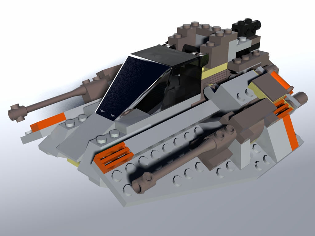
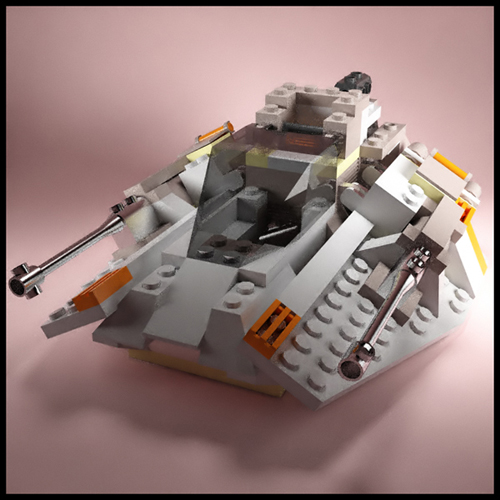
Lego Model
-
Looks pretty good!
-
@smokinbakin said:
Looks pretty good!
Thanks.
(Actually I mean "Shoot!". When I saw that there had been a response I was hoping for some criticism, so I could change something and try again.
 )
) -
If it's a sort of "challenge", it's a cool one. Now imagine what a difference some subtle, rounded corners could make (I did a very rough and overdone one only on the cockpit)

-
This is my clumsy try...


-
-
@gaieus said:
If it's a sort of "challenge", it's a cool one. Now imagine what a difference some subtle, rounded corners could make (I did a very rough and overdone one only on the cockpit)
Good work Gai!
On another subject - what is the secret to adding an attachment which doesn't crop and scroll. Is there a certain max resolution we should use?
-
If you don't place inline, it won't scroll just create a thumbnail of pre-defined size.
Coen is planning to "fix" this scrolling (creating a thumbnail as small as to fit into the text width would be enough I guess)
-
OK, let me push the thread off-topic for one single post - I am testing something I have just changed (not the render is interesting but the thumbnail size if I am successful)

Placed inline...
Do you guys find the above thumbnail big enough? Now it's 400 pixel wide and ou can see the full image by clicking on it(If we go on with this discussion, I can split the topic and move the thumbnail discussion into the Corner bar > Ideas box & board issues subforum - so sorry again, Al, for the OT post)
-
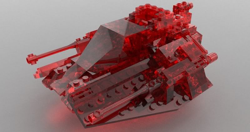
The lego ruby

-
Nice one, Oli.

Thanks, Al.
-
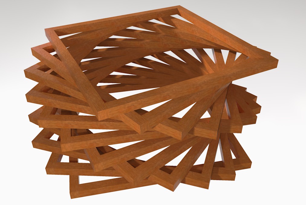
Jelly bean

-
massimo, what renderer is your image?
gaieus: yes its big enough but wouldnt it be better like the twilight forum? no clicking/previews etc.
-
@unknownuser said:
massimo, what renderer is your image?
A quick MLT in Kerkythea. But my i'm quite new to render.

-
@gaieus said:
If you don't place inline, it won't scroll just create a thumbnail of pre-defined size.
Coen is planning to "fix" this scrolling (creating a thumbnail as small as to fit into the text width would be enough I guess)
I changed my initial image from inline to a pure attachment - it is still scrolling.
Actually, it loads as a scrolling image until I click on it. Once I click on it, it becomes full size. But if I reload the page, it starts scrolling again.
@unknownuser said:
Placed inline...
Do you guys find the above thumbnail big enough? Now it's 400 pixel wide and ou can see the full image by clicking on itMy original image was 600 x 413. I would like to see images of 640 x 480 easily displayed.
I think a forum should be full of images, (especially this gallery section), and limiting them in size can make it harder to show something. The text has a limit of 700 pixels wide. If we kept the images to something smaller, then the forum would keep a good appearance.
(Go ahead and move this discussion to a different forum if you like...)
-
@massimo said:
@unknownuser said:
massimo, what renderer is your image?
A quick MLT in Kerkythea. But my i'm quite new to render.

looks nice
-
@olishea said:
...gaieus: yes its big enough but wouldnt it be better like the twilight forum? no clicking/previews etc.
I have scrollbars there, too, with inline images (as far as I remember).
Al, I'll experiment a bit but I think the forum willwant to create thumbnails in any case.
Also, with some bigger images, we need to respect those with smaller bandwidth and loading times. -
yeah when you place inline there are scroll bars.....but if you don't there are none
-
So this is it - I changed the size of the thumbnail created to fit into the 700 pixel (?) text area. This way there are no scrollbars (I can experiment with how big can be displayed without scrollbars).
As for your first image, whatever had been uploaded before I changed it, will remain like that. It only affects new uploads.
(Then Pilou beat me and uploaded one that has scrollbars...)

-
sweet line renders there al, great image

I normally use photobucket for images in this forum....no clicking, scrolling or attachments......but its annoying having to use another web site
-
no i mean the images further up... the metallic looking ones. although i did wonder how u got those colours like that. I didnt realise you could render lines in that app
Hello! It looks like you're interested in this conversation, but you don't have an account yet.
Getting fed up of having to scroll through the same posts each visit? When you register for an account, you'll always come back to exactly where you were before, and choose to be notified of new replies (either via email, or push notification). You'll also be able to save bookmarks and upvote posts to show your appreciation to other community members.
With your input, this post could be even better 💗
Register LoginAdvertisement


