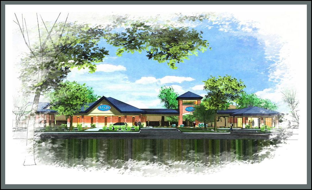
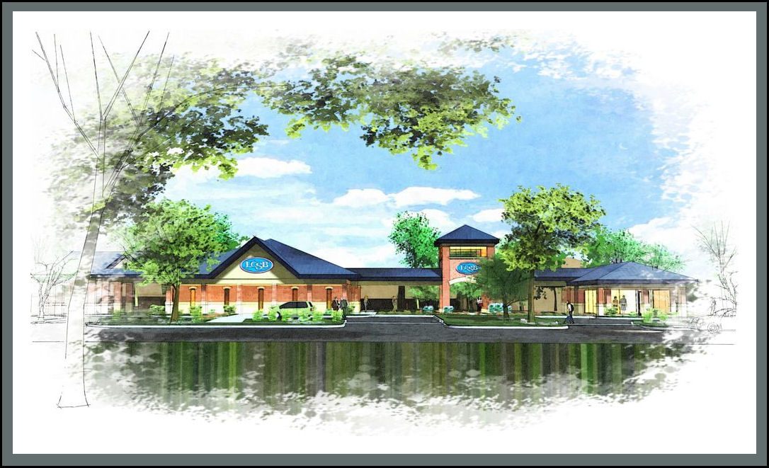
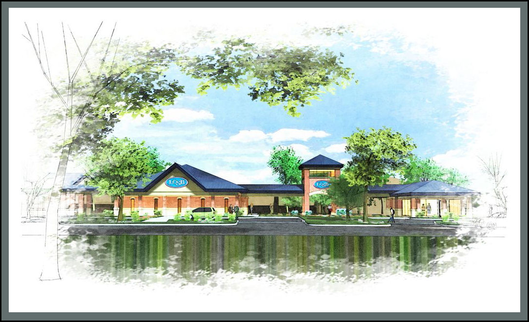
Which one do you like best...
-
...if any :`)


-
Hello. I like these. But i think best would be somewhere between the 1st and 2nd image.
-
Difficult to choose...
 Maybe the first...
-
#2
contrast seems just right but that could be my monitors fault.
love the watercolour/sketch style
-
It's hard to tell on an LCD monitor as brightness is not constant over the screen surface, unlike CRT. But I pick #3.

-
I like the third one best, feels more water color, less bold, easy on the eyes.
-
prefer #1 more contrast/
-
I'll go with 3, just a nice balance.
-
- is my favorite.
-
Well, I like #2. The building is just a tad stronger then the landscape and attracts my attention.
-
yeah I kinda like 2 best
-
Although, I would tone down the water like #3... or even more then #3.
-
Tina you struggling with this?

-
LOL, It's been a rough week!

-
All three look good, to me.
Shouldn't you see the building reflected in the water? -
Not water...just the sub-terranean end of a hemispherical sky: cool base for the render, huh? :`)
That said, thanks all for the response and kind words...I'm quite pleased with the range of likes (and several of you are even spot on with my triggers, thank goodness).
Hello! It looks like you're interested in this conversation, but you don't have an account yet.
Getting fed up of having to scroll through the same posts each visit? When you register for an account, you'll always come back to exactly where you were before, and choose to be notified of new replies (either via email, or push notification). You'll also be able to save bookmarks and upvote posts to show your appreciation to other community members.
With your input, this post could be even better 💗
Register LoginAdvertisement


