SPA wip
-
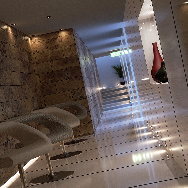
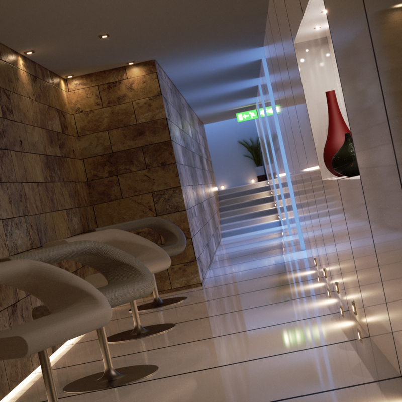
This is a little project I'm carrying on in my (little) spare time, so expect times for improvements to be biblical. The scene is not too complicated itself: the overall feeling is achieved essentially by playing with the colour of the lights.
This is rendered with Indigo (commercial version), 24hours ongoing. The original resolution is 1200x1200 pixels, and there are 5 light layers: the spots, the blue light from the pools, the neon tube on the down-left corner, the exit signal and the leds over the vases on the right.Would be cool if I could do my first light animation video!!!
Enjoy!

-
Fantastic crisp and clean render, great textures on chairs.
I also like the acrylic walls and floors, as well as the blueish light filtering from openings.Only one crit, the exit sign lighting is to intense.
-
Wow!!!
 Mama mia !!
Very clean render, the design is just what I like, congrats...
-
Very, very, beautiful work. More please.

-
very nice pibuz! It's great as-is but I have a feeling you are going to improve on some of the little details to make it extra special
 Looking forward to the animation, too.
 -
I agree this is a great render, nice a crisp.
My only crits would be that the wall (far left) looks like it has a texture shift in it.
Also, is that same wall floating off the floor?Scott
-


 Excellent render.


-
vey good render.. with 24 hours!!! definitely worthy of wait.
-
@ Nomeradona:
Thank you man. I always admire your skills in the images you post.@ Michalis:
Thank you very much!@ scottpara:
Damn, you got me! I saw the shift of the stone texture too late
But the wall is not floating at all.. Gonna try to make the joint more visible..@ Whaat:
Thank you for the feedback Dale! An injection of confidence!


@ Dale:
Thanks man: more to come!@ fymoro:
Thank you very much. The design is very simple, the power here is the unbiased method.@ solo:
..perhaps I exaggerated a little with the diffuse glow effect


The original render was much more lit! BTW, you're right. Gonna fix that! -
Wow... Really nice, crisp and clean render...!

Everything from the camera angle, to the scene composition to the textures and materials you've used is EXCELLENT...!!

If I am to be really nit picking it would be more an idea rather than actual crit...
You should play a little with the spotlights and use IES lights...
Also - it seem as if the small spots inside the wall where the vases are, aren't lit, although they're emitting light on the vases...
(sorry for the poor explanation, but I hope you get what I mean...?!) -
..Perfectly Frederik. I've noticed that too!
Maybe the leds' surfaces (they're tiny circles to simplify calculations) are too small. I've done some tests turning on diffraction and they are much more visible. I definitely prefer the diffraction on, but it's damn heavy RAM-wise..

-
Really nice crisp render....love it.
Hello! It looks like you're interested in this conversation, but you don't have an account yet.
Getting fed up of having to scroll through the same posts each visit? When you register for an account, you'll always come back to exactly where you were before, and choose to be notified of new replies (either via email, or push notification). You'll also be able to save bookmarks and upvote posts to show your appreciation to other community members.
With your input, this post could be even better 💗
Register LoginAdvertisement


