Let's talk about D.O.F
-
Solo:
Can you do a fast 3D nature scene with a house or something in the midle with, render that and the depth pass with VUE and post it here? So that way i'll try to do a generic tutorial that could be used with most 2D apps. I'll post it here with the final result and we all can try make it better with tips and advices. Like a comunity tutorial. What do you think? If you like the ideia try to make a image with detail close and far from the camera.
By the way, has richard said, photoshop it's not that hard to pick up, and beeing a Standart has it is to the industry means that, besides beeing a really great software, anything yout don't know how to do it it's easier to find help and tutorials everywhere. So my advice give a try to photoshop (and if you can pass that "test" and like it in the process, the next step you'll do will probably be the same has i did: buy a tablet;))
David
-
@solo said:
Here is another post edit DOF attempt, this time I concentrated on the flower bed in the foreground, but something is just wrong and I cannot figure out what.
(Twilight render)

i think that the 2 columns next to the center flower bed should be sharp since they are on the same view plane, but they look out of focus for some strange reason..
-
David, great Idea.
I added a few things to a previous model setup in order to give it detail in the fore, mid and background. There is a zip file with the three images which include render, alpha map and depth map.
If anyone has paint-shop pro regardless of version and can pull this off, please feel free to play.Oh, I already have a tablet, a wacom that I use with Corel software like Painter 11.

-
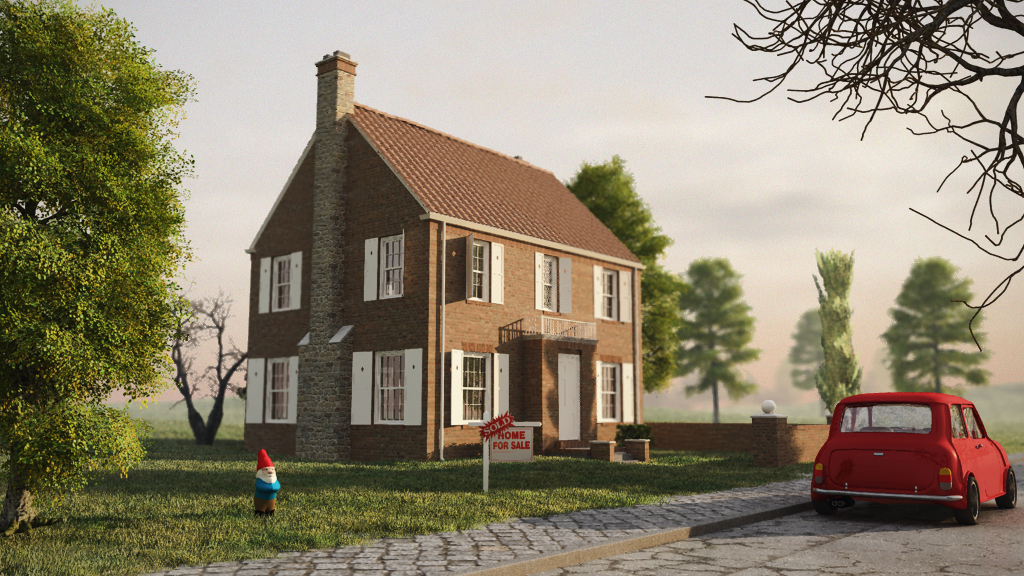
Pete...great image. Here's my quick attempt with photoshop. Tried to keep it subtle. In PS it's a matter of creating a layer mask and loading the depth map into. Then adding a lens blur filter set to read the layer mask (depth map). Then disabling the layer mask when you are done.
I see in PSP they have a DOF tool from version X1 forward...but it doesn't appear to have a place to load a mask or custom aperture shape. I don't know if they make it as a plugin for PSP but DOF Pro http://www.dofpro.com/index.htm is a good stand alone program that you could use.
-
Anyone tried getting a shift lens look in their renders before?
Always thought it looked a little strange myself but i imagine someones found a use for it.
-
I've been following this topic with great interest and now I feel I have to chime in with a big thanks, DacaD!
 (Maybe even I could do a DOF PP after this
 )
)Would you mind if I moved your tutorial (spluit off this topic but of course, leaving a note and link) to the Tutorials subforum?
This is too valuable just to let it sink by time.
-
Hi guys.
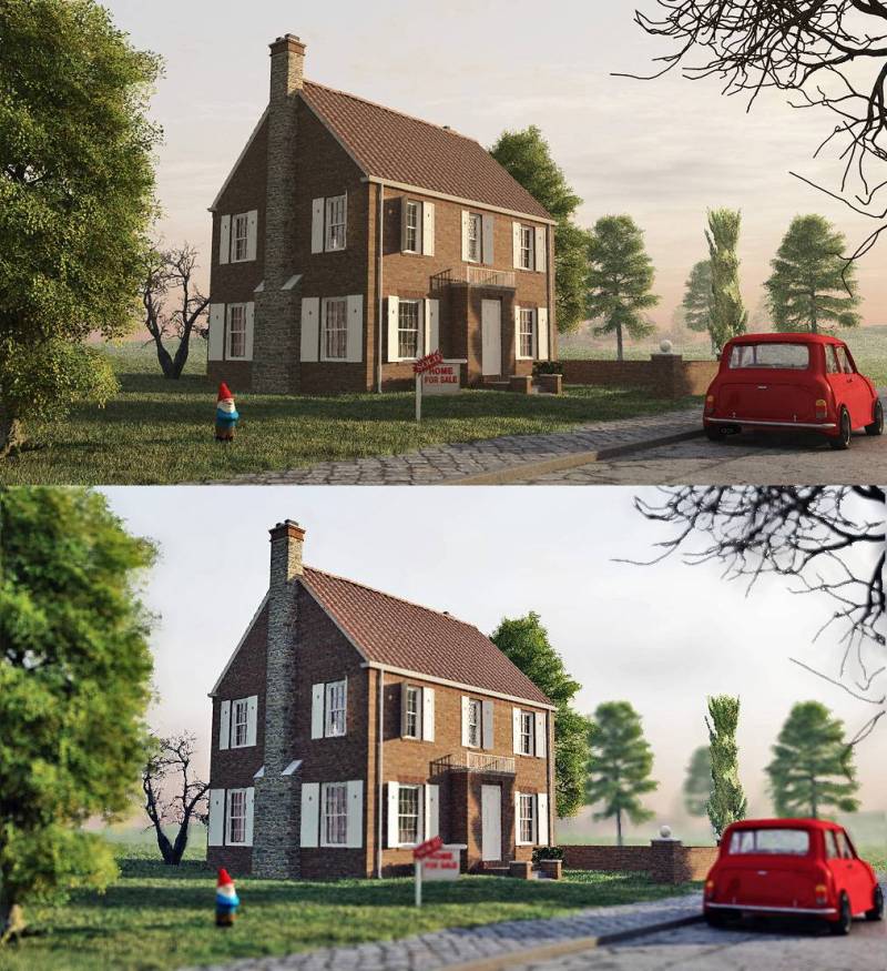
So it is 2 diferent tutorials for 2 ways to work with dofs, the first one is done in photoshop and follows the basic rules; the second one is done in NET.Paint because it's free and open source and it's much easier than GIMP to understand and pick up (think of it as a photoshop with just the basic tools you need). So let´s start:
Photoshop:
1- Open the base image and select all and copy/paste the all image again (ctrl+J) (never work on the base layer)
2- Open the depth map, select all, copy, close the image
3- Now in your top image layer add a layer mask (on the bottom of the layer bialog box you have a square button, or go to the menu Layer-LAyer Mask - Reveal all
4- In that image layer you now have 2 squares, one for the base image other empty, so select the first square (image) then go to the channels menu (top in the same layer dialog box) turn on the new empty square, and paste your depth map
5- when you go back ro the layers menu you'll see the image more red, it's normal, now seletc in the image laeyr the first square of the base image, and got o filter - blur - lens blur
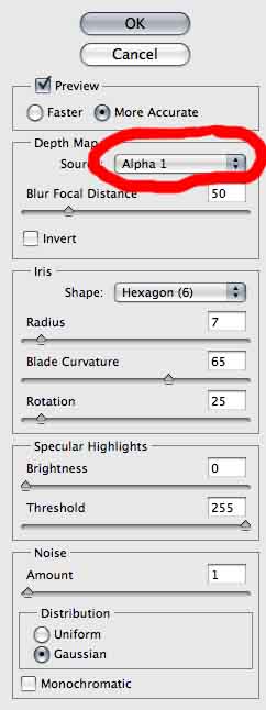
6- In the new menu that shows choose has source the Layer Mask (so to blur things out in the image, the app will use the layer mask of this layer that has the detph map)
7- Now you just have to use 2 slides: The blur focal distance (does what the name says...lol) and the radius (controls the amount of blur). Keep in mind that you shouldn't use too much of this because the good DOF will be subtle most of the times.
8- After that press ok and delete just your layer mask of the image layer (it won't affect your image). Now redo the blur and save as much times as you need with diferents results, and then see in that order outside of PS the diferent images you've made and choose the bes for you (this will be the best way for you to see when overuse or don't use much blur, and will also gain experience controling the amount of blur needed)BONUS TIP: Not beeing DOF related, you also have to keep in mind that 90% of the time you should postprocess your render images. Why? because in renders normally the colours will be washed out, shadows and lights without too much contrast, etc. So don't use your RAW renders.
9- To quickly push the colours of your image, beside doing the usual "auto tone", "auto colour", and "auto contrast" (of course sometime you can't use it but i used in this example), open your choosed final blur version, and duplicate the layer again (ctrl+J)
10- Now in the top layer put the blending for the layer in soft ligh, and play a bit with his oppacity but not too much (know the image will be darker but don't worry with that now because the colours will already look more alive and strong)
11- Go to image - adjustments - shadows/highlights
12- Put the shadows around 15-30 and the highlights around 40-50 (you can try this directly on the top layer or merge the 2 layers down before this last step)
13- That's it. See the 1st picture above for comparison between the orignal image and the final (notice the colour tones and the blur, that here it's exagerated on purpuse, on normal use should be much softer)The next Tutorial, doesn't follow these "normal" rules, and because i used NET.Paint for this i tryed to be more easy and also able to do in any other app.
1- Open the base image, and duplicate the base layer (again, because you shouldn't work on the base layer)
2- Create a new layer, open your depth map, select all, copy, close and paste in the new layer created (the net.paint doesn't do this automatacly...i think)
3- Now on your depth layer go to adjustments - Brightness/Contrast and raise both but more on contrast (this is to diferenciate better the diferent tones of grey)
4- In this tutorial i'll blur the house and focus on things near (but you can focus on anything), so with the help of the diferent grey tones select the dark grey from tree with the magic wand, and put the selection mode in "add (union)", and keep selection until most of the tree and the parts near to the camera are selected (this should include the dwarf too)
5- Go to Edit - Invert Selection
6- Hide the depth layer and select the image layer (you'll see that you'll keep the same selected parts in the image, so we're basic using the depth map as a alpha channel)
7- go to Effects - Blur - Unfocus and put a low value (between 1 and 5 should be enough)
8- And that's it, but for pushing the colours and a bit more contrast, merge all layers down and then duplicate this layer for the final blur image
9- with the top layer selected go to layer properties (f4) and put the blending mode to overlay) and play with the opacity (not much and don't worry about beeing to dark)
10- go to adjustments - levels , and push up a bit the output levels vertical slide.
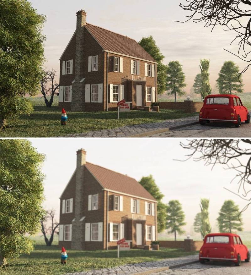
11- save the final result and that's itAs you can see it's pretty simple doing this and there's not one only right way to do it. You don't really need a depth map but it helps a lot to select things or to use as source for the blur. Remember that doing the dof this way has two big advantges: more control, and much faster dof (render dof will allways raise your render time greatly and this will just take 5m to do).Ialso like more the final colours of PS tutorial image (more experience with PS) but the dof in the NET.Paint it's better (because i exagerated that on PS for exagerating greatly the diferences). The colour enhancement tip works better with images with trees or green parts. Feel free to correct any mistakes and share any more tips to enhance this tutorils. Hope it helps
David
-
No problem Gaieus

As you said, leave the note and link in this topic too so that people can follow, but try to put something on the title or something (like comunity Tutorial or something like that) to notice that this is a "open source" (lol) tutorial that anyone can change and share more tips.
David
-
OK, done:
http://forums.sketchucation.com/viewtopic.php?f=18&t=22355In order not to break the continuity of this topic, I left the original in place and only copied it over there.
-
@unknownuser said:
Hi guys.
So it is 2 diferent tutorials for 2 ways to work with dofs, the first one is done in photoshop and follows the basic rules; the second one is done in NET.Paint because it's free and open source and it's much easier than GIMP to understand and pick up (think of it as a photoshop with just the basic tools you need). So let´s start:
.............
David
About all this fine tutorial. First there's an issue with these depth maps. What if we have to deal with a transparent surface? See though mini cooper's glasses. What if we use alpha transparent png cut outs? For all these here's the solution:
"How to create a depth map using SU fog effect".- In SU > shaded with textures > turn shadows off > set fog color white, do some adjustments > light and dark to 0 > display edges off > export 2d graphic at N resolution
Here's an example after some adjustments.
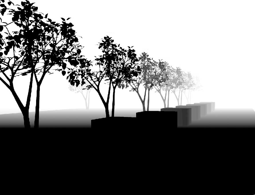
In your favorite rendering engine, render using the same N resolution. (works fine with SU 2d export graphics)
In photoshop invert (CTRL+I, cmd+I(mac)) depth map > open channels palette > select R or G or B channel > drag and drop it on rendered image. This will give you a new A-channel. Filter > blur > lens blur...
(BTW a similar technic is useful for real fog effects -using clouds etc-)
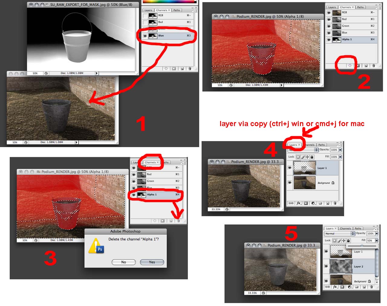
So we don't really need to ask renderer to export a depth map, not always what we really need.
- In SU > shaded with textures > turn shadows off > set fog color white, do some adjustments > light and dark to 0 > display edges off > export 2d graphic at N resolution
-
@unknownuser said:
Solo, I'd like to take the camera out on the weekend and take a set of shots of a similar style house through the DOF range. To get as close as I can I need a few dimensions.
i dunno, the idea that a render's dof should match that of a camera seems sort of ridiculous to me.. for one, cameras always lie so stating them as truth doesn't work.
also, it's not as if cameras were made in order to produce varying dof as an artistic choice rather: dof is a result of aperture and distance to focal point which people have learned to creatively control.rendering isn't photography and the two should remain separate.. shoot photos that look good.. make renders that look good.. don't try to get all scientific about it.
-
Interesting point Jeff, however this begs the question then:
Are renders intended to be photo-real or as we see it real?
-
I'd have to disagree with Jeff on this one. A camera is about as close as we can get to simulating what we see with our eyes on a 2d image. It doesn't make much sense to me to try and fool the brain thinking what's on a paper is real life. When you hand someone a realistic rendering on a piece of paper they're immediately going to think it's a photograph and be evaluating it as such. There's a reason that renderers, particularly unbiased ones, involve a lot of camera parameters rather than eyeball parameters. There are limitations you simply can't get around.
For example someone earlier in this thread didn't like the DOF because it only works if you're looking at the house. If you look at the tree, the idea was, that it's not like real life. But we can't simulate real life, only real life translated to a static 2d image. Cameras pick 1 focal point only and then you snap the picture. Your eyes do the same thing but the focal point is constantly changing. Until you can constantly change the focal point on a sheet of paper along with the exposure and the like, we're stuck with simulating photography.
-Brodie
-
I think it comes down to what you are selling. Is it a product, or is it an intention aimed at selling an emotion? If selling a product...photo real is necessary, and accurate emulation is critical. If it's an expression that you are selling, aimed to convey the artistry of a design, then personal creativity and human influence should dictate.
On one hand you have 3D art that is used to sell an idea and portray that which only exists within the mind. Then you have 3D replication, which is used to sell existing or proposed products as a substitute for prototyping and a real world photo shoot. I think the intention should dictate the approach.....with DOF or otherwise.
Just a thought.
-
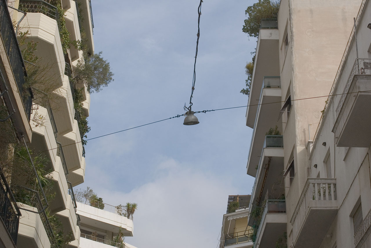
In an ugly town like Athens Greece. Photo taken using Nikon D200, Nikon 50mm(1.4), f11. Lot of depth of field but no blur at all. So don't use DOF in situations like this.
-
@unknownuser said:
We are dealing with three main variables, the focal point, the depth of the focus and the point at which the camera lens cannot resolve a close-up. The speed ASA/ISO hasn't even been taken into consideration. If you look at these variables across the range of aperture settings that are available there are an infinite number of possibilities. There is also an element missing with the render engines and that is exposure time. I’m not sure that the engines are really capable of emulating a camera fully.
I set up Indigo to test its DOF and found that once you got past f11 everything was in focus unless you where to close to the subject and the foreground couldn’t resolve.Film size and focal length are the main variables to take to account. On 35 mm film and a normal or wideangle lens your Indigo example would be quite realistic, I guess. Cheap small format cameras used to have a fixed focus because everything from a couple of meters to infinity would be in focus. Even the focus ring in my Rollei 35S has a red "set it here and forget about focusing" marking. DOF becomes an issue with large film formats and longer focal lengths (that go together). On a 35 mm camera DOF is an issue with telephoto lenses, maybe from 135 mm up. This is what makes Solo's example so unrealistic- in no way could that be a photograph. Traditional architectural photographers used large format cameras, often adjustable. With these, DOF is an issue, and to get everything in focus they used very small apertures (f64, f128...), long exposure times, and camera shift and tilt effects (the tilt is there just to deal with DOF.
Anssi
-
@solo said:
Excellent responses guys, and I agree the top image just does not look right, I was not sure if the DOF was to strong or just wrong, to me it has a 'tilt shift' feel, just as you noticed David, it looks miniature.
Just stumbled upon this discussion. At the risk of going taking it a touch off-topic, there's a dutch photographer that uses a technical camera and DOF to create this "miniature" effect with real-world objects on purpose. There's some nice examples of images from a building site here: http://www.martinluijendijk.nl/projecten/voortgang.htm
Cheers.
Hello! It looks like you're interested in this conversation, but you don't have an account yet.
Getting fed up of having to scroll through the same posts each visit? When you register for an account, you'll always come back to exactly where you were before, and choose to be notified of new replies (either via email, or push notification). You'll also be able to save bookmarks and upvote posts to show your appreciation to other community members.
With your input, this post could be even better 💗
Register LoginAdvertisement


