Kitchen reno
-
@unknownuser said:
As for the space above the cabinets I've never really seen anything very appealing myself. I prefer the cabinets to go all the way up personally. They end up going way too high to be used on an every day basis but you can always put junk up there you don't need often.
-Brodiewhat would you think of boxing in the tops and doing drywall? i'm considering trying that.

complete with crown molding of course.
-
here it is with the tops boxed in and a redesign on cupboard construction:
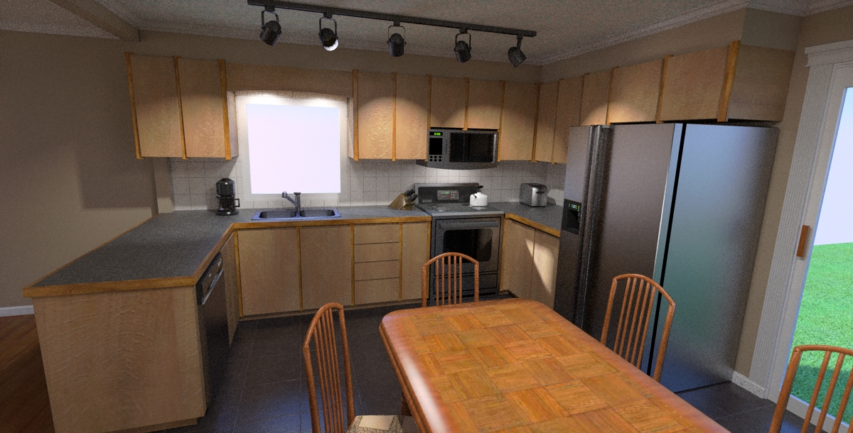
what do you all think? -
OOH! gotta love the MLT, 109-passes 5.5-hours .

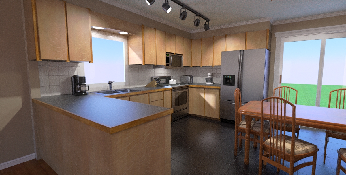
-
found this light at homedepot and just had to put it in

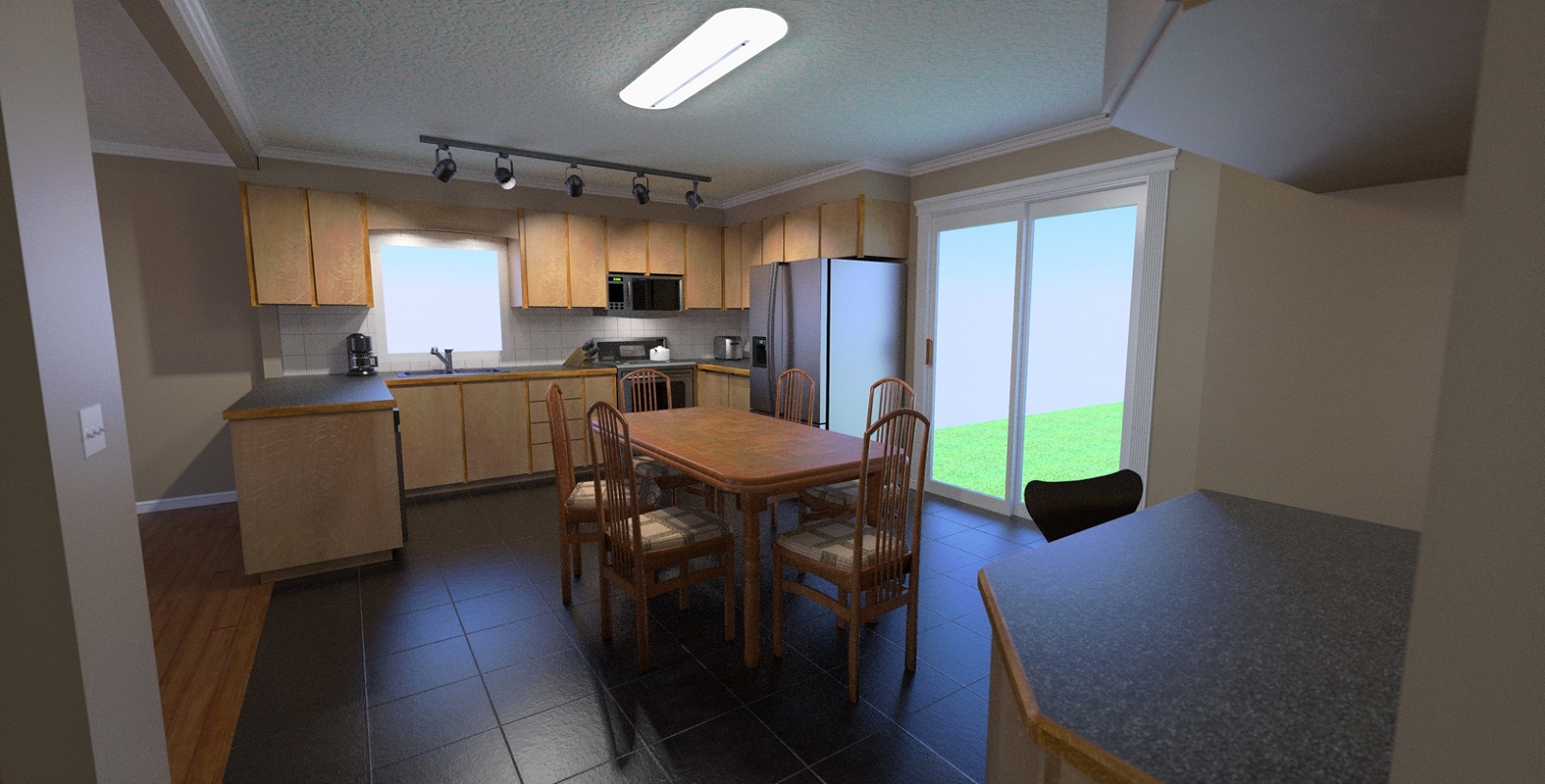
-
Rocky ,
Looking good. Put a nice crown molding around the top of the cabinets. It is always a nice detail. Maybe a threshold on the joint on floor between tile and wood floor. Put a floor to top of cabinet gable on the right side of the fridge. Some handles....long brushed finish. Blah blah blah..... Looking good. Keep posting.
Jeff -
Rocky, the new light looks great!
...but I got a bone to pick with you though - the view out your windows sucks!


Its easy to fix though...takes 5 minutes
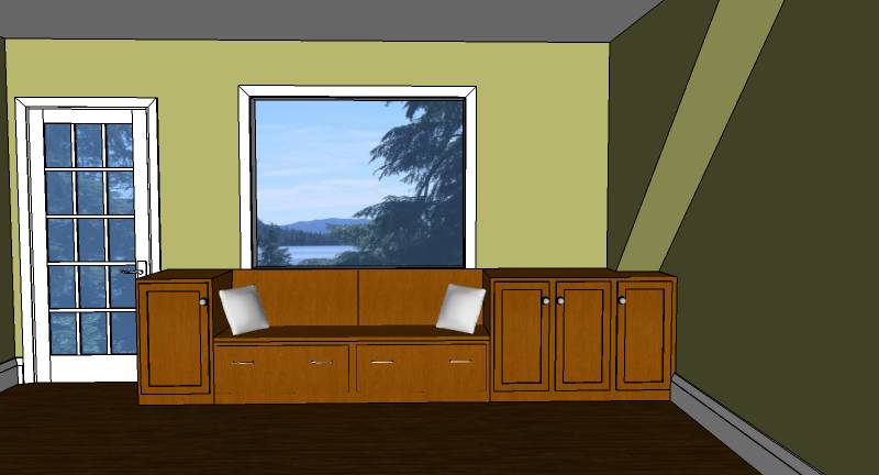
-find an image you like
-import into SU
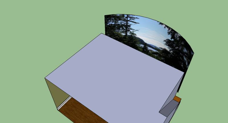
-project it onto a semicircle strategically placed outside your window
-hide or delete the original imageHere is a cabinet install project I did recently. I just searched for something like "Alaska mountains" for the image. The customer was tickled that his home value increased by $3 Mil

-
i was actually thinking of taking a picture on site to put in the background but don't know the best way to go about it.
besides i too busy actually working on the project. not the soft (SU) one but the hard (skin your knuckles) one.
remind me to post some pictures of this place, a real shit hole. (before my magic touch of course)

-
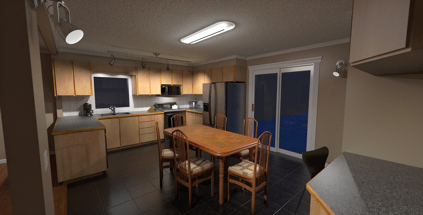
found some new track and wall lights at Rona

thanks again Equadorian for the awesome light shade material!
-
 Wow, just look at the difference with the first image in this thread, just five weeks ago. I see this kitchen design has been quite a journey for you.
September 25:
November 02:
-
yes, i'm living and breathing this damn project!
but it is fun. and i think spending this much design time is really helping on site. when i'm working there i never have to pause for a minute to think about how something is going to look, i can just keep working and i feel as though i've already built it once before.

-
hey i found a picture of what i started with. trust me it was worse than it looks:

the window you can see on the left is where the patio door is in the render. the built-in desk on the right in the render is where the fridge and stove are in the photo.
-
Hi xrok1
pic not showing up on your post!! By the way love the job your doing on the renders - making me very jealous!!!! I know I make really cool kitchens but am totally embarassingly rubbish at modelling / rendering them!!!
-
sorry!

the window you can see on the left is where the patio door is in the render. the built-in desk on the right in the render is where the fridge and stove are in the photo.The wall you see in the foreground is now gone except for a column where the light switches will be.
-
progress report Scotty!

this was taken on my iphone (3pics) and put together with the pano.app
Hello! It looks like you're interested in this conversation, but you don't have an account yet.
Getting fed up of having to scroll through the same posts each visit? When you register for an account, you'll always come back to exactly where you were before, and choose to be notified of new replies (either via email, or push notification). You'll also be able to save bookmarks and upvote posts to show your appreciation to other community members.
With your input, this post could be even better 💗
Register LoginAdvertisement


