Help me decide...
-
Hi, Ioved the last post so to see u back looking for opinions I feel obliged.
My favourite is #3 as it has the right balance of colours and shading. The first pic I found myself drawn to the chimney stack as it was so dark and the roof and sky blended into one. The second pic the grass needed something as the house dominated pic. The fourth I felt the detailing on the house was too pronounced.
But I'm not an art critic and my opinion holds no weight.

-
I like No.4. The slightly darker image seems to suit the morning/evening red sky.
-
Help... I can't see the differences.

They all look good.I love the guy on the roof and his wife trying to convince him to come down....
-
All the same for me. I mean you should consider the color profile, so many OSs, monitors, calibrators profiles etc. Nice work though.
-
Thanks, Guys, for getting the ball rolling so nicely! rich: the individual viewer is the only art critic that matters for each moment...hope to hear more honest personal reviews. michalis: Que?..."color profile" is what?
More please and thank you...
[Yeah, heehee, working title would be: "fidalis on the roof" :`) He gives me a grin up there too (after I got the direction of her gaze right), but let's not stray too far into content right now, thanks...as much as I'd like too, lets save it for another time.]
-
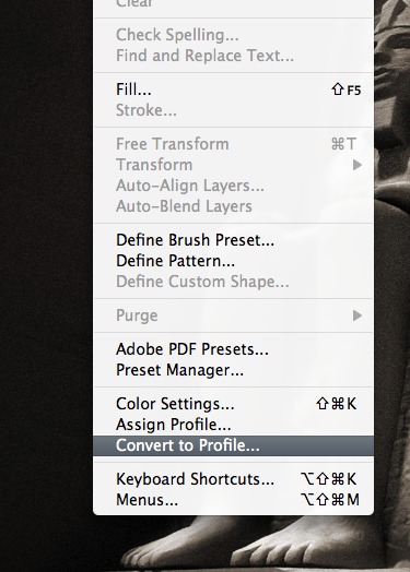
Be careful tomsdesk. This is the way to see same colors in deferent PCs and monitors. If you are in Pshop go to edit menu and convert your photos profile to sRGB. sRGB was internet explorer's default profile and its a standard for many equipments.
-
Hmm I'm liking the second one the most, and the first less.
I like the second one more due to the details I still see in the cladding while the background tree is still
subtle and not too strong pronounced. But that's just my thinking, it might also depend on color profile's
as others told before. I hope you're having something usefully on my comment.Btw, great style, I like it how your style evolves trough the topics, and the man at the roof

Grats,
FoXy ^^ -
No. 2 - although no. 4 has better grass color (IMHO), I think the darker foreground competes with the house for attention. Overall, no. 2 is more pleasing to me.
Your shadows have me baffled - the sun appears to be coming from the right, so all the shadows should be on the left, yet the chimney is casting a shadow on the roof to the right.
-
@foxar said:
...the details I still see in the cladding...
Exactly why I started fussing with the first image: so glad I did.
Michalis...in PSP these images list as "RGB 8bits/channel", in PhotoPaint (I don't have photoshop) as "24bit RGB". I can change to "NTSC RGB" (in Corel PhotoPaint) and the oranges get really strong (changing to "PAL RGB" isn't noticable). I don't find anything called "sRGB"? But do I understand correctly: If I change to "NTSC RGB" then adjust the image colors to look better on my screen they may look better on someone else's? Why wouldn't my machine be like theirs in the first place...or will the ones that are now be fussed up?
Daniel...yes, the little trick of two shadow layers came out too pronounced in this image.
-
Every nice PP app has a color management option. 8bit per channel = 3x8=24bits. Just be sure that your photo has a color profile embedded, then very nice OSs can project colors correct on your monitor. MacOSX and windowsVista can do it. WinXP or some LINUXs... no, sorry. Maybe this explains why photos opened in photoshop, look deferent than any XP photo viewer.
sRGB is fine for most cases. Just ask your app to do this. Look in prefs maybe there is something there, (color management), I can help for photoshop and gimp if you like.
http://en.wikipedia.org/wiki/Color_management
Hello! It looks like you're interested in this conversation, but you don't have an account yet.
Getting fed up of having to scroll through the same posts each visit? When you register for an account, you'll always come back to exactly where you were before, and choose to be notified of new replies (either via email, or push notification). You'll also be able to save bookmarks and upvote posts to show your appreciation to other community members.
With your input, this post could be even better 💗
Register Login


Advertisement