sketchucation logo sketchucation
    • Login
    ℹ️ Licensed Extensions | FredoBatch, ElevationProfile, FredoSketch, LayOps, MatSim and Pic2Shape will require license from Sept 1st More Info

    Trying something new...

    Scheduled Pinned Locked Moved Gallery
    22 Posts 13 Posters 1.1k Views 13 Watching
    Loading More Posts
    • Oldest to Newest
    • Newest to Oldest
    • Most Votes
    Reply
    • Reply as topic
    Log in to reply
    This topic has been deleted. Only users with topic management privileges can see it.
    • T Offline
      tomsdesk
      last edited by

      ...or these?


      tn_0test5-fs.jpg


      tn_0test6-fs.jpg


      tn_0test7-fs.jpg


      tn_0test8-fs.jpg

      http://www.tomsdesk.moonfruit.com/
      2.5D Trees & Shrubs!

      1 Reply Last reply Reply Quote 0
      • J Offline
        Jordan8414
        last edited by

        Very nice

        1 Reply Last reply Reply Quote 0
        • boofredlayB Offline
          boofredlay
          last edited by

          Very artistic Tom and very nice!

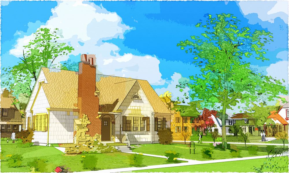
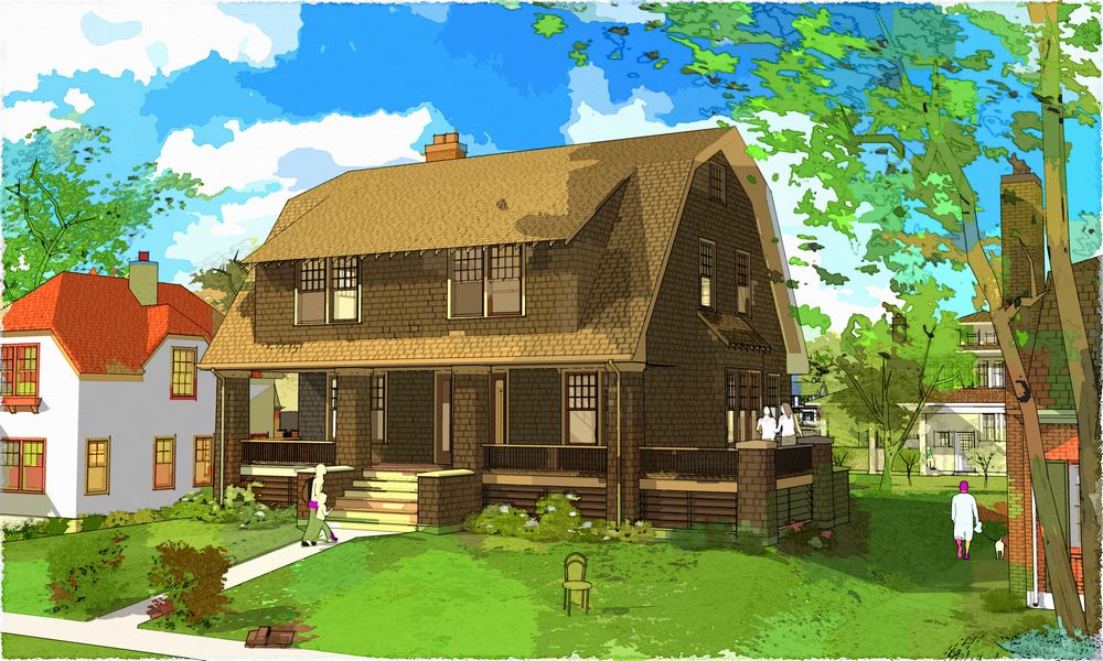
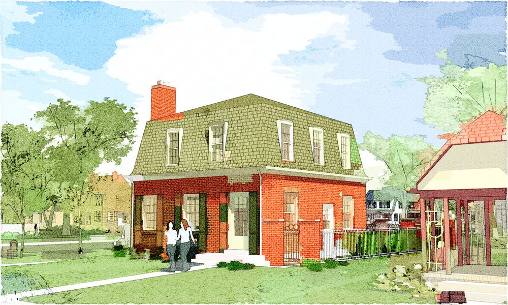
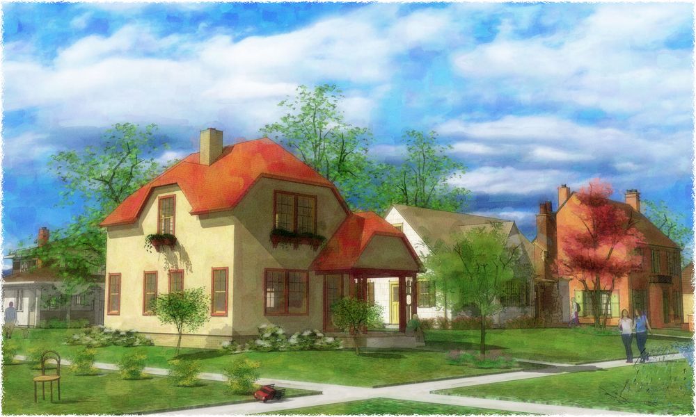
          The first set is too saturated for my taste however. And what is up with that chair in the lawn? I notice that before anything else. A bit distracting IMO.

          Keep it up and show us more. πŸ‘

          http://www.coroflot.com/boofredlay

          1 Reply Last reply Reply Quote 0
          • R Offline
            RustyShack
            last edited by

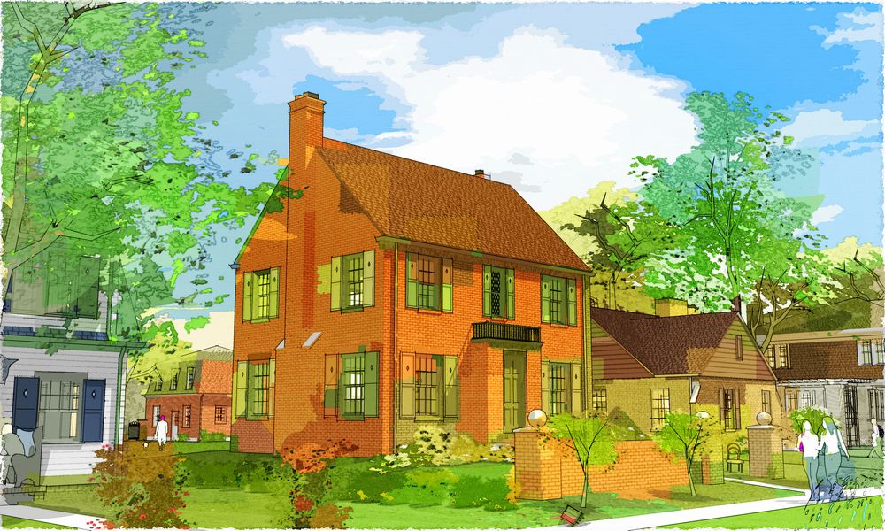
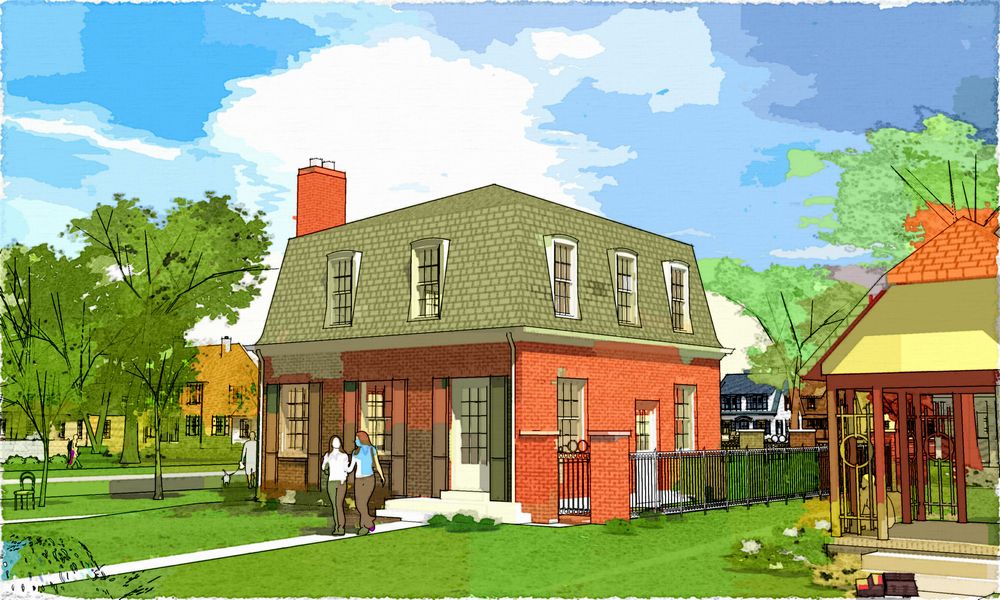
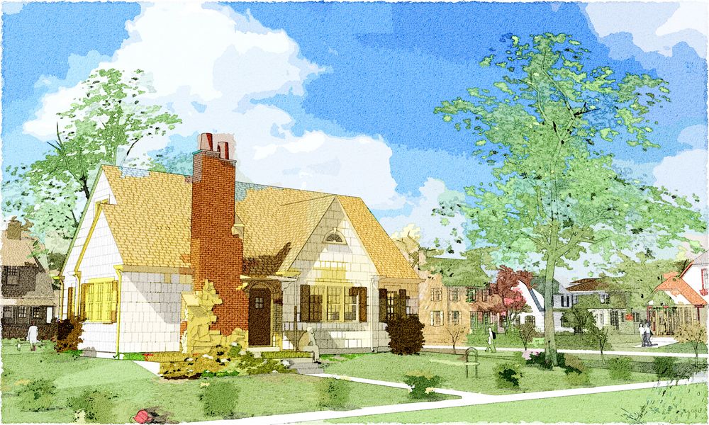
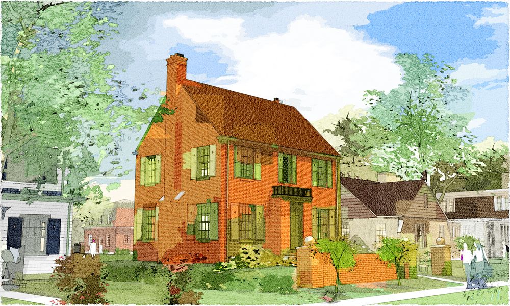
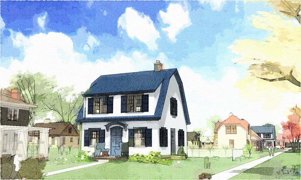
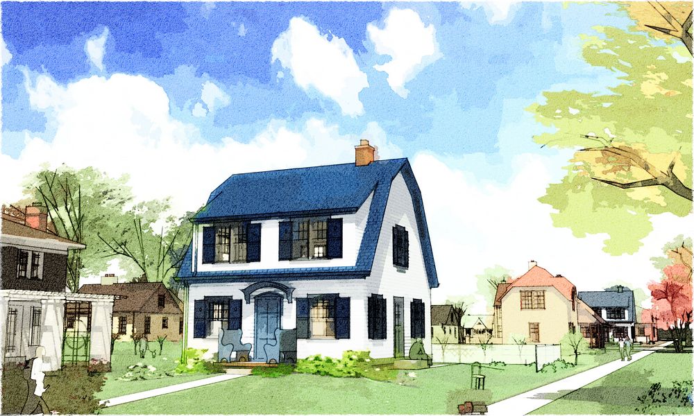
            Really nice work: a modern interpretation of the arts and crafts sensibility. Set 1 does seem oversaturated. Set 2 looks like the goal is to depict some small town scenes. Set 3 looks like the goal is to call attention to the design details of the highlighted house (in a thoughtful way). For commercial purposes, obviously set 3 is the winner so far.

            1 Reply Last reply Reply Quote 0
            • T Offline
              tomsdesk
              last edited by

              Thanks, and yes...probably too saturated for most people's tastes. All part of the (rather rapid, I think) progression today, to these below...more akin to a rendering for others, and finally something I'm really pleased with. How do they trip y'all's trigger?

              And yes, Eric, I'd probably loose (or at least obscure) the chair in a real render...maybe some of the other rather enigmatic symbols too: but these are just for fun for me and art for you! :`)


              tn_!0test5-fs2weird.jpg


              tn_!0test6-fs2weird.jpg


              tn_!0test7-fs2weird.jpg


              tn_!0test8-fs2weird.jpg

              http://www.tomsdesk.moonfruit.com/
              2.5D Trees & Shrubs!

              1 Reply Last reply Reply Quote 0
              • B Offline
                bytor
                last edited by

                Great Stuff Tom!

                How about a mix between the 2nd and 3rd set, The 3rd is just a little bland imo. The 2nd has much more "life" to it. I am not distracted by the chairs and other little things in your images - actually they keep me engaged and looking deeper into the piece. For this reason I always think of your images more as "art" than I do a rendering!

                Bytor

                Find the Cost of Freedom.....

                1 Reply Last reply Reply Quote 0
                • C Offline
                  canoek
                  last edited by

                  Not my favorite. IMHO you've done better work. Great models, though.

                  jb

                  1 Reply Last reply Reply Quote 0
                  • T Offline
                    tomsdesk
                    last edited by

                    Thanks Guys...this is great! Love having specifics to consider. More please! (jb: how so, thanks?)

                    http://www.tomsdesk.moonfruit.com/
                    2.5D Trees & Shrubs!

                    1 Reply Last reply Reply Quote 0
                    • T Offline
                      tomsdesk
                      last edited by

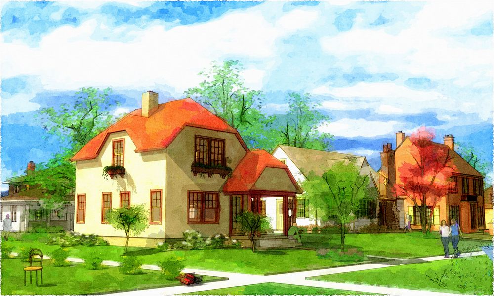
                      Here's another hoping to spur further comment:


                      tn_!0test9-fs3+2weird.jpg

                      http://www.tomsdesk.moonfruit.com/
                      2.5D Trees & Shrubs!

                      1 Reply Last reply Reply Quote 0
                      • Rich O BrienR Offline
                        Rich O Brien Moderator
                        last edited by

                        great looking pics especially as each one improves on the last IMO. Really like the last one. Are those chairs at the front door?

                        Download the free D'oh Book for SketchUp πŸ“–

                        1 Reply Last reply Reply Quote 0
                        • S Offline
                          samprocess
                          last edited by

                          For color saturation, I like to combine 1st and 2nd set together.
                          I like ur color schenme but sky, it look massive and heavy a bit.

                          ur 2.5D tree, i believe u use it, also look great.
                          For overall, I love this ur style so much. 😎

                          http:i132.photobucket.comalbumsq28samprocessSamuisamuilogo30x300.jpg

                          1 Reply Last reply Reply Quote 0
                          • T Offline
                            tomsdesk
                            last edited by

                            Thanks a bunch, Guys, glad you like! Also, really helpful to hear specifics...

                            sam: the big heavy sky is supposed to make the little houses look grounded, safe and cozy...works for me, but so much of this stuff is so subjective(?).

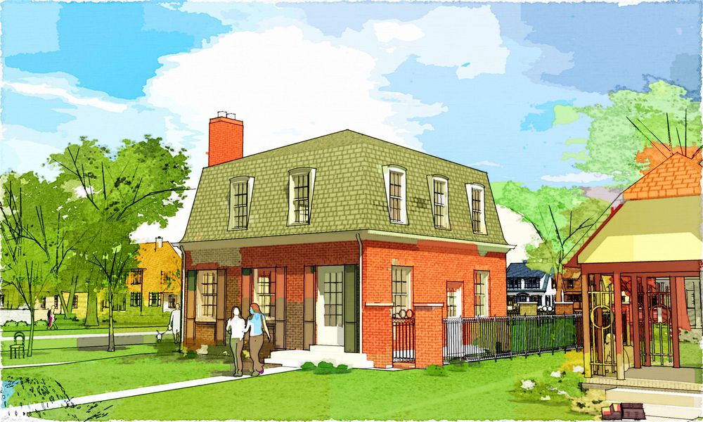
                            rich: yes, little craftsman benches; like the bracketed arch over the door, Sears included some simple style and luxury inside and out in a pretty cost effective way, I think.

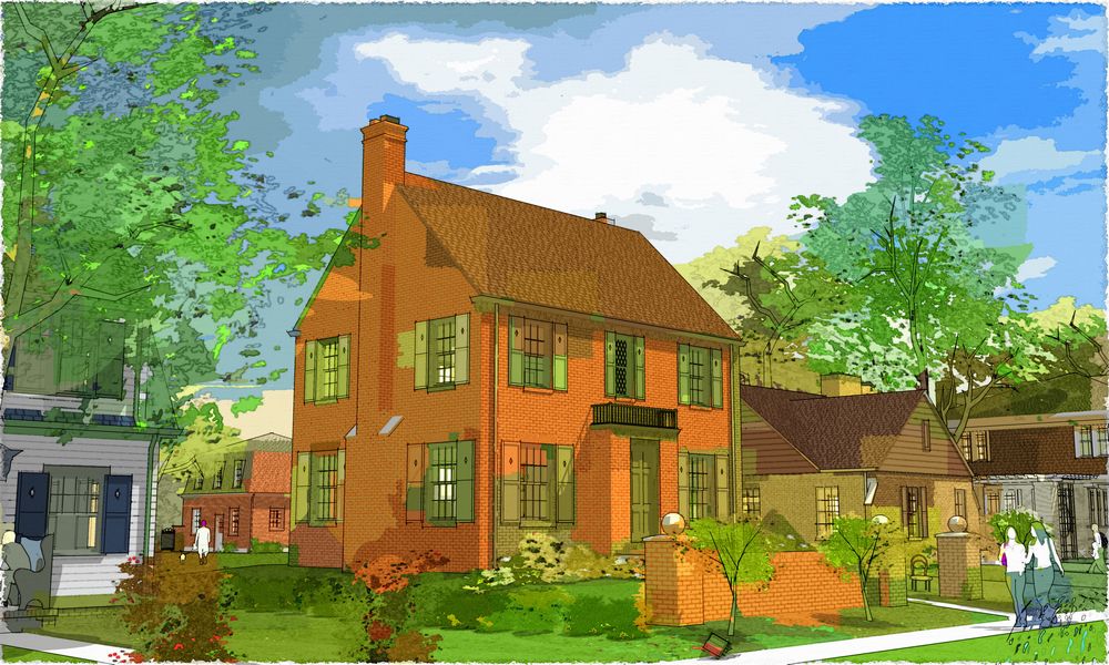
                            Bruce: love it! :`) That one is my least favorite of the last five...so glad to hear it is still well placed in the range of working. I redid some of the areas I felt problematic: did I ruin it for you?


                            tn_!0test9-fs3a+2weird.jpg

                            http://www.tomsdesk.moonfruit.com/
                            2.5D Trees & Shrubs!

                            1 Reply Last reply Reply Quote 0
                            • tinanneT Offline
                              tinanne
                              last edited by

                              OOOOO, I'm lovin' that last one!

                              Executive Director : American Society of Architectural Illustrators
                              AIP 30 Competition opens soon. ASAI.org

                              Architectural Rendering

                              1 Reply Last reply Reply Quote 0
                              • coulteriC Offline
                                coulteri
                                last edited by

                                Hello. Really very nice. πŸ˜„ What about some tutorial about, how to do something like this?

                                Thanks in advance. πŸ˜„
                                coulteri

                                1 Reply Last reply Reply Quote 0
                                • R Offline
                                  Ray Brown
                                  last edited by

                                  I'm with Tina. The last one is the best, although I'd like to see what happens if you dial back the saturation a bit.

                                  Ray Brown
                                  Ray Brown Urban Design

                                  1 Reply Last reply Reply Quote 0
                                  • J Offline
                                    jsimanyi
                                    last edited by

                                    These are all pretty enough to frame and hang on the wall! Very nice indeed, Tom.

                                    Take care,

                                    John S.

                                    1 Reply Last reply Reply Quote 0
                                    • T Offline
                                      tomsdesk
                                      last edited by

                                      Thank you, thank you...John, long time no see! How ya been? Ray, that's like pulling teeth for me (I did try duller first with it but then went back and punched it up...I'm hopeless :`) Coulteri, same tech as I have posted before...just a different layer mix and lots more screening (with a greyscale copy of the WC filter layer): and as you can see below, it's certainly not set in stone yet!

                                      This one more out of the sketchbook rather than old bookplate...whadaya think?:


                                      tn_0blocks2-2weird2test2lt.jpg

                                      http://www.tomsdesk.moonfruit.com/
                                      2.5D Trees & Shrubs!

                                      1 Reply Last reply Reply Quote 0
                                      • T Offline
                                        tomsdesk
                                        last edited by

                                        The full monty (no screening)...a couple of FotoSketch layers over SU edges and shadows topped with some uniform splatter burned in:


                                        tn_0blocks2-fs+.jpg

                                        http://www.tomsdesk.moonfruit.com/
                                        2.5D Trees & Shrubs!

                                        1 Reply Last reply Reply Quote 0
                                        • T Offline
                                          tomsdesk
                                          last edited by

                                          And back...straight SU with SnapArt underpainting (and some adjustments on top :`)


                                          tn_0blocks2-sa+.jpg

                                          http://www.tomsdesk.moonfruit.com/
                                          2.5D Trees & Shrubs!

                                          1 Reply Last reply Reply Quote 0
                                          • tinanneT Offline
                                            tinanne
                                            last edited by

                                            Love it! Has a soft, dreamy experience and the colors are great!

                                            @tomsdesk said:

                                            And back...straight SU with SnapArt underpainting (and some adjustments on top :`)

                                            Executive Director : American Society of Architectural Illustrators
                                            AIP 30 Competition opens soon. ASAI.org

                                            Architectural Rendering

                                            1 Reply Last reply Reply Quote 0
                                            • 1
                                            • 2
                                            • 1 / 2
                                            • First post
                                              Last post
                                            Buy SketchPlus
                                            Buy SUbD
                                            Buy WrapR
                                            Buy eBook
                                            Buy Modelur
                                            Buy Vertex Tools
                                            Buy SketchCuisine
                                            Buy FormFonts

                                            Advertisement