Tom and Pete's Sears collection
-
Sweet Pete...love what you've done with place! The modeled roofing is way cool (up the poly a bit I bet?)
Smokin', the Elsmore is one of my craftsman favorites...just didn't make the cut for the first set of 8. There are so many and variations of them in Wichita it seems like an old friend from childhood.
-
Pete do u just use sandbox and subsmooth for your terrains (as with these examples)??
-
Bruce, we are hoping it will be a hit, but who knows...the Sears branding IMO is pretty important, I'd prefer if we could use it as the significance of these homes lies in the context of the Sears Roebuck company and the whole concept of affordable catalogue bought homes that generated many jobs for local communities in the construction phase at a time this country needed it most. Making home ownership a reality in a time it was just a dream for most folk.
Jason, the first collection will include 8 homes, in .skp, .3DS, .obj and .vob formats.
Tom, I also did some bevelling. the conversion to .3ds with textures is very light, I can proxy the home hundreds of times without even noticing a lag, and SU handles them fine.
I actually prefer the mesh tiles over texture, it just looks better and casts great shadows.Olishea, I use SDS for the immediate terrain, and use Vue tools for all other terrains.
-
Pete these vue renderings look great. You keep impressing more and more with every image. I have a question for you...do you see VUE as being a viable tool for an architural visualization studio? You keep doing these great images that seem to be more artistic than what you typically see and I was wondering how you would see VUE working with doing more commercialized, skyscraper type buildings...ones that may not be as heavily focused on creating the great environmental atmosphers that you have been creating? Would you consider it as competition to vray? Your images are just so impressive and are making vue look more and more appealing. Keep up the great work man.
-
Steelers,
I definitely think Vue is a great archvis tool, unfortunately it's not used more in the industry due to the finicky UI and the somewhat awkward controls not to mention the perception that it's exclusively a landscape creation tool. I must admit it is the artistic look that I prefer over the sterile cookie cutter renders one sees everywhere.
I do not have any skyscraper renders as such (anyone got a project for me?) due to the fact that being freelance I don't get to many high end commissions like that, I definitely would give Vue a try if I did, I believe it would be awesome.Vue IMO is not competition to Vray, as Vray is a rendering solution and Vue is more environment creation, the current version of Vue xstream has integration with Vray and Mentalray for Max so one can render a Vue scene with Vray, the next Vue version is rumored have a direct Vray plug-in, so I'd say they are more collaborative than competitive.
-
Thanks for your answer pete, yes i meant immediate terrain. There was a full article on vue in BD magazine. They reckon because the environments are so realistic and intuitive to set up you can spend more time on the architecture instead of trees/grass/landscape etc. The main criticism was that the UI is difficult and sometimes overbearing.
So how long does it take to cook (take the first snowy image for example) once you have set up the parameters? im guessing you are using at least quad core.
-
Oliver, I agree on the UI being a little challenging at times, especially the function editors.
The Snow scene was rendered at a 16:9 format 1600x900, 300dpi it rendered in 17 minutes on an i7 (8 cores), I used an exterior radiosity atmosphere (slower rendering), Vue is pretty fast, but if you are not up to speed with the render options and atmospheric editor then it can either be blitz quick with crappy shadows or extremely slow with more than needed detail. -
thats awesome to know. As soon as I get time, I am going to try and play with it because integration with vray would be awesome, especially when seeing the quality of your images. Thank you for the explanation..very much appreciated
-
S-O to the L O,
Bring it.
Big scoops of plenty awesome here.
I was on rout to Baton Rouge and kicked some tall cold and golden there in the Big D.
The town action was quite on.
Ate some killer poor boys, Jack bird, oysters at... Ah...
The S and D Oyster bar.
You know that Jack joint?
And what is a "Bow Head?"
Heard that slung around there a time or two.
Seemed top be about curves and there hair, but any illumination you can bring is on.
Durant "Stark Club" Hapke
-
Why just sell them as Vue or Max components? Why not offer them in the home market? Bring in someone to do a simple set of construction documents and charge for the whole package?
-
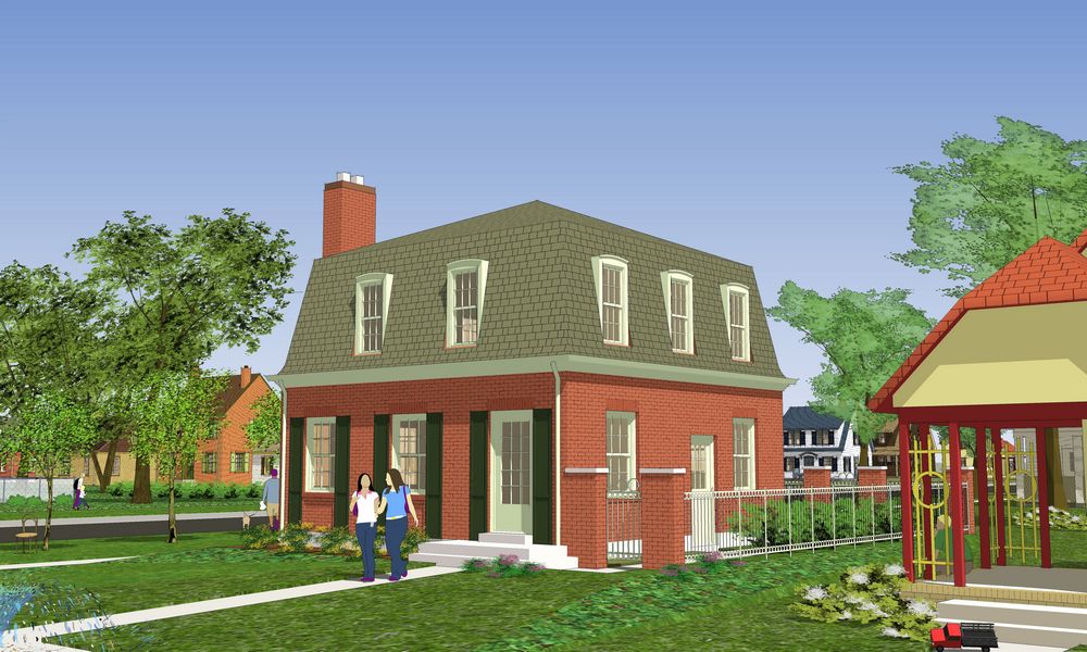
Thought I'd post a straight skippy before hitting it with the DWC tech...The Chateau from 1934:

-
Beautiful, Tom.
-
Thanks, Daniel, these little neighborhoods are fun to landscape (using Tomsdesk growies, of course :`)
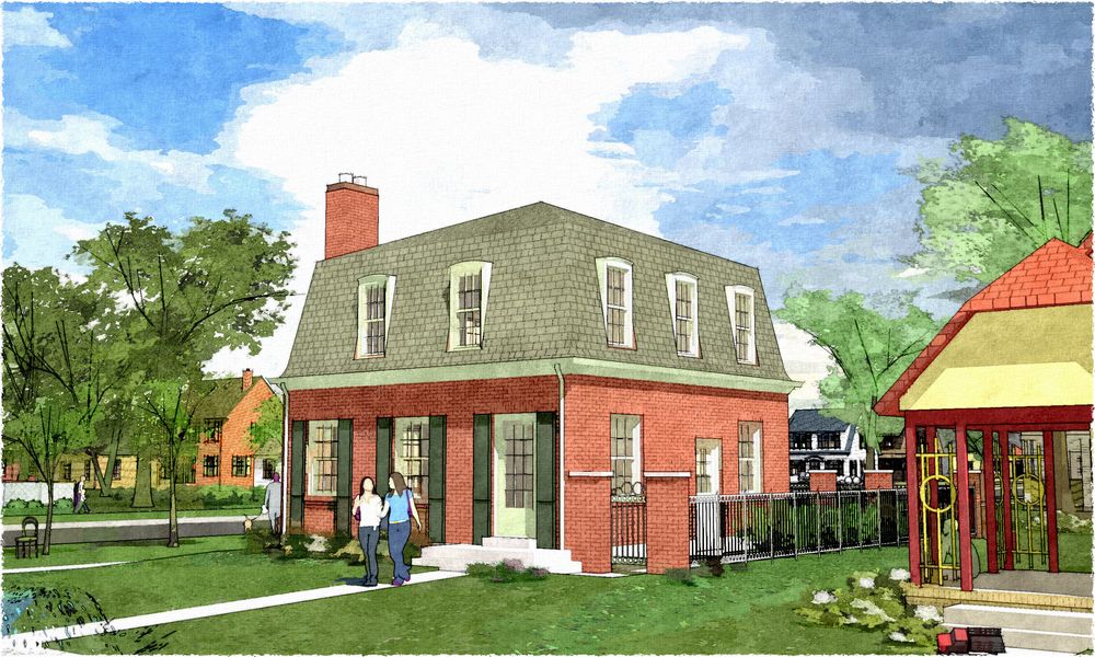
This morning was the first I'd heard of fotosketcher (see here: http://forums.sketchucation.com/viewtopic.php?f=81&t=21172), thank you, Jon, thank you very much...I think it will be a nice addition to the layer mix I've been using (this one is two fotosketcher output layers and a couple of edge and shadow layers from SU):

-
The Chateau 1934.


Textured, setup, and rendered with Vue.
-
Looks good. Keep 'em coming.
-
Amazing. I love the vegetation and the vine covered archway. I don't understand why they built them with the long shutters all the way across the front.
-
This last one "Chateau 1934" is a really amazing render. Great work pete!!!
-
Great stuff guys, thrilling work indeed

-
wow, i see your works, and their progress are great, you are really pro. Btw tom how was this picture rendered (explain the process).
http://forums.sketchucation.com/download/file.php?id=31826&mode=view -
Slate shingles are a beautiful choice Pete, nice!
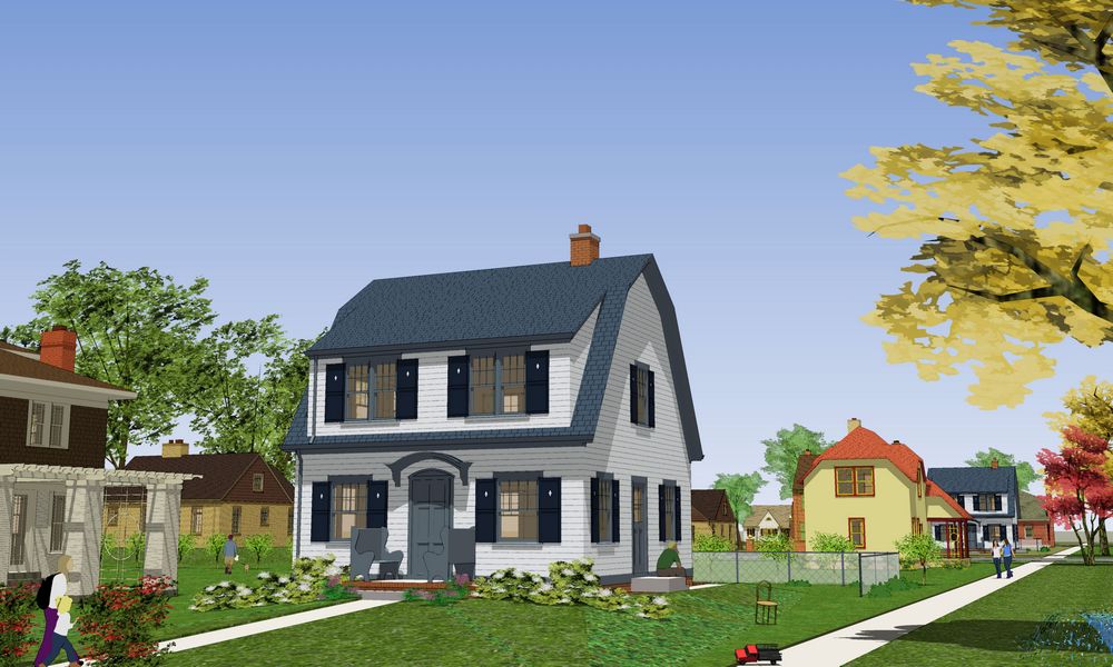
Another skippy...the Puritan, 1922:

_fan, I just export a rather large jpeg from SU, then in PSP copy a new layer above the original...setting it to "soft light" and about 40-55 transparency. Just punching up the color a bit. I sometimes also add (as with this one) a burn layer using an SU profile edge only "hidden line" (no shadows) jpeg export, adjusting the transparency as desired.
Hello! It looks like you're interested in this conversation, but you don't have an account yet.
Getting fed up of having to scroll through the same posts each visit? When you register for an account, you'll always come back to exactly where you were before, and choose to be notified of new replies (either via email, or push notification). You'll also be able to save bookmarks and upvote posts to show your appreciation to other community members.
With your input, this post could be even better 💗
Register LoginAdvertisement


