Gatehouse WIP - Podium renders
-
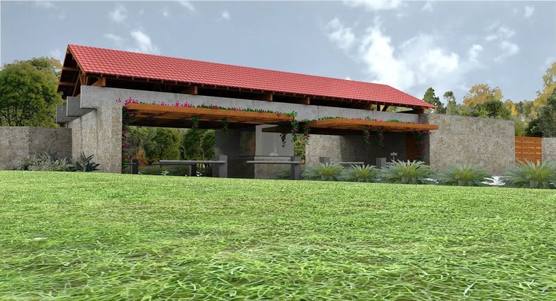
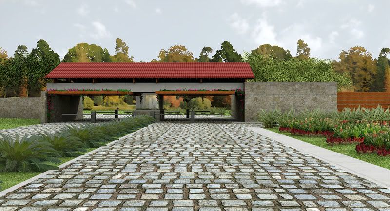
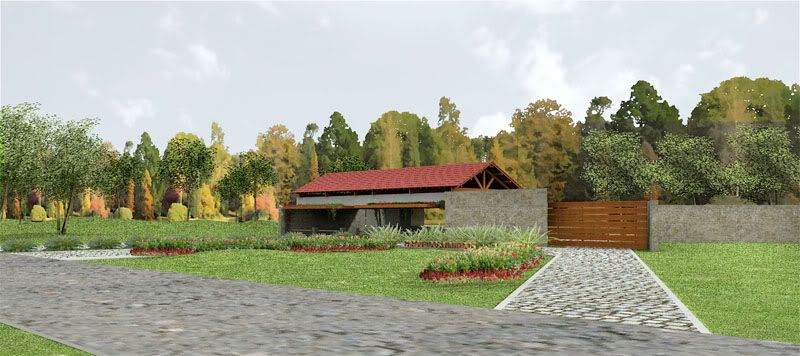
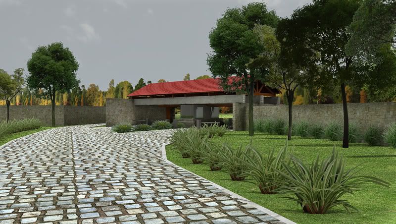
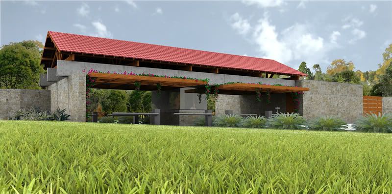
this is an old job that has progressed very slowly because of environmental licensing goes very slow. it is both a WIP in terms of the architecture and the renders. some of you will remember my first steps with podium were done trying to render an early version of this.
the architecture: this is the gatehouse to a residential condominium with 105 houses. my firts proposals did not include a sloping roof with ceramic tiles but my clients kinda forced me to go that way. after many unsuccessful tries i came up with something which i can live with. the concrete structure that supports the roof has some interest, i think.
the renders: they could be improved here and there, i know, but they are quite enough to get the idea across.
-
Well for concept presentation purposes I think these are excellent. I bet the client was very happy.
-
Edson, this project has evolved almost as much as your presentation skills: lovely!
-
Beautifully done, Edson.
-
thanks, fellas. i always appreciate hearing from you. those helpful guys at the podium forum have been making some suggestions for improvement which i will pursue in order to learn. for the client this is more than enough.
the clients have not seen it yet as i am developing the other building that goes with it: the clubhouse. soon i will post that here too.
-
an update to the first image. i improved the foreground with the help of sepo (grass texture) and gabriel johansson (post processing).
-
sweeet..i m not an artist so my critique may be off subject but seems that the roof tiles aren t right in this scene imho..except from that ..wow
-
@ely862me said:
sweeet..i m not an artist so my critique may be off subject but seems that the roof tiles aren t right in this scene imho..except from that ..wow
thanks, elisei. what do you mean exactly by the roof tiles not being right? do you think the proportion is off or perhaps i should have used another kind of tiles? or perhaps there should be no tiles at all?
-
Looks good Edson...


-
What if they are not meant to be these (roundish) "Spanish" tiles, Ely?
-
that s what i said before ,maybe i m off subject..
no i don t want them to be rounded spanish roof tiles ,just to be something that fits to this perfect design..anyway the spanish taste these days is rustic(rustico -es)something like this

but of course that doesn t fit at all with the designanyway as i said imho

hope i didn t bother anyoneElisei
-
ok..let see 1st it seems that the tiles are too thick,u can see this at the base;
2nd they look like bricks ,
3rd the color looks pale
maybe isn t the right texture ..
but that s just my opinion ..el portero parece feliz

Saludos!
-
nice work edson
its hard to fight against the clients about tiles here in the RS. hahaaha
but i think this is very good solution.
-
@ely862me said:
that s what i said before ,maybe i m off subject..
no i don t want them to be rounded spanish roof tiles ,just to be something that fits to this perfect design..anyway the spanish taste these days is rustic(rustico -es)something like this but of course that doesn t fit at all with the designanyway as i said imho

hope i didn t bother anyoneElisei
hi elisei,
you certainly do not bother me. i was thinking of a slightly different kind of tile, flatter than the one you show. but you do have a point in what you say: there is a somewhat excessive flatness to the tiles in the render. however, i do not wish to fall into the hopeless pursuit of the Perfect Render. i do these renders as an architect, that is, in order to offer the client a believable view of my design. this entails some imperfections, of course, as i am not willing to dedicate too much time to them.
looking at my renders from a rendering artist's point of view there is a lot that could be improved.
regards.
-
Looks great, Edson.
-
@alexandre sk said:
nice work edson
its hard to fight against the clients about tiles here in the RS. hahaaha
but i think this is very good solution.
thanks, alexandre.
um abraço.
-
I see ur point Mr. Edson
 .And as i said before u did a great design there
  .
.Cheers!
Elisei
Hello! It looks like you're interested in this conversation, but you don't have an account yet.
Getting fed up of having to scroll through the same posts each visit? When you register for an account, you'll always come back to exactly where you were before, and choose to be notified of new replies (either via email, or push notification). You'll also be able to save bookmarks and upvote posts to show your appreciation to other community members.
With your input, this post could be even better 💗
Register LoginAdvertisement


