Two images
-
Both Indigo.
-
Hello, I like modeling, especially the first picture, I think the second is to dark.
I imagine that would gain much if the renders are placed with a suitable environment.
-
@rcossoli said:
Hello, I like modeling, especially the first picture
Thanks. The first model was a lot of fun to do.
@rcossoli said:
I think the second is to dark. I imagine that would gain much if the renders are placed with a suitable environment.
I disagree on both counts. Appreciate your thoughts, however.
-
RCs obv not seen your previous work and if he had would probably know your particular style.
Nice work as usual Stinkie, why the shift away from Maxwell? -
I forgive him.
 No, seriously - I welcome any comment. Quite refreshing to - so to speak - look at your own stuff through someone else's eyes. Which is why I post to begin with.
Oh ... I've been using Indigo for some time now. I quite like the way Whaat's SU plugin lets you choose material properties. Feels much more artistic (less technical) than Maxwell's approach. What I particulary like, is that you can easily assign roughness/reflectivity values to plain SU colours. Works great for me!
-
Very nice and gloomy
 I like the first image a lot.
 -
Thanks, Sid. My mates and my gf seem to prefer the first image to the second as well. Hmpf. Guess the second one needs more work then. Ah well ... laborare est orare. Hey! Latin class finally paid off!

-
haha..i prefer the second one to the first.... not sure i love the green background, but love the look of the dark building..
-
Not very noisy for Indigo.
-
@marked001 said:
not sure i love the green background
Hmm ... I do think you may have a point there. I'll look into into it. Thanks!
@smokinbakin said:
Not very noisy for Indigo.
My electricity bill may explain a lot.
-
I like both mate! They almost have an illustrated feel! I think that both with a subtle pencil or charcol filter in PS would be convincing!
-
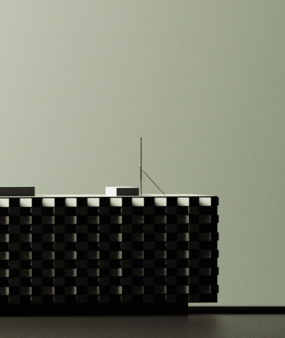
Very enigmatic. It is like an artboard model that is taking up too much space in the cubicle and was put just outside the wall on a friday night before everyone left the office and turned off the lights.
And what was your purpose in the wall tight behind the model and the dusk like green lighting. You don't have to have a purpose, but if you have one I would like to understand your thought process.
-
@richard said:
I think that both with a subtle pencil or charcol filter in PS would be convincing!
Hmmm ... can't do that. I mustn't violate Stinkie's Reinheitsgebot: Thou shalt not use texture maps, and thou shalt most certainly not postprocess your images other than to tweak their colours and/or tonality.
@roger said:
And what was your purpose in the wall tight behind the model and the dusk like green lighting. You don't have to have a purpose, but if you have one I would like to understand your thought process.
My sole purpose is to produce images that I find pretty. The wall is there because I think it looks good.
-
Powerful and yet alienating.
Buildings are machines for people, yet these images suggest a total lack of human interaction. Striking!
This is going somewhere Stinkie. Nice to see continuity in your work.Are you using a proportional system in your image compositions?
-
very dramatic there stinkie, looks like a 1950s scale model (can imagine a smokey room full of architects stood around scrutinising the design haha)
[edit] i like the second image best
-
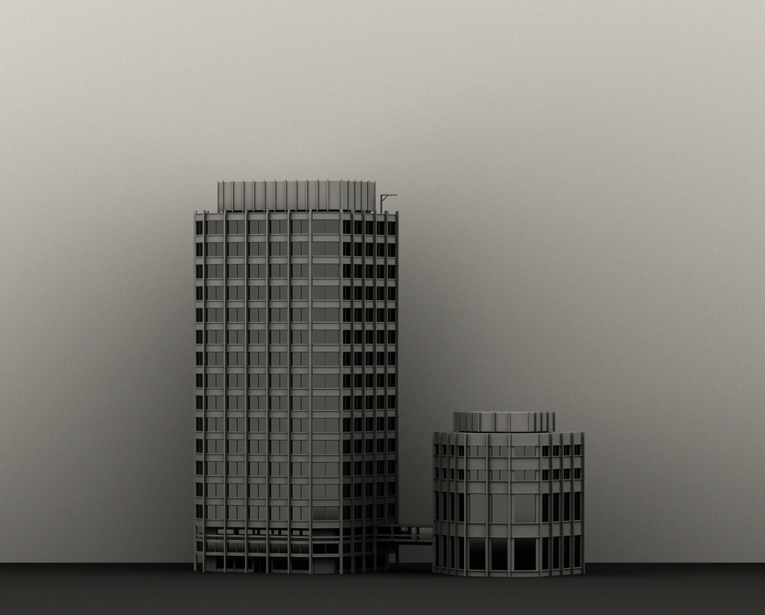
the first one looks like The Economist building by the Smithsons. you are perfecting your grayscale style!
-
good spot there edson. striking resemblance
-
You're right, Edson, it is the Economist Building, though I altered it a tad.
@kwistenbiebel said:
This is going somewhere Stinkie.
I bl**dy well hope so, considering the amount of time and money I've invested so far!
@kwistenbiebel said:
Are you using a proportional system in your image compositions?
No, I eyeball them.
-
@unknownuser said:
@richard said:
I think that both with a subtle pencil or charcol filter in PS would be convincing!
Hmmm ... can't do that. I mustn't violate Stinkie's Reinheitsgebot: Thou shalt not use texture maps, and thou shalt most certainly not postprocess your images other than to tweak their colours and/or tonality.
@roger said:
And what was your purpose in the wall tight behind the model and the dusk like green lighting. You don't have to have a purpose, but if you have one I would like to understand your thought process.
My sole purpose is to produce images that I find pretty. The wall is there because I think it looks good.
That is the answer I was hoping for and the same rational I use.
-
@unknownuser said:
My only crit is bake time. I think some of my favorites from your past collection have been burned well beyond these.
The first one I feel has rendered long enough. I may even have violated my Reinheitsgebot and added noise to that one, I don't remember for sure. The second, however, could do with a little more rendering time. I was planning on tweaking the lighting in that one a bit anyway.
As for simplicity etc - not quite there, I think. My goal is to eventually exhibit stuff like this (yes ... I am that arrogant
 ), and I don't think I'll be able to achieve the sort of quality I want/need for that before a couple of more years have passed. I'd rather not 'get out there' with half-@ssed work.
In any case. Enough dreaming - gotta go bathe my kid.
Hello! It looks like you're interested in this conversation, but you don't have an account yet.
Getting fed up of having to scroll through the same posts each visit? When you register for an account, you'll always come back to exactly where you were before, and choose to be notified of new replies (either via email, or push notification). You'll also be able to save bookmarks and upvote posts to show your appreciation to other community members.
With your input, this post could be even better 💗
Register Login


Advertisement