Twisting 40 storeys Tower for Rio de Janeiro´s Mauá Pier
-
01

02

03


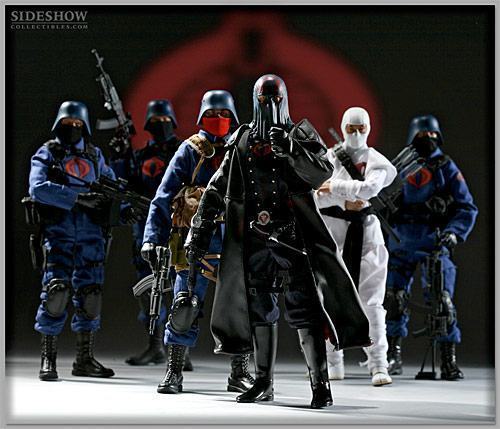
COBRA, PROTECTING YOUR RIGHT TO A BETTER FUTURE

DESCRIPTION
The Complex consists of 4 commercial buildings, a garage building, a monorail station and rowhouses.
The main building is a commercial tower 40 storeys tall (proposal for 60 storeys seen at end of post)
4

5

6
http://img11.imageshack.us/img11/9316/tt10g.jpg7

8

The skyscraper is located over the garage building. Access is found throught the garage building or through to main promenade (which counts with rampstairs, for easy of use by disabilitated people).
There is also an helipad at the northwest corner of the pier.
9

10

The building has the highest atrium in Brazil (over 140 meters tall), where visitors will be able to appreciate the internal architecture through panoramic elevators. The building top will serve as observation area
11
at the pier entrance, to the left, we have some stores which will serve the thousands of employees who will work at the Complex, besides the general population, since the complex will be open to the public.
12

Above the stores we can find a building with offices for the administration and security of the complex
At the left side for visitors, behind the stores, accessible through a secundary street, two commercial buildings of 5 floors, suspended for parking area below, will be open for buying or renting by brazilian investors and businessmen.
13

14
pending rendering15
pending renderingStill on the main street, visitors will soon see at their left beautiful modernist rowhouses. While the majority of them will be on sale, some will be reserved for temporary housing of executives who may be sent to oversee corporations (housed on the main tower) activities in Brazil.
16
17
[img:22ur5smr]http://img4.imageshack.us/img4/4479/tt15y.jpg[/img:22ur5smr]At the right side of the pier, visitors will be able to walk in a nice tree shadowed path, with the sea of Guanabara Bay at their right side.
The path leads to the main promenade, where they will be able to witness a few great giant sculptures
18
[img:22ur5smr]http://img4.imageshack.us/img4/4171/tt14p.jpg[/img:22ur5smr]19
[img:22ur5smr]http://img10.imageshack.us/img10/2426/tt06.jpg[/img:22ur5smr]In the same area its located the beautiful monorail station of the complex.
20
[img:22ur5smr]http://img26.imageshack.us/img26/8207/tt11.jpg[/img:22ur5smr]21
[img:22ur5smr]http://img4.imageshack.us/img4/6123/tt12.jpg[/img:22ur5smr]22
[img:22ur5smr]http://img16.imageshack.us/img16/5636/tt13e.jpg[/img:22ur5smr]Though the complex counts with a garage building that can park more than 1000 cars in its two pavements, the prediction is that the flux of personel and visitors will fastly expand, and because of that, the monorail will connect the complex to Rio´s subway system, as well to a garage building complex that will be built in a later date.
23
pending rendering.INTERNAL PERSPECTIVES OF THE MAIN BUILDING
01
[img:22ur5smr]http://img12.imageshack.us/img12/6381/tt03.jpg[/img:22ur5smr]02
[img:22ur5smr]http://img12.imageshack.us/img12/2927/tt02.jpg[/img:22ur5smr]03
[img:22ur5smr]http://img25.imageshack.us/img25/6189/tt01m.jpg[/img:22ur5smr]04
[img:22ur5smr]http://img16.imageshack.us/img16/7767/tt27.jpg[/img:22ur5smr] (atrium)05
pending rendering (atrium)INTERNAL PERSPECTIVE SECUNDARY COMMERCIAL BUILDING
01
[img:22ur5smr]http://img509.imageshack.us/img509/7531/tt26.jpg[/img:22ur5smr]INTERNAL PERSPECTIVE STORES
01
pending renderingINTERNAL PERSPECTIVE ROWHOUSES
01
pending renderingBLUEPRINTS
Main building (+- 1200 sq meters of area per floor, without counting the circular hallway around the atrium)
[img:22ur5smr]http://img12.imageshack.us/img12/815/planta02.jpg[/img:22ur5smr]
[img:22ur5smr]http://img4.imageshack.us/img4/6425/planta01.jpg[/img:22ur5smr]Blueprint Secondary Commercial Building
pending renderingBlueprints Rowhouses: over 269 sq meters, including garage but excluding open areas, like front garden, terrace and balconies. Only 6 meters of diameter.
[img:22ur5smr]http://img27.imageshack.us/img27/8400/planta03.jpg[/img:22ur5smr]ALTERNATIVE PROPOSAL (60 storeys)
01
[img:22ur5smr]http://img7.imageshack.us/img7/5973/tt60f01.jpg[/img:22ur5smr]02
[img:22ur5smr]http://img4.imageshack.us/img4/4230/tt60f02.jpg[/img:22ur5smr] -
very very nice, i cant wait until i have an idea to do something like this on such a great scale....
my only problem with is i dont feel safe in a skyscraper that stands on top of artificaial land and a garage complex, i hope that you have thaught that through and made sure its perfectly safe for many years to come and if need be easy to fix little problems before they become big ones..
anyway i love it and want more of these around here....
maybe someone could model the 2mile high building going in dubai, or that new hotel there...
-
Nossa! Que legal, gostei muito Rogerio! Muito bem mesmo. O desenho e os renders sao perfeitos! Parabems! Quando vai ser construido? E como foi para trabalhar com "Cobra"?
Chris
(Wow! Thats cool, I like it a lot Rogerio! Very good indeed. The design and renders are pefect! Congratulations! When will it be constructed? And how was it to work with Cobra Command?)
I don't get to use my portuguese often enough. And to be honest, the translation was 50% so everyone else could understand, and 50% so he could read in English what I actually meant to type in Portuguese
-
this is a fantasy building. Its not a real project. I did for fun only.
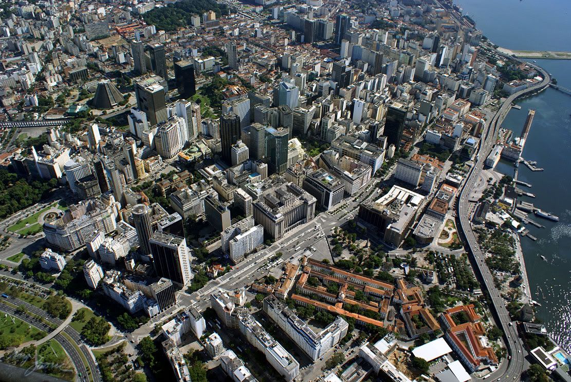
anyway, the pier already exists and is unnocupied currently (since the 80s I guess)
you can see it here, on the top right of the image

btw, there is no 2 mile high building going up in Dubai.
Burj Dubai, almost finished, the tallest structure on Earth, is "only" 818 meters tall... and the AL BURJ, which hasnt been started due to the world economic crysis, will be "only" 1,2 km tall.
-
@chris fullmer said:
Nossa! Que legal, gostei muito Rogerio! Muito bem mesmo. O desenho e os renders sao perfeitos! Parabems! Quando vai ser construido? E como foi para trabalhar com "Cobra"?
Chris
(Wow! Thats cool, I like it a lot Rogerio! Very good indeed. The design and renders are pefect! Congratulations! When will it be constructed? And how was it to work with Cobra Command?)
I don't get to use my portuguese often enough. And to be honest, the translation was 50% so everyone else could understand, and 50% so he could read in English what I actually meant to type in Portuguese
haha, I forgot I left the Cobra symbol on the top of the building.
oh well, I made the complex for a Project Competition at Skyscrapercity Brazil forums.
After creating the building, at first the pattern of dark glasses was supposed to remember the portuguese mosaic sidewalks of Copacabana... but then, because of the shape of the building, it reminded me of a cobra... and then, well, since it was a fantasy building anyway, I created a whole fun story about the COBRA Corporation (the G.I Joe call them terrorists, but that obviously is a lie
 ) creating this tower in Rio to take care of their operations in South America (I read the wiki about GiJoe to have more info on the Cobra and stuff... it seems the COMICs were much more serious and well written than the cartoons, and the Cobra were really a corporation with a "legal" facet, lots of lawyers, etc)
 -
hey awesome model, could you explain briefly how u went about building it?
-
The more I see of this the more I like it. I think Chris Fullmer's comment(joke or not) says it all. "When will it be constructed?"

-
Lets say about 40 years if the government thwere accepts the tower, maybe less but meh!...
-
@unknownuser said:
hey awesome model, could you explain briefly how u went about building it?
I thank Freescale 2.0 for it.
To design the tower, I first tested some extreded shapes with varying degrees of twisting (using freescale 2.0). After I found a shape that pleased me for being unique... I used the same shape to create a floorplan.
I knew the core should have to be circular, or at least have a circular hallways (otherwise each floor would have to be different, since the core cant rotate too). So I designed the core separately and made an equivalent hole on the floorplan.
extruded floorplan to about 40cm and made it into a component. Copied it up a few times and rotated until I found the rotation that best matched the inclination of the test model.
got out of the floorplan component and created the exterior metal frame with the triangular glass panels. Created them STRAIGHT... basically, an "X" 3 storeys high. Copied it around one floorplan. Adjusted it. Obviously, they only matched ONE floorplan.
Selected all "X" metal frames, and using freescale 2.0, twisted them by 12 degrees (each floor rotates 4 degrees in relation to the previous. The X is 3 storeys high). There, now you have a metalstructure that matches the building rotation.
Basically, the rest was just a process of copying up the floorplans and rotating. And doing the same with the exterir metal frame.
Oh yeah, after that I separated a floor component to create some other details (those other windows, the "tip windows", etc...
basically, that was it.
-
thank you

-
you did this for fun???

-
Hello, Very cool
With what renderprogram did yoy rendered it?Fred
-
VRAY
-
And how long did you rendered each picture?
-
about 30 minutes for external renders and some 1 hour - 1:30 hours for internal ones.
-
Wow!
How did you got so good with vray? What version do you use? -
If this was for fun, what do make while you're working?
 ...I'm simply amazed.
 -
this twisted building must have taken you some headacked and time to build hey.
Nice modelling


-
I like it, good job with all the renderings. A few comments I would suggest is the skyline (image 1). Do some post processing to make it not so much of a hard edge, or a waterfall. Also the building on the pier seems to need some structural reinforcement (Image 8), a building of that magnitude would not sit that easily on the existing pier. I would also put up a core inside the building (Image 5, where the stairwells and elevators are going to be) that way you cannot see all the way through the building. On image 13 I would add some people to make it look less vacant. On image 16 the car is floating along with the person walking. Image 04 in the atrium seems a little strange, mostly the placement of the people and the angles of them. Just a few comments to really make these awesome, I think you did a great job though!
-
Eu tava adorando tanto o modelo quanto os renders ate o momento em que tu assassinou a bandeira do rio grande com essas cores gremistas... absurdo!!
I was really enjoying renders and architecture, untill you have completely assassinated my so loved State's Flag putting some blue and black colours on it... absurd!!!
Hehehe.... brincadeiras a parte, tah show de bola!
Abraco
Hello! It looks like you're interested in this conversation, but you don't have an account yet.
Getting fed up of having to scroll through the same posts each visit? When you register for an account, you'll always come back to exactly where you were before, and choose to be notified of new replies (either via email, or push notification). You'll also be able to save bookmarks and upvote posts to show your appreciation to other community members.
With your input, this post could be even better 💗
Register LoginAdvertisement


