Twisting 40 storeys Tower for Rio de Janeiro´s Mauá Pier
-
VRAY
-
And how long did you rendered each picture?
-
about 30 minutes for external renders and some 1 hour - 1:30 hours for internal ones.
-
Wow!
How did you got so good with vray? What version do you use? -
If this was for fun, what do make while you're working?
 ...I'm simply amazed.
 -
this twisted building must have taken you some headacked and time to build hey.
Nice modelling
-
I like it, good job with all the renderings. A few comments I would suggest is the skyline (image 1). Do some post processing to make it not so much of a hard edge, or a waterfall. Also the building on the pier seems to need some structural reinforcement (Image 8), a building of that magnitude would not sit that easily on the existing pier. I would also put up a core inside the building (Image 5, where the stairwells and elevators are going to be) that way you cannot see all the way through the building. On image 13 I would add some people to make it look less vacant. On image 16 the car is floating along with the person walking. Image 04 in the atrium seems a little strange, mostly the placement of the people and the angles of them. Just a few comments to really make these awesome, I think you did a great job though!
-
Eu tava adorando tanto o modelo quanto os renders ate o momento em que tu assassinou a bandeira do rio grande com essas cores gremistas... absurdo!!
I was really enjoying renders and architecture, untill you have completely assassinated my so loved State's Flag putting some blue and black colours on it... absurd!!!
Hehehe.... brincadeiras a parte, tah show de bola!
Abraco -
@gaucho said:
Eu tava adorando tanto o modelo quanto os renders ate o momento em que tu assassinou a bandeira do rio grande com essas cores gremistas... absurdo!!
I was really enjoying renders and architecture, untill you have completely assassinated my so loved State's Flag putting some blue and black colours on it... absurd!!!
Hehehe.... brincadeiras a parte, tah show de bola!
Abracook, for english speakers, let me explain...
The poleflags texture I used is from my state flag. But the real colors are red, yellow and green. Although I love my state and admire the MEANING of the flag, I never liked very much the flag colors hehehe. So I changed the colors to black, white, blue... which are the colors of Grêmio, one of the biggest soccer clubs in Brazil. Now, it seems Gaucho is a Inter fan... (Inter Porto Alegre, not Inter Milan). Inter and Grêmio are both from Porto Alegre and are arch-rivals... thats why he is complaining about the colors

@Gaucho: I also made versions of the flag with germany and italy colors. Hehehe, quite funny. But my real masterpiece is the Pernambuco State. Pernambucans love their state flag, but I HATE it. So I made a nice, modern version of it. They liked, but still preffer their old one

Rio Grande do Sul State Flag Original

Grêmio Colors Version

Germany Colors Version (germans are a big and important ethnic group in the state)

Italy Colors Version (italians are another big and important ethnic group in the state)

Pernambuco State Original Flag

My heretic version

-
@jhuman said:
I like it, good job with all the renderings. A few comments I would suggest is the skyline (image 1). Do some post processing to make it not so much of a hard edge, or a waterfall. Also the building on the pier seems to need some structural reinforcement (Image 8), a building of that magnitude would not sit that easily on the existing pier. I would also put up a core inside the building (Image 5, where the stairwells and elevators are going to be) that way you cannot see all the way through the building. On image 13 I would add some people to make it look less vacant. On image 16 the car is floating along with the person walking. Image 04 in the atrium seems a little strange, mostly the placement of the people and the angles of them. Just a few comments to really make these awesome, I think you did a great job though!
Thanks, I love these kind of tips.
I dont know much about post processing. What do you suggest exactly that I could do on Image 1, with the sky? Or you mean skyline like the ocean/water division? I do not understand what you mean with waterfall. You mean it LOOKS like a waterfall? (due to the hard edge)
One way or the other, please, what kind of post processing would you do? Some blur?
As for structural reinforcement I agree... I did a circle of larger, more robuts piles around the edge. But they are not easy to see. Anyway, I guess I would need another circle of piles, under the external perimeters of the building.
Image 16 I had noticed after rendering. If it was some professional job, be sure I would correct it. But since I did this one for fun only, I let it stay that way. But nice that you noticed it. Shows you paid attention. You are the first one to tell about the car, and I posted these renderings in 5 different forums
-
Ok, I was thinking about the skyline hard edge you mentioned. What happens is that VRAY Sketchup doesnt have atmospheric fog/density (thus, its impossible to create godrays, light halos, etc). Far away things are not affected by atmospheric effects. I didnt even remember it when I did these renders. And the lack of such effects is what makes the skyline seen hard edge.
I wonder what kind of post processing I should make to create the atmosphere effect. It should turn whiteish/bluish the closer to the horizon you get...
-
I there,
thats an nice render time... my I ask which settings you are using?
best regards.
-
After all the explanations, I need to say that Pernambuco's flag is creepy!
Anyway, been Brazilian, Gaucho (who's born in the southern state of Brazil) and also Italian, I'll go for the original and the Italian versions then.
Keep up the good work!
-
Mate for all the photo realism I think you could do justice by work work to make it more model like given the general lack of detail.
-
Yes post processing is a little bit difficult to do on those perspectives since they are more bird’s eye perspectives. Usually the two, sky and sea / land will kind of blend together when they meet at the horizon. I would do just as you suggested create some sort of fog and blend. Google bird’s eye views and horizon lines and I am sure you'll get some good ideas. Sorry about the waterfall confusion, to me it looked like an edge of a waterfall (from above). Keep posting!
-
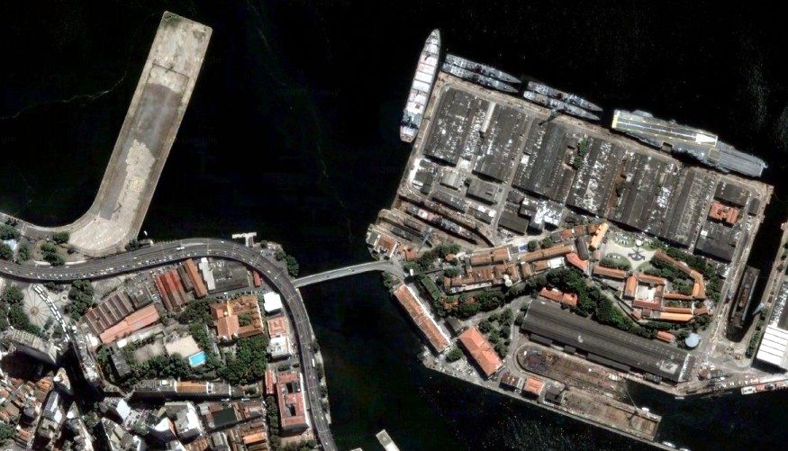
Cool view on cemetery aircraft-carrier?
Hello! It looks like you're interested in this conversation, but you don't have an account yet.
Getting fed up of having to scroll through the same posts each visit? When you register for an account, you'll always come back to exactly where you were before, and choose to be notified of new replies (either via email, or push notification). You'll also be able to save bookmarks and upvote posts to show your appreciation to other community members.
With your input, this post could be even better 💗
Register Login


Advertisement