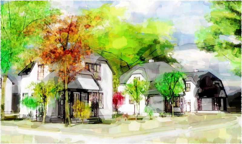
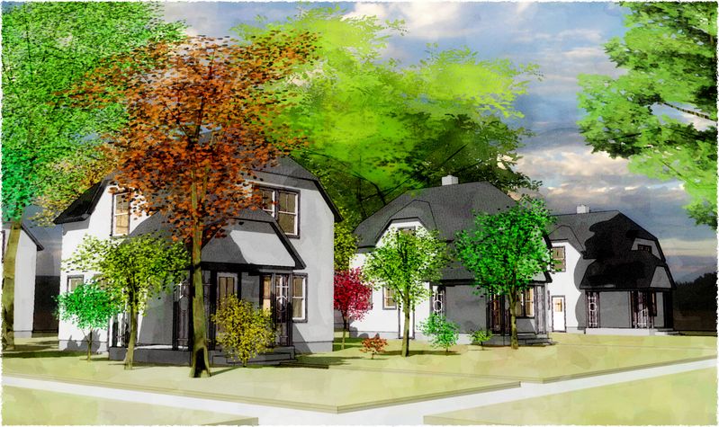
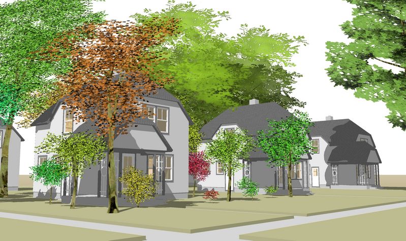
A little break from tree making...
-
...and a little advertisement as well, I suppose :`)


-
One word
Awesome!


-
Tom, very nice as usual. One crit... the depth of the grass, I think it's too much. It almost looks like a curb.
-
Thanks, Toby, Tina...back to bright, I guess: been looking at gauche paintings again. (And you're right, Tina, I had bumped the grass up an additional 2" for a stronger shadowline in a birdeye view and forgot to lower again when I chucked that composition :`(
-
Wow Tom, I love the wet one, I think it does more for your trees, perhaps than the houses, but it is very painterly-like. It sets an amazing scene, I love the tall trees in the background as well. I see vestiges of Snap Art, but you've taken it somewhere else that is not quite discernable by me. I do like the second one as well. Congrats, and best.
-
Thanks, Peter...good eye about the SnapArt: and yeah, I now just use it along with so many other layers to build an image.
-
All excellent, though I am partial to the second one.
-
The first definitely looks like great steps in DWC design.
However, for another style, I like the trees in the SU version as well, but not the house and grass as much in that picture. A combination of some sort would be nice. I think the trees suffer in the second style.
What's Snap art and what advertising are you talking about?
-
Tom,
The wet one is just wonderfull. I would be proud to have it hanging on my wall and I could look at it for hours. Your technique for that image works well as it has a nice balance to it as well as some interesting depth. While your trees hold up well in all 3 versions - in the wet render I like how their detail blends well with the level of detail needed in some of the other elements to achieve the look and feel that you do here.
Bravo on a really nice piece!
Dean
-
Hmmm? Are these meant to demonstrate the Architecture or just a scene? In either way I probably prefer the last one but maybe with 1/3 - 1/2 the trees, darker shadows and maybe the trees desaturated a bit!
-
Richard, mainly showcasing the trees I suppose...though not as blatantly as here: http://www.sketchucation.com/forums/scf/viewtopic.php?f=179&t=17149
 Hope you can help out with the render app conundrum.
 -
@tomsdesk said:
Richard, mainly showcasing the trees I suppose...though not as blatantly as here: http://www.sketchucation.com/forums/scf/viewtopic.php?f=179&t=17149
 Hope you can help out with the render app conundrum.
Good luck with that Tom.
I think for rendering they probably lack a bit of detail and are a bit flat, the ones that Kwistenbeibel made up with my old "Tree Factory" are probably about as light on as you could go for rendering. Cutouts can work if you have a great enough collection of very high res maps that show a variety of shadow casts, though these are often better added post processing.
Just fo shadow casting (hidden to the camera) these are probably fine though even a fairly simple cut out works well for those!
Though someone will possibly prove me wrong! Though I've got a massive collection of 3d skp trees and pretty much no matter how good they are they still produce pretty poor results in renderings palm trees aside! Though probably 90% of work is done for areas that palm trees are only seen in James Bond movies!
Good wishes with this project mate!
Hello! It looks like you're interested in this conversation, but you don't have an account yet.
Getting fed up of having to scroll through the same posts each visit? When you register for an account, you'll always come back to exactly where you were before, and choose to be notified of new replies (either via email, or push notification). You'll also be able to save bookmarks and upvote posts to show your appreciation to other community members.
With your input, this post could be even better 💗
Register LoginAdvertisement


