A website?
-
Ray
I am html challenged, in fact I am no good at anything website related. I use Microsoft live premium for my website, I registered the domain, built the site from their templates and have them host it for me. It was the easiest solution for my needs, not perfect but so far it's been great. I cannot remember the price I am paying as I have a few software apps, One care protection and that combined as a package that gets paid automatically every month.
There are many cheaper solutions that give more bang than what I have, I am just too lazy and do not have the tolerance needed to mess with finding out.
If you click on the link below and navigate to my site you will see on the bottom right of the page a 'powered by microsoft' link that will take you to a page where you can get a free website (never noticed that before until today)
-
Darn, i guess ill have to use a domain one. Thanks anyway
-
Hey yall i tried one with google. Im working on it and it will be full of info and car stuff be sure to bookmark
 http://sites.google.com/site/automotivedesignochoa
 -
I like the blue graphics, but lose the tiled background. I haven't been following posts of your designs, but based on your current set of categories in your gallery shell, I'm looking forward to seeing them.
Todd
-
Definitely lose that background image. If you are going to put design things up there, the site should focus on visual content anyway and everything else is just distracting (not to speak about those background images tiling very badly in the side bar and the images covering it really ugly like here). Put maybe a header banner like image instead on top but also design the appearance of the whole to be consistent.
I'd alkso lose the detailed sitemap for now as you don't have the content for it. Build the website along with the content and don't leave toomany "coming soon" pages.
-
Thanks for da advice, i changed it to all plain colors

-
Hi Ray
Watch this.
ist free with advertising links on the site.
http://www.jimdo.comits realy easy to use.

-
Your fonts are too fat, and it takes WAY too long to load. Other than that, it's OK!!
-
Ray,
My advice is keep it simple. People are coming to your site to see your car designs not how fancy the site design is.
Essentially... my name is Ray... this is what I do... these are my cars.
Right now it takes way too long to access the designs, perhaps more folders with less cars in each.
I think you are close to a great site that shows off your talent... good luck. -
Edit dammit i had to change again i hope yall don't mind.
-
okay i changed it. i will make it simpler.
-
okay i changed it. i will make it simpler. i edited the post before this one
-
CRAP okay i changed my website from cardesign-rayochoa.com to ray-ochoa.webs.com LESS TO WRITE

-
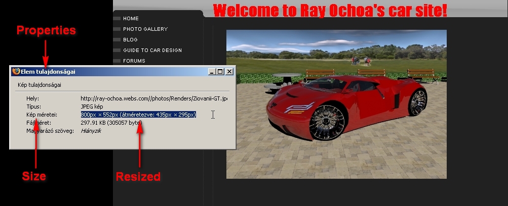
Ray, just an advice on images. If you upload an image to be displayed in a certain size, the html code can display a bigger image smaller than the "real" image is but it's a waste of bandwidth as well as loading time. So if the images are displayed in 328x295 but the file is 800x552 (which is the case with your website), it will take to load as long as if it were displayed in the original (880x552) size but you can only see the "smaller" version.
So if you do that, resize your images to smaller and upload them that way instead (or link to the bigger version somewhere). Loading time will multiply.
-
you mean for the album?
-
No. for the Homepage. I wouldn't even have looked if it hadn't ben suspicious for loading too slow. Go to Properties in the context menu for the image (see attached - in Hungarian)

-
I put a direct link from photobucket. i changed it to this one green car. idk if its better though, all the computers i go to my site with have fast connection
-
I seem to have issues when people link to photobucket. Long load times, even for small images, and may times, images fail to load altogether. Maybe it's just Safari.
-
I have many issues with such image sharing sites as well (Imageshck being even worse). Sometimes I don't even click on a posted thumbnail in the Gallery because my driving license expires by the time it loads.

-
The image still takea while to load...better, but still draggy. If you're having a slot that's 214x428 then that's the size the image ought to be. Your 400x800 pics are taking almost 4 times longer to load than necessary (twice the size in both directions).
I too don't like Photobucket or Imageshack. It's also the case that sourcing your images from there means you are dependent on them...if they're down, your site is useless, even if it's having no problem with the actual hosting. If it's possible to stick all your images into an images folder...maybe keeping the general site graphics and gallery images separate...I'd do that instead.
Hello! It looks like you're interested in this conversation, but you don't have an account yet.
Getting fed up of having to scroll through the same posts each visit? When you register for an account, you'll always come back to exactly where you were before, and choose to be notified of new replies (either via email, or push notification). You'll also be able to save bookmarks and upvote posts to show your appreciation to other community members.
With your input, this post could be even better 💗
Register LoginAdvertisement


