INDIGO STUDY INDOOR SCENE
-
@pibuz said:
.. pushpulling the back wall forward to reach the edge of the shelf...
I think that would be a plausible option.
Either it becomes wall (dry wall), or filled with a closed cupboard (e.g for goods you rarely use). -
Thanks Kwist! Your opinions always mean a lot to me!
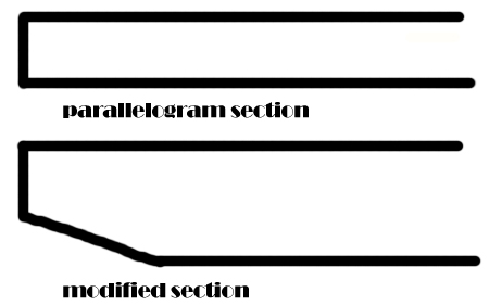
The glass on the cart is thick, with a little absorption (you can see a pale green/blue colouring the edges): it isn't a simple parallelogram, 'cos I often see some beveling applied to the down face in real glass carts (about 4cm), so i scaled (with centerpoint as the base point) the face a little..
It's hard to describe... I'll attach a PS sketch..
I agree with you about the upper shelf


Don't know how to solve that little problem: I even thought about "filling" it by pushpulling the back wall forward to reach the edge of the shelf... Really don't know...
Perhaps I could fill the shelf with cooking books of recipes! Still....
doubts doubts doubts..
Help guys!!!EDIT
added cart glass section sketch
-
@kwistenbiebel said:
Hi Pibuz,
...An animation containing your scene.
Hope you like it
(I used a shitload of rubies to get the animation go smoother than the default SU output. Way too tedious)
I gave you credit in the titles.Here it is:
http://youtube.com/watch?v=vEZm-20dVKE&fmt=18hi, what the software that you make the animation ?
-
I think he used V-ray for sketchup!
-
Hi Jon, excellent image, tips and tricks for those who use kerkythea?

-
YEAH JON! COOL MOOD! Seems like a sepia image, but it's the tones only! Really effective!
I wouldn't be bothered if I'd see a gangster or something going out this room..
Really, cool pictures too!
And excellent vases! Are they from the warehouse? could you link us? please? -
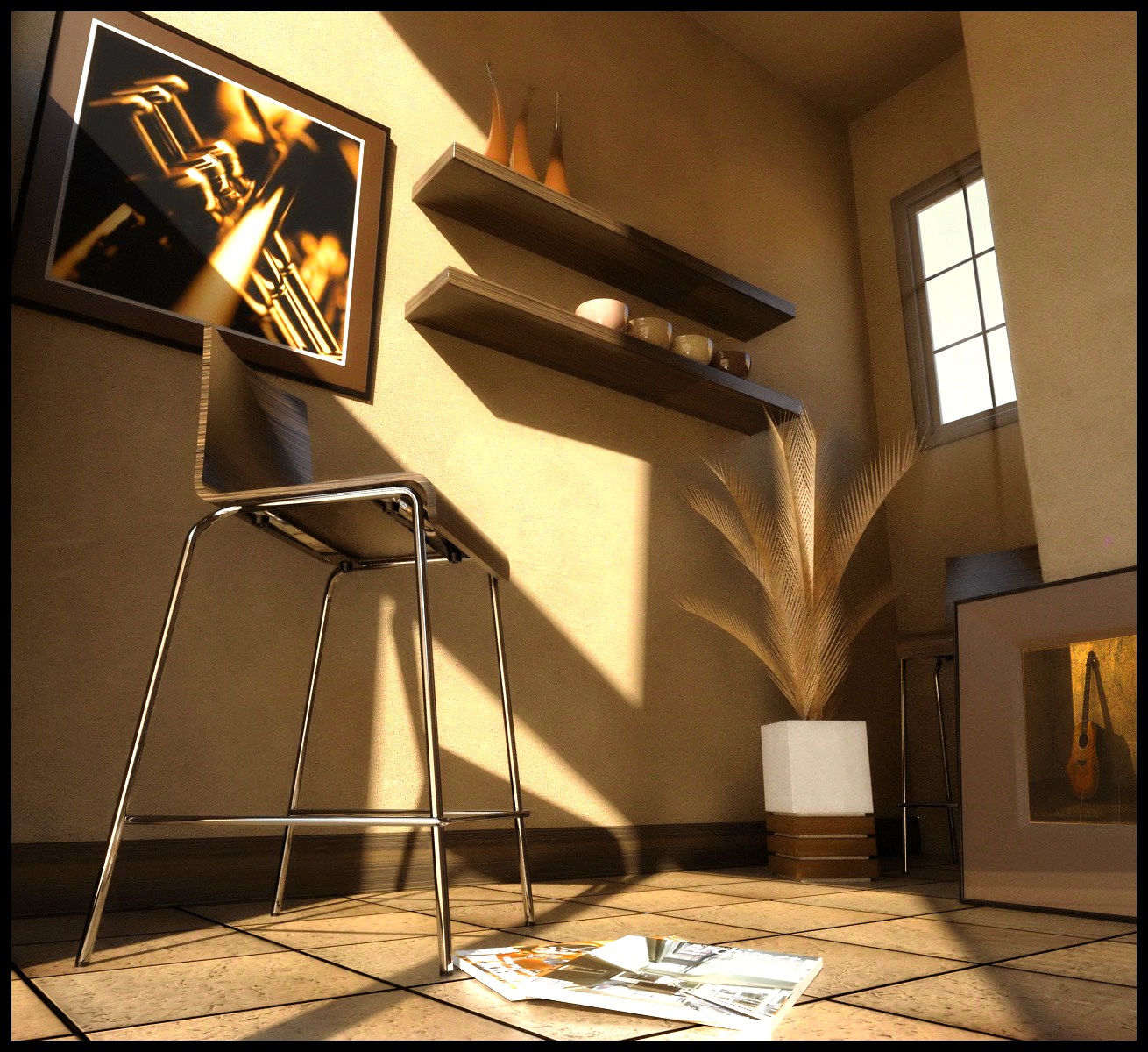
Hi, guys.

Here's my try at this...
-
Heres my go at it:
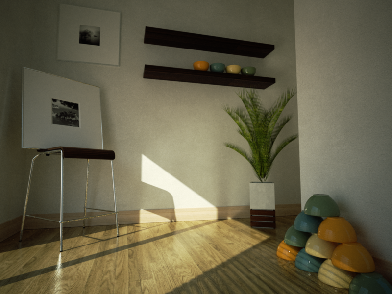
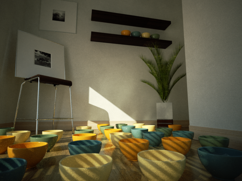
Dammed indigo taking forever.
-
-
You guys really take "less is more" seriously. What a great opportunity to see the masters at work. If this were a complex view it would not be informative. But the simplicity of the base scene really shows how much diversity is available even within simple circumstances. It is a visual "battle of the bands."
-
@remus said:
Heres my go at it:
[attachment=1:17gd3pyn]<!-- ia1 -->im1232840712.png<!-- ia1 -->[/attachment:17gd3pyn]
[attachment=0:17gd3pyn]<!-- ia0 -->im1232927888.png<!-- ia0 -->[/attachment:17gd3pyn]Dammed indigo taking forever.
This scene will soon be flowing with purple because Remus "dammed indigo" instead of damning indigo.
-
an excellent scene... thanks pibuz! i was just beginning to dig deep into MentalRay and this seemed just the perfect candidate for my test!
all the images here are simply awesome! and yes Mies was rite when he said "less is more"

-
@unknownuser said:
Mies was rite when he said "less is more"
However Ms. Farnsworth learned that less costs more, lots more.
-
@jenujacob said:
an excellent scene... thanks pibuz! i was just beginning to dig deep into MentalRay and this seemed just the perfect candidate for my test!
all the images here are simply awesome! and yes Mies was rite when he said "less is more"

good rendering... can you share the .max file ?
-
@rcossoli said:
Hi Jon, excellent image, tips and tricks for those who use kerkythea?

Thanks.

I can't really think of any specific tips. If you have any questions, just go to the KT forum and ask away.
@pibuz said:
Really, cool pictures too!
And excellent vases! Are they from the warehouse? could you link us? please?Thank you.

The vases were made using sub&smooth and FFd.jenujacob, Amazing render as always.
-
@kwistenbiebel said:
Hi Pibuz,
...An animation containing your scene.
Hope you like it
(I used a shitload of rubies to get the animation go smoother than the default SU output. Way too tedious)
I gave you credit in the titles.Here it is:
http://youtube.com/watch?v=vEZm-20dVKE&fmt=18[flash=800,533:1h6vvcpd]http://vimeo.com/moogaloop.swf?clip_id=2954360&server=vimeo.com&show_title=1&show_byline=1&show_portrait=0&color=00ADEF&fullscreen=1[/flash:1h6vvcpd]
.hi kwistenbiel what render settings did you use for this animation
-
Thank you Jon! They're just perfect!
-
@kwistenbiebel said:
@pibuz said:
Maybe overexposing something isn't such a bad affair, as I tend to think.. And a lighter atmosphere won't harm either..
I think the most important thing is that your image has a wide range going from full white 255,255,255 to full black 0,0,0.
That doesn't always mean the image would be overexposed (unless it is the effect you are after).
Overexposed would be having too much areas in the image going full 255,255,255 white.Kwist, you're referring to the final output colors, not the material colors right?
-Brodie
-
can someone pleas help me whit getting the plug-ins to create a smooth animation path in sketchup.. like the video above..?
thanks
-
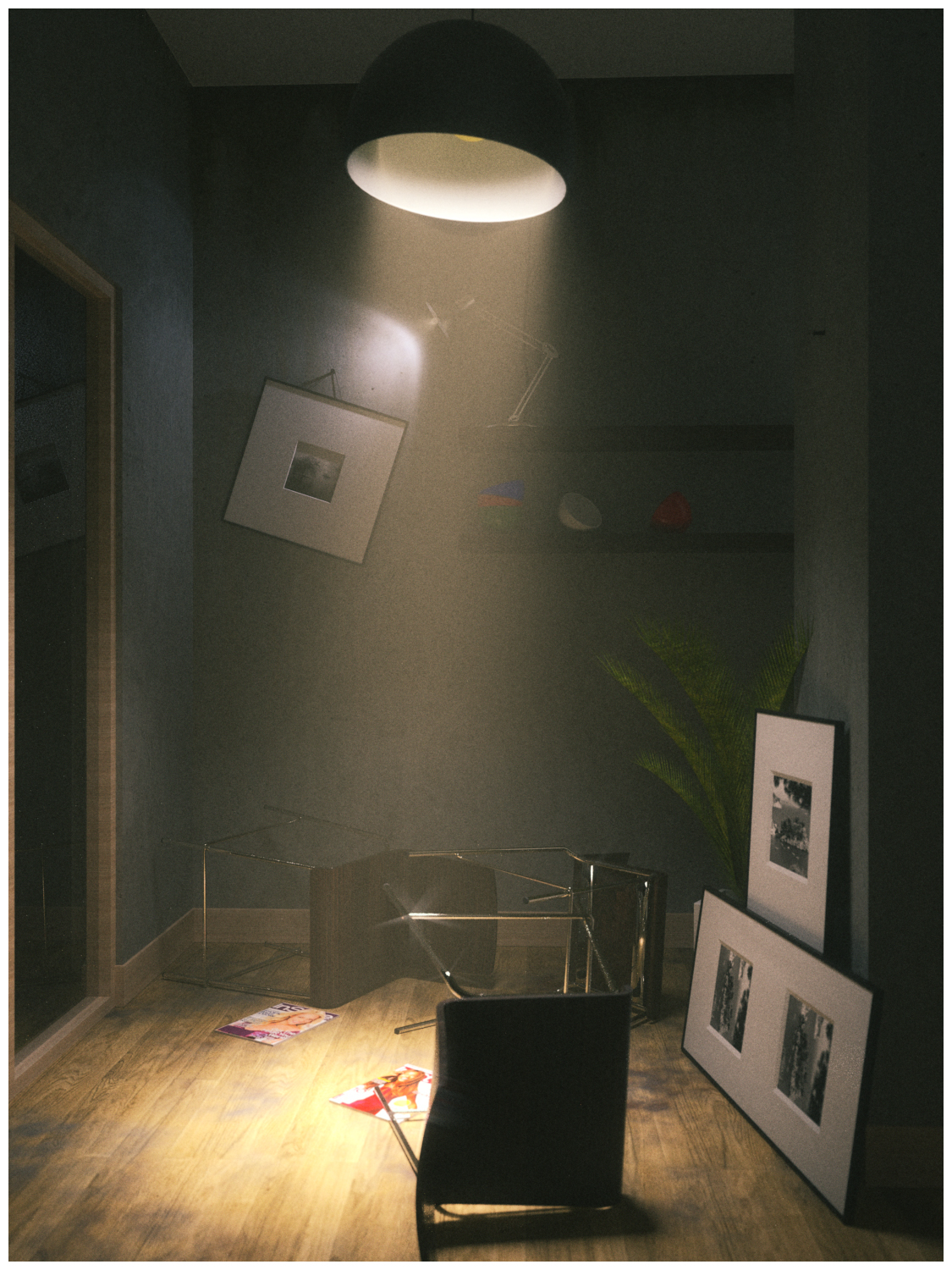
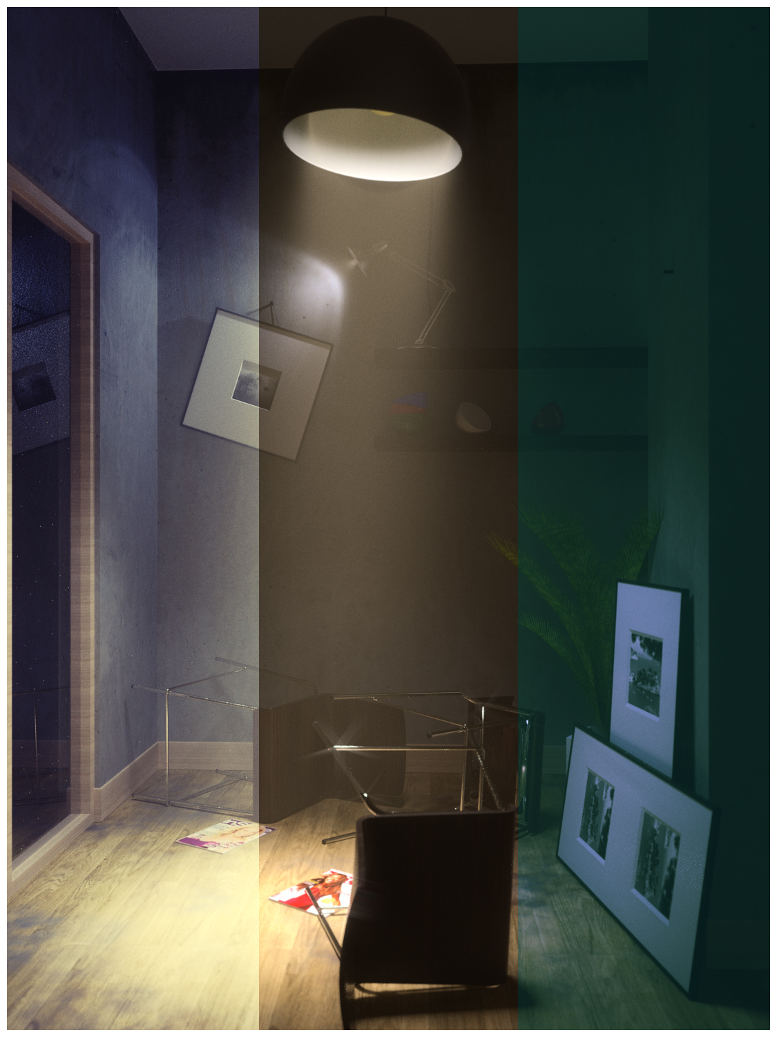
apologies for bringing this back up again... but i revisited this scene.. and what can i say.. it was a mess and found it ransacked (damn those kids!)


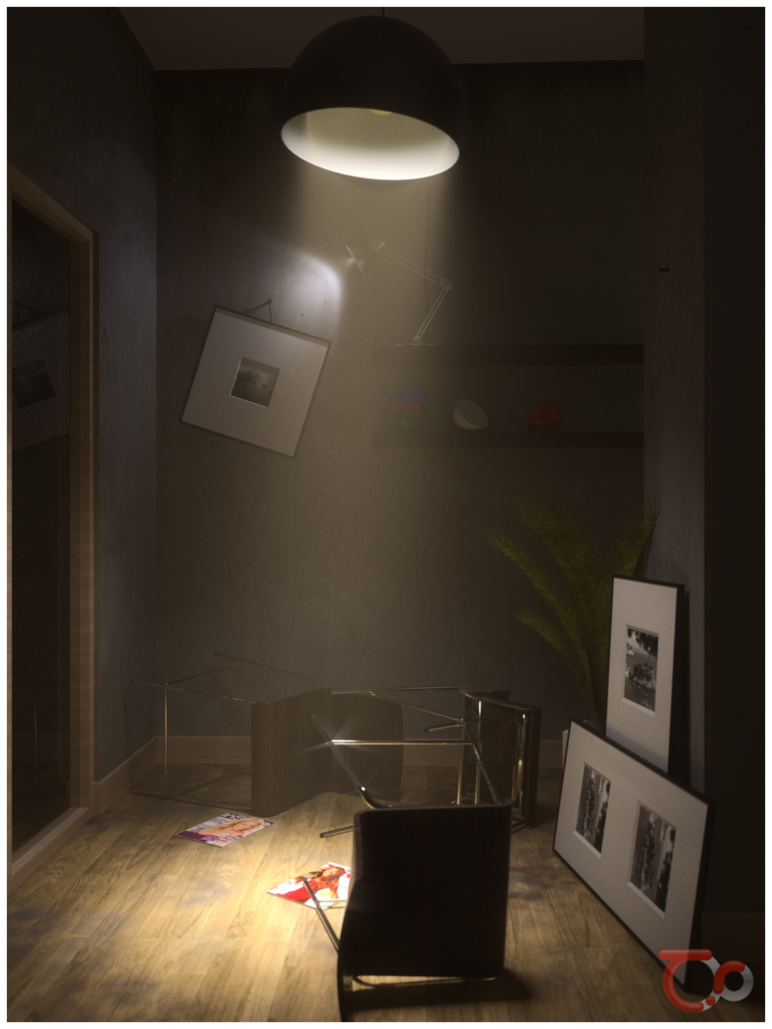
a little PS variations for fun!
Hello! It looks like you're interested in this conversation, but you don't have an account yet.
Getting fed up of having to scroll through the same posts each visit? When you register for an account, you'll always come back to exactly where you were before, and choose to be notified of new replies (either via email, or push notification). You'll also be able to save bookmarks and upvote posts to show your appreciation to other community members.
With your input, this post could be even better 💗
Register LoginAdvertisement


